D/A Clock

da-clock

I am always rather intrigued when digital or virtual experiences are brought back into the physical realm of ‘things’ (‘thing‘ being, ‘stuff’, feelable, touchable stuff). From the popularity of ‘steampunk’ computers we see an almost desperate claw at turning our increasingly digital lives back into something more tangible, more crafty.

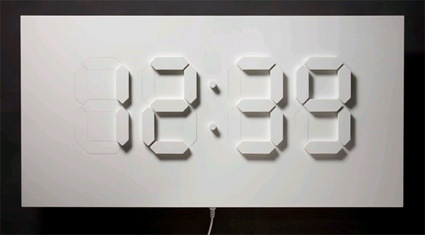
The D/A Clock is yet another example – converting a whole table-sized display of time in the classic LCD segments. What’s also interesting though is the purposefully slow transition from one digit to another. When I first saw the picture I thought the blocks would simply jerk up and down as it changes; the video however shows a much more subtle transition:

 This object plays on the common LED-display digital clock with physical segments that slowly fade in and out of a white surface. The D/A Clock introduces new characteristics to the digital mediation of time: a physical dimension and intermediate states – the time between 0 and 1.

I like that the designer Alvin Aronson noticed and chose to play-up this subtle difference. In the digital world of ’0′ and ’1′s, there are no intermediate states: it’s either one or the other. And when the clock is borne onto this full-sized, physical display, it drops its ‘digital’ properties and re-adopts the analog properties that this world operates in. Interesting thought.

Chocolate Pencil Shavings

nendo-chocolate-pencil-shavings

I loved this chocolate shavings done in the classic color-pencil interpretation. Designed by nendo (many other great works in the website too!) in collaboration with patissier Tsujiguchi Hironobu, the mastermind behind popular dessert shops like Mont St. Claire and Le Chocolat de H, this initially awkward association between ‘delicious chocolate’ and ‘coloring stationery’ becomes gratifyingly apt:

Our “chocolate pencils” come in a number of cocoa blends that vary in intensity, and chocophiles can use the special “pencil sharpener” that comes with our plate to grate chocolate onto their dessert. Pencil filings are usually the unwanted remains of sharpening a pencil, but in this case, they’re the star!

I loved that design-gymnastic on how he managed to link pencil shavings to chocolate shavings – it certainly must take a very acute observation and mental creativity to note this, so that after the design is done everyone else can go “Ah it’s so logical right from the start!”.

And now I can’t look at chocolate, truffle or any other food-shavings without thinking of this.

Day -> Night Curtain

better-view-curtain

Pull…………….and day turns into night!

Better View is a series of perforated black out roller blinds designed by Elina Aalto. Light seeps in through the small cut out holes creating an image of a city by night. The cut-outs represent the light in the windows of apartment buildings and office complexes in the city. With the Better View blind any  dreary view can be turned into an attractive cityscape. The series currently includes views from Helsinki and Tokyo. New additions portraying Stockholm and Paris are in progress. The images represent a selection of cities that Elina has traveled to in the last few years and the photographs are by her. The chosen views are of contrasting cityscapes: skyscrapers in Tokyo, 60s modernism in Helsinki and 19th century architecture in Paris.

This is probably perfect for those of us who hold ‘upside-down’ hours – e.g. if you work on night shift, or have to constantly readjust to jetlag or something. Or simply, if you wish to have a night-view of a city that you could not otherwise have (cue sappy line: ‘Oh my love, even though I can’t afford to fly you there, I brought the night-view of Paris to you!’. Clever design.

NOKIA Remade – Sexy Sustainable Phone

nokia-remade

When I first saw the picture of this Nokia mobile phone I thought – “Wow, that look really sleek! A nice, simple and yet certainly stylish phone – is it yet another venture into their premium metal-casing series?” Reality isn’t always skin deep – and in this case, it was certainly a greater pleasure once I discovered the idea behind.

This is a concept phone where Nokia explores the idea of sustainability – certainly a very pertinent issue in a billion-unit-a-year industry:

We drew on a simple insight that in the not too distant future humanity will have extracted and worked much of the valuable minerals once buried in planet Earth. We will be compelled to reuse and celebrate what is essentially “above ground”. Thus we explored the use of reclaimed and upcycled materials that could ultimately change the way we make things.

In remade, recycled materials from metal cans, plastic bottles, and car tires are used beautifully; whilst helping reduce landfill and preserving natural resources. The concept also addresses cleaner engine technologies, and energy efficiency through power saving graphics.

I’m always irked by the common misconception that green products are a compromise to ‘the real thing’, a sacrifice or a trade-off one makes. And I’m glad this exploration shows that sustainable can be really appealing – this phone is certainly sexier than many on the market right now.

Here’s their little promo video:


Extreme FlatPacking

casulo-furniture

Wow, this is really taking IKEA on its head and beating it flat (no pun intended). All the furniture that you see on the right came from that one (not-so) little box on the left picture. Just perfect for that somewhat temporary stays like those in college but have to rent their own apartments. Here’s how it’s done:

Designed by Marcel Krings & Sebastian Mühlhäuser, who are looking for production partners to bring this onto mass-market.

Comments + Critique Time

You might’ve missed a rather interesting discussion in the comments of one of my earlier posts – about the patent and novelty issues on the MUJI winning entries. Scott, a designer-engineer-patent-agent hybrid brought up some interesting perspectives, and in our conversation I thought it’d be a pity that we don’t get to see the other entries.

The first one is called Postie. “It’s a simple bent structure that offers a day-of-the-week platform for POST-IT’s to help organize the THINGS TO DO and various meetings, etc per week. As you know, the mind works well graphically and this simple structure should help the worker visualize what needs to be done and by when.”

postit-stand

The other idea is the Tackie. Scott: “This one is a two-pin thumb tack that is designed like a coin (better grip) and further includes a curved slot that can receive a card for advertisement. I know using two pins for thumb-tacks is known, but not the combination of two pins and a coin-like handle and the slot. The thumb-tacks are also stackable for cleaner and safer storage.”

pin

muji-01-sheet-2-copy

Personally for POSTIE, I liked the idea of using Post-Its as a medium for activity planning. Them being spontaneous and convenient gives a more flexible approach to laying out your schedules – adding an appointment simply means tacking on an extra note in the relevant space. However, the design solution felt rather clunky (despite it being collapsible) – it seems too much of a material structure for the sole purpose of delineating days. Could the same purpose have been achieved not by a metal product but maybe by graphics, especially as MUJI is rather particular about clutter.

As for the Tackie idea, I definitely agree on the easier-and-safer to store part. Most pins are cluttered in boxes which can be difficult/’prickly’ to retrieve. I was mentally trying to search for applications for these pins though – what are the wider applications apart from the notice board (which seems rather niche). Aesthetically, I think MUJI has a rather particular ‘fetish’ for being simple and not overtly attention-seeking. Maybe something like this?

pin-suggestion

Global Package Gallery

global-package-gallery

If you’re designing packaging, you’d probably find the Global Package Gallery very useful as an reference for what have been done before.  It’s an archive (still in BETA stage, though reasonably populated already) of packaging designs categorized into various types: beverages, food, electronic, etc. With more time the site might very well expand and become the grand daddy archive of good packaging.

Meat Part Keychain

meat-parts

Any of you can’t separate tenderloin from sirloin? Yeah, me neither. These little key chains called ‘Gotoshi Dissection Animals‘ help you distinguish each part of the animal. They’re not actually limited to only popular edible animals though – I doubt, for example, that you eat pandas on a regular basis.

What’s the catch (pardon the pun)? Well you’d have to learn Japanese first before you can understand the naming – so it may still be easier to memorize the anatomy!