Very Clever Hearing-Aid Packaging

goodmorning-widex-hearingaid

This is simply brilliant. While the technique is not new – bands of print on a transparent sleeve can look animated when paired with appropriate underlying box graphic – the aptness absolutely shines through in this packaging design by Goodmorning (a design consultancy from Denmark) for Widex, known for their high definition hearing aid .

As the user pulls out the case for the hearing aid, the graphics dance and animate, mimicking the delightful motions of a sound wave. In fact, the graphics for this raster effect isn’t random either – it spells out Widex’s slogan “High Definition Hearing” (or how someone pronouncing it would look like anyway). Video here:


Studio Manzano – Phone Tablet

studio-manzano-phonetablet1

That’s Studio Manzano’s Phone Tablet – from the looks of it, it’s probably a powder-coated bent-metal piece – a shelf for your mobiles or electronic gadgets.

The detail that really stands out is the cut-out in the center, which are slots for the wires and adaptors to pass through. This is also the part of the design that I really liked – while it serves its functional purpose, it’s also very neatly and poetically integrated into the shelf. I especially prefer the this version below:

studio-manzano-phonetablet3

The color of the finishing feels a tad more sophisticated than the white one, and the cut also looks very elegant – is that a tree blossoming, or could it be a subtle reference to coat hangers, or even a subtle hint at circuit board connections?

studio-manzano-phonetablet2

If you look at the front view, you’d also discover that there are hooks formed out of the sheet metal for you to hang your bags. This, however, didn’t appeal to me: the angular cut felt a bit too brutal – almost like a CAD model with too low polygon count – that I thought did not fit well with the rest of the aesthetics.


40th Tokyo Show – Concept Cars

40th-japanese-concept-car

You’ve probably have seen bits and pieces about some of these cars floating about online over the past weeks or so – they are all participants for the 40th Tokyo Motor Show that wasa held from Oct 26 to Nov 11. From the very expressive Mazda Taiki (first picture) with all its 3d-twisting-and-flowing lines, to the Pacman-monster lookalike Honda PUYO (that is actually my favorite) that explores a soft body rather than the typical metallic panels, this is how car makers get creative and hopefully some elements from these explorations would make it to mass-production.

Most of these concepts fall within the small or mini-car segment. Japanese have a tradition for small cars, as they mostly use cars within cities (what with its narrow streets and very limited parking space), preferring to take the high-speed trains for longer journeys.

Fun-On has more descriptions for each concept (as well as some others that I didn’t feature here).

Nissan All-Round Camera Monitor


As the rear-sensors that beeps to alert drivers to obstacles become standard, Nissan has gone one-up to offer a full Around-View that gives drivers a bird’s eye view of their vehicle. Four cameras – mounted on the front, sides and the rear – captures images in real time and sends them to a central processor, which synthesizes the images and process them into easier-to-understand info-graphics.

Drivers who find parking difficult – rejoice!

Tre di Una – Hunn Wai

tre-di-una-hunn

What if the most important structural parts of a chair are replaced by plastic clay? And how would the same chair look by simply altering the proportions of these connecting parts, while retaining the basic surfaces (hence the name Tre di Una, meaning “three from one”). This family of chairs are formed from a generic beech chair that is taken apart, and then pieced together again by colorful, plasticine-like clay connections, giving it a new and fresh character.

Hailing from Singapore, Hunn Wai studied in NUS before completing a Masters in Design Academy Eindhoven under the tutelage of Droog co-founder Gijs Bakker. You can find more of his craft-leaning designs over at his website.

Opus Design Award – Winners

The Opus Design Award is held annually to invite concept design entries related to eyewear. This year, the theme for the competition was “Eyewear are tools to enhance faces”:

Today, roles of eyewear have come far beyond the original eyesight correction or optic protection.Particularly, possibilities as fashion items have great expectations.Opus Design Award this year dares to define that “eyewear are tools to enhance faces”,and invite designs in accordance with the definition. We look forward to innovative exciting designs that would open up new spheres of eyewear.

The winner was announced, and Singaporean industrial designer Joe Tan‘s entry “blur” beat the pack to win the Gold Prize and a cool 1 million yen! Obviously inspired by one of the tools of our trade – Photoshop – his entry plays a pun in bringing the techniques used in ‘Photoshopping’ to real life:

joe-tan-blur-opus

blur is inspired by the photoshop “blur” tool often used to erase wrinkles in photos. We can find similar blur texture effects on glass or plastic products in our everyday life. Applying such textures to specific area on the eyewear blurs wrinkles and seemingly reverse the effects of aging. blur is specially designed for women who want to look younger in a blink of an eye!

Stacking Classic Chairs

stacking-classic-chairs

How different would it be to have the very classics of chair design reinterpreted as stackable plastic chairs? Dirk Winkel, from the University of The Arts Berlin, finds out in his project ‘A Stacking Hommage’ (sic). I guess these are really classics – even when recast in another (cheap) material, they still retain an elegant form and proportion – that’s probably what made them real classics through the many decades.

For those of us who aspire to but can’t afford the real classics, we’re going to be disappointed again, as these are not for sale.

Dirk has some other works in his portfolio site here too.

Ingo Maurer’s Light Exhibition

maurer-bulb

Ingo Maurer, one of the luminaries especially in the fields of lighting designs, is showcasing some of his latest works over at Cooper-Hewitt.

The 75-year-old Maurer, whose light-bathed work ranges from macro-scale sculptures of flowing, gilded ribbons to chandeliers reconstructed from shards of exploded tableware, is a visionary—an artist as well as a technical and entrepreneurial innovator. For 40 years, Maurer has been in the vanguard of a technological and aesthetic revolution that has transformed lighting from a mere convenience into a high-cachet object of desire. In the process, he has worked with designers from companies including Chanel, Issey Miyake, and DaimlerBenz (DAI)—and become a guru to artists and commercial manufacturers alike.

Of all the lights, my favorite is the one above. At first glance, I didn’t even realize what was special about it – thinking perhaps it’s just a play of scale – blowing up the traditional and familiar silhouette of a bulb into a more surprising size. It was only through the second read that I discovered the bulb nested within the bulb. I can’t really pinpoint exactly why this fascinates me, but somehow it did.

Perhaps it’s a reminder. In my daily routine I typically come across tens or even hundreds of designs in various kinds. This has almost conditioned my eyes to fleet through and in this case, I got caught drawing my own conclusions before really looking at the picture. Perhaps it’s a reminder to look at every product and savor them in detail – soak in a design before jumping to conclusions.

[Business Week on Maurer’s work]

Donn won Braun

donn-and-braun

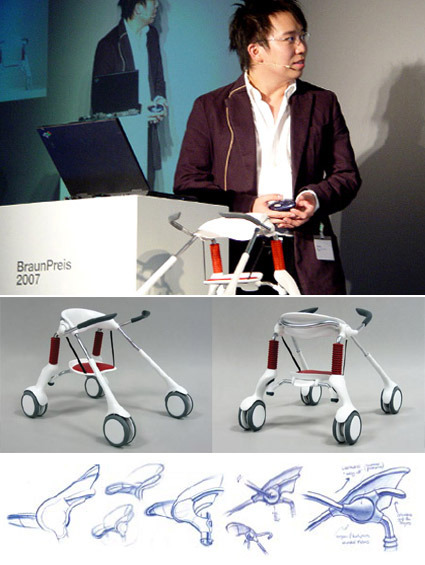
Singaporean designer (and a recent industrial design graduate from NUS), Donn Koh, had recently clinched one of the most coveted prizes for industrial design students – the Braun Prize. Titled Leapfrog, the project helps children with spinal problems to switch between sitting, standing and walking seamlessly:

LeapFrog humanizes the assistive walker for the brain-injured child by combining stander and walker functionality – it transforms, and assists, in sync with the child’s intention to sit, stand or walk. Besides supporting physical development, sense of independence and esteem, LeapFrog also turns ‘painful’ medical engineering aesthetics into sociable, toy-like approachability.

One of the highlights of this product is its trait of being a hybrid product that can accommodate to the wishes of the user, rather than the other way round. Often we find products that reduces a user-state into a single-dimensional, lowest common denominator. The LeapFrog, however, has the innovative ability to scale to its user’s needs: in the sitting-configuration, it fully supports the user and demands nothing; when the user wants to stand up and walk, it knows to ‘retreat’ and surrenders some of that autonomy back to the person – that makes the LeapFrog a lot more human, and certainly less ‘cage-y’.

It makes me wonder also the possibility of developing this product for the other segments too. Having worked with some patients in a geriatric ward, I could see how this could potentially help the elderly who are too weak for sustained walking but feel too undignified in wheelchairs.

In any case, congratulations to Donn for a job well done!