Sleeping Machine (?)

A new discovery could make it possible to take a “power nap” at the flick of a switch. Scientists have found a way to turn on deep sleep at will using a machine that magnetically stimulates the brain. A device worn on the head could in squeeze the benefit of eight hours’ sleep into just two or three hours.

A news clipping has reported that scientists have developed a technique – Transcranial Magnetic Stimulation – to induce slow waves through the skull and into the brain, where it activates electrical impulses that are typical of deep sleep. Apparently this could be a form of treatment for insomnia in the future, and could potentially also be used to induce a “Power Nap” that has the benefits of eight hour’s sleep in just a few hours.

The title of that news article reads “Machine Means End to Sleepless Nights”. As far as I see, that may be true for the clinical insomniacs. But I could also see it being used by people who don’t seem to quite have enough hours in a day – lawyers, auditors, office workers (basically everyone) to squeeze in yet another few more hours of work and productivity in place of sleep. It’d really be a slippery slope – if you can have a gadget that eliminates the need for you to sleep, and frees up the sleep-time for you to do whatever you want – would you use it?

In that case, the title should probably be “Machine Means Beginning of Sleepless Nights”.


Samsung Concept PC

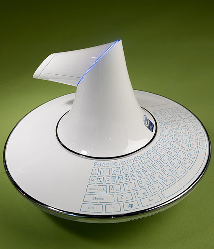
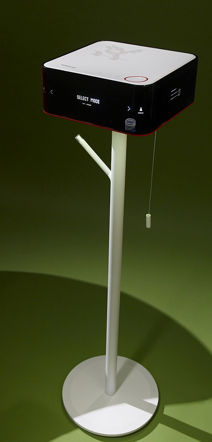
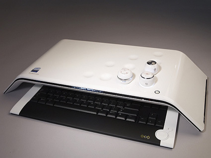
These are some concept PCs released by the Samsung Design team – apparently there weren’t any accompany explanation materials around it… perhaps I’d just venture my own speculation/interpretation to the intentions behind these designs:

samsung_1

Perhaps the central core and base houses the hardware, while the nuclear-smokestack looking part actually projects the screen onto a wall or something?

samsung-c2

Probably something more like a Media Center? Interesting pull string switch (?) though.

samsung_3

A more conventional keyboard, with an interesting lap-table like design. Could the balls be programs that you’re running? When you place them into the recess, it loads the programs that are stored in the balls (you better not live in a shaky place though).

Overall, even though I don’t quite understand these designs – just from the looks of it it is a refreshing take on the age-old beige-box. Ha ha, maybe Samsung should try and enter a Next Generation PC Design Competition…

Reality TV Editing


Reality TV caught the world by storm a few years ago, catapulting as a genre a few years ago with shows like Survivor that promised to capture the real life dramas that might be even juicier or more engaging than reel ones. While we all know that editing are necessary to condense hours upon hours of what amounts to surveillance footages into a decent, rating-pulling show, the extent where manipulation is possible – or perhaps more aptly, easy – might not be easily imaginable.

The clip above sharply illustrates just how easily it is to manipulate a set of footages to the desired outcome. Pretty much puts the whole reality-TV genre into the same band as say, wrestling matches, don’t you think?


Don’t Click It!

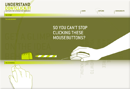
dontclickit

The Internet is pretty much defined by the “click” – people are trying to improve “clickthrough” rate, the cliché goes: everything is just a “click” away, etc. Whether we realize it or not, our experience and perception of the Internet is defined by the “click” (and by extension, the physical input that goes with it, like the mouse). Don’t Click It is an interesting website that attempts to breakthrough the “click”, featuring a full website where clicking is not an option – there are no buttons or links that are clickable, so alternative navigation methods were explored. Personally I felt this is quite a refreshing take on the Internet and the browser environment – I was secretly hoping for even more conceptually interesting navigation though!

PS: You’d have to click on the “Don’t Click It” link to get there. Then be prepared to resist clicking!

Architecture against Threats

The Berlin Wall was a potent symbol crystallizing the divided world of “us” versus “them”. It is stark, monumental, and it gives “protection” to the people from the foes on the other side of the wall (whether you’re the West or the Soviets). The wall came down in 1989, and some predicted a world with less boundaries.

That was not quite the case, and the 911 incident would forever entrench this. Instead of fearing the opposite world power, the fear has shifted to agents of asymmetrical warfare – terrorists. And in place to replace the Berlin Wall are many more little Berlin Walls – various architecture against the newer forms of perceived threats. And, instead of being pure functional and direct in its form and purpose, these new securities are dressed up in disguises.

new_wtc

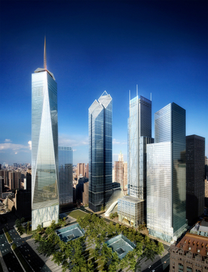
The Freedom Tower (above) may attempt to symbolize the American resilience after the 911, but the insecurity (or to some, being prepared) is betrayed by the 20-story windowless, fortified concrete base. Innocently decorated with prismatic glass panels, it masks paranoia as design/architecture. After hundreds of years, we’ve still not moved much beyond moats and castle walls it seems. While bollards, planters and various other implementation are still used – often these security features are masked as public benches, sculptures and the like.

caltrans-district-7

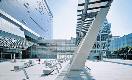
Seems like the owners of the Caltrans District 7 building cares a lot about its occupants – littering the plaza with sculptures and benches – but their real purpose is to deter any large vehicles that may be carrying explosives into the building. Apart from terrorists, building and urban space planners are also increasingly targeting other “threats” like skateboarders and the homeless.

It’s a pity that while we connect and link more on the Internet, the physical space seems to revert to the “protect-my-turf” mentality. While we build walls – numerous visible and invisible ones – against others to keep “them” out, from their perspective we’re simply locking ourselves in.

[read more: NYTimes “Design Strikes a Defensive Posture“, Excellent blog on Architectures of Control]

12 Best Games, in year 2010

totalkungfu

omega-1

Someone has compiled a top-twelve list of the best games – the catch though, is that these games are not published, nor even being scheduled for publishing (as far as I know anyway). They simply represent the dreams/desires of gamers – and I must say that they are really imaginative gamers – because the suggestions that they came up with definitely appealed to me (I’d really want to jump in and play some of these suggestions) even though it was just a simple paragraph explaining how an example game scenario would work in each of those games.

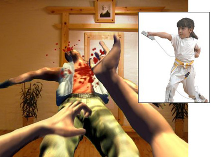
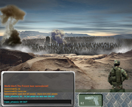
The first picture is for the imaginary game Total Kungfu – where you’d fight animated opponents using the Wiimote, leaving you frantically waving and flailing ala Dance Dance Revolution gone havoc. The next picture, showing a war scene, is simply a Massively Multiplayer Single Scene War – hear ye:

    This is the Combined Arms Simulator PC gamers have been dreaming about from the first time a shot was fired in anger over a modem. A sprawling world war, a Battlefield 2 but with one gargantuan, persistent map that everybody plays on.

There will be AI units to do grunt jobs like holding positions and supply lines. There will be RPG elements like statistics, character growth, and chain of command “guilds.” And Normandy-sized invasions with five thousand players.

Wow, that’s pretty cool aye! Some of the others have pretty cool concepts too! Like “Hard Cell”, whereby the protagonist you control need not want to follow your orders – he does not particularly want to follow your orders, especially if you have betrayed his trust and sent him down hell holes. Your task is then to shepherd and guide him past various obstacles and challenges in the game – fail to look after him, and things gets ugly… COOL isn’t it?

(Am I just fanatical here or something?)

Anyway, here’s the complete list – go look at them yourself and see if these games move you! Game publishers, take note too! And with some luck, some of these would DO indeed come to life.

Sony Design

Sure, Sony seems like a pale shadow of its former self – it is no longer the de-facto category leader in most of its audio/visual business, the brand value is falling, Blu-ray notwithstanding. Yesterday though I was flipping through a book called Digital Dreams – The Work of Sony Design Center, and I must say that I am still rather impressed by some of its concepts/designs.

sony-casette-walkman-joe-waka-1989

sony-walkman-joe-wada-elegance

sony-earphone-concept-1996

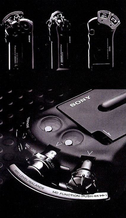
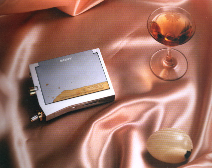
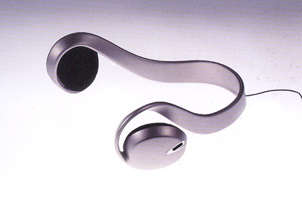
The amazing thing about the concept products in these pictures is that they’re all designed eons ago (relative to the digital age anyway). The first two are Walkman concepts by Joe Wada, done in 1989. The last one is a Street-style earphone, designed by Hiroshi Yasutomi in 1996 (which has since evolved into the mass-production version of the category-defining MDR-G61 StreetStyle. While the technology has moved on, the design to me is still very classic and dare I say, avantgarde even in 2007. The design principles and rationale behind them are still very relevant and inspiring.

And did you know that the Sony VAIO logo (VAIO – acronym for Video Audio Integrated Operations – the sub-brand in Sony that handles items using consumer audio/video) is supposed to represent the transition from analog to digital? The letters V and A forms a analog sine wave, while IO looks like the binary inputs of the digital age – and in fact, the people over at Sony is geeky in some ways – the startup melody made by VAIO products is actually the equivalent to the sound of punching V-A-I-O into a dial tone telephone.

Cool stuff – do check out the book if you have the chance – it’s a great read on the philosophy and legacy of the (once-great, and hopefully will revive to its former glory someday) Sony.

Microsoft Help Clip Dies

microsoft-clip-dies

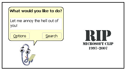
Wow, the clip is finally dead in Office 2007. No more of it popping up and zipping around, trying to be cool and cute. First introduced in 1997, it managed to sustain ten years of what most people perceive to be pure annoyance – and its termination in 2007 is probably ten years too late. It does make me intrigued at how the decision to keep/discard it is made – who actually makes the call? And if they killed it now, why didn’t they kill it earlier – what were the factors that were present then that are absent now (or vice versa)?

Anyway, good riddance!

Tree-like Buildings

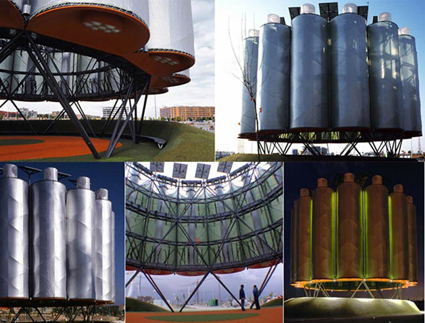
airtree

Stumbled upon this on the cool hunter:

Bad city planners can breathe a little easier now that clever designers have come up with a temporary building that will do the job of trees. Trees keep the air clean, provide shade and act as meeting and gathering points in open spaces. These ingenious contraptions apparently do the same. Made of steel, thermo textile and solar panels, the interesting-looking rotundas even create all the energy they need to light themselves. So, next time you forget to include trees in your plans, stick some of these in their place while the trees grow.

Unable to find more explanation on what it exactly is, or how it works, I’d resort to judging the book by its cover. On first impression, the aesthetic of this structure really doesn’t fit into its usage theme. Fresh air is it you want? Try looking for it under those giant cylinders that look like they may lift-off and roast you – or like a bundle of aerosol cans strapped together.

In terms of its “tree-like” feature – two of them can probably be achieved by almost any architecture feature that doesn’t bill itself as such (provide shade and act as meeting point). Keeping the air clean – well, having such a giant structure for that just doesn’t ring it for me.