Global Most Valuable Brands

brand-values

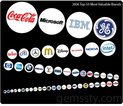
Here is the world’s most valuable brands for 2006 according to a study done by BusinessWeek. I have sorted and presented them according to the relative magnitude of their brand value – the area of each circle represents the worth of the brand within.

Once put on a chart like this, it is very easy to notice the relative (and rapidly diminishing) worth of brands down the list. Some of the brands that I grew up with, or are very familiar with, are hardly visible when compared to behemoths like Coca-Cola and Microsoft.

While brands are intangible, their worth are far from trivial. Little circles may not show them clearly, but the worth of the top ten brands (almost $400 billion) would eclipse the Gross Domestic Product (PPP) of the world’s 80 poorest countries ($350billion). Or perhaps another way to illustrate it – if we place the country’s GDP within the brand-chart, Kuwait’s entire economy would sit just about where GE is now; meanwhile, Iceland would be as difficult to spot as UPS; and Brunei can snuggle comfortably with MTV (bottom left corner, smallest circle).

And I thought they were just some silly marques.

Here is the list for 2012.

A di Alessi – Fall Collection

pot-and-pan-morisson-alessi

Alessi, one of the icons in product design, may remind you simply of extremely over-priced lemon squeezers. This year, however, they’ve decided to re-categorize their products into three branches – the Alessi main collection , ‘A di Alessi’ (Italian for from Alessi), which are designs that are priced at a lower price bracket , and ‘Officina Alessi’ which houses the more experimental, innovative and limited edition pieces.

Alessi’s decision to launch the ‘democratic, accessible products’ under the ‘A di Alessi’ marque spurred me into thinking – why? Alessi had enjoyed the status of being one of the most prominent “designer products” especially to the non-designers, and they have been able to capitalize on that for many years, leading to a perception where designer products are generally fun, whimsical, sometimes useless, etc.

That status, however, is being eroded. With introduction of players like Target and IKEA, mass-produced and very cheap products have shown their potential to be well-designed (or at least look good). In that way, Alessi was invaded on its home turf. The average person would likely not be able to distinguish plastic products from IKEA and Alessi – except that Alessi probably priced it 10 times higher. And that’s where Alessi’s relevance to the mass consumers may diminish and eventually erode its own brand base.

The pot above is by Jasper Morrison, heading off this year’s inaugural launch of A di Alessi. However, I have come to associate these design styles with brands like IKEA more than Alessi. While Alessi may gain some market share in the cheaper, mass-design products, I think it may eventually fare worse in terms of loss brand equity.

Really, what does Alessi still mean to you?

Complaints Choir

You can’t get rich by working
And love doesn’t last forever
In the public sauna they never ask
If it’s ok to throw water on the stove

Old forests are cut down and turned into toilet paper
And still all the toilets are always out of paper
Why products on sale drive the people crazy?
In the middle of Helsinki they built another shopping hell

Finnish artists Tellervo Kalleinen and Oliver Kochta-Kalleinen collected the pet peeves and angst-ridden pleas of people in Helsinki, and then composed this choral work around the list of complaints. Birmingham has also chipped in with their very own Complaints Choir, and I could see no reason why Singapore should not chip in too.

Complaining is for the longest time the national past time: forum pages are often inundated with them; kopi-tiams see groups of uncles-and-aunties rattling on about jobs, the gahmen (Government) and bus fare prices; school kids complaint about homework; adults complain about working hours and their bosses etc.

There are so many good reasons to channel complaining into a song like this. Turning negativity and pessimism into a creative work of art dissipates the grunt – as you sing along about the pet peeves, they may become a little more tolerable, a little more bearable, and perhaps even, a little cuter.

The issues sang in the Complaints Choir are also very localized – only those who’re here can really know and identify with it. In Singapore’s version, maybe there could be: NKF, forgetting to tap-out on buses, about choosing HDB flats close to your kid’s primary school, GRCs, .. these are stuff that makes it Uniquely Singapore. As much as it is a daily gripe, it still gives a facet of life here – something that once you see it, you know you’re here.

I can imagine Finns all over the world nodding in agreement with the song, identifying with the complaints – “Oh yeah! I’m really irritated by that!”, and yet among all these emotions evoke a warm sense of nostalgia and identity, a love for Helsinki for all its quirks and particularities.

So someone, make one already!

Passionate Users

When it comes to how you’d measure how satisfied a user is with your product/service, an article summed it up quite succinctly and simply: the words that you need to look for coming out of the user’s mouth is: “COOL!”.

That’s where passion begins. Those are the words I want every user of my product to utter. Ideally followed up by something like:

“Dude, you have to check this out.”

I don’t want their reaction to be a measured, rational, dispassionate analysis of why the product is better than the alternatives, how the cost is more reasonable, feature set more complete, UI more AJAXified. I don’t want them to pause to analyze the boring feature comparison chart on the back of the box.

That is an incredibly high mark. Satisfying the user so completely that he is left with nothing but amazement, and it’s not stopping there: he is so satisfied from the product that there is nothing but a compelling, almost religious desire to spread it around – to his friends, families, and even strangers – just for them to experience the experience as well. This is the pinnacle of user satisfaction – have them like it so much that they just have to evangelize it.

These are the kinds of products that creates a fan base of its own – people would make video tributes to it; spoof it; make stuff about it that goes viral. And those are really the highest forms of honor and endorsement – possibly one of the most effective ones too, now that our attention span to individual advertisements across any platform are greatly reduced.

Some examples that I could think of are Apple products and Mozilla Firefox. While there may be other companies having items that can match the sale volume of Apple’s gadgets, how many can also boast websites created by fans in anticipation of future products? iPhone Concept Blog features fan art sent from around the world in anticipation of Apple’s iPhone. People dedicating many hours of their time, painstakingly dreaming up and illustrating what your company might produce in the future.

How about Firefox? It inspires users enough to have a site showcasing fans who spent time developing 30seconds flicks to advertise Firefox – free ads made and widely distributed by fans evangelizing the browser. Or how about this picture below – crop circles cut in the mark of Firefox – perhaps to advertise it to aliens from outer space?

cropcircle3

So, when you’re designing, set that ideal in mind – “satisfied” is a good start – but look beyond! Have them enthralled! Thrilled! Mesmerized! They’d tell the world about it, perhaps make guides and hacks around it; they’d be your most persuasive marketers. Have them evangelize your products!

Red Guinness!

red-guinness

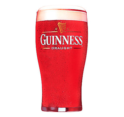
Woo! RED Guinness! Perhaps it’d be a hit in the next Chinese New Year! Personally I find it a little queer though – the whole image of the stout, rich, malty and dark Guinness seem a little frivolous – almost like it’s trying to snatch some market share from the likes of Bacardi. Apparently the taste is still the same though.

Maybe Dracula would switch.

Virtual Virtual Tourism

synth-travel

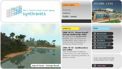
Instead of touring physical landmarks on Earth, Synthravel organizes tours to online places – places in online games such as Everquest, World of Warcraft, Second Life etc – so you don’t have to have a game character to see what it’s like, and there’d actually be a tour guide bringing you around to the more interesting places (you can request).

Now is this surreal or what? Many years ago, some predicted that tourism would decrease as they are replaced by online tourism – we can see that that hasn’t happened. A virtual experience is no match for a physical one. But what about a virtual experience of a virtual world? Hmm. Subversion of the greatest order.

It seems that the concept was not as successful as hoped for as it appears the site is under extended maintenance.

Art-o-Meter

artmeter

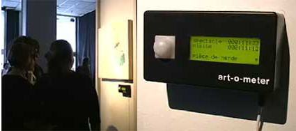
“Art-O-Meter is a device that measures the quality of an art piece. It bases its evaluation on the amount of time that people spend in front of an artwork compared to the total time of exhibition. The measurements are graphically represented by comments and a 5 star rating system”.

The design of the physical artifact aside, I think this device is symptomatic of a two interesting issues: 1) Democratization of content selection, and 2) Love/Hate is better than Indifference.

1) Democratization of content selection
While Internet search engines like Yahoo!, Altavista and Lycos (*gasp*, do you still remember them?) and others were still grappling over who had the largest directory. As hindsight would tell, it wasn’t the quantity that mattered, but the quality of these sites. The spawning of larger masses of choices made human top-down editing nearly impossible, and spurred the creation of aggregate sites like Digg and Reddit, where users up votes or down votes site links that interests them. The collective scores would reflect the aggregate interest level in the community, and be afforded prominence on its site accordingly.

I can imagine the same happening here too. When an art museum installs this (hopefully more discreetly), it could gauge the human interest level in their patrons with respect to individual art pieces and adjust accordingly. At the elementary level, the art museum may shift the more popular pieces to more strategic locations, like nearer the entrance, around the corners etc., and perhaps also influencing which pieces get stored and which get displayed more often. In a longer run, I can even envision a user-generated art museum that has tools where patrons contribute, and the pieces be up/down voted by fellow patrons based on the Art-O-Meter principle.

Some may argue that nothing beats the artistic taste and direction of a human, experienced curator. Well perhaps there are indeed art collections that will pale if one or more pieces are removed from the series; but I do believe that there are room for both types (curatorial vs popular choice) of galleries, just as there are both types of websites today.

2) Love/Hate is better than Indifference

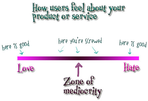
Of course, some may say that the time spent in front of a work cannot equate to its quality – for all you know, he could be condemning the piece – and surely that must be the worst possible rating. But alas, the purpose of art is to provoke, to suggest, to bring in new dimensions. As many marketers (and perhaps also college fraternity boys trying to get a girl) preach, the worst part of the love-hate curve is in the middle – in the “indifference” zone. “Love” is good, “Hate”, you can still work it out, but indifference – not even noticing or caring that it’s there – is certainly the worst.

Borrowing a diagram from the blog “Creating Passionate Users“:
loveandhate10bt1

Mac vs PC. Pepsi or Coke. Settling and compromising for something that pleases everyone eventually would be a guarantee for failure – the zone of mediocrity above.

Wow, did all rant all that just because of a little black box? Hmmm, looks like it’s pretty effective already!