Texture Mapping onto Real Life Videos

Computer Graphics researchers Volker Scholz and Marcus Magnor developed an amazing algorithm that allows one to substitute the texture and shape on a fabric in a real-life video accurately. I know that doesn’t describe much, but I’d venture it is probably more easily understood as compared to their abstract:

In this paper, we present a video processing algorithm for texture replacement of moving garments in monocular video recordings. We use a color-coded pattern which encodes texture coordinates within a local neighborhood in order to determine the geometric deformation of the texture. A time-coherent texture interpolation is obtained by the use of 3D radial basis functions. Shading maps are determined with a surface reconstruction technique and applied to new textures which replace the color pattern in the video sequence. Our method enables exchanging fabric pattern designs of garments worn by actors as a video post-processing step.

Well, a video speaks about a million words – so see for yourself:

Blowable Laptop User Interface


Check this out! By simply using existing microphones found on practically all laptops, researchers at Georgia Institute of Technology have developed a way to emulate screen pointers based on puffs of air instead of the mouse. While they could be used for ‘fancy’ applications like blowing out virtual birthday cakes (as the video suggests at the end), this could also very well be leveraged for people with disabilities such as paraplegics.

Great potential achieved with easily-available and cheap execution – I hope this can really be developed into a comprehensive, easy and accurate system of alternative input method. Just wondering – if we place a few microphones strategically around the screen, could it have a better calibration (think of GPS triangular positioning)? That could help make this much more precise and that much more effective.

Thai Movie-Ad: Smooth E


Once in a while, you get an ad that transcends the very definition of an ad. One that is so remarkably and creatively different from the pack, it shines. I think this is one of them.

The product is as typical as any – a facial cream. You can already picture how an ordinary ad for this would be – a pretty (fair) model rubs the cream into her palm, uses it, and the slow-motion sideview take of the water splashing her face, which leads to an end cut-scene extolling the virtues of Brand X cream, and your life becomes perfect.

But this one manage to narrate it through a series of four short movies (or long ads) – the story can either be cheesy or touching depending on your point of view – but the ad scores brownie points for me when they were able to laugh at themselves: ridiculing the very medium of an advertisement while being on an advertisement. It also doesn’t make it seem like magic will ooze out once you use it like most ads would have portrayed – so there’s an element of honesty there as well (wow!). It’s Thai-produced, so you’d recognize their almost trademark exaggeration and comical humor as well.

They have managed to produce one that in my opinion, even draws people to want to watch it, to “can’t-wait for it to be screened”. That is some feat indeed!

Typography Video


If you’re a typographer and just find it hard to communicate the value of your work (“Oh, so you choose fonts for a living?”) – here’s an excellently-produced video  that may help give a quick explanation of the artistic level in true typography. Well actually, it’s rather likely the response would still be more like “Ah, so you choose pretty fonts for a living!”, but at least the video would probably make you feel the worth of your work more.

“Typography is what language looks like”.

Students of Today


This video serves up survey results of what is typically in a student’s life. The description doesn’t sound all that interesting, does it? Growing up, go to school, party, study a little, go online a lot…we probably think we know this age group pretty well already. Yet, there is something fundamentally different about students in that video that made it thought-provoking for me.

It could be the way this video was made and conceived – the survey questions themselves were mass-authored by all the participants in the survey itself – kinda like, Wikipedia asking itself questions. It could be how much ‘non-traditional’ learning and communication tools – like websites and emails – dominate the average student’s life as compared to ‘traditional’ tools like books and assignments.

In our face is a fundamental shift in the way we learn. Rigid and orthodox methods, like formal textbooks and school lessons, are rapidly giving way to much more flexible mediums. Indeed, as Sir Ken Robinson pointed out in this fantastic TED Talk, in the rapid development of the world what we learnt in school would have been obsolete the before we even graduate. Those who recognize this first (and act accordingly) would stand to gain.

Fastest Rubik Cube Solving


The world record for speed cubing – solving the Rubik’s cube in the shortest time possible – is currently held by Thibaut Jacquinot from France. The guy in this video did it in 10.56 seconds, which is certainly not far away, and shows some really nimble fingers and a good Rubik’s cube (I’m sure the one that I played with didn’t turn that smoothly, and would probably get stuck half the time).

And check out the timer that he uses – pretty cool eh? Based on the text printed on the device, it seems like it was developed for another seemingly trivial but no less speed-obsessed sport: speed stacking.

Very Clever Hearing-Aid Packaging

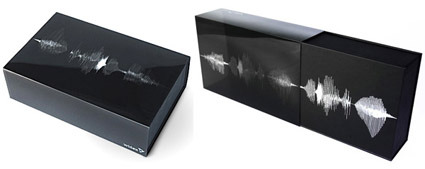
goodmorning-widex-hearingaid

This is simply brilliant. While the technique is not new – bands of print on a transparent sleeve can look animated when paired with appropriate underlying box graphic – the aptness absolutely shines through in this packaging design by Goodmorning (a design consultancy from Denmark) for Widex, known for their high definition hearing aid .

As the user pulls out the case for the hearing aid, the graphics dance and animate, mimicking the delightful motions of a sound wave. In fact, the graphics for this raster effect isn’t random either – it spells out Widex’s slogan “High Definition Hearing” (or how someone pronouncing it would look like anyway). Video here: