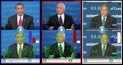
Body Motion Signature

body-motion-signature-green-dot-project

As if there aren’t already enough biometric identification information – from the basic fingerprint, to iris scan, voice and speech patterns, etc. – experts are developing a new way of identifying people – by their unique body motions:

Titled the Green Dot Project:

To identify who is in the video, the computer first looks for movement in the scene. Green dots indicate motion. As the video plays, and the computer collects motion data, it can eventually isolate and identify the human. The moving bar chart shows a comparison of the motion signatures of Senator Obama, Senator McCain, and President Bush as the computer is collecting data.   The blue bar represents “Obama-ness”. Red represents “McCain-ness”. White represents “Bush-ness”. By the end of these short clips, the computer can tell us which person is in each video. You can choose to listen to the audio, but the computer uses only movement data to detect the body signature.

Check it out!

3D Sketching


This, I think is one of the holy grails of 3D-design, be it product, character or others. ILoveSketch is an absolutely awesome program that straddles the sweet spot between sketching and 3D-modeling – sketching in 3D plane and turning those sketches into curves on 3D space on-the-fly, giving the quickness and agility of sketches, while also delivering multi-view perspective capabilities in 3D models.

Of course, nothing will replace a pair of good hands. No matter what software it is, if you can’t throw a line the way you want it, or even conjure aesthetically pleasing designs in your mind before sketching (proportion, form, weight, curves, etc.), software alone isn’t going to help. What it does though is to increase the sweet spot, and to reduce the turnaround time between a sketch-idea and a 3D-representation.

Now I’m just waiting for it to have a ‘paint’ function where you can render the views, and have it turn out 3D surfaces based on the shading (now I’m thinking too much). That would be the holy grail.

Am I asking too much?

Carling iPhone Ad


Carling’s clever use of the medium’s inherent (additional) dimension to give a more engaging experience for its advertisement. If you tilt it too much, beer actually get ‘spilled’ out, and the realistic looking foam marks clinging on to the glass also gives it a touch of realism confined behind the glass.

Which also brings to my mind – just how good does your ad have to be when you know it’s no longer spoon-fed and streamed into people’s faces (ala TV/radio/newspapers/magazines)? If you think about ads that people have to proactively download onto their medium, it really has to be THAT great.

Transformer comes to Strollers

Strollers have come a long way in terms of baby care. It was once exclusive and expensive, and only the upper echelons of the society could strut their babies around on wheels. Today though, strollers are almost a necessity for every mom, and we’ve also seen innovations that tries to make it simpler to use – to push, to store, to keep the baby safe.

4Moms demonstrated the above stroller – ‘Origami’ – recently at a show, featuring a Transformer-like automatic folding, which simply takes the sweat out of this process (parents will know how frequently they’d have to do this). A one-button push initiates the sequence – and the stroller detects whether a baby’s still in the stroller before morphing. The battery is also rechargeable (about 300 feet of pushing will give you the power for 1 fold). You can also find it on Amazon .

Cool Ad


It isn’t the kinds of ad that will blow you away, but I thought this was quite a clever ad. Without spoiling it too much: you’d probably start to get the commercial maybe somewhere in the middle of the ad, and that’s when everything suddenly make sense. And you’d still want to re-watch it, just to revisit the little nuances and hints that was lightly sprinkled within the video.

I also like how switched tacks and turned a usually dry, boring and perhaps ‘too-rational’ topic into something much more poetic. Something from those typical corporate-y and ‘o-big-industry!’ tone to communicating at a much more personal level.

Catch my drift?

F1 in Singapore Simulation

sg-f1-copy-2

singapore-f1

singapore-f1-3

Singapore hosted the first ever night-race in the Formula One in 2008, and AixSponza has an excellent animated reel showing the road-track that will bring F1 drivers around iconic architectures in downtown Singapore. I’ve always thought that street tracks are a lot more romantic than purpose-built racing tracks – typical track racing gives me a much more sterile impression, while street races feel a lot more immersive (and I comment from my very qualified experience founded upon years of video arcade & racing simulation games).

The pictures above are just some stills from the reel, showing its quality quite impressively.  No further ado: