Trash Art with Shadows

shadow-trash2

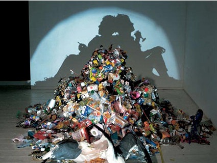
Some people’s art is other’s trash. In this case, however, the trash is the art. Artists Tim Noble and Sue Webster have some great pieces (literally, pieces) of work that at first sight looks simply like trash that does not belong at all in an art museum. When the spot light is turned on however, a totally different paradigm is unveiled in the shadows on the wall. Magnificent!

Diverted by money, property and prestige it is easy to avert our gaze from the vapid bankruptcy and wasted by products of the consumer cultural dream. In a post radicalized world of ambivalence where consumption and oblivion seem the order of the day Tim Noble and Sue Webster’s collaborations “literally” shine a light upon the untouchable residue of conspicuous consumption. With an unpretentious touch of desperate glamour and self deprecating humor they have transformed the gaze upon heaps of trash and side show ephemera generating a playful and contemplative allegorical space in which to consider the consequences of our choices and a hopeful humorous glimmer of the future.

That was a pretty dense paragraph – I’m sure the work speaks for itself and can floor many people indeed. It really makes you see things in a different light, doesn’t it?

More here.

Hand Shadow


Forming shadow patterns with a light source and hands are an old trick that everybody would likely have used to entertain themselves in those days of black-outs and power outage. But our tricks were probably nowhere as imaginative and well-executed as this one from artist Raymond Crowe.

The Hole-y Portrait

hole-portrait

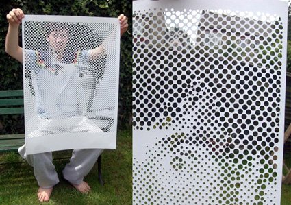
Give a man punched holes, and he’d file it in a folder. But give him a hole puncher (that can punch different sizes, please), and – voila – he can churn out magnificent art piece! Discovered over at NOTCOT:

Steven Nicholson is a 2yr student at Plymouth university in the United Kingdom studying Graphic communications with typography. And apparently he is a genius with a hole punch? Check out this self portrait using 10 different sized single hole punches on a a1 piece of paper that he just sent over. Can you imagine the patience?

All I can say is WOW. This work just makes anyone else with a hole-puncher (What? You only use it for document archiving?!) look really boring and uncreative.

A Romantic Proposal


The video is starting to blaze through the blogosphere right now – a wonderfully romantic video of an elaborate proposal to his girlfriend. I’d not spoil the story for you – but suffice to say, sometimes skills you learn in industrial design could just be useful in your real (romantic) life!

A Living Room in the City

living-room-in-the-city

Wow, count me impressed!

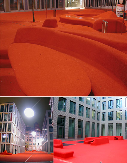
This is an outdoor space, in the center of St Gallen in Switzerland. Known as the Stadtlounge (City Lounge), it’s a massive bold move to put furniture and all right amidst all the buildings. Born of a design competition in 2005 to create a “living room area” in the financial district, this red carpet treatment flows all around, even onto some fake cars on the street.

Amazing, and I wish where I live they have the audacity to liven up a place like this!


Hong Kong, SimCity Style

hongkong-edushi

Wow, Google Earth suddenly doesn’t feel all that fun at all now that I’ve seen HongKong Edushi in 3D. With a striking resemblance to a SimCity style of  urban cartography, it makes it seem like the website itself is the destination, rather than simply a representation of a real place (man, maybe I’ve got a dose too much of Jean Baudrillard).

Anyway, it’s fun, it’s zoomable, it’s navigable, and it’s all in intricate, 3d, glorious details! Go on, you know you want to play!


Paul Potts – Britain Got Talent


The last thing I thought I’d ever be interested in on the planet is opera (the art, not the browser). But Paul Potts, the winner of the talent show Britain’s Got Talent enchanted me – somewhere between his earnest delivery and incredibly emotional singing voice, I think he captured the dreams and imagination of the millions who voted for him, and many more (like myself).

He’s a mobile phone salesman – looking nerdy, with the missing front tooth – these definitely doesn’t make the best first impressions for a talent contest. When he starts singing, you might go “oh well at least he’s not bad”. But when the tune turns into some of the most expressive parts of the song, my hair stood – and it’s just a great feeling looking at how he has remained humble and deeply appreciative of his talents and the support he’s got, and if you look through some of the clips, seeing him grow in confidence in himself.

This is definitely a great, welcome break from the typical talent shows whose sole ethos seem to be superficial glamor – this competition truly brought out a winner who’s talented, and definitely inspiring. Bravo!


Amazing Paper Sculptures/Structures

paper-sculptures-richard-sweeney

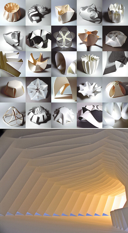
Whether you’re into architecture or not, I’m sure you can appreciate the astounding beauty and sculptural properties exhibited by some of these works by Richard Sweeney from the UK. It’s really amazing how he caresses the simplest of materials – mostly 220gsm cartridge paper – to take on form and substance that look much more complex and seems to me ripe with possible applications in architecture. In his own words –

This demonstration of art through engineered structure is truly inspiring, and is a major influence on the way I go about producing my work- to create objects that are simple to construct yet complex in appearance, and are efficient in the way they are produced, both in terms of construction time and material use. The greatest example of this principle- achieving the most from the least- are structures in nature. As in the greatest architecture, natural forms show patterns of repetition, whereby the very most is made out of the least material and energy possible, to create forms that appear amazingly complex, yet are based on very basic units and patterns of growth- these are objects that have beauty on all levels, from the way they are constructed, to the appearance of the final form.

Be inspired by his Flickr set and his personal site.

Women in Art


Depending on your interest and sophistication in Western portrait art appreciation, this video may be artistically heavenly and awe-inspiring or downright creepy. Unfortunately for me (with my non-existent understanding of western art) it’s more of the latter – it’s interesting though how the paintings seem to come to life in three dimension as they transform from one piece to another.

Fair(y) Use – Tale


Here’s an amazing effort by a professor in a university to illustrate what copyright means. The entire movie was narrated by a continuous montage of narrative derived from snippets of Disney’s movie (which perfectly illustrates the principle of fair use as satire). It’s quite refreshing to see this rehash as a retort to the sometimes absurd legal measures taken by copyright owners like Disney! It also shows how money and power corrupts since by using money gained from copyrighted work, a portion of that money was (and still is) used to pay (bribe) our politicians (congress and senate) to continually extend the copyright time limits. The whole intent of limiting this was to spur new ideas and work, however, as with may things, we the people let this happen by re-electing the bribed politicians.