WordPress in Flash

wordpress-in-flash

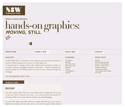
Number Eight Wired is a rather interesting experiment(?) – it adopts the very typical WordPress blog style, but implements it in Flash instead of the more typical CSS. You do get some bells-and-whistles that comes with Flash ( ability/control in animations and effects particularly) – the site do feel slick and polished. And you can use your favorite unique fonts without worrying that your viewer not having it (unlike in standard webpages).

For all the polish though, you’d (usually) have to sacrifice the much taken-for-granted things in webpages: ability to right click, deep-link to specific pages, save images off the web, etc (Note: these are in fact do-able even with Flash contents – it’s just that they’re not common).

Which would you prefer? Style vs usability (or is this actually a false dichotomy)?

Democratic Sheep Art

sheeps

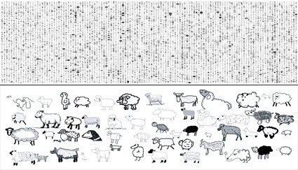
The picture on the top may look like some indecipherable Matrix-like message from outer space, but if you look closely enough, they’re actually rather familiar (and harmless!) things – drawings of sheep facing the left side. That big, 10000-sheep artwork is known as ‘The Sheepmarket’.

The Sheepmarket is a really interesting experiment in art and harnessing the power of the masses.  Artist Aaron Koblin assembled an army of sheep by asking random strangers to each draw him one for $0.02, through Amazon’s labor distribution mechanism – The Mechanical Turk. Here’s the artist explaining the project:

With the project turning into printed books and exhibitions, I suppose this is proof that leveraged correctly, the sum is indeed more than its parts?

D/A Clock

da-clock

I am always rather intrigued when digital or virtual experiences are brought back into the physical realm of ‘things’ (‘thing‘ being, ‘stuff’, feelable, touchable stuff). From the popularity of ‘steampunk’ computers we see an almost desperate claw at turning our increasingly digital lives back into something more tangible, more crafty.

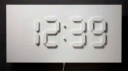
The D/A Clock is yet another example – converting a whole table-sized display of time in the classic LCD segments. What’s also interesting though is the purposefully slow transition from one digit to another. When I first saw the picture I thought the blocks would simply jerk up and down as it changes; the video however shows a much more subtle transition:

 This object plays on the common LED-display digital clock with physical segments that slowly fade in and out of a white surface. The D/A Clock introduces new characteristics to the digital mediation of time: a physical dimension and intermediate states – the time between 0 and 1.

I like that the designer Alvin Aronson noticed and chose to play-up this subtle difference. In the digital world of ’0′ and ’1′s, there are no intermediate states: it’s either one or the other. And when the clock is borne onto this full-sized, physical display, it drops its ‘digital’ properties and re-adopts the analog properties that this world operates in. Interesting thought.

Weird Food Fight

There are many ways to re-examine our history – making films of them are one of the means. But this video scores brownie points for taking a rather different tack: it re-enacts the World War II and other subsequent battles that the US engaged in, with each country represented by popular foods from that country, taking you (via culinary tracts) through the American-centric history of world politics. From World War II, to Korean War, to Vietnam War right up to the current Iraq War – you’ve got it all!

Absolutely weird, but very amazing at the same time too!

Chocolate Pencil Shavings

nendo-chocolate-pencil-shavings

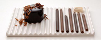
I loved this chocolate shavings done in the classic color-pencil interpretation. Designed by nendo (many other great works in the website too!) in collaboration with patissier Tsujiguchi Hironobu, the mastermind behind popular dessert shops like Mont St. Claire and Le Chocolat de H, this initially awkward association between ‘delicious chocolate’ and ‘coloring stationery’ becomes gratifyingly apt:

Our “chocolate pencils” come in a number of cocoa blends that vary in intensity, and chocophiles can use the special “pencil sharpener” that comes with our plate to grate chocolate onto their dessert. Pencil filings are usually the unwanted remains of sharpening a pencil, but in this case, they’re the star!

I loved that design-gymnastic on how he managed to link pencil shavings to chocolate shavings – it certainly must take a very acute observation and mental creativity to note this, so that after the design is done everyone else can go “Ah it’s so logical right from the start!”.

And now I can’t look at chocolate, truffle or any other food-shavings without thinking of this.

Day -> Night Curtain

better-view-curtain

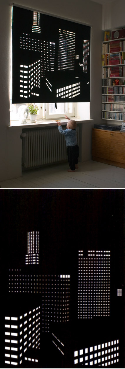
Pull…………….and day turns into night!

Better View is a series of perforated black out roller blinds designed by Elina Aalto. Light seeps in through the small cut out holes creating an image of a city by night. The cut-outs represent the light in the windows of apartment buildings and office complexes in the city. With the Better View blind any  dreary view can be turned into an attractive cityscape. The series currently includes views from Helsinki and Tokyo. New additions portraying Stockholm and Paris are in progress. The images represent a selection of cities that Elina has traveled to in the last few years and the photographs are by her. The chosen views are of contrasting cityscapes: skyscrapers in Tokyo, 60s modernism in Helsinki and 19th century architecture in Paris.

This is probably perfect for those of us who hold ‘upside-down’ hours – e.g. if you work on night shift, or have to constantly readjust to jetlag or something. Or simply, if you wish to have a night-view of a city that you could not otherwise have (cue sappy line: ‘Oh my love, even though I can’t afford to fly you there, I brought the night-view of Paris to you!’. Clever design.