Design meets (Marketing) Research

design-research

New Coke was considered an unequivocal slam dunk in taste tests against Classic Coke but was subsequently a failure of epic proportions when it went to market. Conversely, the Absolut Vodka bottle design was universally panned in focus groups. A courageous Michel Leroux, then the brand manager of the new vodka, pressed for its launch, and the brand set international sales records. The Absolut bottle is now considered a contemporary design icon. So when the demand for validating design solutions is so strong, yet research is seemingly so fraught with pitfalls, what is a designer to do?

Design or market research is always a thorny issue. On one hand, we’re always brought up to believe that we should respect the consumers and give them what (they say) they want. On the other hand, we’ve seen how consumers don’t really know what they want (as seen by the short quotation above). So, what’s a designer/researcher got to do?

AIGA (American Institute of Graphic Arts) tries to probe a little – here’s an article giving a quick rundown of the more common approaches in market research: ethnographic research, focus group, eye-tracking and online-testing, listing down a short description of the method, the challenges and the advantages. While the article may not be really groundbreaking in research approaches, it certainly is a very good primer on some of these more common techniques.

Great Infosthetics: Movie Box-Office Receipts

movies-box-office-graphic

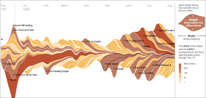
It’s the time of the year for Oscars and what-not, where critics and audience can opine on the great movies of the year, hits-and-misses etc. Of course, what the studio “suits” see as hits or misses are perhaps more centered at the basic question – did it bring in good money? The New York Times has a great interactive graphic showing the major movies all the way from 1986. You can see the impacts of the movie and how it pans out – the height being the weekly revenue, while the width represents the longevity. For instance, on the bottom left, the big slice would be the rather persistent Titanic.

Recently I’m getting quite interested in infographics or infosthetics – the art of visualizing information. Beyond the eye-candy factor (many of these are really well-done; the interactivity afforded on many of these infosthetics make it really engaging too), it’s also about making information appealing – and thus promote its usefulness. People like Hans Rosling and Jonathan Harris really earn my admiration for bringing what is usually dead-boring statistics/information into engaging, illuminative and dare I say, fun thing to play/learn?

The trend towards $0.00

free

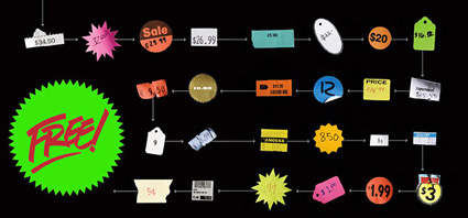
WIRED has a rather comprehensive overview on the trend towards free products, especially in the services/products over the Internet. As a young person who basically grew up surrounded by free online products/applications – from my first Hotmail account, to Yahoo! search, to Google, to Netvibes, to digg, to Firefox, to this very blog – basically my entire online existence) , I’d say I’d have to agree – perhaps more accurately – expects and demands that great quality product remain free:

It took decades to shake off the assumption that computing was supposed to be rationed for the few, and we’re only now starting to liberate bandwidth and storage from the same poverty of imagination. But a generation raised on the free Web is coming of age, and they will find entirely new ways to embrace waste, transforming the world in the process. Because free is what you want — and free, increasingly, is what you’re going to get.

It’d certainly require a shift in our paradigms – how can I make money if I have to release my products as free? It’s certainly a wild shift from the more traditional brick-and-mortar operational model (and even then, my mobile phone is “free” with suscription plans). In the traditional model, I buy something, money changes hand, and then I get to use the product.

The ‘freenomenon‘ model works more like this: I get something for free, uses the product, and the seller hopes I’d eventually hand him some money. In a way, this means your free product has to be even better than the non-free ones: because you need to compel him to want to support and give you money, and your product’s value is evaluated over an extended usage time (e.g. a user will probably only upgrade to ‘pro’ accounts after a long period of testing/usage). This is certainly different from traditional marketing models where all you need to do is to convince the consumer at the point-of-purchase: at least you’ve won the profit for that transaction already.

So, I’m certainly looking forward to even more freemium products – it’d certainly be interesting to see this concept apply to non-tech sectors – like the free photocopying in some Japanese universities (subsidized by advertising on the reverse side). How else can it be? In what more forms can it take?

The Last Lecture: Randy Pausch


It’s a long video – slightly over an hour – so set yourself the time/place when you’re ready for this video. It is certainly a very inspiring video – here’s the short introduction:

Carnegie Mellon Professor Randy Pausch, who is dying from pancreatic cancer, gave his last lecture at the university Sept. 18, 2007, before a packed McConomy Auditorium. In his moving talk, “Really Achieving Your Childhood Dreams,” Pausch talked about his lessons learned and gave advice to students on how to achieve their own career and personal goals.

It’s truly amazing how much positivity Randy can exude – he’s got not much time to live, and yet his message is nothing but life, achieving your dreams and remembering the priorities of life. It was truly a moving moment when he said that he had the lecture only for his three kids – but certainly millions more around the world have been inspired. I hope this video helped to ignite and spark our own dreams in our lives.

Home Virtual Reality Display


Check this out! Jonny Lee, a PhD candidate in Carnegie-Mellon turned a standard flat-screen television into an immersive 3D environment not unlike those you see in the 3D cinemas or those dorky ‘immersive-reality’ goggles, all by cleverly hacking readily available Wii parts and custom software. This seems to be a proof-of-concept, showing that it is indeed not too difficult to create an immersive environment at home. The advantage of this over the traditional visor-like implementation is of course, not having to encumber the user (and the product package) to have to wear a screen on the head. This could mean it’s much lighter, easier, comfortable and certainly cheaper – all that needs to change is pretty much just the software (the hardware is almost insignificant in terms of part costs).

You can already think of the gaming possibilities (I’d drool at a first-person-shooter game with something like this…). This would definitely be a breakthrough – in breaking the fourth wall. Imagine a Playstation 4 with impeccable graphics and this motion-sensing, immersive, spatial reality.

Of course there are some limitations as well – with this configuration the virtual reality can only work for 1 person. It is also somewhat different from the traditional VR-goggle implementation in terms of experience, I think. With the goggles, you can turn your head around and the virtual world follows through. With this hack, if you turn your head, the TV still remains at where it is (though the screen changes) – so chances are you’d be staring at your TV rack or speakers, and this would jolt you out of your virtual world. In other words, the former can accommodate rotation, while the latter is more apt for translation-in-space motions (with your eyes still constantly oriented towards the screen).

For more information, head here.

Japanese Economy Forecast Indicator

japanese-woman-cutting-hair

This is a picture of a young Japanese woman getting her hair cut. The title of this post is about forecasting the economy.

So where’s the beef? Interestingly, researchers at Kao (the Japanese personal care products giant) claim that there is a correlation between the length of hair on Japanese women and the economy. According to the Reuters article:

Economic forecasters beware: Japanese women are cutting their hair again.

Women tend to wear their hair long when Japan’s economy is doing well and short when there is a slump, the Nikkei business daily reported, citing a survey conducted by Japanese cosmetics company Kao Corp.

As for Japan’s future economic performance, the Nikkei pointed to expectations for a trend towards shorter hairstyles.

Looks like the average Japanese woman also know a thing or two about holding a short position on the market aye?

Ideas = Multiplier of Execution

This original post by Derek Silver was from several years ago – but I stumbled upon it recently and thought, “Great Reminder!”:

To me, ideas are worth nothing unless executed. They are just a multiplier. Execution is worth millions.

Explanation:

AWFUL IDEA = -1
WEAK IDEA = 1
SO-SO IDEA = 5
GOOD IDEA = 10
GREAT IDEA = 15
BRILLIANT IDEA = 20

NO EXECUTION = $1
WEAK EXECUTION = $1000
SO-SO- EXECUTION = $10,000
GOOD EXECUTION = $100,000
GREAT EXECUTION = $1,000,000
BRILLIANT EXECUTION = $10,000,000

To make a business, you need to multiply the two.

I think as designers we are naturally protective of our ideas – and probably tend to overestimate an idea’s value. Of course, ideas are valuable and sometimes they can be the difference between success and failure. However, to think that “idea is everything” is certainly very myopic. Eventually, what other see is the final embodiment, which are synthesized from a whole long process after the idea’s been generated – to develop it, to refine it, to test it, to rework it, to market it, to publicize it, to distribute it, etc.

Also, I think it is very important for designers to be able to ‘release’ the ideas – to discuss them, share them, get it out of the system somehow – unless you are working towards patents and such. This means ‘getting over the idea’ – in some ways, to no longer be convinced that the idea is the ultimate, unbeatable best-in-the-world thought that man can ever muster. The process of ‘releasing’ the ideas is also simultaneously releasing yourself from the idea, so that you are not overly tied down by that single idea, or become paralyzed as you bask in the glory of the idea. This way, it leaves much more mental space that (almost always) lead to even better concepts and developments, which might lead you to wonder ‘why did I shackle myself to that idea for so long?’

Design is indeed the business of creating ‘multipliers’.