[Greenhouse Effect] Concepts (Part 1)

cup-lasso

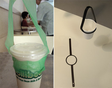
Cup Lasso might require some understanding of the Singaporean context. When you buy a take-away hot drink in a coffee shop, chances are you’d end up with a disposable plastic cup carrier (the green thing on the left photo). Cup Lasso (pictured on the right) is a permanent alternative to this item. Apart from reducing the usage of plastic carriers (which may occur on a daily basis – e.g. for your post-lunch coffee), it can also be an identity, a statement in support of being more sustainable – somewhat like the Live Strong bracelets.

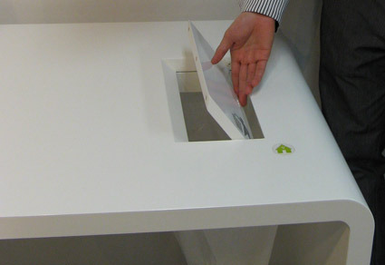
bin-there-table

‘Bin There’ is a table with an in-built rubbish trapdoor. While eliminating an unnecessary extra rubbish bin, it also makes it more convenient for the users, who can simply sweep their tabletop wastes into a plastic bag below. Eco-design does not necessitate sacrifices – in some cases, they can even enhance the functions. The plastic bag can be hanged onto sliding hooks below the table, accommodating a wide variety of plastic bag sizes.

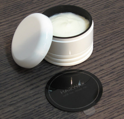
wax-pod

WaxPod brings a familiar eco-concept to a new area of application. Refillable shampoos, lotions, etc. have been around for a long time – they consume less resources as the refills are packed in less energy and resource intensive packagings. Why not hair wax then – as it is a product that one uses constantly? In WaxPod, the white external casing is permanent, while refills come in ‘pods’ (black parts). The slits you see at the bottom of the product are vents for an optional air-freshener module, which are frequently deployed within the same setting. This reduces the total packaging and housing materials required substantially.

[SDF GreenHouse Effect] – Exhibition in SDF

greenhouse-effect-main-picture

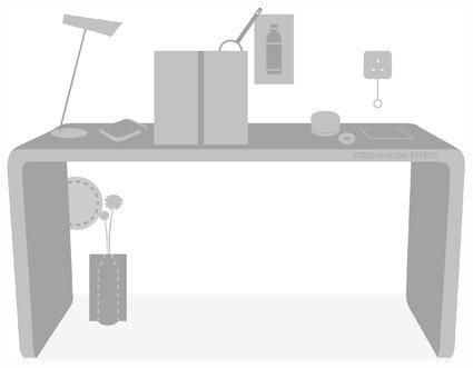
Concurrent with the (somewhat) regular blog posts and tidbits scoured from web, I’d be doing a series of blog posts on some of the exhibitions and going through designs featured in the Singapore Design Festival(SDF) over the next few days. The first (only?) one that I will cover is the GreenHouse Effect, which is conceptualized by Orcadesign especially for the design festival.

[Disclosure: I am part of the team that conceptualized and designed for this exhibition. Which, helpfully, also affords me some ‘behind-the-scenes’ thoughts to the exhibits.]

It was clear from the start (about 3-4 months ago) that we wanted to do an exploration into green/sustainable design. This is a major (almost too overwhelming) topic in design recently, and very likely will continue to be so. The exploration for a more focused theme soon kicked off – and we reached an agreement of what we are not going for rather quickly. There are some prevalent ‘standards’ or approaches in ecodesign:

  1. Guilt: “If you do X, you’re destroying the Earth!”. Guilt is often a primary psychological emotion to exhort the consumers into alternative actions; this is often coupled with pictures of dilapidated landscape and/or cuddly animals, with the hope that the consumer would link ‘ungreen’ practices to the more invisible destruction caused. In many ways, these scare tactics would lose their effectiveness, especially as consumers become more jaded with overexposure.
  2. Statistics: “Every year, we spill X tonnes of Y into Earth; we cut down Z acres of forests just to …”. Statistics is yet another tool to back up – to argue (against the user) logically. Statistics may be quite illuminating when analyzing macrotrends – but they seldom connect intimately with the user.
  3. Sacrifices: “If we just reduce P per person, as a nation we would have saved Q…” – the argument in this is that if everyone does some green thing, the world can be saved. The person is thus persuaded to make some personal, noble sacrifices for the greater good of humanity. But sacrifices are what they are: sacrifices.
  4. Materials/Technology: “The new plastic in this product uses 30% less energy to produce, and does not emit toxic fumes to the air…these appliances uses 50% less electricity”. Important as it is, technological and material eco-innovations are seldom visible or directly appealing to the user. Often also, products stressed their ‘all-natural’ origins (e.g. no synthetic materials), leading consumers to assume that ‘natural=harmless’. This may or may not be the case – it really depends on how that natural resource is being managed and replenished.
  5. Recycle-bility: “It’s made to be recycled: you can take it apart so easily, and you can recycle all the parts!”. Many-a-times, recycle-bility is equated directly to being green. It’s simply not the case – recycling is just a small component of the whole picture of sustainability. It’s often exacerbated by the fact that ‘green-as-recyclebility’ often turns up in many frivolous products, as much to assuage guilt while encouraging consumption.

It’s not that the principles behind those trends are wrong – in fact, those are still important considerations and tools to sustainable living. However, they are admittedly tired – we’ve seen it over and over, while we are still nowhere in sight to being meaningfully greener. This was the question we set to ourselves: “what could green design be – beyond statistics, technology and sacrifices?”. Where and how could designers contribute? How can we more meaningfully connect with people through better (green) designs?

How do we create products that are appealing to the users not simply because they are green, but because they are inherently superior (and green too!)? If a greener product is better – whether in function, aesthetics or meaning – than the ‘non-green’ counterparts, there is simply no reason for the consumer to choose otherwise.

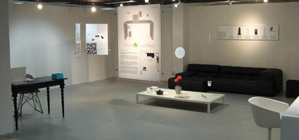
That was our idea in the GreenHouse Effect, which lead to the exhibition (photo below). In the next few days, I’d be posting the actual product concepts and approach, and how we’ve answered our probe (or not). If you want to see these concepts physically, they are still on show at the Utterubbish Exhibition (in Singapore) till Dec 16th.
greenhouse-effect-exhibition

Evolution of CG over the years

124

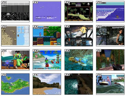
Computer graphics have certainly gone a long way in the last few decades – and what  better ways to see it than to compare one of the most difficult elements – water – and see how water has become ever more realistic through the ages in various games. Here’s a collection of screen captures: from the Flight Simulator way back in 1982, to what we’re now taking for granted in games like Crysis.

Techniques to Deceive

disney_world_castle

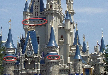
Did you know that the higher windows on the Disney Castle was purposefully made smaller so that the tower could look taller? Well I didn’t know either.

Disney World in Florida had a height restriction for their Cinderella’s Castle. So they used forced perspective to make it look taller. As tourists we assume that the lower windows and the upper windows are the same size but the upper ones look smaller because they are high up on the castle. It is true the higher ones would look smaller, but upper windows were purposely made smaller than the lower windows forcing us to interpret the castle as being taller than it actually is.

That’s a really interesting detail. A lot more of these tactics of persuasion – to lead the viewers into believing in something more desired/positive – are right here on this page. We might be familiar with the concept behind many of them, such as product placement, perspective play and ‘selective honesty’ – but it’s still rather fascinating to see how it actually manifests in actual examples.

Texture Mapping onto Real Life Videos

Computer Graphics researchers Volker Scholz and Marcus Magnor developed an amazing algorithm that allows one to substitute the texture and shape on a fabric in a real-life video accurately. I know that doesn’t describe much, but I’d venture it is probably more easily understood as compared to their abstract:

In this paper, we present a video processing algorithm for texture replacement of moving garments in monocular video recordings. We use a color-coded pattern which encodes texture coordinates within a local neighborhood in order to determine the geometric deformation of the texture. A time-coherent texture interpolation is obtained by the use of 3D radial basis functions. Shading maps are determined with a surface reconstruction technique and applied to new textures which replace the color pattern in the video sequence. Our method enables exchanging fabric pattern designs of garments worn by actors as a video post-processing step.

Well, a video speaks about a million words – so see for yourself:

7-9year-olds designs their Laptops

04-shannon-1

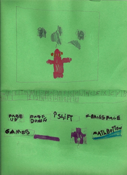
How would laptops look like, if kids (from 7-9 year olds) were at the helm? Some kids in North Carolina shows their vision and design of laptops – and reveals traces of what goes on in their world. Here’s a great interview/article from The Morning News about ‘The Laptop Club’, which was started by a bunch of second and third-graders. They crafted out their visions of laptops, which often included dedicated buttons to what is important to them – often friends, imaginary pets, games and online clubs. You could see how the laptop is very much really a projection of the kid’s worlds. And the speed in which they absorb and learn about the world is truly astounding as well.

Here’s an excerpt of an interview with one of them:

Name: Mandy
Age: 8
How often do you use a computer? Five times a week.
What do you like to do when you’re using a computer? Play games and write stories and poems.
What will computers look like in the future? Well you see, if we had whole days to work on it, and bigger paper, I think we could make it way more detailed.
Who is better at using a computer, you or your parents? Games + me = good. Parents + trying = bad. I am better at using games and if you guys try them, you get crushed.
[ After being told this interview would be published on the internet ] “I’m going to be popular! I should make a blog button, right now.”

Wow to the ‘blog button’ comment – it really crystallizes how in-tuned they are with the online developments!

Blowable Laptop User Interface


Check this out! By simply using existing microphones found on practically all laptops, researchers at Georgia Institute of Technology have developed a way to emulate screen pointers based on puffs of air instead of the mouse. While they could be used for ‘fancy’ applications like blowing out virtual birthday cakes (as the video suggests at the end), this could also very well be leveraged for people with disabilities such as paraplegics.

Great potential achieved with easily-available and cheap execution – I hope this can really be developed into a comprehensive, easy and accurate system of alternative input method. Just wondering – if we place a few microphones strategically around the screen, could it have a better calibration (think of GPS triangular positioning)? That could help make this much more precise and that much more effective.

Dandelion Online Exhibition

dandelion_logo

Some of you might remember the call-for-entry on Gems Sty for the Dandelion online exhibition some time back – I’m happy to announce that the Dandelion Exhibition is up and running! This is an online exhibition (showcasing designs – mostly from Asia – that are at least in the prototype stage) held in conjunction with the Singapore Design Festival, which ran from 28 Nov to 8 Dec.
Over the next few weeks, you’d probably be seeing more posts about other activities held in relation to the design festival. Right now it’s still pretty low-key for the general public though, apart from a sprinkle of bus stop advertisements here and there. Hopefully it’d drum up to be a more happening affair as the dates draw near.