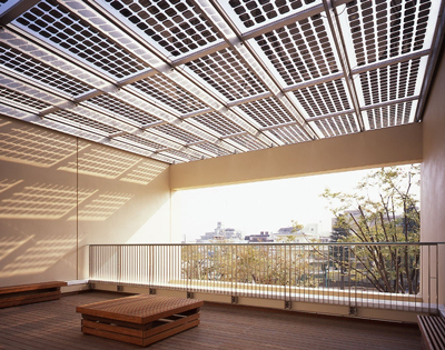
Solar Power + Skylight in One

suntech-solar-grids

light-thru-kowa

We have learned from iPod that an elegant (need not be novel) and well-executed solution could herald a revolution in how we perceive and subsequently expect products. To me, the solar panel above could very well be one of the examples too.

Traditionally solar power panels are often conceived as an additional layer in the architecture – they are added onto existing infrastructure (roofs, walls, etc.) in large pieces. While there are some exceptions, often these solar panels jar out compared to the rest of the aesthetics. In a way you trade aesthetics for eco credence.

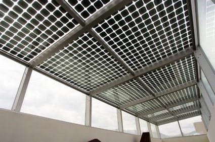
The photovoltaic system above by Suntech, however, is an elegant exception. The photo-voltaic cells are integrated within the laminated glass panels. They are arranged in a grid of rounded squares, with spacing in between that allows sunlight to fall – so you get both sunlight and power in one go (and some shade too!). I could imagine many courtyards, balconies, high-rise green canopies, etc. that would benefit from this.

Vending Machine Dress (among others)

vending-machine-dress-01

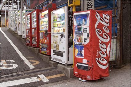
If you noticed something isn’t quite right about the vending machine above, don’t worry, you don’t need to check your eyesight. Yes, the right-most vending machine does look particularly fishy – wait a minute: is that a person wearing a vending machine suit? Has Halloween come to Japan in a weird manifestation?

In what appears to be stranger than fiction, New York Times carried an article with the title ‘Fearing Crime, Japanese wear the Hiding Place‘.

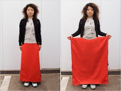
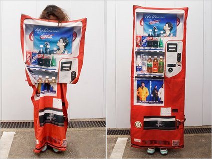
Deftly, Ms. Tsukioka, a 29-year-old experimental fashion designer, lifted a flap on her skirt to reveal a large sheet of cloth printed in bright red with a soft drink logo partly visible. By holding the sheet open and stepping to the side of the road, she showed how a woman walking alone could elude pursuers — by disguising herself as a vending machine.

I’m sure the headline was really just a sensationalist garb – it attempts to suggest that this is already a mainstream practice rather than simply a concept or a chindogu by a designer in Japan. Check how it transforms:

vending-machine-dress-02

vending-machine-dress-03

There are also other manifestations – a bag that transforms into a manhole cover so that people would walk past and not notice it; another bag for children that attempts to turn the child into an unsuspecting fire hydrant. These concepts are certainly amusing, but there is a greater cultural spirit and meaning behind:

But the devices’ creators also argue that Japan’s ideas about crime prevention are a product of deeper cultural differences. While Americans want to protect themselves from criminals, or even strike back, the creators say many Japanese favor camouflage and deception, reflecting a culture that abhors self-assertion, even in self-defense.

Perhaps it is this culture of invention-tolerance, no matter how idiosyncratic or bizarre, that facilitated Japan’s contribution to the world’s other (arguably more useful) innovations and inventions. It’s again of those moments – ‘it could only be Japan!’.

Troika Tape Dispenser

troike-tape-dispenser

Beileger mit †bersetzungen ohne MC.eps

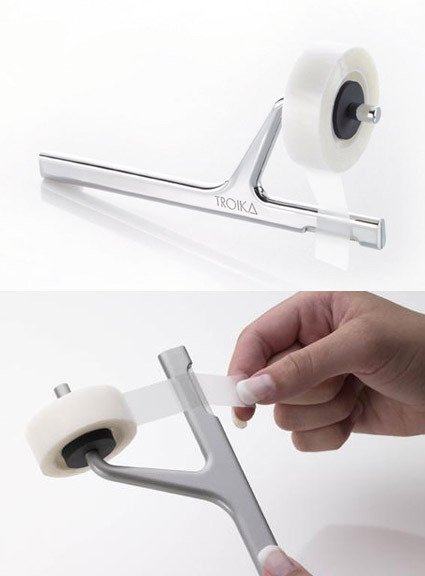
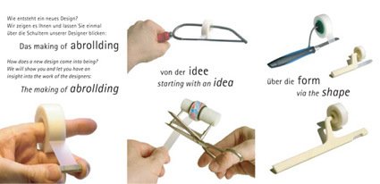
The Troika tape dispenser attempts to break away from the norm – we typically see either the big-bulky desk-bound types, or the disposable light ones that comes with the tape itself. Seemingly alluding to the musical tuning fork, the design is extremely neat and delightful, while shattering the previous stereotypes of tape dispensers. It has even won quite a series of design awards, including the Good Design Award from Japan in 2006.

But how well would it work?ROGER LiVE has a not-so-concise but certainly impassioned plea for its thoughtlessness:

Well, until you actually try and use this beautiful thingamajig: Firmly grip the handle with one hand, stick the roll of tape onto the rubber core with the other hand, place the poster with your company’s goals (or whatever) on the wall with your free hand, try and get it level, hold it firmly in place, realise you have no hand left to pull off a strip of tape, try and hold the poster with your little finger and your ring finger while pulling off the tape with the other fingers, drop the poster on the floor, swear a little bit, pick the poster up, place it on the wall and get it level again, hold it in place with your elbow, notice the poster slipping away, swear a bit more, decide to rip off four strips of tape first, stick them onto the cupboard next to you, put the adrollding aside, get the poster level AGAIN, pull the strips off the cupboard, remove half of the varnish while doing so, try and fix the poster with the bits that aren’t full of varnish, swear at the abrollding and decide to give it to some poor colleague when it’s time for Secret Santa.

What’s your verdict? Is it a good design (perhaps for shattering conventions with a fresh new form in return), or would you crucify it for its not-so-usable design? Or maybe you can actually do a better one! (This is probably another JuicySalif-like discussion). Sad to say though, this is now discontinued.

Very Clever Hearing-Aid Packaging

goodmorning-widex-hearingaid

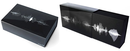
This is simply brilliant. While the technique is not new – bands of print on a transparent sleeve can look animated when paired with appropriate underlying box graphic – the aptness absolutely shines through in this packaging design by Goodmorning (a design consultancy from Denmark) for Widex, known for their high definition hearing aid .

As the user pulls out the case for the hearing aid, the graphics dance and animate, mimicking the delightful motions of a sound wave. In fact, the graphics for this raster effect isn’t random either – it spells out Widex’s slogan “High Definition Hearing” (or how someone pronouncing it would look like anyway). Video here:


What if Google.com is search-optimized?

google-search-optimized

What if the Google homepage itself was optimized to Google’s own search algorithms? This site finds out to humorous effect what Google.com would turn into if it was Extreme SEO-ed (search engine optimization).

Another interesting thing to note – if you search for “search engine” in Google, Google only comes up in the second page of results – and that is also only through Google UK sandwiched right smack in the middle.

Studio Manzano – Phone Tablet

studio-manzano-phonetablet1

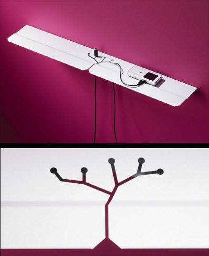
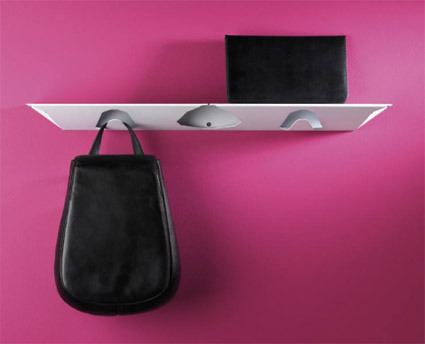
That’s Studio Manzano’s Phone Tablet – from the looks of it, it’s probably a powder-coated bent-metal piece – a shelf for your mobiles or electronic gadgets.

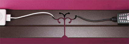
The detail that really stands out is the cut-out in the center, which are slots for the wires and adaptors to pass through. This is also the part of the design that I really liked – while it serves its functional purpose, it’s also very neatly and poetically integrated into the shelf. I especially prefer the this version below:

studio-manzano-phonetablet3

The color of the finishing feels a tad more sophisticated than the white one, and the cut also looks very elegant – is that a tree blossoming, or could it be a subtle reference to coat hangers, or even a subtle hint at circuit board connections?

studio-manzano-phonetablet2

If you look at the front view, you’d also discover that there are hooks formed out of the sheet metal for you to hang your bags. This, however, didn’t appeal to me: the angular cut felt a bit too brutal – almost like a CAD model with too low polygon count – that I thought did not fit well with the rest of the aesthetics.


40th Tokyo Show – Concept Cars

40th-japanese-concept-car

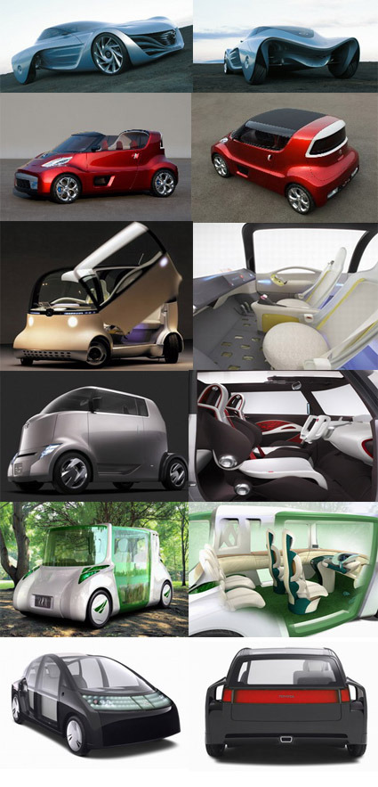
You’ve probably have seen bits and pieces about some of these cars floating about online over the past weeks or so – they are all participants for the 40th Tokyo Motor Show that wasa held from Oct 26 to Nov 11. From the very expressive Mazda Taiki (first picture) with all its 3d-twisting-and-flowing lines, to the Pacman-monster lookalike Honda PUYO (that is actually my favorite) that explores a soft body rather than the typical metallic panels, this is how car makers get creative and hopefully some elements from these explorations would make it to mass-production.

Most of these concepts fall within the small or mini-car segment. Japanese have a tradition for small cars, as they mostly use cars within cities (what with its narrow streets and very limited parking space), preferring to take the high-speed trains for longer journeys.

Fun-On has more descriptions for each concept (as well as some others that I didn’t feature here).

Nissan All-Round Camera Monitor


As the rear-sensors that beeps to alert drivers to obstacles become standard, Nissan has gone one-up to offer a full Around-View that gives drivers a bird’s eye view of their vehicle. Four cameras – mounted on the front, sides and the rear – captures images in real time and sends them to a central processor, which synthesizes the images and process them into easier-to-understand info-graphics.

Drivers who find parking difficult – rejoice!

Tre di Una – Hunn Wai

tre-di-una-hunn

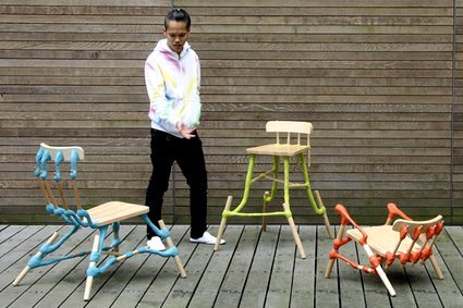
What if the most important structural parts of a chair are replaced by plastic clay? And how would the same chair look by simply altering the proportions of these connecting parts, while retaining the basic surfaces (hence the name Tre di Una, meaning “three from one”). This family of chairs are formed from a generic beech chair that is taken apart, and then pieced together again by colorful, plasticine-like clay connections, giving it a new and fresh character.

Hailing from Singapore, Hunn Wai studied in NUS before completing a Masters in Design Academy Eindhoven under the tutelage of Droog co-founder Gijs Bakker. You can find more of his craft-leaning designs over at his website.