Spot the Difference Game

ivoryboy-spot-the-difference

There’s certainly more than meets the eyes in this Spot the Difference Flash game developed by Ivoryboy. One of the reasons would be the excellently executed artwork that gives it a much more poetic feel while playing – it’s almost like you’re strolling through the scenes. And as you play, you might go – wait a minute, did that guy move? Ha – that’s the brilliance of it!

Play it and you’d know what I mean!

Opus Design Award – Winners

The Opus Design Award is held annually to invite concept design entries related to eyewear. This year, the theme for the competition was “Eyewear are tools to enhance faces”:

Today, roles of eyewear have come far beyond the original eyesight correction or optic protection.Particularly, possibilities as fashion items have great expectations.Opus Design Award this year dares to define that “eyewear are tools to enhance faces”,and invite designs in accordance with the definition. We look forward to innovative exciting designs that would open up new spheres of eyewear.

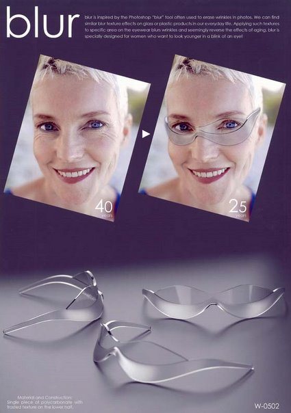
The winner was announced, and Singaporean industrial designer Joe Tan‘s entry “blur” beat the pack to win the Gold Prize and a cool 1 million yen! Obviously inspired by one of the tools of our trade – Photoshop – his entry plays a pun in bringing the techniques used in ‘Photoshopping’ to real life:

joe-tan-blur-opus

blur is inspired by the photoshop “blur” tool often used to erase wrinkles in photos. We can find similar blur texture effects on glass or plastic products in our everyday life. Applying such textures to specific area on the eyewear blurs wrinkles and seemingly reverse the effects of aging. blur is specially designed for women who want to look younger in a blink of an eye!

Outta 9Rules

Some time ago, this site was accepted under 9Rules:

“9rules is a community of the best weblogs in the world on a variety of topics. We started 9rules to give passionate writers more exposure and to help readers find great blogs on their favorite subjects. It’s difficult to find sites worth returning to, so 9rules brings together the very best of the independent web all under one roof”.

Recently, however, an email was sent with new terms and conditions – it is now compulsory to be actively participating in the forum:

If you feel you are contributing by your entries being shown only, 9rules is no longer a good fit for you, decline the agreement (or do not respond), please remove the leaf from your site and we will remove your site from displaying on 9rules. If you agree but don’t have the time to interact or don’t feel you should (or don’t want to), the participation will become a chore, something you didn’t want to do in the first place. It just won’t work in the long-term so it would be best to decline now.

When I first joined it, I liked the fact that 9Rules was a curated, closed network of blogs demanded quality content, over the more indiscriminate ‘web-directory’ approach that aimed to include all. Quality over quantity. Now that is no longer enough it seems – we need to be active participants in their forum as well.

I have never been active on the forums – I thought quality content was what mattered. Since our objectives are no longer aligned, I guess it’s time to call it quits then. So, thanks for the exposure while it lasted – hopefully readers who discovered my little abode on the Internet through 9Rules would continue to drop by.

Germans vs Chinese

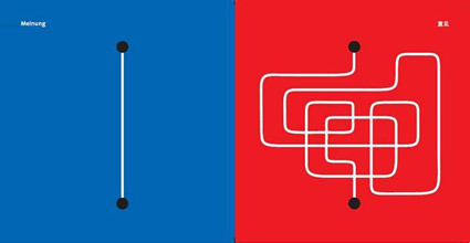
The different cultures of the Germans and the Chinese, portrayed as a series of illustration – here’s just a few examples out of many more: some are really spot on too! The brain behind this series is Yang Liu (a Chinese designer/artist/lecturer who’s living in Germany) though her website doesn’t show the as many of the series as seen here.

chinese-vs-germans-contacts

Contacts

Opinions

Opinions

Punctuality

Punctuality


Construction Paper Art

construction-paper-art

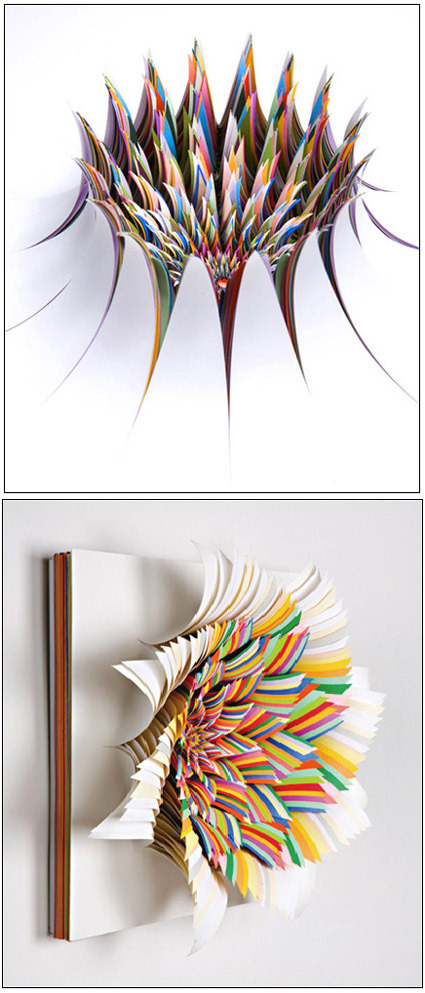
I thought construction papers were mostly just for book covers and the occasional handicraft – but look how far this material can be sculpted! Breathtaking works of art by Jen Stark – the explosion of colors were carefully cut and ‘peeled’ off from a thick stack of construction paper – I really wonder how much time and painstaking effort it took to create an artwork like this. Great photography to capture it too!

More of her works here!

Sony Bravia Bunnies


An ad that people eagerly discuss when you’re in the process of making it; an ad that people speculate and wonder about before it even screens; an ad that turns into an almost cultish following; an ad that is cinematographically excellent and inspiring.

Personally I hope that advertisements in the future are more like these Sony Bravia series – rather than brainstorming on how else to push your advertisement agenda – strive to create unique, interesting and memorable ones like these. If you have people eagerly waiting and wanting to watch your ad (not to mention evangelizing your ad for free, like what I’m doing now), you can’t be wrong.

The Sony Bravia ‘Color – like no other series’ have just released the latest installment to eager fans (it’s quite weird, and yet refreshing, to have fans of advertisements aye? Usually these terms are more for epic movies). Bunnies hopping around the New York City. Watch it!

Dandelion – Call for Entries at IDAsia

dandelion_logo

The Singapore Design Festival 2007 ran Nov-Dec 2007, and IDAsia.org had an online exhibition showcasing design talents from Asia. Titled as ‘Dandelion’, it is a virtual exhibition that has the blessing of DesignSingapore as one of the official events in this festival.

It is pretty much targeted to designers who are interested to sell themselves or their products that this exhibition will be their means to an end. Therefore the big requirement is that product images must consist as either non-functioning and functioning prototypes or models. They can be anything, portfolio work, furniture, packaging or anything product related.

The internet is filled with beautifully rendered images that really are at the end of the day impossible to make or realise, often this becomes a circular discussion that goes back to the fact that the design is just not well resolved. Therefore we aim for this exhibition to only showcase fantastic designers that can not only dream but also make as well.

If you have it, go flaunt it! Much more details at IDAsia.

Cool Desktop Wallpaper

desktop-wallpaper

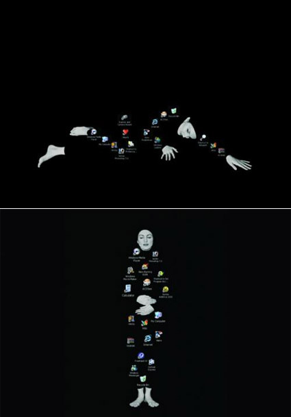
These desktop wallpapers aren’t quite like the typical pretty ones – more than being just a passive background, these are soulful wallpapers that demands your desktop icons’ cooperation to form themselves – at times seemingly thoughtful, at times contented, at times poetic. Just make sure your desktop ain’t too cluttered!

Art – Daydream of the Faceless Worker

daydream-of-the-faceless-worker

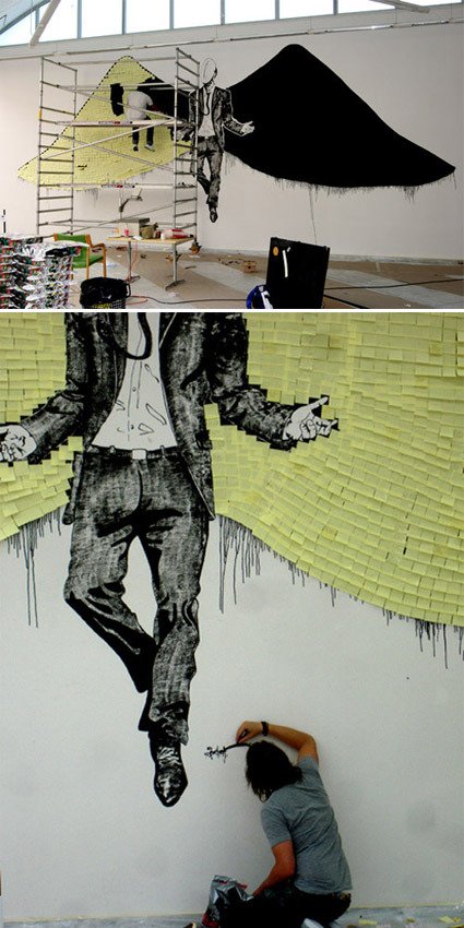
“The piece is called Daydream of the faceless worker. It is about 6×14 meters and made up of 4000 post-it notes. I wrote poetry on about 400. They had told me that the wall was half the size. My idea then was to let people take what they liked and have pens around, so that they could add their own thoughts to the empty notes. Now it became too big, the notes are too far up for people to write on unfortunately.”

An art piece by Sixten – I truly dig the use of Post-Its on the wings that so effortless and cleverly brought out the art piece – illustrating in one go the sheer amount of mundane office paperwork, and yet the physical form of those Post-Its also form up nicely as ‘feathers’ in the wing. And for those who watch Heroes, does this remind you of the artist in it?

The artist has a jaw-dropping portfolio of diverse ranges of artwork right here – you’d be impressed!