Touching Ad


Thai advertisements are usually known to be funny – they are especially deft in comical exaggeration. This, however, is probably one of the most intense advertisements I’ve seen – it might simply just qualify as a short film instead. Narrating a simple but powerful story, it’d probably touch a nerve or two.

The client is a Thai insurance company.

Stacking Classic Chairs

stacking-classic-chairs

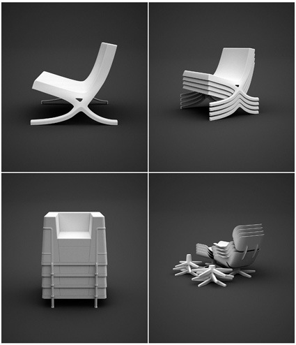
How different would it be to have the very classics of chair design reinterpreted as stackable plastic chairs? Dirk Winkel, from the University of The Arts Berlin, finds out in his project ‘A Stacking Hommage’ (sic). I guess these are really classics – even when recast in another (cheap) material, they still retain an elegant form and proportion – that’s probably what made them real classics through the many decades.

For those of us who aspire to but can’t afford the real classics, we’re going to be disappointed again, as these are not for sale.

Dirk has some other works in his portfolio site here too.

Trash Art with Shadows

shadow-trash2

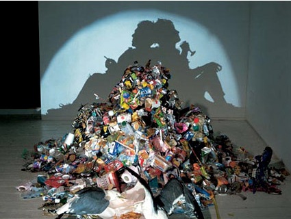
Some people’s art is other’s trash. In this case, however, the trash is the art. Artists Tim Noble and Sue Webster have some great pieces (literally, pieces) of work that at first sight looks simply like trash that does not belong at all in an art museum. When the spot light is turned on however, a totally different paradigm is unveiled in the shadows on the wall. Magnificent!

Diverted by money, property and prestige it is easy to avert our gaze from the vapid bankruptcy and wasted by products of the consumer cultural dream. In a post radicalized world of ambivalence where consumption and oblivion seem the order of the day Tim Noble and Sue Webster’s collaborations “literally” shine a light upon the untouchable residue of conspicuous consumption. With an unpretentious touch of desperate glamour and self deprecating humor they have transformed the gaze upon heaps of trash and side show ephemera generating a playful and contemplative allegorical space in which to consider the consequences of our choices and a hopeful humorous glimmer of the future.

That was a pretty dense paragraph – I’m sure the work speaks for itself and can floor many people indeed. It really makes you see things in a different light, doesn’t it?

More here.

Outsourcing to India

Outsourcing has been the media and management’s darling for the past few years – you can’t have leafed through any magazines or newspapers without having come across this term. Of course we know, we know – improved infrastructure, wage differentials, and a million (or as some articles might suggest, 10-12 billion) other reasons why outsourcing is the way to go.

But what about us mere mortals who don’t happen to own a multinational or two? A.J Jacobs from Esquire is equally piqued by this proposition – and ventured to find out. After hiring a few personal assistants (outsourced from India), he documents his little adventure in this light-hearted article. It’s quite amazing how deft in words these assistants can be – for instance (Honey is the name of his assistant from India):

Plus, Honey is my protector. Consider this: For some reason, the Colorado Tourism Board emails me all the time. (Most recently, they informed me about a festival in Colorado Springs featuring the world’s most famous harlequin.) I request that Honey gently ask them to stop with the press releases. Here’s what she sent:

Dear All,
Jacobs often receives mails from Colorado news, too often. They are definitely interesting topics. However, these topics are not suitable for “Esquire.”

Further, we do understand that you have taken a lot of initiatives working on these articles and sending it to us. We understand. Unfortunately, these articles and mails are too time consuming to be read.

Currently, these mails are not serving right purpose for both of us. Thus, we request to stop sending these mails.

We do not mean to demean your research work by this.

We hope you understand too.

Thanking you,

Honey K B

That is the best rejection notice in journalism history. It’s exceedingly polite, but there’s a little undercurrent of indignation. Honey seems almost outraged that Colorado would waste the valuable time of Jacobs.

Interested in your own concierge already?

Ingo Maurer’s Light Exhibition

maurer-bulb

Ingo Maurer, one of the luminaries especially in the fields of lighting designs, is showcasing some of his latest works over at Cooper-Hewitt.

The 75-year-old Maurer, whose light-bathed work ranges from macro-scale sculptures of flowing, gilded ribbons to chandeliers reconstructed from shards of exploded tableware, is a visionary—an artist as well as a technical and entrepreneurial innovator. For 40 years, Maurer has been in the vanguard of a technological and aesthetic revolution that has transformed lighting from a mere convenience into a high-cachet object of desire. In the process, he has worked with designers from companies including Chanel, Issey Miyake, and DaimlerBenz (DAI)—and become a guru to artists and commercial manufacturers alike.

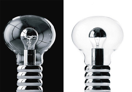
Of all the lights, my favorite is the one above. At first glance, I didn’t even realize what was special about it – thinking perhaps it’s just a play of scale – blowing up the traditional and familiar silhouette of a bulb into a more surprising size. It was only through the second read that I discovered the bulb nested within the bulb. I can’t really pinpoint exactly why this fascinates me, but somehow it did.

Perhaps it’s a reminder. In my daily routine I typically come across tens or even hundreds of designs in various kinds. This has almost conditioned my eyes to fleet through and in this case, I got caught drawing my own conclusions before really looking at the picture. Perhaps it’s a reminder to look at every product and savor them in detail – soak in a design before jumping to conclusions.

[Business Week on Maurer’s work]

Donn won Braun

donn-and-braun

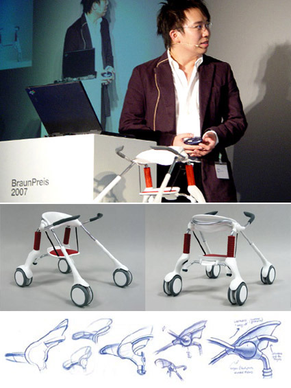
Singaporean designer (and a recent industrial design graduate from NUS), Donn Koh, had recently clinched one of the most coveted prizes for industrial design students – the Braun Prize. Titled Leapfrog, the project helps children with spinal problems to switch between sitting, standing and walking seamlessly:

LeapFrog humanizes the assistive walker for the brain-injured child by combining stander and walker functionality – it transforms, and assists, in sync with the child’s intention to sit, stand or walk. Besides supporting physical development, sense of independence and esteem, LeapFrog also turns ‘painful’ medical engineering aesthetics into sociable, toy-like approachability.

One of the highlights of this product is its trait of being a hybrid product that can accommodate to the wishes of the user, rather than the other way round. Often we find products that reduces a user-state into a single-dimensional, lowest common denominator. The LeapFrog, however, has the innovative ability to scale to its user’s needs: in the sitting-configuration, it fully supports the user and demands nothing; when the user wants to stand up and walk, it knows to ‘retreat’ and surrenders some of that autonomy back to the person – that makes the LeapFrog a lot more human, and certainly less ‘cage-y’.

It makes me wonder also the possibility of developing this product for the other segments too. Having worked with some patients in a geriatric ward, I could see how this could potentially help the elderly who are too weak for sustained walking but feel too undignified in wheelchairs.

In any case, congratulations to Donn for a job well done!

Designing Fonts

hm-font

I came across this series of images by font foundry MAC Rhino showing the design process for a font used by fashion retailer H&M. I think it’s really some great work, because at first look (and maybe even with second, third and fourth looks) you’d probably think it’s hand written with a typical marker pen used in retail shops.

I think this is one of the tougher tasks in font design – to mimic a very natural organic writing into a systematic font. The little nuances of every stroke has to be accurately captured, edited and re-edited (you can see some of that process on the top few images – the pencil mark shows the editing comments). We have seen how a font that mimics handwriting or scripts can easily become unnatural – you know it’s just a font (cue BrushScriptMT, perhaps the notorious Comic Sans even).

For this H&M font though, they’ve made it look effortless. I think that’s probably one of the defining elements of great design actually – an execution that looks effortless (when it’s most likely anything but).