Thai Police dons Hello Kitty Armband

hello-kitty-armband-for-thai-police

In what sounds like a can’t-be-true story, Thai police are required to wear bright pink Hello Kitty armbands against their dull grey uniform as a punishment if they commit petty offenses.

From the Bangkok Post article:

“A pink ”Hello Kitty” armband wrapped around a khaki-clad arm is shouting for attention at the police Crime Suppression Division. It is a new disciplinary measure introduced especially for police investigators who refuse to play by the rules.

Starting this week, the warning will come in the form of the popular Japanese cat cartoon sitting on a heart on a pink background. “The same old warnings no longer work for some officers,” CSD acting chief Pongpat Chayaphan said.

“This new approach is intended to engender a feeling of guilt and discourage them from repeating the offense.” Offenses liable to earn an officer the pink Kitty include failing to report for duty, parking in a prohibited area, fighting, or being the subject of a complaint about poor service.

Policemen see it as a bitter pill to swallow. Most agree it would be quite embarrassing to have to wear the pink armband, which stands out in vivid contrast against their uniform.”

Wow!

Flickr DJ Music Slideshow

music-mash-up

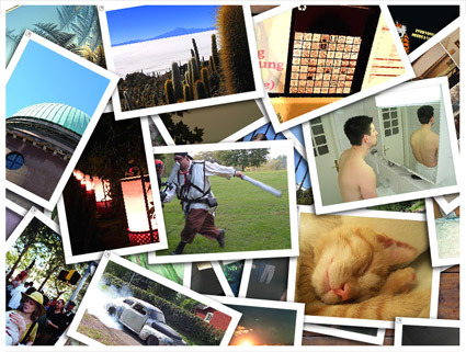
I stumbled upon this very cool project that’s a mash-up between a song file and pictures from Flickr. The idea is simple and captivating: as the song is played, pictures from Flickr are flashed according to the words/lyrics based on their tags. So you get a nice music in the background, while enjoying (somewhat?) relevant but random images. The interface is pretty cool too ~ you can drag them around just like a pile of real photos.

Try it out – it’s a little heavy though (~3MB).


Moon Lamp

moon-lamp

This Moon Lamp is a whimsical giant lamp of – well – a crescent moon. While it’s certainly very literal and outright in its interpretation of the moon, it still somehow retains a magical attraction. Perhaps the moon itself has a strong sense of legacy, evocative mystery and beauty (can’t say the same for say, “Mars Lamp”). Although perhaps in real life, this lamp might just be the centerpiece of an extremely cheesy romantic proposal going along the line of “I’d even bring you the moon~~”.

[via English Russia]

Pixels or Pies?

square-graphs

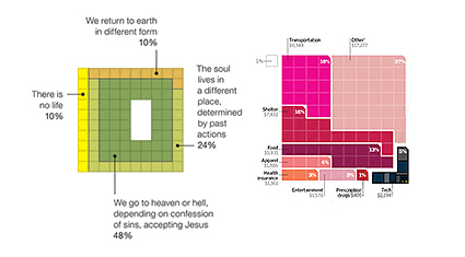
According to Anil, there seems to be an trend of using pixels and grids to represent percentages rather than the traditional pie chart. There are some speculations on why – perhaps it’s a reflection of our digitized age? Or maybe it’s simple aesthetics – a rectangular chart gives you less dead/white space around your chart than a circle, so the article looks better? Text description of each region looks more neat with rectangular matrix compared to a juxtaposition against a circle?

Well there could be really any number of answers. The important thing is, is it better? Or perhaps a better way to ask – in what scenarios would grid charts be more effective, and when are they less so?

A Living Room in the City

living-room-in-the-city

Wow, count me impressed!

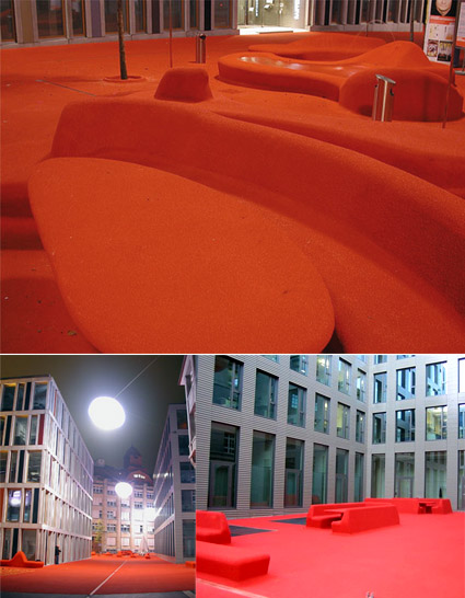
This is an outdoor space, in the center of St Gallen in Switzerland. Known as the Stadtlounge (City Lounge), it’s a massive bold move to put furniture and all right amidst all the buildings. Born of a design competition in 2005 to create a “living room area” in the financial district, this red carpet treatment flows all around, even onto some fake cars on the street.

Amazing, and I wish where I live they have the audacity to liven up a place like this!


MINI Clubman – Awkward Adolescent?

I loved the new MINI that was unveiled some years back. While paying homage to the original MINI with its classic and yet playful lines, the design was modern and alluring. That car proved to be very popular indeed, reviving the MINI brand, which I suppose was the raison d’être for this new expanded MINI Clubman, which unfortunately did not gain my affection.

2008-mini-clubman

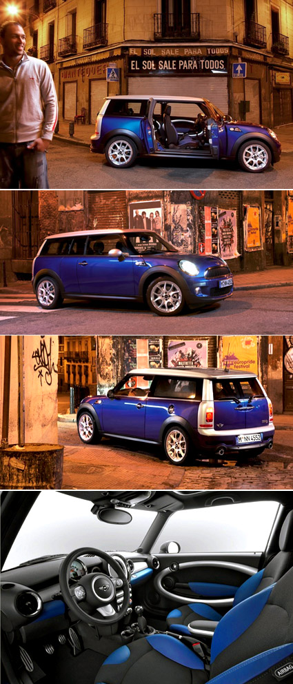
Perhaps extending a tiny classic would necessitate some compromise in its design or spirit – after all, you can’t just chop the car in halves and extend the middle section (like what Top Gear people would do to make a limousine). The proportions aren’t quite so endearing, but the thing that really killed it for me was the rear.The silver plastic frame looked really squarish and squashed-up – it seemed like it was transplanted from some other cars, like a small Daihatsu van or something.

The car actually has five doors – but it’s not your typical configuration though. The barn door design at the back counts as two, and there are two front doors, so what’s left? One short door on the side, of course! It’s on the right side of the car (see the first picture), more like a half-door that allows more access to the back seat. For instance, where the driver seat’s on the left (non-British systems), this would allow the back passenger to get off onto the pavements on the safe side of the road. One of the griefs though, is that the back seats seems to be the non-folding kind, which means you’re very much screwed if you want to chug some bulky stuff around.

Overall, for me it’s really like seeing MINI grow up and entering the awkward adolescent age. It’s got bigger, and are pretty much still uncertain what to do with some of its parts. The cuteness that carried it in the tender years cant really pull it through, and yet it hasn’t muster enough sophistication for adulthood. Haha, am I thinking too much?

[Jalopnik gallery with more pictures]


Celebrity Caricatures

celebrity-caricature

Stumbled across some rather well-done caricatures of famous people – usually caricatures are limited to pencil sketches or maybe paintings…but these have a much more 3D feel to them! Not sure who’s the artist behind them though…[Edit: The artist is David O’Keefe – I have modified the link above to point to his site; Thanks Joe]

No prizes for guessing who are the celebrities – though I must say the second one looked rather more like Michael Moore than the supposed Elton John.

[Nicole Kidman, Elton John, Hillary Clinton]


Vinyl Dance Floor

vinyl-dance-floor

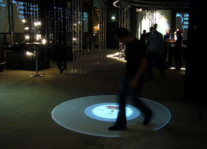
A pretty cool concept – the music plays as you walk or run on the projected vinyl (it also responds to the direction you’re walking – you can play the music either forward or backwards). My immediate thought was, this would make a really interactive piece if people started “scratching” and synchronizing their dance moves to the music – and it turns out this is indeed in the works, and would be released in the next edition.

Stay tuned here!


Sustainable Dance Club?


This really smells like greenwashing to me, but for what it’s worth here’s the story: the movements of the clubbers and dancers on the floor are harnessed as electricity by the floor (loaded with springs and such?) – the electricity garnered are used to power itself (the music, the lights, etc).

I am deeply skeptical about this – given the exorbitant amounts of energy that these hundred-decibel, bass-thumping, strobe-flicking, juice-guzzling contraptions uses in any typical day, versus the actual amount of electricity that can be harnessed: it just doesn’t seem logical at all.

And yet it seems that these are some of the most visible or publicized ways to achieve the green agenda – massive undertakings (think of the installations and how much extra energy/resources are required to produce them) with questionable actual effect: my take is, everyone just want to feel good that they’re doing something. Whether it’s really green, well – that may not be so important after all.

[The Dance Club]