iriver Life Unit

iriver-life-unit

iriver was for a long while the “also-ran of the also-ran”: the followers with me-too products on the portable mp3 player scene. Their former company name, iRiver, didn’t help much in suggesting originality – it looked like they’ve pirated it straight off the iPod. (Actually the company was founded in 1999, before iPod’s launch in 2001. That’s probably why they’ve changed the company name from iRiver to iriver, dropping the capital R to shrug off the shadow of Apple’s “iProduct” naming convention).

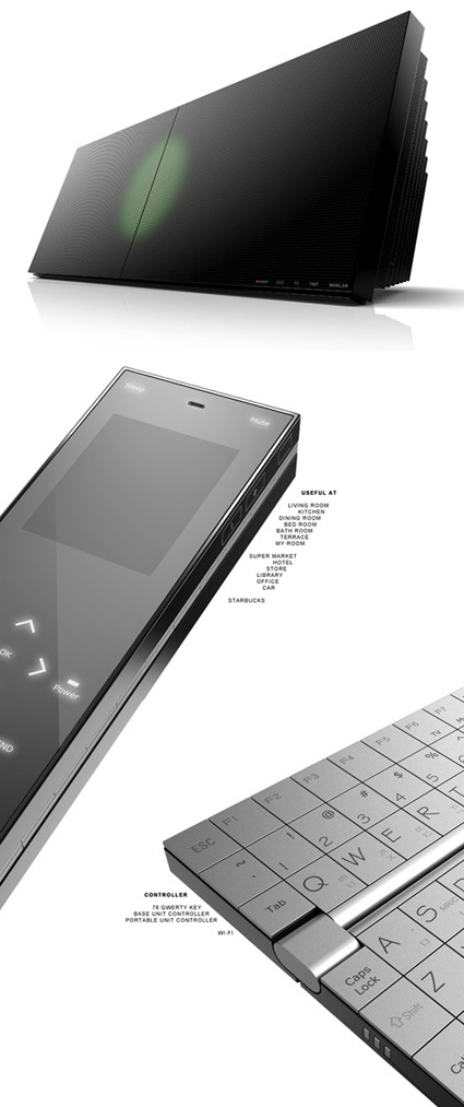
I must say I was rather pleasantly surprised about iriver’s to-be-launched Life Unit – from the looks of it, this is positioned as a high-end entertainment hub that handles all the media you could imagine: music, movie, flash, photo, e-book, Wifi-streaming; it charges and syncs with their portable players; – you name it, they’ve covered it. They’ve also got Niro Nakamichi onto the team for sound design.

The aesthetic also looks exquisite and refined, though the friendly, rounded iriver logo does seem slightly awkward nested among the precise and pristine lines in the Life Unit. I’m particularly drawn to the flippable remote control – the touch screen controller opens up to reveal a finely-crafted Qwerty keyboard. All of this does suggest that iriver put a lot of attention into this product, and that could be just a suggestion of their ambitions to come.

This actually triggered me to rethink and reposition the new roles of digital media and the devices – that will come in a later post soon!

Paul Potts – Britain Got Talent


The last thing I thought I’d ever be interested in on the planet is opera (the art, not the browser). But Paul Potts, the winner of the talent show Britain’s Got Talent enchanted me – somewhere between his earnest delivery and incredibly emotional singing voice, I think he captured the dreams and imagination of the millions who voted for him, and many more (like myself).

He’s a mobile phone salesman – looking nerdy, with the missing front tooth – these definitely doesn’t make the best first impressions for a talent contest. When he starts singing, you might go “oh well at least he’s not bad”. But when the tune turns into some of the most expressive parts of the song, my hair stood – and it’s just a great feeling looking at how he has remained humble and deeply appreciative of his talents and the support he’s got, and if you look through some of the clips, seeing him grow in confidence in himself.

This is definitely a great, welcome break from the typical talent shows whose sole ethos seem to be superficial glamor – this competition truly brought out a winner who’s talented, and definitely inspiring. Bravo!


Branding to Design?

I stumbled onto a great article on the current state of branding for products:

So you got line extensions, big ads, expensive logos, brand onions. You got branding. And most of it was as intellectually rigorous as phrenology. Actually it was probably more like Scientology; it was somewhere between a fake religion and a false science.

The dismal nature of the branding science has started to become clear to business recently and they’re starting to vote with their investments and appointments. They’re turning from the people who create perceptions of value to the people who create actual value – the designers, technologists, innovators. Hence branded utility, hence ‘design is the new management consultancy‘, hence the current Business Week heroes being IDEO and Ives not CHI and Chiat Day. Hence the limited tenures of CMOs. Hence the rise of communications businesses that can actually make stuff rather than just think of stuff.

If you take Business Week as the sole, definitive guide to the business landscape, you might have the impression that design (and design thinking) has indeed become the zeitgeist, tour-de-force of the new world. Design is increasingly being recognized as much more than simple surface styling – in fact it’s not so much the design skills that are attractive to the suits, but more the design approach, attitude and thinking: for instance the natural emphasis design places on the end user. Personally I guess it’s about time too – years of management theories have focused a lot on the processes – cheaper, more efficient, quality management – supply-side intervention: the tide has turned onto the demand side.

And yet, amidst this hype about incorporating design into the corporates, there lies a great fundamental risk as well – as the “design” buzzword gets applied to every field and where everybody wants to own a piece of the “design” action to somehow feel more important and strategic; every other product launch is termed as the greatest innovation (EVAR!); every little tweak to the systems is labeled as an overhaul after extensive usability study and re-design; and perhaps most pervasively, where every management action/decision is heralded as a consequence of strategic design.

At some point, design in its true sense would have been diluted beyond its original context. By its very nature, design usually leverages across disciplines – unifying and synthesizing a multitude of factors into a coherent, appealing whole. That requires tremendous vision and authority on the designer. And yet, the essence of design: insight, original thought, clever solutions, attention to details and users – might just get left behind or placed on the backburner in favor of quicker, more painless adoption of design into current corporate cultures – “let’s not shake too many trees or too many monkeys would fall”.

Herein lies the greatest danger: as much as it is being trumpeted the loudest, design might fundamentally not be given the room nor its role to play – and are but relegated to mere surface patching of corporate visions in tune with the latest fad – “design”.

That, perhaps is the time when the term “design” loses trust and equity, itself becoming a fad branding: somewhere between fake religion and false science.
 

Oogmerk Eyewear Ads

oogmerk-ads

A clever ad by Oogmerk (which I presume is an eyewear company focused on creative, funky glasses) – it’s true how perceptions can easily changed by eyewear. Incidentally if you’re interested, the Opus design competition is on now and their theme is also on eyewear being tools to enhance faces.


Amazing Paper Sculptures/Structures

paper-sculptures-richard-sweeney

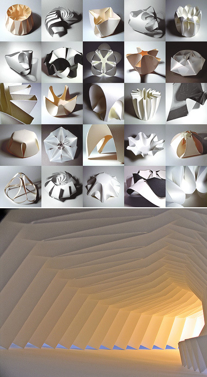
Whether you’re into architecture or not, I’m sure you can appreciate the astounding beauty and sculptural properties exhibited by some of these works by Richard Sweeney from the UK. It’s really amazing how he caresses the simplest of materials – mostly 220gsm cartridge paper – to take on form and substance that look much more complex and seems to me ripe with possible applications in architecture. In his own words –

This demonstration of art through engineered structure is truly inspiring, and is a major influence on the way I go about producing my work- to create objects that are simple to construct yet complex in appearance, and are efficient in the way they are produced, both in terms of construction time and material use. The greatest example of this principle- achieving the most from the least- are structures in nature. As in the greatest architecture, natural forms show patterns of repetition, whereby the very most is made out of the least material and energy possible, to create forms that appear amazingly complex, yet are based on very basic units and patterns of growth- these are objects that have beauty on all levels, from the way they are constructed, to the appearance of the final form.

Be inspired by his Flickr set and his personal site.

Face Make-Up Printer

matsushita-make-up-printer

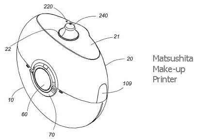
Matsushita has filed a patent on this idea of “printing” make-up onto faces. Imagine having downloadable templates of make-up that has exactly the right colors at the right place. Or simply just the idea that make-up is done within seconds instead of minutes or hours (as perceived by the guys anyway).

Battery-powered, hand-held and armed with a liquid cosmetic cartridge:

The device ionises the liquid allowing an electric field to accelerate it through a nozzle to form a jet. The result is a make-up spray that can be turned on and off at the flick of a switch. But if that doesn’t do the trick, the device has a drip mode which can dribble liquid onto the skin instead. Perhaps it could be upgraded to print family snapshots onto your eyelids too…

[via New Scientist Invention]

Prometeus


This video charts and describes some of the past events that we’ve seen – traditional media (whether content or advertisements) being displaced by new technologies and new perspectives of how information is passed on: from a hierarchical, top-down style to one in which the masses themselves are both the producers and consumers of information – hence the term “prosumers” (a different definition from the market segment of expert/professional consumer users).

There are some claims to what the future holds too – these are pretty bold, but it does give some sense of the revolutionary, paradigm-changing nature of the world that we live in – the transient nature of what we may have considered to be immovable and anchored firmly within the very fabric of society – things like television and radio.

On another note, I think the accent of the narrator is somewhat addictive too!


Flash-less Camera

kodak-flashless-light

Kodak – the company that practically invented modern consumer photography (who subsequently saw its near demise as film photography transits to digital photography) is digging deep into its heritage in innovation again in an attempt to restore their former glory. In the news release announced recently, it claims to have a new sensor technology that significantly increases sensitivity to light, so that flash photography is eliminated.

So far, the only picture accompanying the news report is a mysterious lab-looking guy holding up a palette of colored light, which frankly could’ve just come from any stock image websites. If the technology is indeed true though, would they be able to claw their way back, or have they already lost too much? The answer is it was not enough to rescue the sinking ship.


Kensington Ci Mouse

kensington-mouse

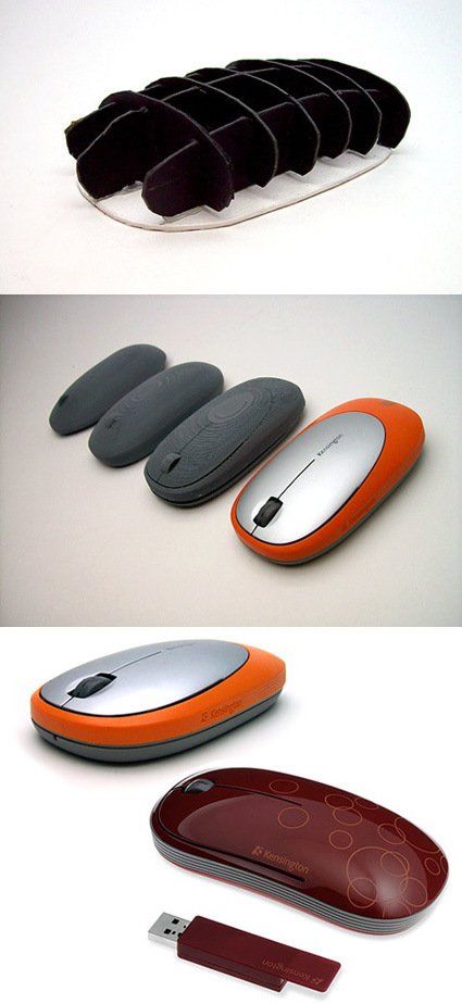
Business Week has a very interesting article on Kensington’s design approach to designing a new collection of computer mice. Kensington, being the number 3 computer peripheral maker was likened to Nintendo – both companies are trailing behind market leaders and behemoths (Microsoft and Sony for Nintendo; Microsoft and Logitech for Kensington). The peripherals market is indeed very tough: on the low end, you’re flooded with anonymous but cheap offerings, while on the high-tech end, it’s like David vs Goliath taking on the big companies with deep financial resources.

But, like in the case of David vs Goliath, there is still hope. For Kensington, the leverage was in a strategic, design-led thinking: the technological race in peripherals are ruthless and yet the consumers appreciate very little of it – they don’t see what’s under the shell. So why not define a new turf? For them, they engaged the design consultancy One & Co.

Having product designers instead of dedicated researchers conduct the study gave the designers a head start in thinking about the creative problems they’d be facing—and strengthened the research because designers asked questions and noticed details that might have gone overlooked by someone else. “There’s an emotional connection that people have to products,” Becker told me. As a product designer observing users firsthand, “you’re just more in tune to how people interact with the product. You notice how someone holds it, notice all these different subtle interactions,” Becker said.

I’d probably have to copy-and-paste the entire article to depict how they engaged in the design process – so you might as well head on and read the entire BW article – for me it’s a great case study in strategic-design-led venture. Designers have, or are trained, with a sharpened sense of intuition, observation and connection with users, which are a markedly different view from marketers who may be more quantitative and “big picture” inclined. In Kensington’s case, it was about the emotion and product experience.

As markets become more saturated and products more undifferentiated, you’d need more than a “we need a new collection of mice for Spring 2008 that is better than our competitors” kind of attitude. What is the X-factor that would set your product line apart, and perhaps as (if not more) importantly, how do you get to the “X-factor”? And do it consistently?