Creative Zen Stone

creative-zen-stone

Creative recently launched its newest kid on the block – the ZEN Stone, priced at just about half of the 2nd generation iPod shuffle. I haven’t seen the actual product, but from the photograph (albeit probably heavily enhanced with Adobe® Photoshop® software), it doesn’t look too shabby. Of course, one look at it and one might scream “Shuffle Copy!”. Well that has some truth in it, though there simply aren’t too many permutations if you have the basic UI element with a rectangular IC board in it. Looks wise, I’d actually prefer this over the Shuffle, though this doesn’t clip (and comes with IMO awful color options).

What is much more interesting for me, though, is a comment that I came across over at the Engadget comments. One commenter remembered way back in 2005, when Sim Wong Hoo announced the declaration of war on Apple (Apple had then just launched the 1st generation iPod shuffle):

We’re expecting a good fight but they’re coming out with something that’s five generations older. It’s our first generation MuVo One product feature, without display, just have a (shuffle feature). We had that — that’s a four-year-old product. So I think the whole industry will just laugh at it, because the flash people — it’s worse than the cheapest Chinese player. Even the cheap, cheap Chinese brand today has display and has FM. They don’t have this kind of thing, and they expect to come out with a fight; I think it’s a non-starter to begin with. [Sim Wong Hoo, 11th Jan 2005]

Looks like he’s forced to eat his words.

From having to exchange the patent rights for “Made-for-iPod” branding rights, to launching the ZEN Stone following the success of Apple’s iPod shuffle, Creative has been forced to swallow humble pie time and again. Perhaps one of the lessons they can learn (and should have learned a long time ago), is that technological prowess is by no means the defining factor in consumer decisions and sales. The one who can best woo the customers in the field wins. And from the company’s performance in this market, it seems that they have either not learned the lesson, or are just unable to compete at the level required.

Perhaps as a result of the dismal returns that their $100million (budget for marketing head-on against Apple) has brought them, they have realigned their strategy of providing the cheaper and just-as-good me-too products. If you can’t fight them, well at least run along?

Current version is also available.


Milan Fair 2007 – Galleries!

designboom-milanfair core77-milan-fair

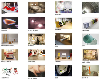
Well it’s finally out! For those of you who weren’t able to be at the Milan Design Fair 2007, both Core77 and designboom has compiled a whole lot of photos of goodness fresh (well, about a month old?) from the Fiera! Even for those fortunate ones among you who were there – I’m sure your legs didn’t carry you enough to see all that the fair has to offer – so here you go:

Core77 Milan Fair gallery

designboom Milan Fair gallery


Spirals in Nature

spirals

I used to recall my personal discovery of the mathematical rhythm in nature, and was totally fascinated by how nature embeds specific proportions in its beings. It seemed to be then that if I can master Pi and Phi, I’d probably rule the world, create master pieces in design, and stuff like that.

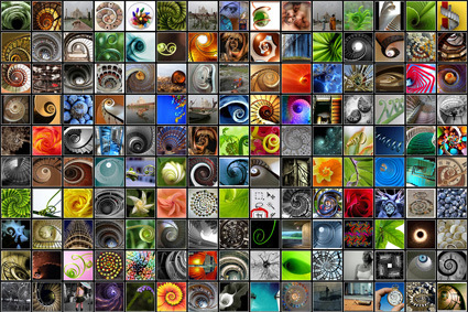
Well, spirals would be one of the many examples of mathematical proportions at work in nature – and this site has just about every spiral you can imagine! While I’m not exactly sure how that would be of use, it’s still a pretty (literally) good time-gnawer just browsing through the many pictures!

Interview with Aston Martin Design Director

aston-martin-v8-and-sketches

I stumbled across a rather old (dating all the way back to 2005), but still illuminating interview between Motorsportscenter.com and Aston Martin’s Design Director, Henrik Fisker. It’s three pages long, in which he talked quite extensively about the development process of the Aston Martin V8, as well as some other car-design topics, such as his personal favorites, goals and, well, cars in general.

“As soon as you curve a line, you lay that line over a surface, which is curving in another direction, and that line and that surface have to look good from any view when you walk around it. Once you’ve got that, that line will end somewhere, and then what you just designed at the back doesn’t line up with that now, and you have to redesign that to make it line up. There are all these aspects of the sculpture, the graphics, and the actual lines in the car. And then there are the overall proportions. There are so many things that have to come together. And that is why you can do a drawing that looks really good…you can’t turn a drawing around. You draw the perspective, which is one view – which you can make work, as a designer, it is your view – but what you don’t know is what happens when you turn this. That’s when you see it in the three dimensions.”

Anyone going “Ah! That’s exactly what I feel”?

The interview is in three parts: Part1, Part2, Part3

Exhaust Gas in One Day

wwf_blackcloud

A rather effective ad by WWF in China to illustrate the sheer amount of pollution generated in one day by a car – I never imagined it was that much (the Chinese copy on the balloon doesn’t suggest that the amount was produced in one day though the English copy does). Anyway, it’s a promotion of the WWF’s microsite: 20to20.org.

Samsung Concept PC

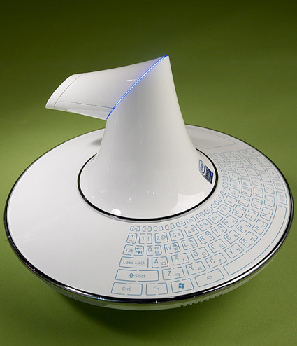
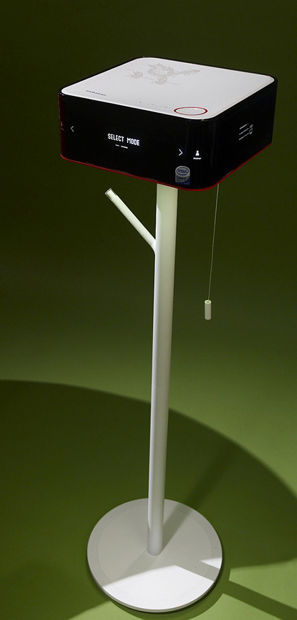
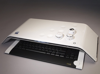
These are some concept PCs released by the Samsung Design team – apparently there weren’t any accompany explanation materials around it… perhaps I’d just venture my own speculation/interpretation to the intentions behind these designs:

samsung_1

Perhaps the central core and base houses the hardware, while the nuclear-smokestack looking part actually projects the screen onto a wall or something?

samsung-c2

Probably something more like a Media Center? Interesting pull string switch (?) though.

samsung_3

A more conventional keyboard, with an interesting lap-table like design. Could the balls be programs that you’re running? When you place them into the recess, it loads the programs that are stored in the balls (you better not live in a shaky place though).

Overall, even though I don’t quite understand these designs – just from the looks of it it is a refreshing take on the age-old beige-box. Ha ha, maybe Samsung should try and enter a Next Generation PC Design Competition…

Transformers – from Other Objects

transformer-something-awful

Of course, Transformers, led by an Optimus Prime with lips, are beginning their marketing blitz for the movie’s launch on 4th July this year  – and with that, we all (at least those who’re around my age maybe?) go back into our childhood obsession with Transformers. And who says Transformers can only come from cars? The SomethingAwful forum has a routine Photoshop Friday contest, and this time the theme really cracked me up – at page 6 or so they start to get cranky though.