E-Ink in Products

sony_reader2

As computers proliferated, various speculations of how it would eventually be a mainstay in our lives were rife, and the notion that computer displays would eventually replace the traditional published materials like books, newspapers and magazines etc. were especially popular. Like the Sony Reader (first picture) above, flat, book-like gadgets of all shapes and sizes were prophesied or produced.
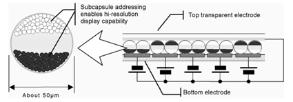
eink

E-ink was a particular fore-runner in this sector. Their technology is illustrated above – millions of capsules houses even more subcapsules that are either white or black in color. When an electrical charge is applied, the black/white subcapsules would drift up or downwards accordingly to form the desired display. There are some advantages in this technology over conventional displays (like LCD) – they are much cheaper to produce, can be made very thin, requires very little power because it doesn’t need to have a backlight, can be read over a wide angle, and are high in contrast and crispness.

It does seem that the E-ink display may be getting closer to their founder’s goal of an electronic display to replace paper. However, that can be a very limiting thought – not because I am against e-papers, but rather, by constraining the perspectives to simply replacing paper, we might have missed many other opportunities where this technology can be applied – and with much beauty indeed!
seiko-e-ink-watch

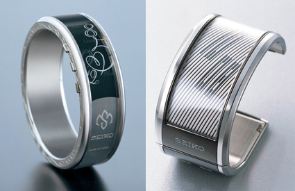
Above are Seiko watches that uses the E-Ink technology in their watch displays. The one on the right won it the 2006 Grand Prix d’Horlogerie de Genève prize for electronic watches for the breakthrough application in watch displays. And in 2007, they are even more delightfully used – taking E-Ink’s display versatility to have a much more sensual and evocative display, away from the conventional look of the segmented LCD that have been pervasive in digital watches (for the productivity-mule among you, the watch also has a efficiency mode where information is indeed displayed more clearly and directly). I’m definitely impressed with their sensual and elegant application of the E-Ink technology, which has erased my impression of E-Ink being confined to cheap-looking, squarish and boring.
motofone

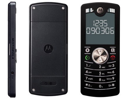
The MOTOFONE is another great example in E-Ink application. The MOTOFONE was developed to target at the developing regions like India and China. A few factors would become very important: they have to be (dirt) cheap to produce, be able to last long in between charges (electricity supply may be erratic; the user may be out-of-home for extended periods of travel without access to any power points; designing for it to be used in the outdoors and rural areas would require good contrasts while in the sunlight, as well as dust-proofing):

The most radical thing about the Motofone is the screen. It’s the first cellphone to make use of technology from E Ink, a maker of electronic ink. E Ink is literally like ink embedded in the screen, and each molecule switches between dark and light depending on how it is zapped with electrical charges.

Once the ink is electrified into a pattern — say, the time — it stays that way without using any more power, behaving like ink on paper.

The result serves two important purposes for the Indian market. First, the screen uses exceedingly less power than a typical illuminated cellphone screen. The Motofone has about 400 hours of standby battery time. Second, the screen is clearly visible in direct sunlight, again like ink on paper. This is a nifty feature when marketing to farmers and fishermen.

With E-Ink as the display, it can afford to have a MUCH lower consumption in battery power (the screen has always been the chief gobbler of cellphone battery juice). It does not need a backlight, and there is zero power consumption to maintain the display (power is only required to switch between the black/white states). This would mean that they can afford to give it a slimmer and lower-capacity batteries without affecting performance at all (does YOUR cellphone have a 12 days standby time?), which would definitely have a tremendous impact to the price point. It costs around $40 to produce, and I have seen it being retailed for around USD55 without any contracts with service providers.

So, think beyond the paper!

Spatial Visualization Game

mathsnet

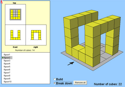
I remember a few years ago, in the admission aptitude test for the industrial design course, there were questions that tested our spatial visualization abilities. A few 3D perspective views of some blocks were given, and we were supposed to construct the top, front and side views. I didn’t remember it being too much of a challenge then.

This game is slightly different – instead of giving you the 3d perspective to construct the elevation views, it does the reverse – and requires you to construct the blocks in 3D instead, with an additional requirement in terms of the total number of cubes used (as little as possible).

There are a total of 10 puzzles (figuur 1 to 10). A green dot beside the puzzle name indicates that the 3 views are correct, but the number of cubes are not. The goal is to achieve the yellow dot. Try it!

[PS: if you want to make it more challenging, try not to use the “Fill up” button!]


Reality TV Editing


Reality TV caught the world by storm a few years ago, catapulting as a genre a few years ago with shows like Survivor that promised to capture the real life dramas that might be even juicier or more engaging than reel ones. While we all know that editing are necessary to condense hours upon hours of what amounts to surveillance footages into a decent, rating-pulling show, the extent where manipulation is possible – or perhaps more aptly, easy – might not be easily imaginable.

The clip above sharply illustrates just how easily it is to manipulate a set of footages to the desired outcome. Pretty much puts the whole reality-TV genre into the same band as say, wrestling matches, don’t you think?


Bowling Split Spare


For those of you who bowl, you’d know that when the pins are “Split” (i.e. after the first roll, two or more pins are left standing with a substantial gap between them, so it’s very difficult to knock them all down in the second roll). Now, what if the split is…across lanes?

It’s a bowling trick-shot – not quite what you’d encounter in your normal alley outings – but it’s still quite cool to see! If you prefer the real deal, it looks something like this.

Trek Lime

trek-lime2

trek-lime

Some time ago, Shimano and IDEO collaborated to find out why bicycle sales dropped significantly in the US between 2000 and 2005, even though industry profits were on the rise due to sale of high-end bicycles marketed to the elites. It turned out that while technological advancements such as lighter and stiffer frames, multi-speed gear shifts, carbon fiber etc. excites the experts, they may not appeal to the average Joe (who likely doesn’t know what a dérailleur is, and does not want to find out either). While pursuing high-tech advancement in technology, the bike industry had somewhat neglected the emotional connection with the average users and the amateurs:

The Shimano/IDEO design team conducted observation-based research, revealing a series of factors that influence casual cyclists’ interest and participation: 1) A better riding experience – many adults miss the easy, joyful feel of riding a bike as a kid; 2) Product platform – a new feature set was needed, with automatic shifting and less visible mechanics; 3) The purchasing experience – independent bicycle dealers need to learn to engage with a new customer base that may include more women, amateurs, and inexperienced bikers.

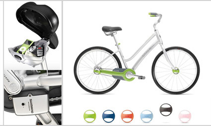
Enter Trek Lime (as seen above). I thought the design was a very good job that fit the target market they were aiming at. The first look brings about a sense of nostalgia – it has a classical look/profile, not much different perhaps from what your aunt may have passed to you when you were a kid. At the same time, it retains a modern and fun image, looks absolutely easy and familiar, and yet it was given some new technological innovations and twists.

It features automatic gear shifting – not unlike those found in automatic-gear cars; the mechanical parts are all concealed within, giving a cleaner and easier-to-maintain look. The saddle doubles up as a storage compartment for your little nifties – for those small stuff you don’t want to hold while you ride, for example. The tires are puncture resistant; at the center of the tires there are little colored plastic parts – “Peelz” is their marketing name – that can be interchanged for different colors (and possibly graphics in the future).

I’m not sure how successful this would be in lifting their mass-market sales – I hope it does well, as I do really like the execution of this whole program from the research to the end-product. From the insightful research that led to the key observations and design goals (IDEO, Shimano); to the bicycle’s design execution (Trek) in assembling the necessary technological innovation and parts to meet the user’s desire, as well as the styling that in my opinion nailed the brief; right up to the website itself – a clean, simple interface, with a casually-posed bicycle that invites you to explore it. They work hand-in-hand to remind and reinforce the idea of an easy, leisurely and fun bike.

Does it evoke the same in you?

Trek Lime website

B-buckles

bbuckles

Some time ago, being pregnant means giving up fashion and style, embracing loose maternity dresses instead. While that may still be a rite of passage that some moms-to-be would look forward to, the more fashion-conscious need not lose heart! B-buckles is basically a “waist-extension strip” that hooks onto your jean’s belt loops to accommodate the growing tummy.

[B-buckles]

Giant Drawing for Shiseido


I’m not sure if this is a production advertisement or perhaps a viral marketing video – whatever it is, it is really cool! While I’ve seen Chinese peasants practicing calligraphy with a mop and water, the scale of this is definitely much larger. Watch as the guy paints a picture many times his size – and when others join in the fun as well! I really wonder how he maintains a sense of proportion and perspective over such a large canvas though.

Belkin Gromet Gear

belkingrometgear

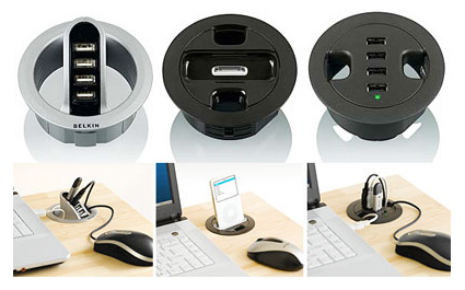
Behold! The Belkin Gromet Gear! (I didn’t know that cap for the round hole is known as a gromet – I learned a new vocabulary today). With more and more gadgets and other USB-based goodness, Belkin has quickly and cleverly launched this cap that would be a mini-hub for your digital gadgets, saving you knee killing trips to connect your gears to the back of the CPU under your desk. Ordinarily I’d give them full marks for the innovative efforts – but a glance at my desk says that my messy, cluttered belongings would block off whatever gromet and render it useless. But that could be just me.