Make your own MP3 player!

mp3-player

Of course by now, MP3 player comes in all sorts of shape and sizes – ranging from the ultra-mini cube-shape ones (like those above) to chunkier, meatier versions that has much higher storage capacities and other functions like video-playback. The hardware technology to simply listen to MP3 music has advanced to the stage where the size is no longer much of a constraint – for instance, the one above is not much bigger than a few stacked coins. Instead, the design, user interface, technology and other factors would come into play – which is why we see the wide diversification of MP3 hardware.

The ones in the top picture shows MP3 player that is much like a handphone accessory (now you know you don’t need to pay extra dollars for your MP3-enabled phone – you can get the MP3-phone-strap instead!). What is more interesting, however, is that the internal module (known as MOTZ DIY Music Box) is for sale as well. Featuring the standard volume and track controls (think iPod shuffle), Li-Polymer battery and 256MB memory, it is the barest of a functional MP3 player. You can wrap it up in cloth mini-socks, or RP a custom-designed case, or line up a 3×3 matrix of these to form your 9-channel MP3 mixer.

The question now then is – what would you do with it? What can you do with it? In a way, it can be the perfect challenge for designers and design students. Think you can do better than Ives? Now you have a cheap, flexible and easy-to-use piece of internal component – see how far can you push yourself to create a desirable and attractive MP3 player design to call your own – and, with some luck and mad skillz, others would covet it too!

Link to the part supplier (Korean)

Motorola Cellphones – the History

American Heritage has a really good, detailed article on the birth of the personal cellphone business for Motorola. As with many-a-legacies, the story of the development of cellphones in Motorola is also filled with the excitement worthy of a Hollywood thriller: coming up with a imagination-capturing work within an impossible deadline, to thwart the impending AT&T’s application for monopoly rights over the cellular telephone business.

The biggest problem the Motorola team faced was time. At AT&T’s request the FCC had scheduled a new round of hearings for May 1973. This gave Cooper and his engineers less than three months to design and assemble a product that had never been built and still have time for testing and demonstrations for both the media and the FCC prior to the hearings. Everyone involved would have to drop everything.

After Motorola’s staff returned from the Thanksgiving holiday, Cooper got the ball rolling. Rudy Krolopp, Motorola’s ebullient lead industrial designer, was the first line manager to get the news, probably because he and Cooper exercised together. “Rudy, who was in excellent shape, put on physical fitness classes which I attended, where you really stretched yourself,” Cooper recalled. “The last exercise Rudy directed was one where we paired up and pushed on our partner’s chest. He always found some good looking babe as a partner.”

A little after 10:00 a.m. on Monday, December 4, Cooper summoned Krolopp to his second-floor office, “which was unusual,” Krolopp says, “because he usually came to mine to rap.” On his arrival he asked what Cooper wanted.

“We have to build a portable telephone,” Cooper answered.

“What the hell is that?” Krolopp asked.

“A phone you carry around with you.”

“That sounds interesting. Let me clean up what I’m working on.”

“No, you don’t understand. This has to be done in six weeks.”

And so, sketches were made and models built.

Krolopp chose eight or nine sketches, which were turned into models. The winner was a model nicknamed the “shoe phone” for its shape. It had been created by Ken Larson, a 10-year Motorola veteran. “His model looked like you could put it right into production,” Krolopp notes. “His wasn’t the best design in terms of creativity, but it was logical and very basic. It looked good and solved the problems.”

The day after Larson’s model was chosen, cooper gathered a group of engineers and managers, including Mitchell, Richardson, Chuck Lynk (Linder’s boss), and James Mikulski (who worked on overall systems design), along with various Motorola executives, most of whom knew nothing of the project. Krolopp draped Larson’s model under a piece of blue cloth and stood by as Cooper described the project and the schedule. When he was done, Krolopp pulled the cover off Larson’s model.

“Eyes opened and jaws dropped, because it was really small,” Krolopp remembers. Cooper issued a challenge: “Anybody who doesn’t believe that this can’t be done in time, get up and leave the room.” “With the kind of egos we had in the room,” Krolopp says, “no one got up.”

And of course, the fairytale ending, without which we may not know Motorola as a brand today:

After all this, reporters finally got a chance to use the two Dynatac phones, which performed flawlessly. Gene Smith of The New York Times reported that “reception was clear, although the wife of one reporter told her husband, ‘Your voice sounds a little tinny… . There’s no resonance. I knew you weren’t calling from a regular phone.’”

Mitchell then went down to the street with one of the handsets and made a few calls while posing for photographers in front of some suddenly old-fashioned pay phones. In the flood of stories that poured out the next day, reporters noted that pedestrians were “agape” at a man making a wireless call. In a prescient lead paragraph, the AP reporter noted, “There may be no way to escape the strident summons of a telephone in a few years if a portable telephone developed by Motorola Inc. catches on.”

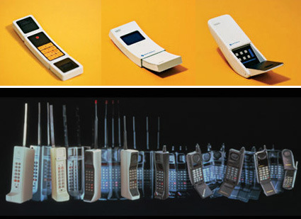
Snapshots of early models:
motorola-hp-development

Top row: The initial concept models, not much different from today’s phone actually – double-flips, slide out and one with flip-mouthpiece. Bottom row: Evolution of phones from 1973 – 1998

Do read through the full article over at American Heritage. Cell phones are so ubiquitous today that it’s hard to imagine a world without them. The article is one of the best primers on early cell phone developments, documenting the colorful encounters of Motorola changing the course of cellular network.

Concept Calendar

calendar-concept

This is a pretty nifty and interesting calendar – there are still the pages daily calendar sheet to be torn away like the traditional ones, but the month is indicated by the weight of the paper left. As the pages are torn, they get lighter and the slider moves upwards from January to December.  Designer unknown.

Crazy Speed Silverbrook Memjet Printer


This is some crazily fast printer, even though this Video doesn’t really do it justice. Silverbrook Research, one of the top 10 innovative companies globally in terms of patent granted, has unveiled the prototypes for a new inkjet technology that analysts think will revolutionize the industry.

Traditional dogma says that out of fast, cheap and good, you can only pick two. Let’s see where this thing stands:

Fast: Unbelievable fast. Some statistics: Document printers can go at 60 pages, full width and color at 1600dpi, per minute. Label printers blaze at 6-12 inches per second. And large format printer (51″ wide) goes at 6 inches to 1 foot per second.

Cheap: Yes. A 30-photo per minute printer is projected to cost just around $150 while still being 10 times faster than existing competitors. Projected printing costs are at $0.02 and $0.06 per page for black text and color pages respectively. 50-ml individual ink cartridges are predicted to sell for less than $20 – compared to current 10-ml cartridges which go for $15-$30.

Good: Can’t be determined exactly yet – from the video it doesn’t look that bad at all. Not bad at all.

So how does this work? Conventional inkjet printers have a small printhead that zips across the page repeatedly to spray ink. In this technology, the printhead covers the span of the page, eliminating the need to shuttle around. 1600 nozzles per inch (working to 70,400 nozzles in a standard A4 printer) are arrayed to spray the required inkdrops.

I am definitely looking forward to this – traditional giants like HP, Canon and Epson have dominated the market, whose clout on the printing industry has enabled them to sell ink at rather exorbitant prices. It’s refreshing then to see a potentially revolutionary product that might redraw the battlegrounds with superior technologies. [Pessimist] Though Silverbrook will probably just license the technology to the Goliaths again, and once again price-fixing, disabling chips etc. would mean that eventually this isn’t all that rosy cheap, fast future, as the raw deal gets shoved down our throats again. [/Pessimist]

Mini Wonderland Hamburg

hamburg-miniature-museum

If you’re a modeling (that is, the art of coloring and assembling scale models, as opposed to the art of posing and walking) fanatic, you’d probably be in permanent orgasm when you’re in Hamburg’s Mini Wonderland. Housing the world’s biggest  model railway tracks, it is a stunning showcase of the most detailed scenes from the world. Cars, bridges, human figures, the level of detail is truly amazing. HOW on earth do they place all those people in the stadium? And it’s not just straight lining-up of models – they do make it more interesting by adding little twists and life, like the cyclists who’d fallen down, and even, the couple making out in the sunflower field. Amazing!

More pictures here.

Desktopography

desktopography

Desktopography is a website that has a collection of desktop wallpapers:

Desktopography is an exhibition, a showcase of nature themed desktop wallpapers created by designers worldwide.

Designers spend around 90% of their waking life in front of a computer so the most appealing genre for a wallpaper would be one that has beautiful design mixed with the all important aspect of being outdoors. This year we present over 40 new desktop wallpapers for you to display and enjoy.

They do have some really beautiful, high resolution pictures. Some of which perhaps are not quite suitable as desktop as much as just beautiful scenes to look at (I can’t use desktop backgrounds that are too distracting for me to find my icons). What I like most, however, about this website, is their title. A word that succinctly and elegantly summarizes their page: Desktop, photography, topography, all in one word. Whee!

Don’t Click It!

dontclickit

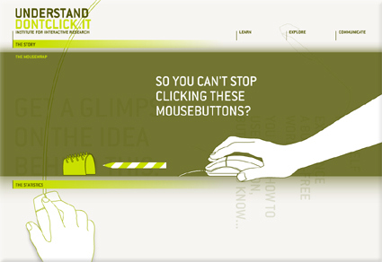
The Internet is pretty much defined by the “click” – people are trying to improve “clickthrough” rate, the cliché goes: everything is just a “click” away, etc. Whether we realize it or not, our experience and perception of the Internet is defined by the “click” (and by extension, the physical input that goes with it, like the mouse). Don’t Click It is an interesting website that attempts to breakthrough the “click”, featuring a full website where clicking is not an option – there are no buttons or links that are clickable, so alternative navigation methods were explored. Personally I felt this is quite a refreshing take on the Internet and the browser environment – I was secretly hoping for even more conceptually interesting navigation though!

PS: You’d have to click on the “Don’t Click It” link to get there. Then be prepared to resist clicking!