Another amazing pure-CG visual effect with what is perhaps the most difficult to work with – water. See it flow, splash, bubbled, bend, in pure 3d goodness (no composite frames at all). By Scanline VFX, who worked on films like Poseidon.
Another amazing pure-CG visual effect with what is perhaps the most difficult to work with – water. See it flow, splash, bubbled, bend, in pure 3d goodness (no composite frames at all). By Scanline VFX, who worked on films like Poseidon.
It’s corny, but quite clever at the same time:
Scene from a newly-wed couple’s home:
Wife: Honey, where shall we go for our honeymoon? London? Tokyo? Paris would be romantic … the Eiffel Tower and all…but it’d be quite expensive. Maybe India would be a cheaper but good choice – would you love me like Shah Jahan and build a Taj Mahal for me?
Husband: Dear, you know I love you so! We’d go for a tour around the world to ALL of those places!
Wife: REALLY! YOU’RE SO SWEET!
Husband: Click Play!
[This is a video that compiles various landmarks around the world as seen through a round-the-world tour with Google Earth]
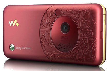
Sony Ericsson recently launched the W660i – its back face has an elaborate, intricate and rather classical floral motifs on it. Which is about time – many small consumer electronic products have taken on Apple’s clean style – keeping to one or few color tones, vast stretches (is this too much an adjective to use on a gadget?) of white spaces – which is good at times, but when everything around me became just flat, blank pieces, it becomes rather monotonous and dehumanized.
So I applaud them for being brave enough to launch this – where the motif is actually molded into the piece, rather than just some “safe” option of having the pattern printed instead, or even “safest” – have the basic option, but allow the consumer to “fully customizable faceplate with stickers you can buy at 7-eleven according to lifestyle preferences for a different experience!”. Though, regrettably, that’s about the only part of the phone that I liked.
More of other more intricate, craft-originated designs that goes into products:

Marcel Wander’s HE – the four “pebbles” with intricate patterns on top are the speakers.
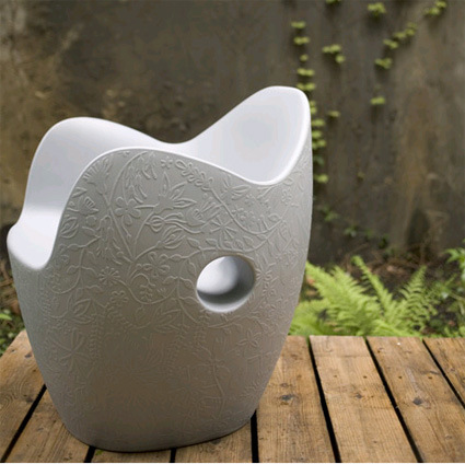
The “Nest” chair by Tord Boontje
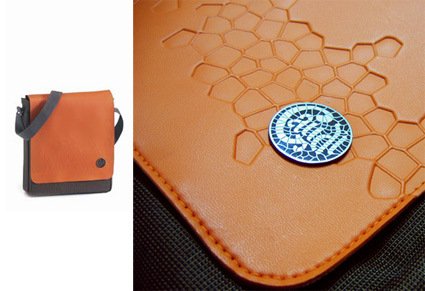
Above is a bag that I bought – inspired by the mosaic patterns of Park Guell by architect Gaudi through embossed stamping on the leather.
[Disclaimer: This entry is not a post of cognitive dissonance or a justification to the purchase of said bag.]
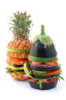
Justin, a copywriter from Brooklyn, applied the risk-and-reward analysis to the realm of fruit eating, resulting in some rather amusing muses:
fruit: banana
risk: low
reward: moderate
analysis: Never a bad choice, the banana is the .290 hitter of fruit. When was the last time you had a surprisingly bad banana? Never, that’s when. More importantly, the banana offers the most easily interpreted warning signs in the fruit family: if it’s slightly green or covered in brown spots, you know you’re rolling the dice. You will most likely never eat a memorable banana, but for a low-risk fruit that pays out solid dividends, you can’t do better. If you don’t like surprises, the banana might be the fruit for you.
Head on to his blog for 14 more fruits!
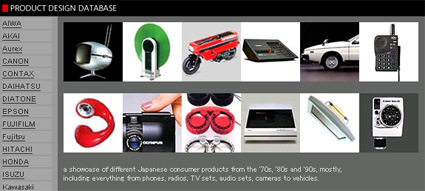
Say, you’re a product designer looking for some retro inspirations for the next digital gadget you’re doodling on, or perhaps you’re a design student hit with a ‘History of Industrial Design’ assignment looking for a place where you can copy-and-paste your homework away creative reference, check out this great resource site: (Japanese) Product Design Database.
It has amassed a rather large collection of rather high resolution photos or posters of Japanese consumer products from the 70s, 80s and 90s – phones, radios, TV and audio sets, etc. Truly a great resource to see some great works from our industry’s seniors.
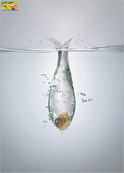
The best things in life are simple, clear and clever!
Man, recent developments in games and 3D effect technologies just doesn’t stop amazing me – check out the trailer above on Crysis, an upcoming game that has already netted numerous awards on its technical excellence. And if you think that it’s just marketing trailer, and that game play would be of a significantly lower quality, you may be convinced otherwise after looking at this video of their level editor for an earlier Crysis version.
All elements real, destructible, dynamically mapped, dynamic shadows, parametric skeletal animation, I could go on and on – but if I do, I’d start to wonder why does my simple one-frame product render still take up so much time!
[Crysis website – yet to launch]

This picture made me chuckle a little – a little time, creativity and maybe some bruises nets a skateboard powered by drills! I’m not sure how well it handles – judging by my weight, I’d probably need to have *four* industrial strength drills to even nudge me while on a skateboard. But if you’re up for the challenge, the full instructions are over at Instructables!
Honda’s take on self-balancing personal mobility ala Segway – much more compact, personally liftable, well-’wrapped’. While Segway seems to target the <3-5miles type of navigation (e.g. 5 blocks down the road), U3-X – by virtue of its size and user’s posture (sitting rather than standing over a platform) – seemed to be suited more for indoors use like museums & galleries. I doubt this will revolutionize personal transport or replace cars, but it’d be interesting to figure out the niche markets that would desire something like this: nursing homes? Front-desk service personnel?