Upcoming Star Wars Game Physics Engine


This is pretty amazing – yet another step in the holy grail for realism in game and game designs – the materials and AI that reacts in real time to random actual instances around them and acts accordingly. Quite a mouthful, but you’d get what I mean when you watch the video.

The physics engine is called Euphoria – and would be used for the Star Wars movie (I suspect this video is part of the sneak-preview buzz campaign).

Slimming Michelin Man

michelin-man-evolution

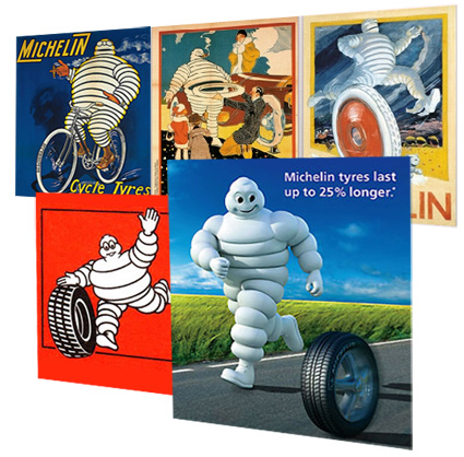
The Michelin Man, aka Bibendum, has just been recently overhauled to give a refreshed image to the company – according to Thierry Rudolph, Michelin’s head of Marketing:

We’ve refreshed him because he’s a key asset for us. We’ve slimmed him down because it shows the evolution of people and is a way of keeping up with changes in society. He demonstrates the evolution of society but also the evolution of the brand and the world we live in.

That statement is rather interesting in its irony: while the society’s definitely getting more obese by all indicators, the ideals and aspiration of the society heads the opposite direction – a healthier, slimmer one. In the same vein of irony lies products like McDonald’s, Diet Coke etc: while they continue to feed the growing trend of obesity, the power of marketing concocts the bluff that these products help to reach the consumer’s ideal of being slim and healthy. And that’s where Michelin heading too – mirroring the society’s aspiration rather than reality.

It’s also pretty interesting to see the evolution of the Michelin Man, which has continuously evolved, mirroring the changing landscapes of the society. Starting off as a proud, cigar-smoking, leather-boots wearing persona, the Michelin Man then was one of aristocrat – only the richest could afford wheels, even if it’s just bicycle wheels. The same persona continues even as cars were developed – the tire on his bodies are still slim (reflecting the tire dimensions then).

As automobile develops to become a mass-market item rather than luxury, the Bibendum was toned down to be much friendlier, as it put on massive weight around its tummy to mirror the girth of the tyres. And now it needs to slim down and cut out its flab due to the society’s health concerns. I wonder what’d be next – for example, if the airless tyres (known as tweels, incidentally developed by Michelin) were popularized – will he be left to just bones?

[see more of the Bibendum’s history here]

**** Addendum ****
kfc-logo-comparison

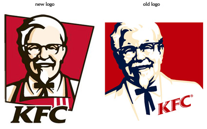
In response to Hann’s comment about KFC’s Colonel Sanders losing weight – well they’ve just introduced their new logo (to my dislike), and it does seem like some of the changes are similar in spirit to Michelin’s:

Colonel Sanders has discarded his clean white suit for a more blue-collared apron (Apron! Sensitive New Age Guy we have here?) outfit – now he resembles the person serving your fried chicken rather than a rich wealthy white colonial master or something. He’s definitely gotten his Botox jab, looking a lot younger now. Yup, and like Michelin Man, he’s definitely slimmer now.

Sony Design

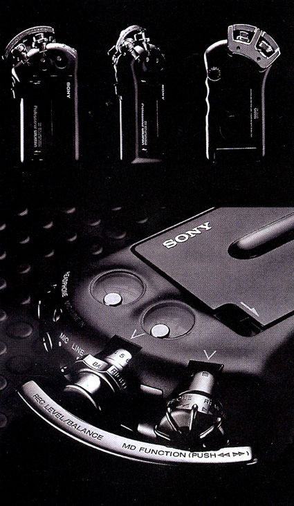
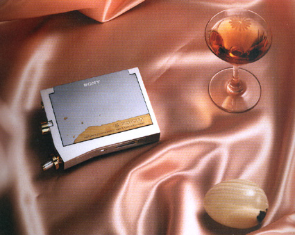
Sure, Sony seems like a pale shadow of its former self – it is no longer the de-facto category leader in most of its audio/visual business, the brand value is falling, Blu-ray notwithstanding. Yesterday though I was flipping through a book called Digital Dreams – The Work of Sony Design Center, and I must say that I am still rather impressed by some of its concepts/designs.

sony-casette-walkman-joe-waka-1989

sony-walkman-joe-wada-elegance

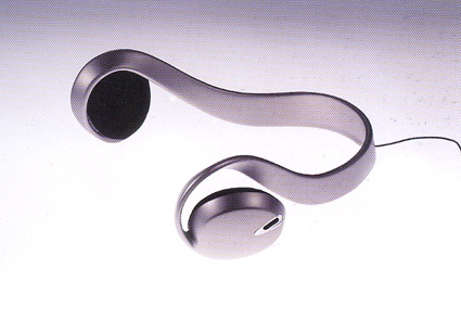
sony-earphone-concept-1996

The amazing thing about the concept products in these pictures is that they’re all designed eons ago (relative to the digital age anyway). The first two are Walkman concepts by Joe Wada, done in 1989. The last one is a Street-style earphone, designed by Hiroshi Yasutomi in 1996 (which has since evolved into the mass-production version of the category-defining MDR-G61 StreetStyle. While the technology has moved on, the design to me is still very classic and dare I say, avantgarde even in 2007. The design principles and rationale behind them are still very relevant and inspiring.

And did you know that the Sony VAIO logo (VAIO – acronym for Video Audio Integrated Operations – the sub-brand in Sony that handles items using consumer audio/video) is supposed to represent the transition from analog to digital? The letters V and A forms a analog sine wave, while IO looks like the binary inputs of the digital age – and in fact, the people over at Sony is geeky in some ways – the startup melody made by VAIO products is actually the equivalent to the sound of punching V-A-I-O into a dial tone telephone.

Cool stuff – do check out the book if you have the chance – it’s a great read on the philosophy and legacy of the (once-great, and hopefully will revive to its former glory someday) Sony.

What’s Special About this Number?

A mathematical fanatic, a certain Professor Friedman, either had too much time on his hand, or perhaps he was actually tenured to do this – anyway, he has created a list explaining what is special about the numbers from 1 – 9999, just so you’d know that 31 is a Mersenne Prime, and that 143 is the smallest quasi-Carmichael number in base 8, or that 9862 is the number of Knight’s Tours on a 6×6 chessboard.

If the properties of each number doesn’t fascinate you, well, maybe the sheer effort to find out what’s special about each of the 9999 numbers would, like how teachers would tell each kid that they’re special (what happens when everyone’s special?) Though there are definitely plain kids too – when even teachers fail to distinguish any special talent or ability in the child – as is the case for numbers like 8930 – 8939.

Architecture against Death

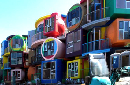
mitaka-exterior

mitaka-interior1

mitaka-interior2

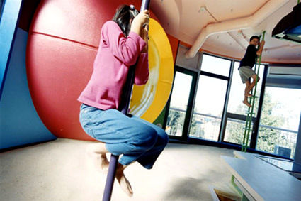
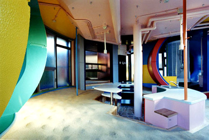
Externally the architecture may look like Gaudi rose from the dead and had a cup too much, or perhaps the architect is just woefully child-like. But these lofts, “Reversible Destiny – Mitaka” has just the opposite aim. Constructed in 2005 with the aim to delay the degradation of elderly’s sense, it invigorates and excites their senses not only by the vivid colors and complexly-juxtaposed geometries, but also by purposely having a difficult house to live in.

For instance, inside, each apartment features a dining room with a grainy and bumpy floor, a sunken kitchen and a study with a concave floor. Electric switches are located in unexpected places on the walls so you have to feel around for the right one. A glass door to the veranda is so small you have to bend to crawl out. You constantly lose balance and gather yourself up, grab onto a column and occasionally trip and fall.

According to the people behind this, Shusaku Arakawa, a Japanese artist based in New York, and his creative partner, poet Madeline Gins:

Set up to put fruitfully into question all that goes on within them, they steer residents to examine minutely the actions they take and to reconsider and, as it were, recalibrate their equanimity and self-possession, causing them to doubt themselves long enough to find a way to reinvent themselves. These tactically posed architectural volumes put human organisms on the track of why they are as they are. To be sure, every loft comes with a set of directions for use.

Like a crazy children’s playground, this house is definitely one for you not to relax in. And that is precisely the point. Many of you may know some elderly relatives who’d slowly become dull and senile simply by being bored and sit their lives away. I’m not quite sure how much of this architecture is bull, or whether it be truly be effective, but judging by their sale of $750,000 a piece and people actually snapping it up, it does seem like a good venture!

More pictures of this project, and other similarly radical proposals for hotels here.

Volkswagen Ball

volkswagen-ball

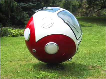
My brain went “PS!” the moment I saw this picture (for the less aware, PS means photoshopped – where the photo was manipulated using Adobe’s software). “Bah, a very well-done spherize-filter or something.” It looks like I’d be eating the humble pie – because this seems to be the real deal – someone actually made a Volkswagen like a ball! Full respect for the audacious idea, and more for the execution.

Now if only this could really drive (it has no wheels) instead of just rolling around perhaps…

[link]

Microsoft Help Clip Dies

microsoft-clip-dies

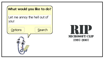
Wow, the clip is finally dead in Office 2007. No more of it popping up and zipping around, trying to be cool and cute. First introduced in 1997, it managed to sustain ten years of what most people perceive to be pure annoyance – and its termination in 2007 is probably ten years too late. It does make me intrigued at how the decision to keep/discard it is made – who actually makes the call? And if they killed it now, why didn’t they kill it earlier – what were the factors that were present then that are absent now (or vice versa)?

Anyway, good riddance!

Table, Lamp.

table-with-lamp

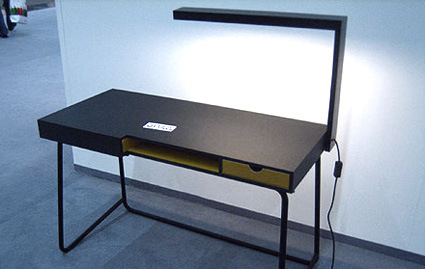
Reduce your clutter! Integrate the lamp into the table! I like this design because it does a few things in one stroke: give light to the table surface; eliminate the need for a lamp-base; create a somewhat-sculptural aesthetic look out of the whole thing; and it is easy to keep/flat-pack.

Though the lamp is probably not adjustable (meh!); though the wire seems to be clumsily jutting out of the piece (meh!); though it’d probably be cooler if the light is turned on/off simply by rotating the light into position instead of using the switch (meh!).

Designed by John Slater.

VW Phaeton Shadowplay Commercial


This is a beautiful commercial from Volkswagen Phaeton – Phaetons are Volkswagen’s top line model. I’m not quite sure what it’d mean to you, but I definitely think that the factory that made these Phaetons (as covered by my blog post on it last year) are certainly more beautiful than the cars themselves.

Phaetons are hand assembled in the factory, which is why this VW commercial focuses on the beauty that the hand can give – in this case, the familiar art of using the shadows formed with a hand to create animated shadows. You’d probably know the “eagle”, but this ad is chock full of various lively creatures that tells a story.

It is perhaps regrettable though that the digital age of animation has bred a cynic in me – before I could be truly impressed by the artistic feat, a definite voice in my brain would ring “That is probably just CG – DON’T be impressed!”. Which is a stupid thought – why should I reduce the amount of surprise, delight and amazement in my life – but I guess it’s a stupid thought that would stick with me.

Green Lullay Cradle

GLcradle

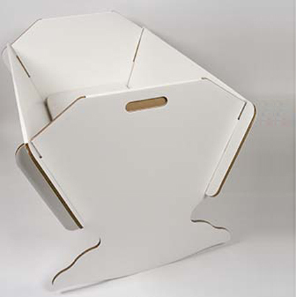
This cardboard cradle meets all the usual standards. It’s flame retardant and meets the EU’s safety and performance for cribs and cradles. However, unlike traditional cribs, you won’t need any tools to assemble it and you can either store flat when done or recycle the cardboard. Keep this crib in mind for traveling as well. For infants up to three months old.

It’s interesting that the introduction blurb for this cradle starts off with a defensive statement by reassuring potential buyers that this thing is safe – they probably anticipate that the first reaction from most people would be the fear of their precious newborn would roll-over, crumble, tear apart or be injured in every scenario imaginable.

That said, this design  started me thinking about whether it made sense. Portability – well, okay it can be taken apart and all that, but I do not really see it as really useful (does it have to do with me never being a parent to a baby?). Being made out of cardboard, the recyclable aspect of it seemed an important point in this design, which  is also somewhat strongly correlated with treating the “baby” phase of a newborn as a relatively temporal one.

But babies would usually sleep in a crib for maybe 3 years or so – by then the next child in line could have arrived, and who’d take over the crib for another few years. So this crib is likely to be in the house for maybe five years or more. In that case, wouldn’t a more permanent crib be more relevant? Of course, this crib has passed all the structural tests etc., but ultimately, the semantics of this design seemed to make the point that it is temporary and functional, which is probably  just about the furthest emotion away from a parent’s attitude towards his/her child.

Green Lullaby Cradle