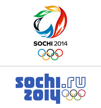
Now that the 2014 winter Olympics have wound down, it is fun to look back at the decision the Russian Olympic committee had to make between two competing logo choices.

Which would you choose? My first reaction was certainly the top one – it looked fresh, Olympic-esque and contemporary. The one at the bottom had so much Russian old-schoolness, it seemed like they were still stuck in the Soviet-Russia era, and have not caught on the graphic design evolution.
But following the argument on Sans Raison made me a convert (it’s too detailed to be quoted or reproduced her – please head over!) – as she carefully and patiently compared between the 2 final candidates, and espousing the merits of this logo that has much more long-term strength in its identity; that Olympics logo frequently falls into a certain cliche (like the one at the top). Eventually I became a convert for the second one too.
Of course, seeing it being applied in context gives it a whole new render/perspective as well:

In context, it does hold a lot on its own (although the shade of blue on the logo in context seem much friendlier too). You can also check out the full identity in action at their official website.

