BMW GINA Concept

bmw-gina

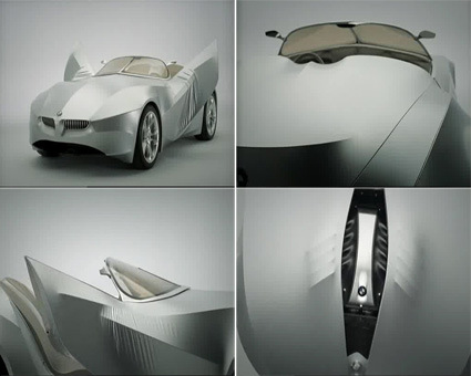
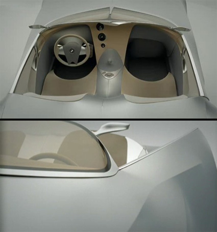
BMW has just unveiled their latest concept called GINA Light Visionary – GINA being an acronym for their design philosophy behind: Geometry and Functions In ‘N’ Adaptations (I suppose GINA sounds cooler than GIFNA?). At my first glance, I thought it was not too radical – the initial impression was a concept that was probably a sportier extension of the Mille Miglia concept unveiled back in 2006.

But after going through the video (in Youtube above), I realized it was a rather radical and refreshing perspective of automotive design – this may yet be a watershed in automotive styling. BMW has always been experts in dealing with expressive surfaces (that are often sharply ‘clipped’), with one of their master strokes being the iconic negative curvature found along the sides of many of its sportier cars. But I think in GINA they re-thought the whole tradition of car body designs.

In typical automotive designs, you have a certain structure on which you add metallic panels on. You can style these panels in as many ways as there are cars on market now – but they are generally all seen as panels. The associated possible actions are linked to traditional metal sheet forming technologies – bending, rolling, cutting, etc., as the automotive designers think of themselves as sculptors, adding or coring away extra ‘clay’.

In GINA, instead of hard panels, the body is conceived more like a soft skin wrapping against a skeleton body. While it may very well be made of metal panels eventually just like any other cars, the important thing is at the design level, the ‘skin’ metaphor brings out a whole set of different analogies and thus designs – you’re thinking about creases, pinching, pricking, etc. Design is thus by growing and subtracting the inner skeleton (which then defines the creases). I particularly liked the quote by Chris Bangle in the video: “…let’s let material talk in a different manner; and let the tooling be a different issue, instead of just a way to give us form.

bmw-gina-concept

There are some other interesting features enabled by such a skin too: for example, there can be a continuous line on the sides, with the door creasing and folding away rather than opening/lifting. It could also consume less resources to build and drive, since the fabric would probably be lighter and require less manufacturing energy. Imagine also the possibility of changing the profile of your car exterior at a whim – in a fabric concept, it may be as simple as pressing a knob to rotate or shift the underlying skeleton.

It reminds me of Gehry’s Guggenheim too – which was for architecture another conceptual breakthrough: where technology has grown to such sophistication that we can in fact produce a building not by ‘ground-up’, ‘level-by-level’ structure which is then clad by facade. Instead, the building was defined much by its skin itself, its transformations and its refreshing organic lines.

In a way, I also felt it made the car more organic – it’s almost like a silent…monster. As it lifts it eyelid, the head lamps project its vision menacingly ahead; the unveiling of the bonnet reminds me of open-heart surgery; makes me think about Toyota’s ‘Human Touch’ ad too (haha both are somewhat creepy).

Overall, I must say this is one of the most refreshing and innovative concept cars that I’ve come across these years. There are many concept cars that are wild, interesting, etc. but I thought the GINA managed to tackle car design in a whole new perspective, while inheriting the qualities that make it a BMW.

Bravo to the design team!

(And if you’re the essay type, here’s their philosophy (wall-of-text!))

Yamaha Concept Pianos – ‘Keys’

Yamaha had exhibited a series of piano design concepts at the Milan Salone 2008. Titled ‘Keys’ in reference to the defining common element among all these concepts, they explored some alternative configurations or perspectives to the familiar piano – asking “what would a piano look like if it is used in another context?” At first I didn’t pay too much attention to it amidst the avalanche of visual candies pouring out at that time, thinking that they’re mainly just Yamaha tossing a few concepts to attract attention and all.

In fact they probably are just that. But if you look closer at each concept, there are quite interesting and thoughtful details with each of the 7 concepts that deserve more than a fleeting glance – these design details do demonstrate the thoughtfulness, the idea behind the design, and each new design is refreshingly suited for their new calling through various sensitive design touches:

Key Between People

yamaha-concept-piano-key-between-people

‘Key between People’ is (in your current Internet lingo anyway) the grand piano brought to the social. In the traditional grand piano, the lid is lifted high up (like a bonnet) forming a formidable visual impact, accentuating the lone genius at the keys. In this concept, the piano is turned much more into a grand, flat table or bar-counter where people just hang-out, recalling the unifying, social dimension of music that perhaps get forgotten these days. The players and the listeners are placed on a level plane, giving a more direct and intimate connection between the two parties. The matte finish also makes the piano look more approachable and down-to-earth, in contrast to the traditional high-gloss piano black treatment.

Key as Gift

yamaha-concept-piano-key-as-gift

Key as Gift looks at the piano that gains connection and intimacy with the owner as it ages gracefully. The C-shaped band of bent wood juxtaposes well against the friendly and slightly-playful looking design – as seen through the flowery array of speaker openings and the softer, more rounded keys. As time passes by, the wood will age with a patina and impressions that you’ve left on it – the special little personal marks that eludes modern plastic gadgets – almost like something you brought out from your childhood.

Key for Living

yamaha-concept-piano-key-for-living

Key for Living, with its rounded-rectangle silhouette – is more modern looking, having no problems fitting into a typical contemporary apartment or loft. It seemed to be designed with compactness and versatility in mind. For instance, it can be stood-up vertically at the corner of your room or something. Another interesting detail is the speakers which are placed in between the keys and the base – there are a total of 10 speakers and a subwoofer within for sound to emanate in every direction. I also quite like the row of round metallic button – I think it gives a visual highlight to the top surface.

Key for Journey

yamaha-concept-piano-key-for-journey

Key for Journey is perhaps the iPod of pianos. Housed like a sketchbook (with binded paper for the musical genius in you to perhaps jot down the more inspired tunes while on-the-go) within leather-bound covers, the authentic material finishing and the detailing are very exquisite and sensitive. Instead of the standard black-and-white, the finishing plays the role in differentiating the keys: high-chrome vs matte metallic. The juxtaposition gives a harmonious and yet refreshing feel to it. If you look closer, you’d also notice the diamond-knuckled metal dial at the side, and also the squarish metallic paper binding that comes in sets of 3s and 2s (reflecting the arrangement of the piano keys). I think these little design touches go a long way in lending character and demonstrating the designer’s sensitivity to the product.

Key in Cantilever

yamaha-concept-piano-key-in-cantilever

Key in Cantilever gives a much more simple and yet sculptural look. Composed basically of two rectangles – the piano surface cantilevered on the rectangular stand, it delivers a strong visual impact, accentuated by the quality of the extremely geometrical and straight-cut slabs of white marble. In its simplicity, it is very strong in the visual impact, distilling every element down to the purest of forms.

Key Like Jeans

yamaha-concept-piano-key-like-jeans

Key like Jeans again plays with the idea of a well-aged, patina-inducing product. With a solid dark and smooth walnut body that is oiled to finish, you are reminded of a vintage guitar. Details like the screwed-in chrome metallic socket where you can plug your cables in, the keys that extend beyond the body’s footprint, and the heavy and solid feel of the walnut-wood encasement also help to give it the feeling of a classic electric guitar.

Key near Window

yamaha-concept-piano-key-near-window

Key near Window has a bit of a retro-futuristic look, especially with the dark-tinted glass cover. Once you lift it up, you get a more soothing-tech feel as the embedded lighting and display shines through the white casing. The three distinct layers in construction – dark glass, white marble and dark wooden base – also help give the piano very different and distinct appearances.

All in all, as I looked through the design details in each of the concept, I must say I am quite impressed with how the designers modified the little design elements to suit each concept, and the result is a set of widely different designs that appeal in their own ways for their own contexts.

Head on to the official Yamaha Gallery to see these concepts. I do wish they designed their website as well as they did with the pianos though – the menus seem to be over-eager in popping up in some cases, and I’d say the short looping background music doesn’t show too well for Yamaha (who are supposed to be good in music?).

Laziness -> Invention

The old adage goes – ‘laziness is the mother of all invention’. Typically when a new invention comes up, it meets resistance for people who are used to the status quo, and denounce the new effort or time-saving invention as a farce, a device for the lazy. For instance, the automatic gear was once condemned as a luxury device for the lazy – “if you can’t even be bothered to stick out a leg and change your gear, why drive a car?”.

Of course, history has proven otherwise – automatic gear sticks are now very much the default in new cars. People get used to it, prefer it for the time and effort saved, and after a (short) while, the chorus of condemnation are all but forgotten.

That said, what’s your take on this?

Wall Cleat

wall-cleat-by-karl-zahn

Coming from a place that inherited the British wall plug (that comes default with on/off switches, eliminating the need to unplug), I never quite understood why’d anyone decide to have sockets without switches. Of course, that’s how a big chunk of the world operates, embedded in legacy lock-in – and as such it is up to individual designers to attempt to accommodate such decisions.

The Wall Cleat, designed by Karl Zahn, has very simple extensions above and below the standard socket – allowing one to coil extra cables around it. While particularly useful when the cable is unplugged, I could also see it as a simple yet effective device to manage cables that are almost by their very (evil) nature, messy.

A simple solution for a (not-so) simple problem.

Shoulder Bag

square-bag

There are quite a few bag designs in the series, though I particularly liked how this Square Bag designs by the Dutch design group XS-M-L takes the familiar bag-toting posture on the shoulder, and highlighting it through the kidney-bean shaped opening. A bag to wear and not to carry – interesting! Check out other interesting works too – the site is in Dutch though.

Engadget vs Gizmodo

engadget-vs-gizmodo

(Pic: Ryan Block leads Engadget (left), Brian Lam leads Gizmodo)

If you’re a gadget/design person (like many industrial designers are, I’m sure), you’d certainly have come across Engadget and Gizmodo, the twin titans in the consumer gadgets arena. And if you’re a frequent visitor, you’d certainly also notice a less-than-friendly relationship between the two blogs, as in any good ol’ fashion rivalry, with each blog racing to bring the latest and juiciest in gadget-o-dom. But just how bad (good?) is it?

Wired has a rather comprehensive and interesting look behind the scenes, outlining how much the bloggers do to get an edge over the other. In a battle for online eyeballs lusting for gears, speed and exclusivity is indeed critical – many times it can really boil them to a matter of minutes for one blog to earn the bragging rights for being the first to cover major product releases. Much like high-school fraternity rivalry, perhaps.

Describing the ‘war strategy’ for Gizmodo during the Consumer Electronics Show (the SuperBowl equivalent in Gadget-dom) coverage, for instance:

No wonder Lam has been devising his CES strategy for the past 12 months. As soon as the 2007 show ended, he made a 2008 reservation at the Hilton, the hotel closest to the convention center, to serve as Gizmodo’s war room and “infirmary” for bloggers needing a midday break. He also reserved a block of rooms at the Imperial Palace because it was close to the Las Vegas monorail. That meant his writers could avoid the hour-long taxi lines that have come to define CES. And, of course, Lam expects his staff to sacrifice for their art. “In Thai boxing, the trainers don’t allow their fighters to have sex for two weeks before a match,” whispers Lam, a onetime kickboxer, “and the trainers can tell if they have, because it makes them lazy.” He shakes his head and pokes an accusing finger at one of his bloggers.

Head on for the full article.

Method Tub Scrub

method-tub-scrub

I’ve always loved Method – I think they set the standards in household cleaning products – their tub scrub bottle is no different, with a well-resolved slot for the inevitable cleaning pad that goes with scrubbing. It just show the thought and sensitivity that the designer had (my scrubbing pad is always tugged in between the wall and some pipes in the bathroom – who knows what grows on it?).

KDDI au concept phones

The KDDI au design project is probably a favorite among many industrial designers and phone designers. Japan’s phone technology is certainly world-leading – this is fortunately paired by KDDI’s commitment to explore the forefront in the design side as well. Many design luminaries were engaged to envision what could mobile phone really be, resulting in many breath-taking concept phones, with quite a good percentage going into mass-production (such as the Infobar by Naoto Fukasawa, the Mediaskin by Tokujin Yoshioka, Talby by Marc Newson etc).

I’m not sure if I’m late to the party, but I just came across these three new(ish?) phone prototypes – the latest in the series.

kddi-sorato-prototype

Even though there are English descriptions, the really poetic nature of the descriptions for the Sorato can only leave me guessing at its intention (I have absolutely no qualms about its product design though). The Sorato – “use this phone to reach up and touch the sky, and feel the present moment in your hand” – if I guess correctly, the phone’s outer skin morphs according to the environment around it, much like how a chameleon blends into the surrounding. The crystal clear and yet soft object becomes like a drop of rain on the car windshield, capturing the poetry of the environment into itself.

kddi-hitoka-prototype

In the Hitoka concept, the typically tech-centric phone interface is swapped for a much more emotive scene: think of it as having your own butler that lives in the world within your phone’s frame – “they are your friends, your assistants, your confidants, and even your alter egos. A little human touch adds even greater pleasure to communication”.

kddi-actface-prototype

Actface translates activity on your phone into a SimCity-like arena: “your town grow as you use the phone. Your town’s residents are the people in your address book. In your town, something is always happening”. It’s pretty interesting to see how the harvested information is translated into different developments of the town too – and in this way, everybody has their own truly customized, a unique digital fingerprint on their phones.

I’m not sure whether KDDI set a specific theme for this year’s exploration, or did the designers explore their own paths and coincided on a broad perspective – it does seem like there’s a focus towards the the software rather than hardware – on how the phone behaves; how the phone reacts emotionally and organically.

It’s no longer so much about the product design: the curves, surfaces and line of a technological product. Instead, you get a feeling that this is an emotional object, with a life and world of its own, that just happened to be a phone as well.  The designers are really designing the phones’ behaviors as much as the phones themselves.

What are the implications of designing behaviors be – what are the new challenges and opportunities as compared to designing products/artifacts?