This guy’s old, but he’s accurate with his slingshot. Really accurate. After losing quite a few trees and plants to Japanese Beetles, I especially enjoyed his aim on those.
This guy’s old, but he’s accurate with his slingshot. Really accurate. After losing quite a few trees and plants to Japanese Beetles, I especially enjoyed his aim on those.
Something I didn’t know about iPhone’s camera (and probably most camera-phones in general?):
In typical cameras, the sensor captures the scenery all at once and the image is exposed (whether on film or digitally). But the CMOS sensors on iPhones doesn’t do that – instead it scans from left to right. So if you use it to take something that is moving rapidly (such as the propeller below), you get a warped result:
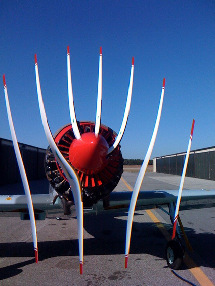
(not Photoshopped).
[via globalnerdy]

The photographer Simon Hoegsberg spent 17 months taking photos from the same spot on a railroad bridge in Berlin in 2007, and put them all together in this megawide panorama (it is 78cm x 100m long), titled “We’re All Gonna Die” showcasing unique – and mostly unaware – people walking about in their daily lives (I wonder what’s up with that title though).
Check out the full photo here.
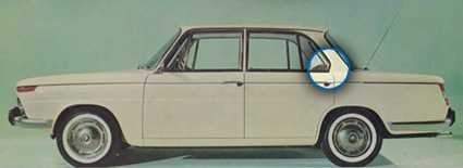
newmediacampaigns has a rather interesting article zooming in to a fine detailing on BMW’s automobile design – the Hofmeister Kink. As seen above (highlighted in blue) in the BMW 1500 launched in 1961, the kink describes the bend at the C-Pillar (rear pillar), representing a turn in the window lines that one may have expected to flow smoothly towards the rear.
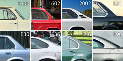
The Hofmeister Kink (named after BMW’s design director at that time) persisted throughout BMWs – and according to newmediacampaign, as BMW became more established as a car marque with qualities of luxury, high-end and quality, the kink itself became a subtle element representing these qualities as well.

Other carmakers caught on, and the application of the kink helped to differentiate similar cars/platforms tweaked towards different market segment – for instance, the Taurus has the smooth lines that coincide towards a sharp angle, while the Lincoln MKS sports the kink.
Quite an interesting read – though I’m sure you will be able to find counter-examples, I thought this was an interesting back story to a design detail that most of us would never even have noticed. Head on the their full article for a more comprehensive read.
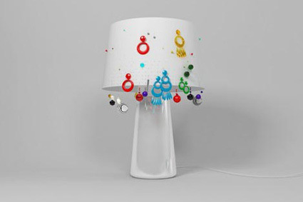

The Sophia Lamp by babbaakcja is a clever parasite design – by perforating tiny holes onto the lampshade (which can form an interesting pattern), women can also hang their earrings on it, and transforming the aesthetic into a different, more personal one instead.

Optimism?
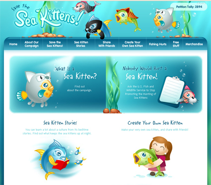
I don’t know how can I react to this – PETA is known for its deliberately provocative and eccentric campaign tactics – but this has got to take the crown. Listen to the plea of the “Save the Sea Kittens” campaign:
People don’t seem to like fish. They’re slithery and slimy, and they have eyes on either side of their pointy little heads—which is weird, to say the least. Plus, the small ones nibble at your feet when you’re swimming, and the big ones—well, the big ones will bite your face off if Jaws is anything to go by.
Of course, if you look at it another way, what all this really means is that fish need to fire their PR guy—stat. Whoever was in charge of creating a positive image for fish needs to go right back to working on the Britney Spears account and leave our scaly little friends alone. You’ve done enough damage, buddy. We’ve got it from here. And we’re going to start by retiring the old name for good. When your name can also be used as a verb that means driving a hook through your head, it’s time for a serious image makeover. And who could possibly want to put a hook through a sea kitten?
Ask the U.S. Fish and Wildlife Service to stop promoting sea kitten hunting.
Right – call the fish a sea kitten to evoke the ‘awwwwwww’-ness associated with the feline. Wow.
We certainly have a tendency to recognize familiar shapes from all actually-random sources: we see faces or creatures in the clouds, we imagine that there is indeed a divine intervention when Virgin Mary appeared on toasts; and now – “cartocacoethes – a mania, uncontrollable urge, compulsion or itch to see maps everywhere”:
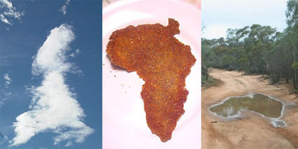
UK, Africa and Australia? Further elaboration here.
[via infosthetics]
Thought this was pretty funny – I’m always partial to these ‘feel-good-motivation’ movies. The speeches and the background music usually raises goosebumps on my skin. But put together, they’ve concocted a rather different (more amusing) tone to it…
The trailer for the film “Objectified” (a documentary about industrial design by Gary Hustwit, the same guy who directed “Helvetica“) is certainly making the rounds around design blogs today – so here you go in case you haven’t seen it yet: