NASA: A case for the Moon

NASA’s internal Powerpoint presentation style was critiqued by Edward Tufte who had even apportioned some responsibility to poorly structured/presented information in Powerpoint for the Columbia crash. Powerpoints like those are certainly not easy (at least for the layman) to read and understand – perhaps those decks really needed rocket scientists to decipher.

A rare gem coming off NASA is this presentation pressing for Moon exploration, though:

nasa-why-the-moon

In the 100+ slides, “Why the Moon?” compares lunar exploration to the expedition to Antartica last century, drawing a case for continued exploration on the moon. Quite an interesting and inspiring read – PDF though.

Auditorium – the Music Game

auditorium-screenshot-1

auditorium-screenshot-2

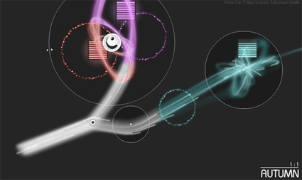
Have a go at Auditorium – like many web-based Flash games it is based on a simple concept and features slickly-executed graphics. The concept that sets it apart from other Flash games is the focus on the audio sensory: you are supposed to solve puzzles by guiding streams of particles to the goals – in the process making music.

Quite interesting!

The art of Keys Arrangement

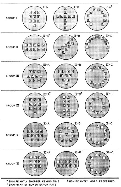
If you’ve ever wondered how they transitioned from rotary dialing to button-press on the telephone, here’s an interesting background story. Before it became a standard that every phone now follows, human factor specialists (or the equivalent in those time) actually tested 18 different possible key layouts:

testing-for-telephone-number-keypad-sequence

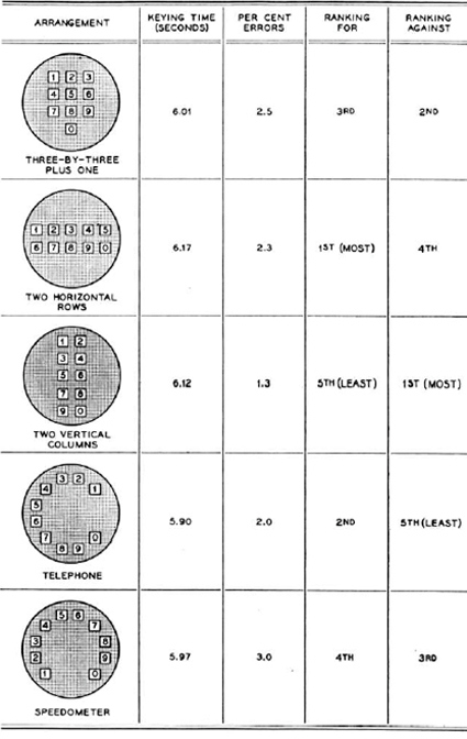
The participants were asked to key in a bunch of numbers and timed for it. Other factors like aesthetics and error rates were also computed. The five finalists were as follows:

test-results

Some pretty mixed results there actually. The familiar layout of the predecessor (the 4th one – ‘Telephone’) scored the best on timing, most likely due to the inherent familiarity. To be honest though I don’t quite know how they chose the (3×3)+1 arrangement that we now have though. From the data it seems it could’ve really gone any way. Perhaps because it’s a less polarizing option?

Now, someone needs to explain why the arrangement is different on calculator numberpads.

And while we’re on the topic of key arrangements – here’s a different but similarly intriguing story about the placement of the arrow keys: how did they come to the arrangement that is standard across all keyboards today? It turns out that there were testing and studies too:

arrow-key-sequence

Check it out here.

[via mental floss]

MUJI Award 03

The MUJI Award 03 results have been released – 1986 entries vying for the prize within the theme of “Found”:

For the coming MUJI Award 3, we want you to find “Found MUJI” from your viewpoint. Learn from the wisdom accumulated by our predecessors all over the world, find good points in such long-established merchandise, and convert them into a design that fits our modern life. We expect to see your “yes, of course” products that are also great in the modern age.

Here’s the Gold Prize winner – Straw straw:

muji-03-straw-straw

That’s exactly what it is – a straw made of straw. Straws have long been replaced in manufacturing by extruded plastic. Straw Straw asks the question “why emulate nature with artificial plastics when nature’s own solution has already been there all along?”, returning back to the natural simplicity of a straw Straw – a reunion of natural material and form.

As judge Masaaki Kanai points out, his reaction was “That’s it – it’s exactly what it is?!”, and probably many are thinking that there is nothing particularly new nor inventive (straw straws were used before plastic straws were used). One might be expecting a stunningly clever new contraption that does something like never before, and be disappointed/confused by the choice for the Gold Prize.

For me it’s symptomatic of the society’s (or at the very least, MUJI and MUJI’s designer-judges) march towards not creating more things. And aptly for this year’s theme of “Found” – seeking the things that have been forgotten, buried, became niche…and restoring it to the consciousness of the mainstream. In that respect, I thought this was a deserving entry.
muji-03-silver-prize

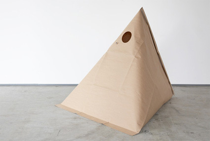
Silver Prize winner is Trash pack for outdoors – taking advantage of the natural structural properties of a pyramid (inspired by the shape of milk packaging commonly found in Japan) for stability, eliminating the need for additional layers of structure particularly for outdoor activities like picnics or camping.

For this concept, I do wonder a bit about disposal though. As the paper bag gets filled, how does one seal it? Paper bags or plastic bags have the natural handles that turn into tying mechanisms – how about this? It doesn’t seem to show through in the award images.

The Bronze awards are: Tachia Mat (hand-weaved straw that can be used as bedsheet); Grandpa’s Nail Hook (nails that have been designed to allow you to pound at it at a specific angle for hanging); Camelia washing-up Powder (byproduct powder from oil-production used as natural washing detergent); Second Skin (double layered cloth: one side soft and the other side waterproof, for flexible usage as towels, bags, poncho, etc.) and Precise Staper (a stapler that helps you align your paper for consistently accurate stapling).

muji-03-bronze-award

Any comments on the winning entries?

The Inside Light

vision

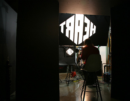
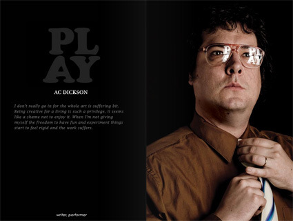
Cinco Design had done a rather intriguing project. The premise is this – inside every designer/creative is a guiding light that shapes our vision and fuel our creativity. So they asked a bunch of people to boil it down to one word, make a light box of it, and take a photo showing the reflection of the word on the person – they even have a making-of:

making-of-vision-light

play

And here’s the interactive e-Magazine from the result of the shoot – TheInsideLight.

What can you buy for $5?

five-dollars

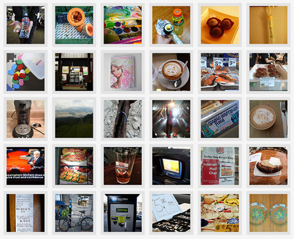
The Advanced Design team in Nokia set up a website – The Five Dollar Comparison – to find out what can people buy with $5 in different parts of the world.

Discussions around the consequences of a truly connected planet have been going on for some time in our organisation, and maybe also in yours. Five Dollar Comparison is a small step to broaden the discussion and explore how the impact might vary across cultures and contexts by asking a simple question: What can you buy for five dollars?