Just saw this ballet performance by Chinese dancers Ma Li and Zhai Xiaowei – an absolutely inspiring, beautiful and mesmerizing performance.
Just saw this ballet performance by Chinese dancers Ma Li and Zhai Xiaowei – an absolutely inspiring, beautiful and mesmerizing performance.

David Report has been turning in high-quality updates and articles on design issues – and this one is no different. Issue 10 chronicles 5 major theme that owner David Carlson observed in 2008 – it is very well produced and inspiring – so head on to browse or download it.
There were some hoo-ha a year ago about the wearing of lapel pins as a sign of patriotism in the USA elections. The small metal accessory was suddenly cast into the spotlight. It became a marker of loyalty and patriotism – the absence of which signifies the absence of these values as well. For all its absurdity, it became a big talking point particularly between the Republicans and Democrats.
One year on, Men’s Vogue commissioned renowned graphic designer Michael Bierut to redesign the lapel pin, “which members of both political parties can wear into the voting booth and beyond”:
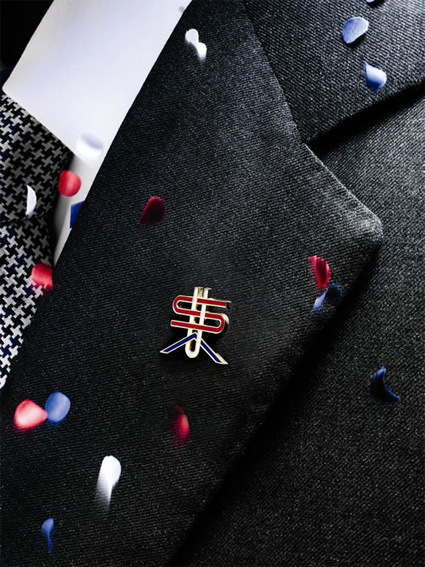
According to the blurb:
“I tried to defamiliarize a very familiar configuration of letters,” [Michael Bierut] explains, referring to his unconventional, interwoven font — inspired by the country’s history as a melting pot. “A flag is a corporate logo. A monogram is much more private.”
…
After nearly a decade of limited lapel options (you’re either with the flag pin or against it), sporting this one shows support for the true meaning of bipartisanship — pride in America.
The first thing I saw on the pin didn’t remind me of ‘melting pot’ and ‘multiculturalism’ though – the $ sign is definitely and unmistakeably the most prominent element on the whole pin. Perhaps this is what you can say unites America – the pursuit of wealth and capitalism?
The next, secondary element that I see is the A that has the horizontal bar removed, with a particularly wide stance. This to me looks much more like a chevron in the military ranking insignia – perhaps a subtle allusion to the US’s military might.
The article makes no direct mention of either of these symbols – even though to me they are quite readily apparent. While these are certainly facets of America that are quite distinctive, I’m not sure if they are integrative or ‘private’, particularly at this trying economic climate with war that has dragged on, where the positions on these issues are frequently much more divisive than unifying.
Or maybe I’m just seeing things with my tinted eyes?
The Universal Declaration of Human Rights is an important milestone in setting out the basic rights and dignity of all people on Earth. Now set in video, it animates more vividly the aspects of the declaration. By the Human Rights Action Center.
wefunction.com had a list of 50 redesigns – from the minor nips-and-tucks to full-fledged revamping of various designs – from logos, characters to products. It’s quite interesting to put the ‘before-and-after’ side by side and see the improvements: sometimes a little tweak can go a long way. Here is the list:
The colors are the same. The graphic is now 3d and the text is made lower case so it mimics what would by typed in a browser. These small changes make a huge difference.
The text was changed to lower case, again making it Web friendly. The colors were also retained. Changing the graphic to a flower was likely done to convey a “green” image.
New colors, new font and new image. It is a nice simple logo.

The text was changed to all caps and a new font was used. The color was retained for one of the “PacMan looking” circles.
By changing the shading, the impact is significant.
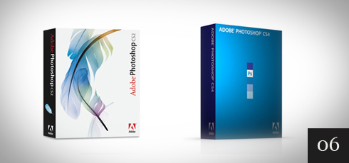
In Photoshop CS4 Adobe went to a solid color packaging and one color font. No way you will mistake one version over the other.
Very nicely done. The font was changed and both words are now in inverse print. The graphic works well both on web site and as the graphic shown in the lower right hand corner during broadcast.

The new look is brighter and fresher. The wording was also made more planar and in order to make the whole word visible from one direction, the letters were brought closer together. Very nice.
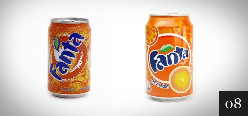
Inverse print and more diffuse colors. Gentle is the theme.
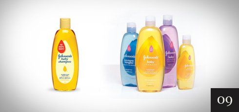
The difference in these is huge. The former version would pass for an older east European model. The new version looks modern.
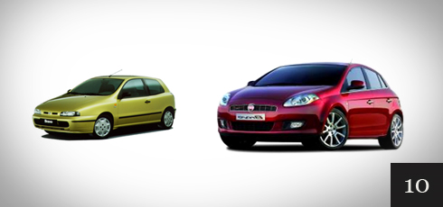
With richer coloring and effective use of shadows, the design looks modern and attractive.
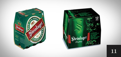
The new font and using a slogan instead of a title is effective. The colors were also updated.
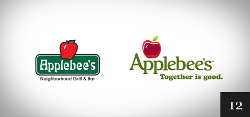
The logo was changed to a round one (similar to Windows Explorer and Chrome) and the name was also changed. By including the blue globe, the colors are attractive.
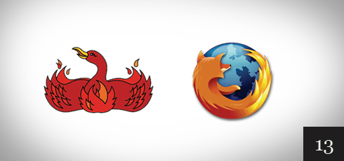
Major change to the color, font and new Graphic symbolizing the Q. I expect to see an update to this one soon.
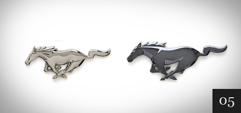
In line with what Ford did to the Mustang logo, dark/black is used with bold shadows to give a modern look.
A simple change of font and as other web properties have done, going to a lower case word.
By bolding the font slightly and creating a shadowed background, the new logo is definitely more modern.
The newer Ford Fiesta design is much improved and is made to look expensive even more so than the Fiat Bravo mentioned earlier.
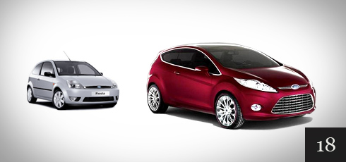
New font and higher contrast. They did not go to lower case. Very clean while keeping with tradition.
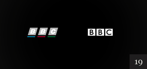
The font and design stayed the same. Only a slight color change and use of shadows makes it look much better.
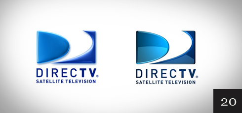
This website redesign was very well done. The new version utilizes brighter coloring and shadows effectively.
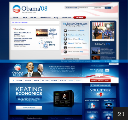
A new larger and bolder font combined with higher contrast is a major improvement.
A new font that is bolded and the removal of the blue line at the bottom is the upgrade here. I’m not sure how effective this change was.
This is another example of how many modern sites are successfully using these design concepts.
By placing the star inside the R instead of outside enabled a slight enlargement of the other letters. The colors were also adjusted slightly. Very nice.
The new model design sure speaks “Lets race”.
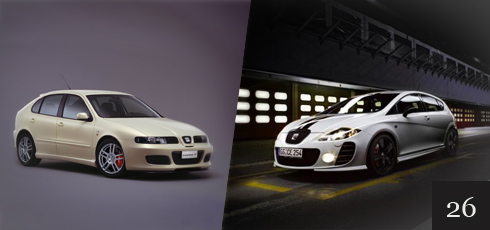
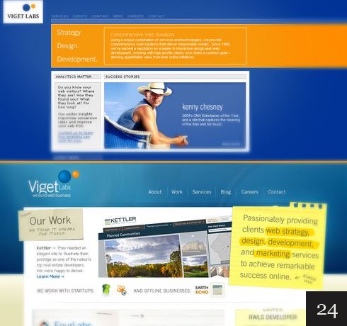
By fully utilizing the background with colors and design, the web site shows off very nice.
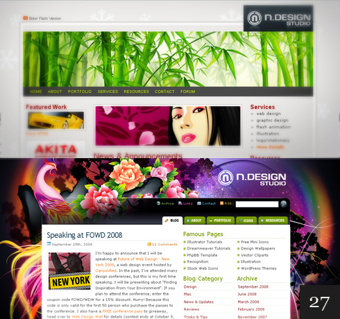
The new design of the BBC website is a huge improvement and is geared toward more video articles.
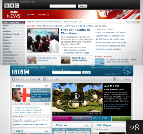
By adding color and shadows, the upgraded site appears modern and has an attractive feel to it.
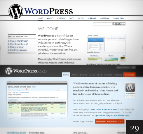
This redesign happened quite a while ago, however, as we have seen, by going to a high contrast simple logo is often very effective.
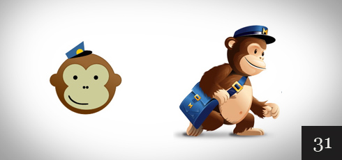
By letting us see the mascot is carrying the mail, the new logo is still cute, but gives us a bit more info.
CNET was already using lower case. I like the updated logo that removed the line between the letter c and n. Shadows were also added to give it a slight 3d appearance. Small but effective changes.
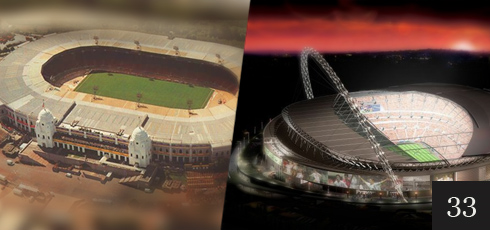
A large and expensive redesign of Wembley Stadium resulting a modern looking structure.
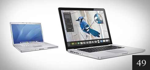
Apple has done well with the designs they use for consumer electronics. Here they use contrast to great effect.
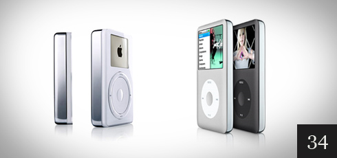
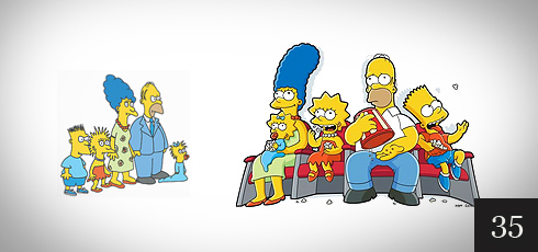
This redesign made the characters more unique and easier to recognize. Very well done.
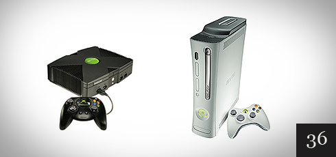
The new design almost made it look like something Apple would produce. The new clean case looks good in modern entertainment centers.
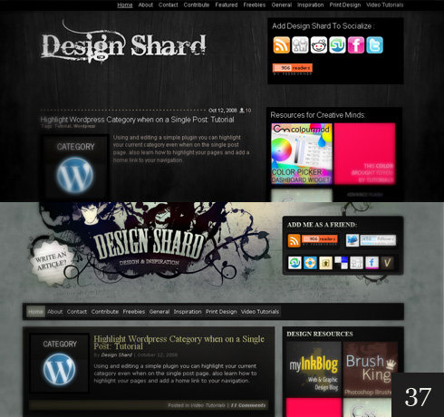
By lighting up the background a bit and a new logo, the sight continues to stay at the forefront in design.
With cleaner lines and an apron, the colonel is also made to appear slightly younger. The letters KFC are also larger and more visible.
New colors and a new font (almost all lower case), improves this venerable logo.
With this re-branding, the logo continues with the old colors, however, the font is bold and in all lower case.
Best Buy did a good job with the original logo and few in the US will not recognize it. The new version bucks the trend to go all lower case and also uses a less bold font.

The new font using the green throughout makes this logo redesign look much improved and modern.
Going to a warmer green color with shadows, and a new font, this is a great improvement.

The color was given more contrast and the graphic was made more abstract with additional colors. The original graphic could be confused with sports so this is a great improvement.
Going to one color and utilizing shadows giving it a 3d look, the Vicks redesign is very effective. It also will invoke an association with the what Vicks sells. The original logo looks like something you would find on some running shoes.
Changing to a high contrast bold font and taking the flame out of the letters was a smart move for this logo.
The original logo was conveying the Amazon river, however, the new logo in lower case fits the company much better. The orange graphic also conveys moving fast, again reflecting the message Amazon wants to convey.

Although this was a buyout, the new logo is a huge improvement that conveys better what the store carries.
Made modern by a solid glass front and a solid aluminum base.
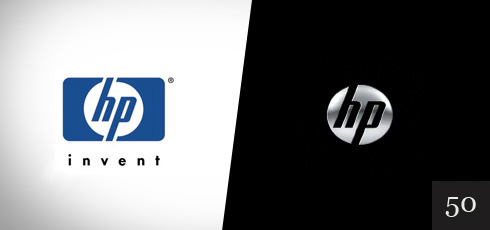
HP added shadowing to the circle for a 3d effect while keeping the lettering and font in the circle, however they have shed the tagline and the frame. A great example of making it simple.
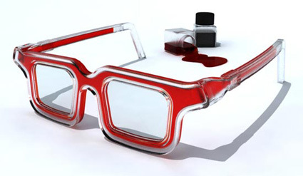

An interesting concept eyewear from Portuguese designer Luis Porem called ‘RGB Rainbow Glasses’:
The structure of the glasses have an internal channel where colorful ink can pass through, allowing
users to choose their own colors. made from plastic the glasses have a flexible arm and can be filled
with water based ink.
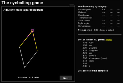
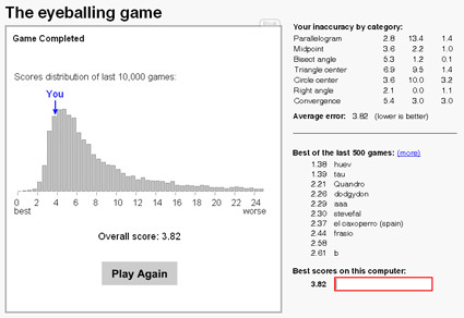
Hot on the topic of sketching – ‘eyeballing’ is one of the essential traits needed to product good sketches. It’s the ability to accurately place where a point or a line should be by imaginarily-visualizing them: finding a midpoint; the bisecting angle; drawing parallel lines, etc. Without good ‘eyeballs’ it is horribly difficult to get an accurate sketch out.
So, test yourself right here with a series of exercises to determine how good your visualization skills really are (the lower the better).
I got a 3.82 (quite a few bad judgments on my second round ![]() – don’t lose concentration!):
– don’t lose concentration!):
This, I think is one of the holy grails of 3D-design, be it product, character or others. ILoveSketch is an absolutely awesome program that straddles the sweet spot between sketching and 3D-modeling – sketching in 3D plane and turning those sketches into curves on 3D space on-the-fly, giving the quickness and agility of sketches, while also delivering multi-view perspective capabilities in 3D models.
Of course, nothing will replace a pair of good hands. No matter what software it is, if you can’t throw a line the way you want it, or even conjure aesthetically pleasing designs in your mind before sketching (proportion, form, weight, curves, etc.), software alone isn’t going to help. What it does though is to increase the sweet spot, and to reduce the turnaround time between a sketch-idea and a 3D-representation.
Now I’m just waiting for it to have a ‘paint’ function where you can render the views, and have it turn out 3D surfaces based on the shading (now I’m thinking too much). That would be the holy grail.
Am I asking too much?
The Opus Design Award is an annual design competition open to conceptual designs of eyewear. Here’s the winner in 2008:
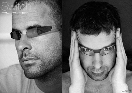
Switch, by Nick Jinkinson, is an eyewear that fully goes from ‘normal’ eyewear mode to ‘shades’ mode, and this won the Gold Prize. According to the designer:
Traditional photochromic eyewear suffers from the problem that the overall design of
the eyewear is usually biased towards one typology: normal glasses or sunglasses. When in tinted mode, normal glasses do not look like convincing sunglasses and therefore can appear compromised. This limits the appeal, which considering how practical it is, is a great shame. Switch addresses this by making a more complete transformation between states. Rather than just the lenses reacting to light, the arms and nose bridge do also, making a distinction between 100% normal glasses and 100% sunglasses.
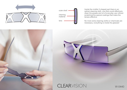
Another entry that I thought was quite interesting was ClearVision by Emil-Dragos Brogdan (winning one of the Special Prizes). Observing that wiping the lenses off dust/moisture/grease was a regular action for the bespectacled, the bridge of this design incorporates cleaning mechanisms as well so you’d not need to bring along any other cloth (or even your sleeve).
I never noticed there were that many…