Designing the Magazine’s Feature Article


Matt Willey recently put together a video snapshot of the design and editing (and editing, and editing, and editing…) process for a Royal Academy magazine cover story. Before the final layout is frozen – there is a pretty long and iterative process that designs in general often undergo before it reaches the final glossy look (which is what most laymen may have access to).

This may help in-part for those of you who have clients or others saying “What? You spent a whole day just on this”? type of questions.

Mortality

how-do-you-want-to-die

How do you want to die?

“Would you prefer to be old when it happens?” she then asked.

This time the response was swift and sure, given the alternative.

Then Dr. Lynn, who describes herself as an “old person in training,” offered three options to the room. Who would choose cancer as the way to go? Just a few. Chronic heart failure, or emphysema? A few more.

“So all the rest of you are up for frailty and dementia?” Dr. Lynn asked.

And then she showed the audience – health policymakers, legislative staff, advocates for the aged and for family caregivers, etc. mostly at middle ages – these graphs:

mortality-curve

Dealing with one’s own mortality is definitely not a pleasant thing – it’s not all fun-and-games, and many of us would probably just turn a blind eye to it, avoid it and pretend it doesn’t exist, so much so that death is in many ways still a conversational taboo. You may ask someone about his family, his career, his life in general, but never about his death. When conversation hits a recently-deceased family member, the standard is just to say “Oh I’m sorry” and to just fudge on from there.

Handling (on-behalf) a sick loved-one’s can prove to be an even more difficult dilemma. Family members with sick elderly often find themselves staring down extremely tough decisions, tangled amongst the vines of exorbitant medical costs, guilt, dignities, care-responsibilities, quality-of-life, etc.

As medical treatment advances we are seeing ways of intervention that can put more time into our lives – but it doesn’t necessarily put more life into our time. At some point we would need to ask ourselves how do we want to age – and die?

[via NYTimes – The New Old Age]

Make a 17′ Gandhi Statue

If you’re in a Gandhi mood today, you may want to pay Joseph Delappe a visit, because he loves Gandhi. Or really admires him. Or something like that. Because for one, he built this incredible 17-feet Gandhi statue (looking somewhat like a video-game character back in the days of Playstation 1 or something – what with the low-polygon count). Not only did he build Gandhi, he’s made an Instructable out of it – so you can make your own Gandhi in your own backyard too!

gandhi

The reason that he makes it is perhaps somewhat more interesting than the sculpture itself. Joseph has an avatar in the online virtual world Second Life called (guessed it?) MGandhi Chakrabarti:

In March of 2008 me and my Gandhi avatar walked throughout Second Life for 26 days to reenact his famous 1930′s Salt March – the forward steps of my avatar in SL were controlled by me walking in real life on a customized treadmill.

… After walking with Gandhi in Second Life for 240 miles I decided it would be interesting to extract my avatar from this online world and recreate him in monumental scale…the process of creating the 17′ tall cardboard Gandhi using a variety of readily accessible (mostly free!) software tools, cardboard and a hot glue gun. The production of this sculpture took a total of 4 weeks, 6 days a week, 9-11 hour days with the assistance of an intern for two-three days of each week.

Here’s MGhandhi walking in Second Life:

[Artist’s Page]

VooDoo Envy Laptop & Packaging

voodoo-envy-box

voodoo-laptop-in-case

voodoo-laptop-unboxing

voodoo-laptop-details

I think Voodoo has certainly showed that they are pulling out every last trick to conjure the absolutely lust-worthy, live-up-to-its-namesake ‘Envy’ laptop. Nothing’s spared – from the packaging we see the high-quality squarish box with a signature cut in front; the microfiber sleeve that comes with it…

On to the laptop itself – taking on a bold, boxy profile with the high-gloss, genuine hand-formed carbon fiber shell (reminds me of Japanese lacquerware or urushi); thickness is only at 0.7 inches (1.79cm); the microweave texture on the surface; and the unique array of dimples replacing the staid trackpad.

There are a few things that I liked about these designs, which are rather rare among other similar products. Firstly, they’ve included the microfiber sleeve that is gorgeous enough to be used as a day-to-day laptop skin – the packaging isn’t necessarily just a temporary refuge for the product waiting to perish after unboxing. Instead I suspect most owners will keep the sleeve and it will remain as an iconic companion together with the laptop.

Also, as everyone’s led and harping about Apple’s ‘simplicity’ I like how Envy’s going on all burners in the details with textures. Personally I think appropriately placed surface textures add interest and detail to a product, helping to prolong an interactive experience with the owner in the longer run. Check these out:

envy-texture-1

envy-texture-2

I think Voodoo have set for themselves a mark to beat.

[More Envy goodness]

75th birthday for Phillips (the screw)

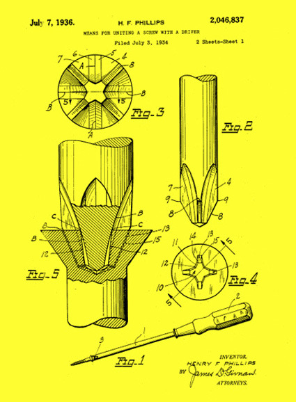
philips-patent-screw-driver

On July 7th 1936 (almost 75 years ago) Mr. Henry F Phillips received a patent for a type of screw and the accompanying screwdriver – the Phillips screw. The Phillips screw has been around for so long, and have been taken for granted for so long that I’ve never pondered about its birth – why did someone come up with a “+” shaped head to go along with the “-” shape. The only thing that went off in my mind was probably, “+” shape has four arms and somehow that makes it easier to turn and less likely to slip.

It was of course that, and more:

The Phillips-head screw and Phillips screwdriver were designed for power tools, especially power tools on assembly lines. The shallow, cruciform slot in the screw allows the tapering cruciform shape of the screwdriver to seat itself automatically when contact and rotation are achieved. That saves a second or two, and if you’ve got hundreds of screws in thousands of units (say, cars), you’re talking big time here.

And not only does a power Phillips driver get engaged fast, it stays engaged and doesn’t tend to slide out of the screw from centrifugal force. Another advantage: It’s hard to overscrew with a power tool. The screwdriver will likely just pop out when the screw is completely fastened.

Ah! That additional bit of engineering, design and thoughtfulness that almost everyone have taken for granted – and I suppose, that’s why it became such a popular fastener.

That said, consumer electronics do seem to increasingly treat screws with disdain – it is now seen more as a blot in the aesthetics, if you will. Could the screw ever one day disappear from manufactured products altogether?

[via WIRED]

Bypassing Chinese Censor

It is well known that the Chinese government proactively clamp down on any media that it deems to run contrary to its own interest. Besides keeping a tight lid on official press such as newspapers and TV reports, popular online forums are also actively patrolled to keep a tight patrol on dissidents that run contrary to their appetites.

Chinese netizens, of course, aren’t simply willing to lie low and submit to that. Apart from technical solutions such as proxy surfing, they’ve also been quite creative in forum posts. Chinese forums are commonly littered with different-but-phonetically-similar words in place of more sensitive terms. But that too, gets caught by the officials pretty quickly.

The latest round in this cat-and-mice game is rather ingenious – rearranging words to read from a different orientation to fool the (very likely computerized) scanning. For instance, instead of writing from left to right, the posts are authored from right to left, or even scrambled to a top-bottom arrangement. This, in fact, heralds back to the traditional Chinese script back when the times where it was written on bamboo strips vertically from right-to-left. Thus, it makes perfect sense for human readers, but State computers may have a tougher time combing.

An example of the scrambling software:

bypassing-chinese-censor

Which made me ponder – captchas have come to become an integral part of the Internet landscape to verify if one is a human or not. This could mean having to recognize jumbled-up digits or alphabets, or recognizing cats from dogs. These are tasks deemed easy for the average human being, but tough for computers to crack.

Could there be other similar hacks around censored forums that are easy for humans to decipher, but difficult for computers to crack? What are some of the methods that defies simple computing power? And tools to achieve this in a forum setting? Scrambling orientation is one of them – could there be more (and more interesting ones too)?

[via WSJ]

Zoomii – Bringing Real Life to Amazon – Fail

zoomii

Zoomii was a website that took the books on Amazon and turned them into a more real-life like display with shelf presence. The covers of each book was arranged in neat ‘shelves’ where you could pan to browse around just (almost) like when you’re in a real bookstore. This perhaps makes online book browsing somewhat more intuitive and leisurely, unlike in typical sites where book-browsing or searching is more like a task to complete rather than part of the joy.

One major flaw for me though, is when you attempted to search for particular genre or books (e.g. ‘Design’), Zoomii brought you a search list instead of zipping you (I’d imagine myself flying) across the shelves to the relevant section (and maybe with a librarian-sounding voice going “Here’re the books you’re looking for” – alright, maybe not the voice).

After all that hard work convincing the user they’re in a bookstore, with one user-search you were dragged right out of that illusion and back to the 2-D world – this did not make much sense to me.  I suppose that is why the web site is now history.

Discussion: Design Competitions worth it?

revolution-copy

Regular reader Scott asks:

We designers and innovators struggle all the time to get our name “out there” so we can more quickly push our designs into reality.  Entering (and winning) such contests as Muji can certainly help, but at what cost?

If you sit back and look at the bigger picture of what is happening, it is really quite sad.  Let’s say a huge company needs to develop a new fun dispenser for their soap product.  They can spend millions hiring a prestigious design firm to get a filtered short list of a few new ideas put together by a team of perhaps 5 designers, or they can sponsor a design competition – disguise their motive in the form of a “challenge” to the designers of the world.

As in most design competitions, it would not be surprising to see 5000 designers enter from around the world.  Each designer would carefully follow the rules, in many cases pay a FEE of up to perhaps $100 or so and then spend hours carefully and vividly illustrating their novel work, presenting it in the exact form required by the rules of the competition (and the sponsoring company).  They would then submit their invention, their design, their intellectual property to so-called “judges” who work with the sponsor to determine select winners.  During this process, the sponsoring company has the privilege of inspecting the outcome of perhaps the biggest brainstorm session in the world.

The cost to the company is minimal (pay the judges and award $10,000/ $5,000/$1,000 to the winners).  For this small cost, the company gets to see incredibly diverse and innovative concepts from great minds of many parts of the world (ideas that have not be shown before) AND they get the rights to the designs they want AND they don’t have to pay royalties or give the struggling designer any design credit to HIS or HER design, AND they also get free advertisement as a result of being the sponsoring company (it looks like great PR – a win win win for the company).

Are we fools here?  I’m surprised all companies don’t tap into this wealth of eager brains.  We need to form a union to protect our innovations from the corporate world.

If we don’t win, which is often the case, we don’t even get any constructive criticism from the judges for our fee.  So we don’t really learn from the experience (design wise) and honestly, we can’t be certain that the judges even looked at our designs.  We often don’t even get a courtesy email to let us know that we didn’t make the next round.  I wish there was a better way.

What are your thoughts?