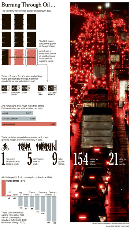
Burning Through Oil

burning-through-oil

I think New York Times is getting a habit of churning out informative and well-designed graphic aesthetics – here’s another one on oil consumption. Even as I know how much Americans drive, it still somewhat surprises me that there are 154 drivers who drive alone for every 5 commuters. Click through for the full view.

Speaking of infographics, I’ve also just stumbled on this great list of what can be described as the Holy Grail of of infographics links right here – sit back and drool over those cool graphics that make information sexy.

Flogo – Cloud Logos

flogo-cloud-logo

Flogos are flying logos – a company has found out how to make these puffy white things and set them up into the sky, bearing whatever marques you wish to have through stenciling. The sizes aren’t too big now – from 24 inches to 48 inches – so you aren’t about to see a giant logo hanging on the horizon over the city’s skyline, yet. So for now, they’re still cute, funky little things that’d be great to spice up your launch event or what-have you.

But I’d imagine them getting bigger as technology improves. New and bigger. From 48 inch to 48 feet. From white puffy things to multicolored splendor (Flogos is already working on tinted versions).

The thought of walking out of your house, and being unable to avoid advertisements and commercials even in the skies is rather troubling. Right now we’re seeing them on billboards, signs, streets, buildings…imagine when the sky’s full of these clouds too. On one end of the sky you see a whole patterned formation of LV’s monograms; elsewhere you see McDonald’s arches and Apple’s half-eaten apple jostling for space and attention, each pretending to be a clever gimmick, a part of nature’s clouds – when they are patently not.

And if these cloud-logos are just that – a bunch of water vapor – how would a city district regulate it? Can you classify it as a blimp that needs license for the airspace it permeates? “But it’s just a cloud!”. And it can probably be released anywhere, rather anonymously and difficult to trace.

Maybe I’m just in a bad mood.  Anyway, below is a video showing the small versions floating indoors.

Reproduction Artists Paints Themeslves

Apparently a village near Shenzhen, China called Dafen is responsible for 60% of the world’s reproduction oil printings. They operate by reproducing famous paintings at the request of clients, much like a factory, except that instead of factories the production is still done by hand.

REGIONAL collaborated with some of these artists to paint a picture of themselves, using the same technique and styles of the masters they reproduced:

REGIONAL productively collaborated with the otherwise commoditized community in Dafen by asking selected individuals, some for the first time, to imagine themselves in their professional medium. The final works show the technical, creative, and professional facets of the artists identities subsumed by the styles and relationships they maintain with specific famous artists. The hybrid result of original subject with derivative style comments on originality, global cultural production and REGIONAL’s cooperation with emerging enterprise forms that are internationalizing the village.

The product of the collaboration are sets of images (seen below) comprising a digital photo of the artist in his studio, an indicative painting of their usual output and an original self-portrait. While the final works contain both the creative signature of the original masters and the emergent self-consciousness of the Dafen artists, it is equally important to note that they derived great fulfillment from using their talents freely, and were remunerated at a rate commensurate with the unique international nature of the project.

painters-paint-themselves

If you think of a reproduction factory, perhaps the analogy that comes to mind is a photocopying machine. Painting in (original), painting out. But as these self-portrait clearly shows, there is an important but subtle difference. The artists mastered the technique to paint in a particular style, with as much skill level (painting technique wise) as Mr. Van Gogh, Renoir or Da Vinci. And it is this that gives them the ability to paint other (original) paintings such as these self portraits.

Which makes me wonder – what if these obviously talented/skilled artist came to to venture on their own? Would they be unable to paint anything that isn’t the exact derivative of the master-style that they’ve adopted? Would it probably be a question of social-connection rather than technical mastery that hinders them from being recognized as an artist in their own right?

[REGIONAL blog with several more examples]
A case of Brand Over-extension?

Now, what do you think of when I say “Kellogg’s Cornflakes” or “Frosted Flakes”? Maybe breakfast, send-the-kids-off-to-school…generally the warm fuzzy young-family feel. So you might expect Kellogg’s to tie up with back-to-school-campaigns, tupperware, SUV, stationery, and all that.

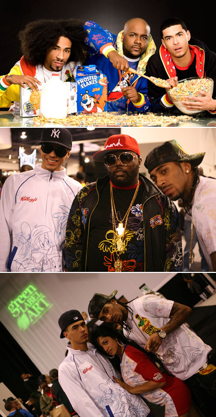
But it was a surprise when I saw the new ‘Premium Licensed Apparel’ from Kellogg’s called ‘Under the Hood‘:

kelloggs-under-the-hood

It is either the most innovative, surprising and daring reach-out, or (what I think) a really-awkward brand extension into a mood/category that is in the almost direct contradiction to the original brand image. Maybe a marketer looked at the demographics buying the cereals and thought – “Hey this group buys quite substantial amount – let’s appeal to them!”.

To me though, it seems like this will erode the principle brand equity that Kellogg’s has been building over the years. The street and almost ‘gangsta’ feel is really awkward on Kellogg’s. But who knows – maybe out there, Tony the Tiger can give you some street cred!

Inspiring Video


A very powerful message encoded in a very clever narrative – it’s all a matter of perspective and choice, isn’t it? If that previous sentence seems a little cryptic – just watch the video titled Lost Generation – I just don’t want to spoil it.

What are you doing now that is making your world, and this world, a better place?

In the Grand Scheme of Life

Some posts back, I blogged about Carl Sagan’s insightful and inspiring take on the smallness of mankind in the grand scheme of things – Earth was really just a speck in the universe, and humans are, in turn, specks on this little blue dot.

Here again, is yet another take on the smallness of Man in the grand scheme of Life. A visualization we might all be familiar with – the branches of life zoomed out in each frame to reveal its place and proportion in the overall picture.

And with this perspective, does the further divisions – the artificial divisions that we have erected in our existence – race, nationalities, religion, origins – start to fade away, and perhaps seem somewhat less surmountable?

human-tree

How far we’ve come

Found this bit of recollection on the Times of India (excerpt below):

And if you did have a phone, it wasn’t necessarily a blessing. I spent my high school years in Calcutta, and i remember that if you picked up your phone, you had no guarantee you would get a dial tone; if you got a dial tone and dialed a number, you had no guarantee you would reach the number you had dialed. Sometimes you were connected to someone else’s ongoing conversation, and they had no idea you were able to hear them; there was even a technical term for it, the ‘cross-connection’ (appropriately, since these were connections that made us very cross). If you wanted to call another city, say Delhi, you had to book a ‘trunk call’ in the morning and then sit by the telephone all day waiting for it to come through; or you could pay eight times the going rate for a ‘lightning call’ which only took half an hour instead of the usual three or four or more to be connected. As late as 1984, when a member of Parliament rose to protest this woeful, appalling performance by a public sector monopoly, the then communications minister replied in a lordly manner that in a developing country, telephones were a luxury, not a right; that the government had no obligation to provide better service; and that if the honorable member was not satisfied with his telephone, he was welcome to return it, since there was an eight-year waiting list for this supposedly inadequate instrument!

Indeed, it’s probably easy to take for granted these infrastructure that have improved communication so drastically – even as we’re now looking at the imminent decline of the phone line as mobile communication and VOIP now makes the fixed-line phone looks somewhat inadequate. Still, some great perspectives!