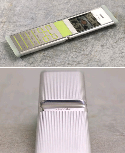
NOKIA Remade – Sexy Sustainable Phone

nokia-remade

When I first saw the picture of this Nokia mobile phone I thought – “Wow, that look really sleek! A nice, simple and yet certainly stylish phone – is it yet another venture into their premium metal-casing series?” Reality isn’t always skin deep – and in this case, it was certainly a greater pleasure once I discovered the idea behind.

This is a concept phone where Nokia explores the idea of sustainability – certainly a very pertinent issue in a billion-unit-a-year industry:

We drew on a simple insight that in the not too distant future humanity will have extracted and worked much of the valuable minerals once buried in planet Earth. We will be compelled to reuse and celebrate what is essentially “above ground”. Thus we explored the use of reclaimed and upcycled materials that could ultimately change the way we make things.

In remade, recycled materials from metal cans, plastic bottles, and car tires are used beautifully; whilst helping reduce landfill and preserving natural resources. The concept also addresses cleaner engine technologies, and energy efficiency through power saving graphics.

I’m always irked by the common misconception that green products are a compromise to ‘the real thing’, a sacrifice or a trade-off one makes. And I’m glad this exploration shows that sustainable can be really appealing – this phone is certainly sexier than many on the market right now.

Here’s their little promo video:


Extreme FlatPacking

casulo-furniture

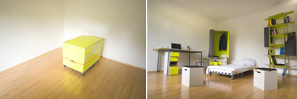
Wow, this is really taking IKEA on its head and beating it flat (no pun intended). All the furniture that you see on the right came from that one (not-so) little box on the left picture. Just perfect for that somewhat temporary stays like those in college but have to rent their own apartments. Here’s how it’s done:

Designed by Marcel Krings & Sebastian Mühlhäuser, who are looking for production partners to bring this onto mass-market.

Year of the Rat!

It’s going to be the Chinese New Year soon. For those of you who celebrate, I wish you a prosperous and fulfilling new Year of the Rat. And for those who don’t, check out this video of this Mighty Mouse:

Morality of tampering with genetic materials aside, this experiment is rather intriguing. Researchers at Tokyo University stripped the mouse of its inherent ability to fear cats, resulting in this rodent that is fearless even of its own natural nemesis. Weird, or scientific breakthrough?

Grand Central – Frozen

I’ve been a great fan of Improv Everywhere (Improv Everywhere causes scenes of chaos and joy in public places – they ‘spontaneously’ do something out-of-the-blue in a public space to bring a short, abrupt but memorable twist to a day in life). But I think they really outdid themselves in their latest mission – the Frozen Grand Central:

On a cold Saturday in New York City, the world’s largest train station came to a sudden halt. Over 200 Improv Everywhere Agents froze in place at the exact same second for five minutes in the Main Concourse of Grand Central Station. Over 500,000 people rush through Grand Central every day, but today, things slowed down just a bit as commuters and tourists alike stopped to notice what was happening around them. Enjoy the video first and then go behind the scenes with our mission report and photos.


Amazingly fun! I just wished they have it everywhere in the world!

Philips Robotskin


Here’s an advertisement for Philips shaver, set in a sci-fi futuristic setting. I liked the artistic direction and details of the film – but at the same time, I can’t help but to wonder whether it’s (waaaaay) too elaborate for a shaver. If it was for a car, I can still associate the emotional attachment. But for a shaver, it is attempting to give too much of an mystical aura to a shaver – is there anybody that emotionally engaged and invested in their shavers?

Comments + Critique Time

You might’ve missed a rather interesting discussion in the comments of one of my earlier posts – about the patent and novelty issues on the MUJI winning entries. Scott, a designer-engineer-patent-agent hybrid brought up some interesting perspectives, and in our conversation I thought it’d be a pity that we don’t get to see the other entries.

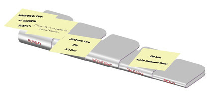
The first one is called Postie. “It’s a simple bent structure that offers a day-of-the-week platform for POST-IT’s to help organize the THINGS TO DO and various meetings, etc per week. As you know, the mind works well graphically and this simple structure should help the worker visualize what needs to be done and by when.”

postit-stand

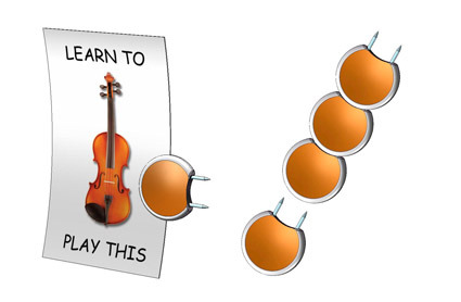
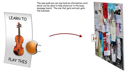
The other idea is the Tackie. Scott: “This one is a two-pin thumb tack that is designed like a coin (better grip) and further includes a curved slot that can receive a card for advertisement. I know using two pins for thumb-tacks is known, but not the combination of two pins and a coin-like handle and the slot. The thumb-tacks are also stackable for cleaner and safer storage.”

pin

muji-01-sheet-2-copy

Personally for POSTIE, I liked the idea of using Post-Its as a medium for activity planning. Them being spontaneous and convenient gives a more flexible approach to laying out your schedules – adding an appointment simply means tacking on an extra note in the relevant space. However, the design solution felt rather clunky (despite it being collapsible) – it seems too much of a material structure for the sole purpose of delineating days. Could the same purpose have been achieved not by a metal product but maybe by graphics, especially as MUJI is rather particular about clutter.

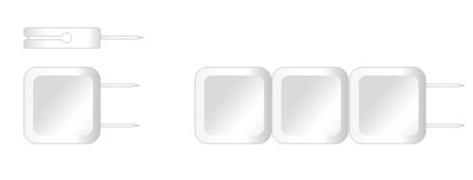
As for the Tackie idea, I definitely agree on the easier-and-safer to store part. Most pins are cluttered in boxes which can be difficult/’prickly’ to retrieve. I was mentally trying to search for applications for these pins though – what are the wider applications apart from the notice board (which seems rather niche). Aesthetically, I think MUJI has a rather particular ‘fetish’ for being simple and not overtly attention-seeking. Maybe something like this?

pin-suggestion