Global Package Gallery

global-package-gallery

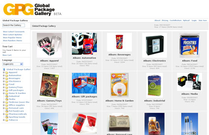
If you’re designing packaging, you’d probably find the Global Package Gallery very useful as an reference for what have been done before.  It’s an archive (still in BETA stage, though reasonably populated already) of packaging designs categorized into various types: beverages, food, electronic, etc. With more time the site might very well expand and become the grand daddy archive of good packaging.

Meat Part Keychain

meat-parts

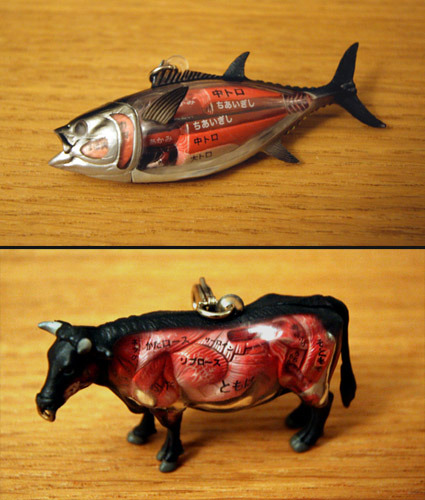
Any of you can’t separate tenderloin from sirloin? Yeah, me neither. These little key chains called ‘Gotoshi Dissection Animals‘ help you distinguish each part of the animal. They’re not actually limited to only popular edible animals though – I doubt, for example, that you eat pandas on a regular basis.

What’s the catch (pardon the pun)? Well you’d have to learn Japanese first before you can understand the naming – so it may still be easier to memorize the anatomy!

iPhone Guitar

Give a man a fish. Give a man a fish and you feed him for a day. Teach a man to fish and you feed him for a lifetime.

Give a man (or for that matter, hopefully many men) an open platform in touch-interactivity, however, and you’d start to get really interesting and creative applications – quite certainly more than you’ve ever envisioned yourself. In this case – it’s for the Apple iPhone. Previously some concepts like Starbucks coffee ordering sprang up on the net – while perhaps useful I didn’t think it was particularly creative in harnessing the iPhone’s capability.

This one, however, is pretty cool:

iphone-guitar

While it’s still in a rather primitive state currently, it does show potential in really harnessing and leveraging on the iPhone’s touch-sensor capabilities. Imagine a guitar that fits in your pockets! Practice and pluck over with your earphones while you travel, to the accompanying MP3 tune on the phone! Too bad Apple’s still insisting on a closed platform.

Building 3D Models by Tracing


It seems like 3D modeling is getting easier and easier – trace the overall outline from a video and voila – you’ve got a material-ed and rendered 3d object! Of course this is the promotional video which means that everything works approximately 132 times better than the actual application. But it’s still quite impressive nonetheless to me.  I believe that there will be a time where 3D modeling skills are like typing skills nowadays – everybody (kind of) has it, and it doesn’t matter that much anymore since it’s relatively much easier. While we’re probably still years or decades away from that, it certainly looks like software and AI for 3D are heading in that direction…

Whale Blimp

whale-blimp

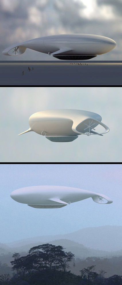
With all the talk about reviving the airship in the recent years – it seems like this  peaceful and spacious mode of travel (as compared to the airlines which are still desperately trying to trim half-inches of leg rooms) could be back for a rebirth after the much-documented Hindenburg disaster. If they do come back, I’d wish for it to be in the form of this ‘Manned Cloud’, a concept airship developed together by Jean-Marie Massaud and the French national aerospace research body ONERA.

Airships are certainly no match for traditional airplanes in speed or efficiency – but it’s certainly much more relevant in leisure purposes like an ‘air cruise’. Capable of hovering at much lower altitudes (typically 500-1000 meters above ground), it brings being-in-the-air as an experience in travel itself, rather than simply a means-to-an-end. As described by Massaud:

Living in the sky, watching the Earth from above. Rediscovering the marvel of traveling, experiencing contemplation. Exploring the world without trace


Manned Cloud is an alternative project around leisure and travelling in all its form, economic and experimental, still with the idea of lightness, human experience and life scenarios as the guiding principles. The spiral of Archimedes is the driving force of this airship in the form of a whale that glides through the air.

I thought the form had the peace, grace and elegance associated with this mode of air travel. It sort of brings us close to nature again in appreciation.

Wallpaper Design Awards

wallpaper-title

Wallpaper, the art/design magazine that I’m sure many of us are familiar with, have just published the Wallpaper Awards 08, giving kudos and recognition to great designs in a wide field, including best city, public housing, fashion and even specifically grooming product.

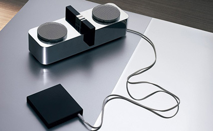
As a product designer I am of course partial to the ‘domestic appliance’ category. With a jury mix that is more eclectic and varied than many typical design awards – including Donatella Versace, Tadao Ando and Wong Kar-Wai – the products selected all seem to ooze personality and soul. The winner is the Katamari 01 Speakers by Gizanze:

katamari-01

Other finalists include:

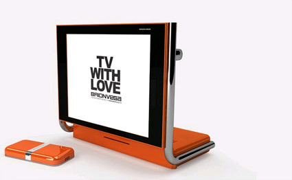
Alpha TV by Brionvega

brionvega

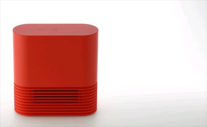
Heater by Plusminuszero

plusminuszero-heater

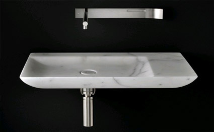
L10 Washbasin by Boffi

l10-washbasin

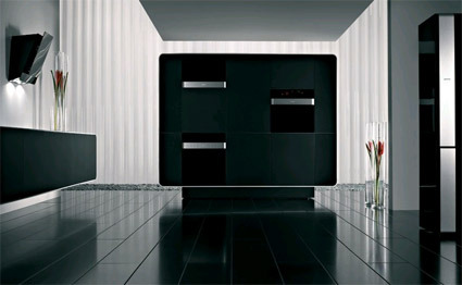
Gorenje Kitchen Appliances by Ora Ito

gorenje-kitchen-appliances-ora-ito

What’s also really interesting is how they honor their winners. Instead of solely plastering the glamor shot of the product, they’ve also made a 15-second animation for each winner – check it out (total of 10 categories) !

Permutations for Obama’s Logo

obama-logo

A while ago in my post ‘Visual Branding – More than a Mark’, I mused about the changing nature of a (company’s) branding identity. While the traditional notion of branding is a strong, iconic but static symbol, we are starting to see much more versatile branding identities that leave room for permutation and re-interpretation. An extract from that post:

They are often just as strong and iconic (if not more), but they have an added dimensionality and freeplay that allows for creative interpretations of the symbol, rather than just a static stoic symbol.

It’s great though to see brands getting more alive and versatile. With the new mediums of expression (cellphones? Google Earth views?) and the Web2.0 culture of hacking and mashing, a versatile logo allows the audience not only to receive but also to actively reciprocate and reinterpret what these brands mean to them …

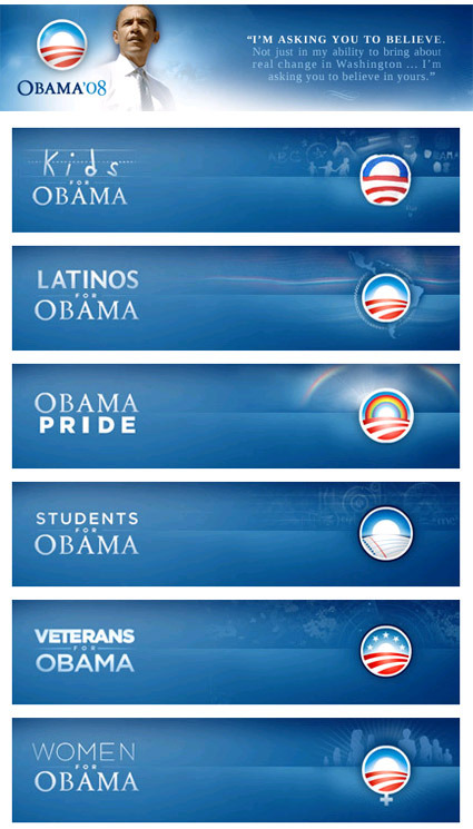
Shown above are Barack Obama’s campaign logos. While the top one is the official icon, there’s also a whole range of other icons that were tweaked to cater to the various niches while retaining the strong and very recognizable primary branding. The free-exchange nature of the Internet has definitely encouraged ‘mashing’ of different elements for customization. As a nod to the web culture, these logos are even available for download on his website, and at 96×96 pixels they seemed to be precisely targeted at web-uses such as online avatars for forums and instant messaging services.

If your company’s logo isn’t versatile enough to accommodate re-interpretation and transformation (hey, even politicians have done it), you might want to consider some change as well!
NIKE Ads – ‘Defy’ and ‘Endure’


I came across and was very much inspired by the two ads above from Nike, titled ‘Defy’ and ‘Endure’ respectively. They were really wonderful in many senses. For both videos, a series of really expressive scenes extracted from sports played in slow-motion, coaxing and allowing the emotions from the sportsmen/women to really flow out to the viewer (with matching background music too).

‘Defy’ paints a picture of hope and of celebration of the human body – how great athletes seem to defy gravity and common notions of what is possible – aptly ending with the tagline ‘A little less gravity’. On the other hand, ‘Endure’ takes a straight look at the less glorious part of sports – the agony in endurance, defeat and disappointment, with the tagline ‘A little less hurt’. Juxtaposed together, they show poetically the humanness and the emotions in sports – and that they are very much simply two sides of the same coin.

If you have been inspired and motivated by the strength of human spirit in sports and endurance, be sure to also check out this story which has been floating on the Net recently, chronicling the superhuman feat of a 61-year old farmer who beat professional athletes in a grueling 875-km race, simply because he didn’t know he was supposed to stop and rest.