MIT RoboScooter

mit-smart-cities-roboscooter

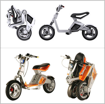
The RoboScooter is a lightweight, folding, electric motor scooter. It is designed to provide convenient, inexpensive mobility in urban areas while radically reducing the negative effects of extensive vehicle use – road congestion, excessive consumption of space for parking, traffic noise, air pollution, carbon emissions that exacerbate global warming, and energy use. It is clean, green, silent, and compact.

“We looked at existing folding bicycles and we looked at origami,” Mr. Mitchell, professor of architecture and media arts and sciences, said of the design. He said the students liked to call the vehicle “the cuter scooter.” The final show-quality prototype was presented at the Milan Motor show on November 6-9th, 2007.

Scooters are often the best form of transportation in some urban areas, be it the bustling but narrow alleys in developing Asia, or along roads in historic cities like Paris and Rome that have been constrained from accommodating to our modern forms of transport. Quick, agile and economical, they are perfect for zipping from point A to B – at the same time reducing some hassles associated with driving, such as parking space.

The RoboScooter from the MIT lab was the outcome of the collaboration between MIT’s Smart Cities group, San Yang Motors and Taiwan’s Industrial Technology Research Institute. Taking the versatility and portability factor even higher – this scooter features a foldable body unit, allowing it to be stowed neatly in crowded urban spaces and apartments. This was achieved with the use of electrical motors that are placed within the wheels, which eliminated the need for a drive-chain. The electric engine also create less air pollution – just what we need in the cities.

Overall I think the design is pretty well-done, especially considering the fact that it has only 85 parts (as oppose to approximately 250 parts in a typical gasoline scooter). Personally, there is a bit of lost-in-translation between the top render and the actual prototype – it seemed to have dropped some elegance/neatness along the way. Could it be the exposed wires and joints? Or maybe even the color schemes. But I think I’m asking too much… (Yeah, I also know one that side-view tends to conceal much more than the more unforgiving perspective…). So, well done MIT et al. – hopefully we’d see some of these on the streets soon.

Userful Computer – Split your PCs

userful-computer

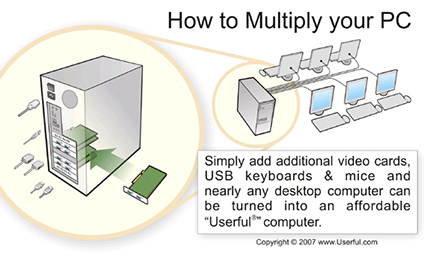
I came across this software called Multiseat by a company called Userful. It lets you leverage the power of one physical CPU for up to 10 virtually separate users. As we know, CPUs and processors are getting ever more powerful, while much of what we do (email, browsing, etc) doesn’t really require the full strength. With this software, you can have only one physical computer for your home/office – everyone still works independently, running programs, opening files on their own display and inputs. This is especially valuable in commercial/public sector works where the computer is used to run small and simple programs – like a inquiry terminal in a library, or an Internet kiosk in an airport, for example.

This could dramatically reduce the costs needed, be it hardware or software. On the environmental note, this would certainly also consume less resources (be it electricity or in production of hardware) than having the full configuration. There seems to be some issues with software licensing though – can you only buy 1 copy of the software, or do you still need to buy by the number of people using? Perhaps that’s why it seems on their website they only have it for Linux so far.

Personally I’d hope it’d come onto the mainstream Windows too – and the bonus would be to develop wireless connections between the CPU box and the input/output (monitors, keyboard, mouse). One central wireless home server/computer for everyone’s needs. Perfect!

Instant Table

instant-table

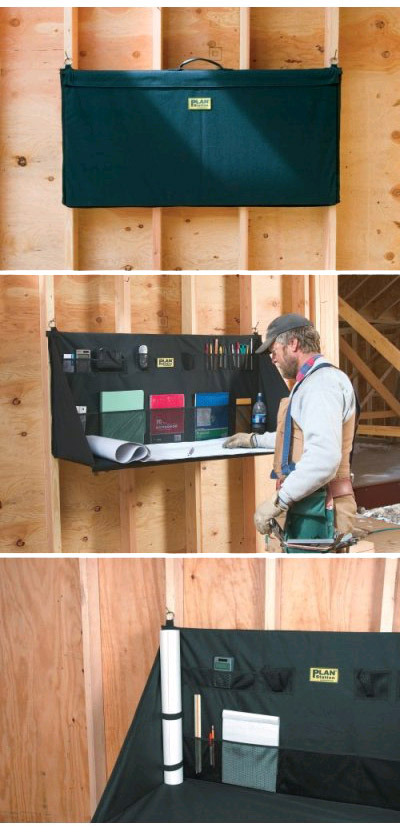
Here’s a pretty interesting design of a table that was designed explicitly and specifically for use at a construction site. The details in the design show. Made of rugged nylon, the fabric ‘bag’ transforms into a table when you open it up and sliding two standard pieces of plywood into it sleeves. You just hang the whole station onto two nails on the wall – a quick work for the folks at construction site – certainly much quicker than building (and later dismantling) a proper temporary table. The hanging rings are 48inches apart, so it fits nicely onto the ribs in the standard 16″ wall-stud system.

While the meshes hold various documents, there’s even some thoughtful bands for holding up rolls of blueprint at the corner. There’s also a power-cord outlet at the far corner of the table, allowing cables to be plugged for laptops etc.

As the blog ‘unpressable buttons‘ say – “Products intended for a wide range of users and uses often suffer from attempting too much versatility – it’s tough to be everything to everyone. But something which is this focused on being exactly the right thing for one specific use and user stands a pretty good chance of doing it!

You can find this on Amazon here.

Million Dollar Homes

It’s a new year – and it’s the time for resolutions and such. For many, getting richer could be one of the targets this year, and being a millionaire is still many people’s dream. That magical milestone will still be elusive to most – nonetheless it’s a financial goalpost (or dream, if you’re less optimistic) for many to strive and aim for. Yet, it seems being a millionaire perhaps isn’t all that ‘rich’ anymore in the real sense.

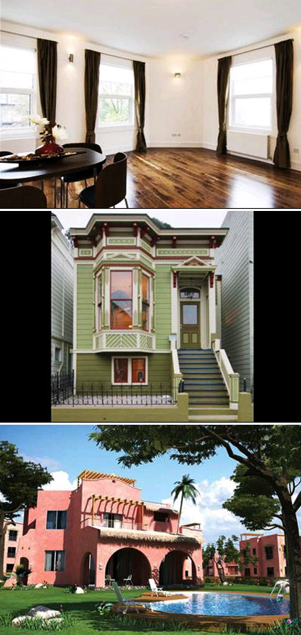
Forbes did a scan of what a cool $1million can buy in terms of real estate properties across the world.  In most of the major cities in the developed world, a sub-1000 square-foot apartment is probably all you’re gonna get. It’s only when you shift to the developing world (or a much less prime location) that you’re going to have some land under your feet.

In London you get a 1-bedroom 1-bathroom apartment at Primrose Garden. It’s the same story in New York, you might settle for a 650 square-foot condominium in Turtle Bay Manhattan. You could get some land in San Francisco – if a 1900-vintage Victorian-style home is your taste. But to get some real footage – like the villa or bungalow that you might envision yourself living in when you’re a millionaire – you’d have to venture into places like Kenya or Egypt. (Million-Dollar homes – from top: London, San Francisco, Egypt respectively)

million-dollar-homes

So – two choices. One – realize that being a millionaire perhaps isn’t really that jazzy or *gasp* rich anymore. You probably can’t really ‘live it up’ for your life with that – and decide to work really hard to become a billionaire (now we’re talking). Two – realize that there are in fact more things to life than big (or even, small!) homes in prestigious addresses, and so decide to still work hard and achieve financial and other dreams, but keeping them still in rational perspectives.

Clever Shower Curtain Rail

pluviae-shower-head

pluviae-shower-head-2

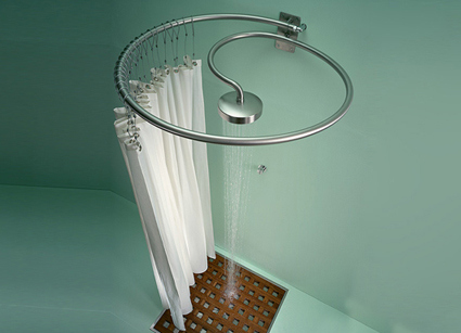
A metal water pipe attached to the wall well above head level describes a complete circle before spiraling on itself and completing its journey at the shower head, located in the very center of the circle. If you want a shower curtain, all you need to do is to hang it from the water pipe, which doubles as a curtain rail: it could hardly be any simpler.

Ah! Cleverness and elegance in the solution! Why have two things when you can accomplish the objective in one? Designed by Matteo Thun & Partners,  this shower head + curtain rail combo would certainly add an element of interest in your bathroom.

Retouching Photos – the Process

christophe-huet-touch-up

We’re all probably very familiar with photo-retouching – especially after that ad campaign by Dove. There are of course master ‘touch-uppers’ who are very skilled artists capable of turning one photo into quite another image. While portfolios of these touch-up artists often show before-and-after pictures to showcase their abilities, Christophe Huet went a step further in his rather well-done portfolio website – he also shows quite a bit of the intermediate steps to show how the transformation was done.

And it’s kinda amazing how much detail was reworked in each picture – even the tiniest ones far off in the background. Just goes to show sometimes, you really do have to fabricate the perfect picture that works.

MUJI Award 02 Ceremony

muji-yurakucho-entrance

That is the MUJI Yurakucho, MUJI’s 3-storey flagship store in Tokyo. Practically all of MUJI’s wares are on display here, ranging from furniture, apparel, electronic/electrical appliances to household and lifestyle products.

party

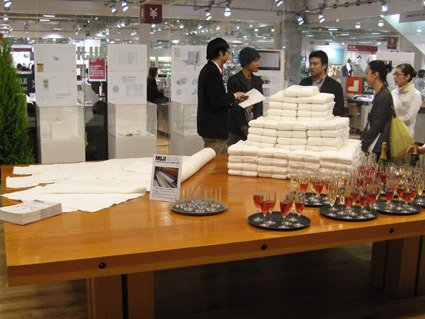
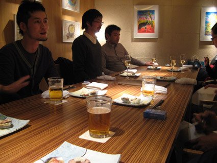
For this ceremony, they have converted the usual MealMUJI (a restaurant within the store) to the grounds for the awards ceremony. Pictured above are some of the winners of this year’s competition, with the Gold Award winner (the towel) on the table.

winners

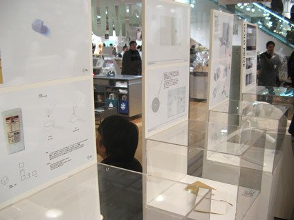
More explanation and prototypes.

muji-award-jury

Luminary judges giving their comments about the challenges of the MUJI design competition, the quality of entries and what really is MUJI about (Pictured above: Masaaki Kanai, Takashi Sugimoto, Kenya Hara and Naoto Fukasawa).

muji-dinner

At the end of it all, they also brought us to a great Japanese restaurant.

MUJI Award 02 & More on ‘Chronotebook’

muji-award-02-results

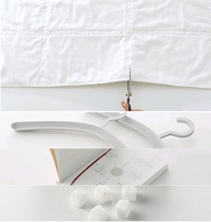
You might’ve known that the results for MUJI Award 02 was announced some time ago – the winners were selected from among 3422 entries from the world. ‘Towel with Further Options” won the Gold Prize:

This bath towel moves your mind toward further uses of the product. Towels take every day dirt and gradually become damaged. In accordance with such changes, you can downsize the towel with “further options” from a bath towel to a bath mat, and then to a floor cloth and dust cloth. The towel has a vertical and horizontal textured surface that does not produce pile-fabric waste when cut with scissors. The lines act as a marker for cutting and form square modules that let you imagine other uses, encouraging you to re-use it.

The rest of the entries are the Stackable Hanger, Chronotebook and Kakujio (cube salt). In this post, I’d like to explain more about the Chronotebook design: if for no other reasons – well, because I’m the designer behind this. As the title implies, this is a notebook with Time as a central element in design.

chronotebook-outside

On the outside, the Chronotebook is a rather plain notebook meant for daily use – much like a daily planner. It is A6-sized, thus able to fit into your pants pockets if you really wanted it to. It comes with rounded corners both for aesthetic purposes, as well as to minimize ‘dog-earing’ of the book pages as you use it. A handy bookmark ribbon helps you remember which page you stopped at. Overall, simple plain MUJI-ness.

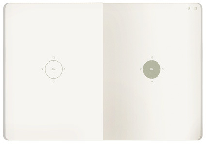
chronotebook-inside

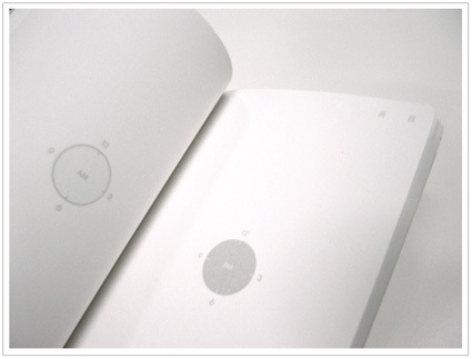
The inside is where the difference lies. Instead of lines and rows of scheduling grids, you are greeted by stark and minimal graphics. At the center of each page there is a graphic of a clock – AM on the left and PM on the right. That’s it. You plan your daily activities around the clock.

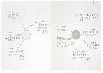
muji-chronotebook-usage

That much about the product design and usage itself. Why do it this way? Quite a few factors. A daily planner’s central purpose is to communicate clearly what the owner needs to do at each time. Here’s where I thought the design can be improved:

1) Grid Phobia

typical-daily-planner

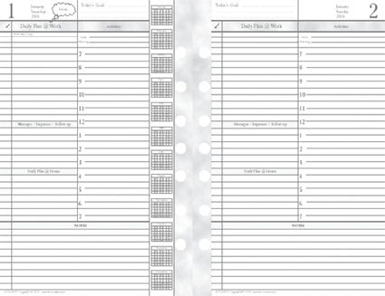
This is how a typical daily planner might look like. In the traditional layout, time is usually arranged in rows defined by horizontal lines. At a glance, they look oppressive and rigid, as we are forced to segment our lives and activities into an artificial lattice of compartments. We are however, not that robotic.

2) Analog vs Digital

analog-vs-digital

We lead our lives in analog, continuous circles of days and nights. While some have grown used and fond of digital watches, I believe that many of us still feel a more direct and intimate connection to an analog watch face. Time seems to be more human this way – maybe it’s the tradition dating all the way back to the first sundial. Or that it’s round and repetitious, just like time (day and night). These are subtle qualities that are lost in the translation to the digital notions of telling time (albeit more precise perhaps). 3) Writing within the lines All Over

typical-diary

Because of the numerous hours in a day (and various other constraints), the lines in a diary are typically very narrow. They are also usually equally distributed (somewhat). But our information is a hierarchy. Some are more important to us. Some we feel happier about. We want to highlight stuff that’s important to us. We want to write things that are more important in BIGGER sizes. Our lives cannot be so easily and clearly divided into equal parcels.

chronotebook-detail

In response to those issues, the Chronotebook’s design gives freedom: You can write all over the page – there are plenty of blank spaces. It’s not entirely haphazard either – the central graphical ‘clock’ element still holds all the appointments and schedules together in a logical and intuitive way. It is also easier and quicker to glance at the happenings for the day.

So, those were some of the thoughts behind this design. Hope it helped you understand the design intent behind. If you have any comments/criticisms, do voice them out – I’d certainly appreciate them. Meanwhile, I’d be away for the next few days in Tokyo for the award ceremony – so there probably won’t be any updates until next week.