MINI Clubman – Awkward Adolescent?

I loved the new MINI that was unveiled some years back. While paying homage to the original MINI with its classic and yet playful lines, the design was modern and alluring. That car proved to be very popular indeed, reviving the MINI brand, which I suppose was the raison d’être for this new expanded MINI Clubman, which unfortunately did not gain my affection.

2008-mini-clubman

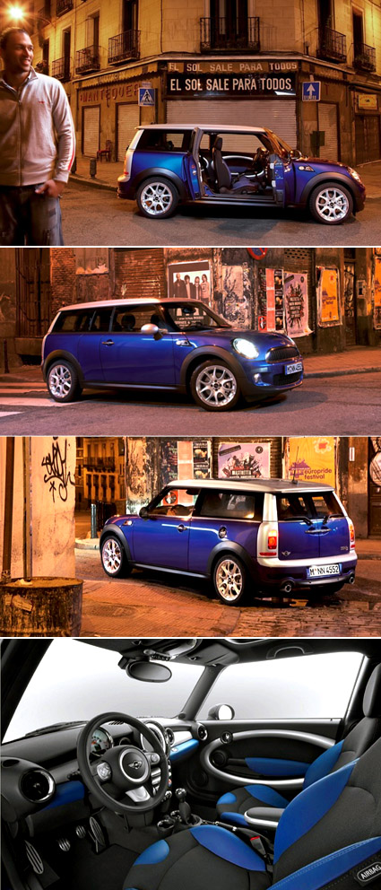
Perhaps extending a tiny classic would necessitate some compromise in its design or spirit – after all, you can’t just chop the car in halves and extend the middle section (like what Top Gear people would do to make a limousine). The proportions aren’t quite so endearing, but the thing that really killed it for me was the rear.The silver plastic frame looked really squarish and squashed-up – it seemed like it was transplanted from some other cars, like a small Daihatsu van or something.

The car actually has five doors – but it’s not your typical configuration though. The barn door design at the back counts as two, and there are two front doors, so what’s left? One short door on the side, of course! It’s on the right side of the car (see the first picture), more like a half-door that allows more access to the back seat. For instance, where the driver seat’s on the left (non-British systems), this would allow the back passenger to get off onto the pavements on the safe side of the road. One of the griefs though, is that the back seats seems to be the non-folding kind, which means you’re very much screwed if you want to chug some bulky stuff around.

Overall, for me it’s really like seeing MINI grow up and entering the awkward adolescent age. It’s got bigger, and are pretty much still uncertain what to do with some of its parts. The cuteness that carried it in the tender years cant really pull it through, and yet it hasn’t muster enough sophistication for adulthood. Haha, am I thinking too much?

[Jalopnik gallery with more pictures]


Vinyl Dance Floor

vinyl-dance-floor

A pretty cool concept – the music plays as you walk or run on the projected vinyl (it also responds to the direction you’re walking – you can play the music either forward or backwards). My immediate thought was, this would make a really interactive piece if people started “scratching” and synchronizing their dance moves to the music – and it turns out this is indeed in the works, and would be released in the next edition.

Stay tuned here!


Sustainable Dance Club?


This really smells like greenwashing to me, but for what it’s worth here’s the story: the movements of the clubbers and dancers on the floor are harnessed as electricity by the floor (loaded with springs and such?) – the electricity garnered are used to power itself (the music, the lights, etc).

I am deeply skeptical about this – given the exorbitant amounts of energy that these hundred-decibel, bass-thumping, strobe-flicking, juice-guzzling contraptions uses in any typical day, versus the actual amount of electricity that can be harnessed: it just doesn’t seem logical at all.

And yet it seems that these are some of the most visible or publicized ways to achieve the green agenda – massive undertakings (think of the installations and how much extra energy/resources are required to produce them) with questionable actual effect: my take is, everyone just want to feel good that they’re doing something. Whether it’s really green, well – that may not be so important after all.

[The Dance Club]

Great Color Legends

color-legends4

If you’re the kind of person who notices little things and likes to know why are things a certain way – this might be a neat gem. The Color+Design blog has compiled a list (actually, now two) of some of the trivia behind why specific colors are attributed to a certain item or notion: why is the envy monster green? Why does the leader of the Tour de France wear a yellow jersey (and why does the Italian one wear pink)? Why is the US dollar the greenback?

If these questions-and-answers fascinate you (as they are for me), be glad that there are over 20 of them right here!

Transformer – The Man behind the Transformation

transformer

Transformer’s of course all the rage now – everything’s getting all hyped up with these shape-shifting robots – I had fond memories of them too, watching these cartoon episodes religiously when I was growing up. There’s always something enchanting about the mechanisms as cars transform into humanoid robots – it’s as if there’s some magic that liberates an inanimate, stale object into enchantment through transformation.

Pingmag had an interview with the man behind the transformation of major characters like BumbleBee and Mirage in the Transformers movie – Australian Alex Kubalsky:

Basically, I’m an inventor and a character designer and my input is bringing everything into 3D reality and adding cool character dimensions like feature weapons and funny things to it: I do the part lists, draw the blueprints and then draw a 10 or 12 frame short animation to show how the toy would transform. I do this based off Hasbro concepts as well as my own characters and concepts that are okayed by Hasbro. They are a great team to work with.

I’ve always wondered how the Transformers toys are designed – how could the designer visualize every single hinge and part that needs to be rotated here, twisted there and snap-folded in, etc., while maintaining the overall animation and cosmetic integrity. Here’s Alex’s answer to whether 3D softwares were used:

No, I draw everything on millimetre paper, including every part. It is all in my head!

Amazing!


Pimp My Satellite Dish

pimp-my-dish

There aren’t too many details from the Times newspaper article, but I’m loving this make-over of the satellite dish to give a bright dash of fun and joy to an otherwise drab urban flat. By Dutch artist Peter doeswijk.

Incidentally, the hooks you see are for lifting heavy furniture up into houses through the balconies, as the stairwells are too narrow to fit them.

[Edit (Thanks Martien): “The artist’s name is Peter Doeswijk. The drawings were actually made by children. In this specific part of Amsterdam live a lot of foreigners. They use the satellite dishes to receive the broadcasts from their country of origin. Doeswijk printed the drawings on stickers which he put on the dishes. The stickers will stay on for a couple of months. The project gained a lot of positive response and publicity and the artist is considering making a business out of it.“]


Fine Art to Color Palette

fine-art-with-color-palette

Here’s a cool post of people taking classical paintings and converting them into color tones:

The world has seen thousands of artists and millions of great pieces of art, but we chose just a handful of pieces of art from some of greatest masters of painting to show a little of how they were inspired by color… or perhaps, how they inspire us with color.

Branding to Design?

I stumbled onto a great article on the current state of branding for products:

So you got line extensions, big ads, expensive logos, brand onions. You got branding. And most of it was as intellectually rigorous as phrenology. Actually it was probably more like Scientology; it was somewhere between a fake religion and a false science.

The dismal nature of the branding science has started to become clear to business recently and they’re starting to vote with their investments and appointments. They’re turning from the people who create perceptions of value to the people who create actual value – the designers, technologists, innovators. Hence branded utility, hence ‘design is the new management consultancy‘, hence the current Business Week heroes being IDEO and Ives not CHI and Chiat Day. Hence the limited tenures of CMOs. Hence the rise of communications businesses that can actually make stuff rather than just think of stuff.

If you take Business Week as the sole, definitive guide to the business landscape, you might have the impression that design (and design thinking) has indeed become the zeitgeist, tour-de-force of the new world. Design is increasingly being recognized as much more than simple surface styling – in fact it’s not so much the design skills that are attractive to the suits, but more the design approach, attitude and thinking: for instance the natural emphasis design places on the end user. Personally I guess it’s about time too – years of management theories have focused a lot on the processes – cheaper, more efficient, quality management – supply-side intervention: the tide has turned onto the demand side.

And yet, amidst this hype about incorporating design into the corporates, there lies a great fundamental risk as well – as the “design” buzzword gets applied to every field and where everybody wants to own a piece of the “design” action to somehow feel more important and strategic; every other product launch is termed as the greatest innovation (EVAR!); every little tweak to the systems is labeled as an overhaul after extensive usability study and re-design; and perhaps most pervasively, where every management action/decision is heralded as a consequence of strategic design.

At some point, design in its true sense would have been diluted beyond its original context. By its very nature, design usually leverages across disciplines – unifying and synthesizing a multitude of factors into a coherent, appealing whole. That requires tremendous vision and authority on the designer. And yet, the essence of design: insight, original thought, clever solutions, attention to details and users – might just get left behind or placed on the backburner in favor of quicker, more painless adoption of design into current corporate cultures – “let’s not shake too many trees or too many monkeys would fall”.

Herein lies the greatest danger: as much as it is being trumpeted the loudest, design might fundamentally not be given the room nor its role to play – and are but relegated to mere surface patching of corporate visions in tune with the latest fad – “design”.

That, perhaps is the time when the term “design” loses trust and equity, itself becoming a fad branding: somewhere between fake religion and false science.


Flash-less Camera

kodak-flashless-light

Kodak – the company that practically invented modern consumer photography (who subsequently saw its near demise as film photography transits to digital photography) is digging deep into its heritage in innovation again in an attempt to restore their former glory. In the news release announced recently, it claims to have a new sensor technology that significantly increases sensitivity to light, so that flash photography is eliminated.

So far, the only picture accompanying the news report is a mysterious lab-looking guy holding up a palette of colored light, which frankly could’ve just come from any stock image websites. If the technology is indeed true though, would they be able to claw their way back, or have they already lost too much? The answer is it was not enough to rescue the sinking ship.


Desperation Drives Design

cheating-shoes

Law circumvention and persecution have always been opposing nemesis that feed off each other. As we move into the high-tech world, methods for cheating in exams have also evolved beyond scribbles in the palm. A seller of cheating aids in China was recently busted as an undercover agent pretended to be interested in the newest “cheating shoes”. Touted to be able to bypass the signal detector/jammer that is employed by test centers to deter ordinary cheating electronics, these shoes go for RMB2000 a set, as they are claimed to transmit encrypted exam results through a high-level bandwidth.

How it works: someone would read off the answers for the major examinations and these answers would be relayed to the shoe and then to the tiny earpiece. How would they know the answers in the first place? Leaked examination papers, of course (these go for RMB20,000 though).

[Link (Chinese website)]