Designing Fonts

hm-font

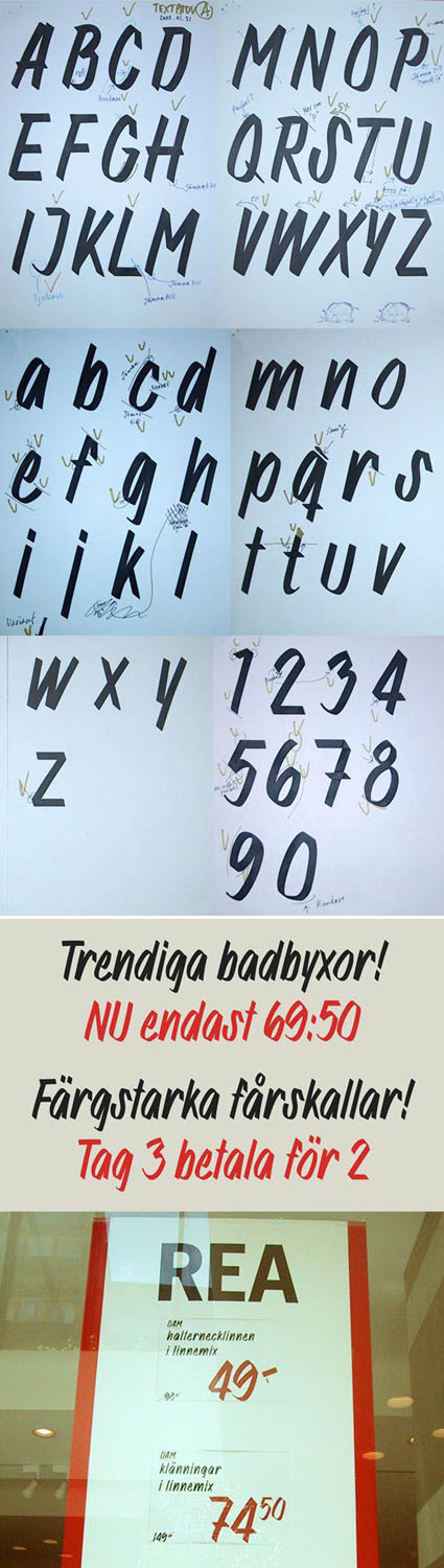
I came across this series of images by font foundry MAC Rhino showing the design process for a font used by fashion retailer H&M. I think it’s really some great work, because at first look (and maybe even with second, third and fourth looks) you’d probably think it’s hand written with a typical marker pen used in retail shops.

I think this is one of the tougher tasks in font design – to mimic a very natural organic writing into a systematic font. The little nuances of every stroke has to be accurately captured, edited and re-edited (you can see some of that process on the top few images – the pencil mark shows the editing comments). We have seen how a font that mimics handwriting or scripts can easily become unnatural – you know it’s just a font (cue BrushScriptMT, perhaps the notorious Comic Sans even).

For this H&M font though, they’ve made it look effortless. I think that’s probably one of the defining elements of great design actually – an execution that looks effortless (when it’s most likely anything but).

Origami Paper

origami-paper

I came across these origami papers over at Pingmag (along with many other souvenir ideas from Tokyo), and thought they were pretty clever: having the final form pre-printed on the origami paper so that the end product has an additional dimension of appeal. Of course, this would mean that the paper is restricted to only that particular fold/object, but it’d still make a good gift especially for beginners!

Graphic design on the paper done by cochae.

Packaging Design Blog

packaging-design

Here’s to yet another niche design blog – this time focusing on the art of packaging. According to the blog owner Torben,

A quick count shows that an average person is in contact with a packaging approximately 52 times per day! If you didn´t notice this fact before it is maybe because you´re surrounded by good and well worked out packaging designs.

But for those who are disabled to some extend, bad packaging design can turn out to be an everyday nightmare. That is what I deal with and want to improve!

It’s a budding blog but it certainly shows promise. Head over to Design Better Packaging to shower some love!

Apple iPhone unlocked

iphone-unlocked

Prayers of fans worldwide has been answered – the Apple iPhone has finally been fully unlocked (with just software, no hardware modifications at all) from the AT&T Carrier, and can now be used with any carriers worldwide. Of course this isn’t a turnabout on Apple or AT&T’s management decision – rather it’s the result of weeks of sleep deprivation, code cracking, head scratching and clever programming from hackers.

Engadget here has the full documentation right here – or, find unlocked phones on Amazon here. They have not released the software publicly yet – judging from their website they seemed intent on making a quick buck via licensing or selling the unlocking software – but I’m as certain that it will eventually be free (if you can unlock the iPhone, others can unlock your software).

So Apple and AT&T executives would lose some sleep – and are perhaps already furiously working on patches to cover this loophole. But as we can see from hardware-software-locked examples like the PSP, you’re (almost) certainly never going to win. Sony tried to patch up their firmware from custom-firmwares and even throwing in incentives for users to upgrade, but they still failed every time to get it secured. In my opinion, iPhone will be no different.

Perhaps it’s also time to think – now that the cat is out of the bag, how could each stakeholder make the best out of the situation?

Image Resizing


Those of you who’re into graphic UI and navigation design might find this a heaven-sent: context-aware resizing for photos. Unlike typical scaling, the algorithm behind this is intelligent – it recognizes what are the likely ‘low-priority’ areas in a photo and squeeze out those pixels, rather than applying a generic, overall scaling.

In layman’s terms, it makes your pictures scale to fit your space without losing information (through cropping) or become recognizably distorted (through uni-axis scaling).

Concerned Communicators Award 2007

concerned-communicator-award

If you’re the creative kind, here’s a fun and rewarding competition that you might consider entering:

Concerned Communicator Award – which is a reputed and well-recognized social advertising award in India. It invites ad professionals and free lancers all over the world to make print ads (within 500sq. cm size) on any social issues. Winner will be awarded US$11,000. There is no entry fee. Foreign entries are accepted by emails also. Entries can be pre-published or un-published.

Check out here for more details – the deadline’s 25 August. Here’s an example of a winner from last year (from Ogilvy & Mather, Mumbai):

concerned-communicator-award-winner-2006


Icon: 50 manifestos

50manifestors-from-designers

Yes, it’s a long list. Well icon (a design+architecture magazine) has decided to poll many leading architects and designers on their manifestos – what do they see and visualize happening in the design industry and the world as a whole: many heavy weights are in the midst too – click through and see if you get inspired! Maybe you’d start to consolidate your own thoughts and develop your own manifestos!

[via HiID]

Flickr DJ Music Slideshow

music-mash-up

I stumbled upon this very cool project that’s a mash-up between a song file and pictures from Flickr. The idea is simple and captivating: as the song is played, pictures from Flickr are flashed according to the words/lyrics based on their tags. So you get a nice music in the background, while enjoying (somewhat?) relevant but random images. The interface is pretty cool too ~ you can drag them around just like a pile of real photos.

Try it out – it’s a little heavy though (~3MB).


Pixels or Pies?

square-graphs

According to Anil, there seems to be an trend of using pixels and grids to represent percentages rather than the traditional pie chart. There are some speculations on why – perhaps it’s a reflection of our digitized age? Or maybe it’s simple aesthetics – a rectangular chart gives you less dead/white space around your chart than a circle, so the article looks better? Text description of each region looks more neat with rectangular matrix compared to a juxtaposition against a circle?

Well there could be really any number of answers. The important thing is, is it better? Or perhaps a better way to ask – in what scenarios would grid charts be more effective, and when are they less so?

A Living Room in the City

living-room-in-the-city

Wow, count me impressed!

This is an outdoor space, in the center of St Gallen in Switzerland. Known as the Stadtlounge (City Lounge), it’s a massive bold move to put furniture and all right amidst all the buildings. Born of a design competition in 2005 to create a “living room area” in the financial district, this red carpet treatment flows all around, even onto some fake cars on the street.

Amazing, and I wish where I live they have the audacity to liven up a place like this!