Evolution of CG over the years

124

Computer graphics have certainly gone a long way in the last few decades – and what  better ways to see it than to compare one of the most difficult elements – water – and see how water has become ever more realistic through the ages in various games. Here’s a collection of screen captures: from the Flight Simulator way back in 1982, to what we’re now taking for granted in games like Crysis.

Techniques to Deceive

disney_world_castle

Did you know that the higher windows on the Disney Castle was purposefully made smaller so that the tower could look taller? Well I didn’t know either.

Disney World in Florida had a height restriction for their Cinderella’s Castle. So they used forced perspective to make it look taller. As tourists we assume that the lower windows and the upper windows are the same size but the upper ones look smaller because they are high up on the castle. It is true the higher ones would look smaller, but upper windows were purposely made smaller than the lower windows forcing us to interpret the castle as being taller than it actually is.

That’s a really interesting detail. A lot more of these tactics of persuasion – to lead the viewers into believing in something more desired/positive – are right here on this page. We might be familiar with the concept behind many of them, such as product placement, perspective play and ‘selective honesty’ – but it’s still rather fascinating to see how it actually manifests in actual examples.

7-9year-olds designs their Laptops

04-shannon-1

How would laptops look like, if kids (from 7-9 year olds) were at the helm? Some kids in North Carolina shows their vision and design of laptops – and reveals traces of what goes on in their world. Here’s a great interview/article from The Morning News about ‘The Laptop Club’, which was started by a bunch of second and third-graders. They crafted out their visions of laptops, which often included dedicated buttons to what is important to them – often friends, imaginary pets, games and online clubs. You could see how the laptop is very much really a projection of the kid’s worlds. And the speed in which they absorb and learn about the world is truly astounding as well.

Here’s an excerpt of an interview with one of them:

Name: Mandy
Age: 8
How often do you use a computer? Five times a week.
What do you like to do when you’re using a computer? Play games and write stories and poems.
What will computers look like in the future? Well you see, if we had whole days to work on it, and bigger paper, I think we could make it way more detailed.
Who is better at using a computer, you or your parents? Games + me = good. Parents + trying = bad. I am better at using games and if you guys try them, you get crushed.
[ After being told this interview would be published on the internet ] “I’m going to be popular! I should make a blog button, right now.”

Wow to the ‘blog button’ comment – it really crystallizes how in-tuned they are with the online developments!

Blowable Laptop User Interface


Check this out! By simply using existing microphones found on practically all laptops, researchers at Georgia Institute of Technology have developed a way to emulate screen pointers based on puffs of air instead of the mouse. While they could be used for ‘fancy’ applications like blowing out virtual birthday cakes (as the video suggests at the end), this could also very well be leveraged for people with disabilities such as paraplegics.

Great potential achieved with easily-available and cheap execution – I hope this can really be developed into a comprehensive, easy and accurate system of alternative input method. Just wondering – if we place a few microphones strategically around the screen, could it have a better calibration (think of GPS triangular positioning)? That could help make this much more precise and that much more effective.

Dandelion Online Exhibition

dandelion_logo

Some of you might remember the call-for-entry on Gems Sty for the Dandelion online exhibition some time back – I’m happy to announce that the Dandelion Exhibition is up and running! This is an online exhibition (showcasing designs – mostly from Asia – that are at least in the prototype stage) held in conjunction with the Singapore Design Festival, which ran from 28 Nov to 8 Dec.
Over the next few weeks, you’d probably be seeing more posts about other activities held in relation to the design festival. Right now it’s still pretty low-key for the general public though, apart from a sprinkle of bus stop advertisements here and there. Hopefully it’d drum up to be a more happening affair as the dates draw near.


London Olympics 2012 Logo

2012

I can’t say I liked this logo designed for the London Olympics 2012 – in fact I think it’s outright ugly. The colors hurt my eyes as much as they are loud, while the shapes look haphazard except for the requisite “2012″ embedded within. For a lack of a more elegant way of putting it, I shall block quote from retry:

This is the logo unveiled for the 2012 Olympic Games in London. Lord Coe, the guy who spoke at this auspicious event said “London 2012 is inspired by you and it’s for all of you.” The people of London are wondering what they did to deserve that comment. The thinking was sound: Olympic viewing will take place on a lot of media devices in 5 years time so they wanted a recognizable shape that can work across lots of platforms. I love the bold intention to create an original Olympic ID and break from Otl Aicher’s Berlin ID (enough with ancient history! most of us weren’t born when that work was done.) I’m disappointed that the execution will open it up to massive criticism and give smug design/client conservatives one more arrow.

Lisa Simpson giving a blowjob indeed! Haha, I couldn’t remove that mental image after this comment was made, much like the hidden arrow in Fedex’s logo (I apologize if I have irreparably rid your mind’s ability to look at this logo simply as a London Olympics logo). An excerpt of some of the (predominantly negative) reactions on the BBC Sports Blog as well:

Is this supposed to be one of those picture puzzles that eventually makes sense after slowly refocusing your mind’s eye?

It looks like a logo designed for young people by old people who don’t understand young people.

Like the 2012 Committee had a student intern who said he could use Photoshop and they said ‘Great, you can design the logo’.

Disjointed and dysfunctional, a graphic mess and also underwhelming and uninspiring.

It’s awful isn’t it. I just can’t decide which bit of it I hate the most.

Oh,dear! This is so sad. Aren’t Logos meant to sum up the spirit of something and capture a vision. This one only seems to evoke derision.

This is foul beyond words and a total embarrassment to a world leader in design. which London is (or was).

For better or for worse, the logo seemed to have rallied a great majority of Londoners (if only in opposition of a common enemy) – it’s like a grand party of universal condemnation, seeing who has the wittiest retort for the design. Oh well, Creative Review has more to say (a more neutral and considered article). If you liked this logo, don’t be afraid – you’re not alone either!

Visual Branding – more than a mark

cow-branding

The idea of branding – and indeed the term ‘branding’ itself – began thousands of years ago, when people started literally branding their livestock with hot iron as a mark of ownership or quality. Gradually through the years, the notion of branding as a clear visual symbol has evolved and spread to practically all industries. Some of the principles of branding include clarity (legible, easy-to-read even within a short time), identity (the mark should communicate the idea/spirit of the brand) and consistency (consistent style of application to reinforce the mark’s strength and recognize-ability).

These principles have generally evolved into extremely comprehensive brand identity guidelines – the exact vector of the marks notwithstanding, there are also generally stringent rules about the colors, minimum perimeter space around the logos, where and how the logo may be used, etc. Like a jewel on a crown, they were the untouchables – the identities must be so – they stand proudly on or atop products, displays, posters, etc., almost like a king watching in solitude over the rest of the artwork doing the legwork in conveying the message. The brand-mark was very much simply a stamp of approval.

Lately though, I’m beginning to see some forward-thinking brand-marks developed less as a stamp, but more as a flexible lasso to hold everything together. Wolff Olins is among the pioneers in this school of thought. As their CEO, Karl Heiselman remarks:

In the past, corporate identity was about control and consistency. With too much control, people tend to forget about content. In the era of blogging, social networking and user-generated content … a bit of flexibility is essential.

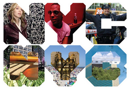
They are often just as strong and iconic (if not more), but they have an added dimensionality and freeplay that allows for creative interpretations of the symbol, rather than just a static stoic symbol. Sometimes they are used as a design tool – an example is the ‘NYC’ logo for New York City, which can be manifested beautifully such as in the second picture below:

nyc-logo-usagenyc-application1nyc-application-2

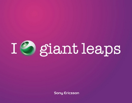
Some other memorable and successful designs from Wolff Olins include the Sony Ericsson symbol, which is being used in place of a verb in many billboards and poster advertisements, leaving the user to imagine and associate whatever the word is (and associate that to Sony Ericsson too):

se1

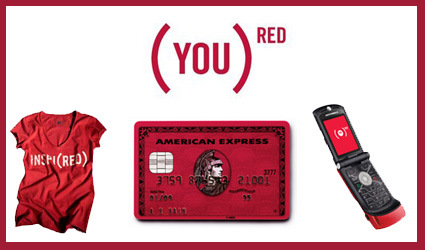
Another one is the Product(RED) campaign – the bracket and the superscript RED forms an extremely strong visual identity, and yet allows a large amount of free play to how it is used, which is especially important given the varied styles and usage for its partners.

red2

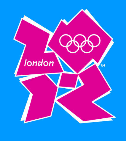
They are also the ones behind the London 2012 Olympic logo, which I didn’t find too impressive (and blogged here). The logo was along the same thought – promising versatility and flexibility in usage – but I thought aesthetically they weren’t as well-done as some of these above.

It’s great though to see brands getting more alive and versatile. With the new mediums of expression (cellphones? Google Earth views?) and the Web2.0 culture of hacking and mashing, a versatile logo allows the audience not only to receive but also to actively reciprocate and reinterpret what these brands mean to them (such as the (LESS) campaign in response to the RED). Some marketers may freak out and take this as perversions of the company’s brand identity – but let’s face it – a brand is what the consumers think about you, and not what you want them to think about you. And with modern technologies like the net, there is no way you can stop them either. So might as well just leap in!

Dassault 3DVIA – Amateur 3D Modeling

dassault-3dvia

Dassault, which is the conglomerate behind popular professional 3D softwares such as CATIA and Solidworks, are putting another big step forward with their (coming) debut of 3DVia, which is a web-based 3D modeling interface for people to create CAD models:

3DVIA is the newest of the 6 Dassault Systèmes brands. Its mission is democratizing the usage of 3D so that everybody can use it in its everyday life, either at work or at home, through the web. Our objective is to give you the power of 3D.

This is certainly a radical branch from its stable of sophisticated (certainly with price tags to match) softwares traditionally only operated by professionals, be they designers or engineers. This is all about increasing the accessibility of 3D software: free (accessible to more people), online (accessible anywhere) and easy to use (accessible in terms of learning curve). In a world where many are increasingly immersed in virtual worlds – be they games like WOW or universes like The Sims (I still don’t get Second Life though) – giving people a foothold in creating 3D artifacts online seems really logical.

It is certainly worth thinking of the implications of a move like this – what does it hold in the future, if it succeeds? What if 3D literacy is as common as computer literacy? What would that imply? Think of how the PC overthrow the mainframe computer; or how blogging opens up mainstream journalism. It could be a case of massive rapid prototyping, where each person creates their own products around them as easily as creating a Facebook profile today. Or products can be developed like a Wiki or open-source software, with each participant crafting a specific part (this is already sort-of happening with BugLabs).

How would designers evolve? Would technical operators of traditional 3D softwares becoming extinct, just as we don’t see many computer operators around anymore? The designers who succeed would then be people who can readily harvest the massive growth of a 3D-literate online populace – how would you position yourself to be the next Bill Gates for 3D?

Typography Video


If you’re a typographer and just find it hard to communicate the value of your work (“Oh, so you choose fonts for a living?”) – here’s an excellently-produced video  that may help give a quick explanation of the artistic level in true typography. Well actually, it’s rather likely the response would still be more like “Ah, so you choose pretty fonts for a living!”, but at least the video would probably make you feel the worth of your work more.

“Typography is what language looks like”.