Happy 50, Peace Symbol

peace-symbol

Did you know this was how the peace symbol (as a graphic element) was born?

 Gerald Holtom, a designer and former World War II conscientious objector from West London, persuaded DAC [Direct Action Committee Against Nuclear War] that their aims would have greater impact if they were conveyed in a visual image. The “Ban the Bomb” symbol was born.

He considered using a Christian cross motif but, instead, settled on using letters from the semaphore – or flag-signalling – alphabet, super-imposing N (uclear) on D (isarmament) and placing them within a circle symbolising Earth.

WordPress in Flash

wordpress-in-flash

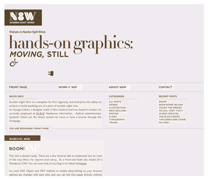
Number Eight Wired is a rather interesting experiment(?) – it adopts the very typical WordPress blog style, but implements it in Flash instead of the more typical CSS. You do get some bells-and-whistles that comes with Flash ( ability/control in animations and effects particularly) – the site do feel slick and polished. And you can use your favorite unique fonts without worrying that your viewer not having it (unlike in standard webpages).

For all the polish though, you’d (usually) have to sacrifice the much taken-for-granted things in webpages: ability to right click, deep-link to specific pages, save images off the web, etc (Note: these are in fact do-able even with Flash contents – it’s just that they’re not common).

Which would you prefer? Style vs usability (or is this actually a false dichotomy)?

Design meets (Marketing) Research

design-research

New Coke was considered an unequivocal slam dunk in taste tests against Classic Coke but was subsequently a failure of epic proportions when it went to market. Conversely, the Absolut Vodka bottle design was universally panned in focus groups. A courageous Michel Leroux, then the brand manager of the new vodka, pressed for its launch, and the brand set international sales records. The Absolut bottle is now considered a contemporary design icon. So when the demand for validating design solutions is so strong, yet research is seemingly so fraught with pitfalls, what is a designer to do?

Design or market research is always a thorny issue. On one hand, we’re always brought up to believe that we should respect the consumers and give them what (they say) they want. On the other hand, we’ve seen how consumers don’t really know what they want (as seen by the short quotation above). So, what’s a designer/researcher got to do?

AIGA (American Institute of Graphic Arts) tries to probe a little – here’s an article giving a quick rundown of the more common approaches in market research: ethnographic research, focus group, eye-tracking and online-testing, listing down a short description of the method, the challenges and the advantages. While the article may not be really groundbreaking in research approaches, it certainly is a very good primer on some of these more common techniques.

Great Infosthetics: Movie Box-Office Receipts

movies-box-office-graphic

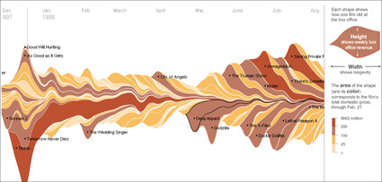
It’s the time of the year for Oscars and what-not, where critics and audience can opine on the great movies of the year, hits-and-misses etc. Of course, what the studio “suits” see as hits or misses are perhaps more centered at the basic question – did it bring in good money? The New York Times has a great interactive graphic showing the major movies all the way from 1986. You can see the impacts of the movie and how it pans out – the height being the weekly revenue, while the width represents the longevity. For instance, on the bottom left, the big slice would be the rather persistent Titanic.

Recently I’m getting quite interested in infographics or infosthetics – the art of visualizing information. Beyond the eye-candy factor (many of these are really well-done; the interactivity afforded on many of these infosthetics make it really engaging too), it’s also about making information appealing – and thus promote its usefulness. People like Hans Rosling and Jonathan Harris really earn my admiration for bringing what is usually dead-boring statistics/information into engaging, illuminative and dare I say, fun thing to play/learn?

Comments + Critique Time

You might’ve missed a rather interesting discussion in the comments of one of my earlier posts – about the patent and novelty issues on the MUJI winning entries. Scott, a designer-engineer-patent-agent hybrid brought up some interesting perspectives, and in our conversation I thought it’d be a pity that we don’t get to see the other entries.

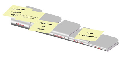
The first one is called Postie. “It’s a simple bent structure that offers a day-of-the-week platform for POST-IT’s to help organize the THINGS TO DO and various meetings, etc per week. As you know, the mind works well graphically and this simple structure should help the worker visualize what needs to be done and by when.”
postit-stand

The other idea is the Tackie. Scott: “This one is a two-pin thumb tack that is designed like a coin (better grip) and further includes a curved slot that can receive a card for advertisement. I know using two pins for thumb-tacks is known, but not the combination of two pins and a coin-like handle and the slot. The thumb-tacks are also stackable for cleaner and safer storage.”
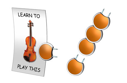
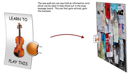
pin

muji-01-sheet-2-copy

Personally for POSTIE, I liked the idea of using Post-Its as a medium for activity planning. Them being spontaneous and convenient gives a more flexible approach to laying out your schedules – adding an appointment simply means tacking on an extra note in the relevant space. However, the design solution felt rather clunky (despite it being collapsible) – it seems too much of a material structure for the sole purpose of delineating days. Could the same purpose have been achieved not by a metal product but maybe by graphics, especially as MUJI is rather particular about clutter.

As for the Tackie idea, I definitely agree on the easier-and-safer to store part. Most pins are cluttered in boxes which can be difficult/’prickly’ to retrieve. I was mentally trying to search for applications for these pins though – what are the wider applications apart from the notice board (which seems rather niche). Aesthetically, I think MUJI has a rather particular ‘fetish’ for being simple and not overtly attention-seeking. Maybe something like this?
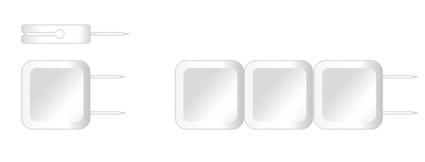
pin-suggestion

Global Package Gallery

global-package-gallery

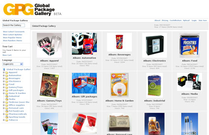
If you’re designing packaging, you’d probably find the Global Package Gallery very useful as an reference for what have been done before.  It’s an archive (still in BETA stage, though reasonably populated already) of packaging designs categorized into various types: beverages, food, electronic, etc. With more time the site might very well expand and become the grand daddy archive of good packaging.

iPhone Guitar

Give a man a fish. Give a man a fish and you feed him for a day. Teach a man to fish and you feed him for a lifetime.

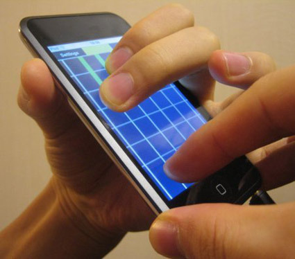
Give a man (or for that matter, hopefully many men) an open platform in touch-interactivity, however, and you’d start to get really interesting and creative applications – quite certainly more than you’ve ever envisioned yourself. In this case – it’s for the Apple iPhone. Previously some concepts like Starbucks coffee ordering sprang up on the net – while perhaps useful I didn’t think it was particularly creative in harnessing the iPhone’s capability.

This one, however, is pretty cool:

iphone-guitar

While it’s still in a rather primitive state currently, it does show potential in really harnessing and leveraging on the iPhone’s touch-sensor capabilities. Imagine a guitar that fits in your pockets! Practice and pluck over with your earphones while you travel, to the accompanying MP3 tune on the phone! Too bad Apple’s still insisting on a closed platform.

Whale Blimp

whale-blimp

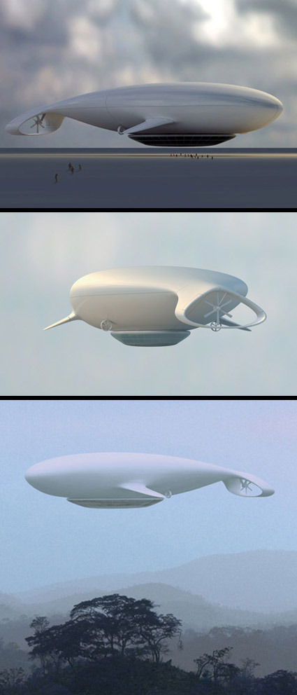
With all the talk about reviving the airship in the recent years – it seems like this  peaceful and spacious mode of travel (as compared to the airlines which are still desperately trying to trim half-inches of leg rooms) could be back for a rebirth after the much-documented Hindenburg disaster. If they do come back, I’d wish for it to be in the form of this ‘Manned Cloud’, a concept airship developed together by Jean-Marie Massaud and the French national aerospace research body ONERA.

Airships are certainly no match for traditional airplanes in speed or efficiency – but it’s certainly much more relevant in leisure purposes like an ‘air cruise’. Capable of hovering at much lower altitudes (typically 500-1000 meters above ground), it brings being-in-the-air as an experience in travel itself, rather than simply a means-to-an-end. As described by Massaud:

Living in the sky, watching the Earth from above. Rediscovering the marvel of traveling, experiencing contemplation. Exploring the world without trace


Manned Cloud is an alternative project around leisure and travelling in all its form, economic and experimental, still with the idea of lightness, human experience and life scenarios as the guiding principles. The spiral of Archimedes is the driving force of this airship in the form of a whale that glides through the air.

I thought the form had the peace, grace and elegance associated with this mode of air travel. It sort of brings us close to nature again in appreciation.

Permutations for Obama’s Logo

obama-logo

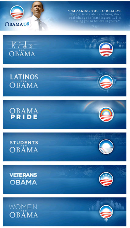
A while ago in my post ‘Visual Branding – More than a Mark’, I mused about the changing nature of a (company’s) branding identity. While the traditional notion of branding is a strong, iconic but static symbol, we are starting to see much more versatile branding identities that leave room for permutation and re-interpretation. An extract from that post:

They are often just as strong and iconic (if not more), but they have an added dimensionality and freeplay that allows for creative interpretations of the symbol, rather than just a static stoic symbol.

It’s great though to see brands getting more alive and versatile. With the new mediums of expression (cellphones? Google Earth views?) and the Web2.0 culture of hacking and mashing, a versatile logo allows the audience not only to receive but also to actively reciprocate and reinterpret what these brands mean to them …

Shown above are Barack Obama’s campaign logos. While the top one is the official icon, there’s also a whole range of other icons that were tweaked to cater to the various niches while retaining the strong and very recognizable primary branding. The free-exchange nature of the Internet has definitely encouraged ‘mashing’ of different elements for customization. As a nod to the web culture, these logos are even available for download on his website, and at 96×96 pixels they seemed to be precisely targeted at web-uses such as online avatars for forums and instant messaging services.

If your company’s logo isn’t versatile enough to accommodate re-interpretation and transformation (hey, even politicians have done it), you might want to consider some change as well!