Tag Galaxy (Flickr)

tag-galaxy

Tag Galaxy is a rather weird but interesting way of browsing through Flickr images – probably more for casual browsing than a specific search. You start off with a tag on a topic (which becomes your ‘central planet’) while other related tags appear in your galaxy. You can then click on those related tags and browse photos with both the original tag and the subsequent tag(s) (top picture).

And eventually, when you really do want to look at those photos, you can click on the planet and photos will ‘land’ on the planet (2nd picture).

I thought the visual/cognitive link between the two was a tad too literal and forced, but an interesting interface nonetheless for exploring images in a (pseudo)-3D space (yeah, space).

When is a design ‘finished’?

signature

When is a design done? As design itself is usually a rather subjective judgment, designers are often lulled into a seemingly endless cycle of re-examination and ‘that-last-bit-of-tweaking’. Abduzeedo asks 23 professional (graphic) designers on their take on when/how they consider their design work to be finished – here are some samples:

“I know a design is finished when every time I add something or adjust something it seems to get worse. I often create a set of history snapshots of the design trying different things – additions or small alterations – and then show them to my wife – who is also a designer. When we both agree that the original is already complete then I delete the snapshots and stop there. Of course sometimes adding one more element can lead you down a whole other path of design, and I have wound up totally reworking a look. But that’s the joy of design, there are always many solutions to a problem!” – Collis Ta’eed.

“I’m never sure if a design is done unless i take a break from it and don’t bother looking at it until the next morning. If what I see the next day puts a smile on my face, then it’s done.” – Kevin Brisseaux

“When the deadline is met.” – James Wignall

“I am finished with a piece when nothing else I add looks good. To me this means the piece isn’t finished, it’s simply reached my creative limitations.” – Joshua Smith

Your take?

Brand Tags

Noah Brier has released a very interesting web-application called Brand Tags. The premise is this: a brand is really what the consumer has in mind, the sum-of-all-thoughts regarding that particular brand-name or logo. Using the commonly-used representation of a tag cloud (in which the most popular entry gets the greatest font-size), we can see exactly what each brand (-word) means to the masses.

From the dominant word association, you can get a good feel of what it means as a whole, as various nuances and reactions play themselves out in the word-cloud. It is also quite intriguing to note (as the examples below show), how each brand can embed itself differently in the minds of consumers.

Product/Function
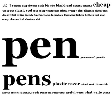
For Bic, for instance, it is very strongly tied to its single most successful product – the pen. Its iconic and classic status mirrors the consumer’s impression of “Bic = Pen”. In this case, the brand is the product, much like how Xerox came to be a substitution for photocopying.

brand-tags-bic

Marketing Tagline
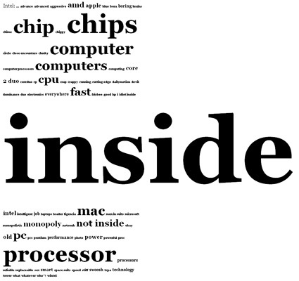
It could also be a reflection of the success of a brand-marketing campaign. For Intel, the most dominant word wasn’t chips, computers or anything like that. It was ‘Inside’. It just shows how strong the ad campaign was to imprint this message into consumer’s heads (even as you read this, perhaps the signature Intel jingle rang through your brain).

brand-tags-intel

Associated Emotion
I must admit I was rather surprised with Harley-Davidson though. In many business textbooks, Harley was a frequent example used to illustrate how the ‘freedom’ and ‘rebellious’ spirit was core to Harley-Davidson’s business. But it does seem like the crowdhas a rather different take (although it is still a feeling for a brand):

brand-tags-harley

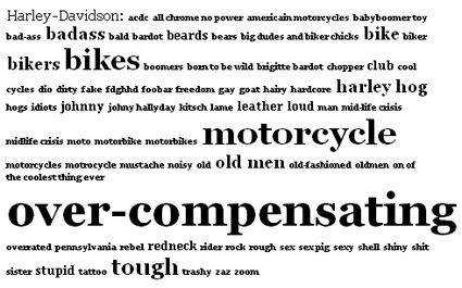
Perhaps it’s time to rework the campaigns a little?

Anyway, there are quite many more brands on the website – head over and play around!

Using Photoshop as Measuring Tool

We all know how powerful and you can say essential Photoshop is to a designer – It’s virtually the bedrock program for any designers. From touching up photos to creating montages to making posters, Photoshop has embedded itself firmly into the toolbox of virtually any designer.

But what else can Photoshop do besides arts/design related stuff? For instance, can it do math and scientific measurements? Jacks of Science finds that there are some functions in Adobe Photoshop CS3 Extended that you can take advantage of – in particular the ‘Analysis’ menu – to go about some research problems that could otherwise be much more tedious:

Can you determine the phase of each moon based on this picture?

moonphase-copy

Turns out you can approximate very accurately – by using the Magic Wand to select a single instance of the moon, and then ‘Record Observations’ under the ‘Analysis’ menu, you get a rich panel of information, including “Circularity” (Circularity measures how circular something is. A value of 1.00 indicates a perfect sphere). By combining the moon’s circularity with the knowledge that there are 30 days between each full moon, you can estimate at which phase your moon is in!

Now, for those of you who like a challenge: how do you know how many green M&Ms are there in this picture?

Answer, and quite a few more of such examples, over at Jacks of Science.

Burning Through Oil

burning-through-oil

I think New York Times is getting a habit of churning out informative and well-designed graphic aesthetics – here’s another one on oil consumption. Even as I know how much Americans drive, it still somewhat surprises me that there are 154 drivers who drive alone for every 5 commuters. Click through for the full view.

Speaking of infographics, I’ve also just stumbled on this great list of what can be described as the Holy Grail of of infographics links right here – sit back and drool over those cool graphics that make information sexy.

A case of Brand Over-extension?

Now, what do you think of when I say “Kellogg’s Cornflakes” or “Frosted Flakes”? Maybe breakfast, send-the-kids-off-to-school…generally the warm fuzzy young-family feel. So you might expect Kellogg’s to tie up with back-to-school-campaigns, tupperware, SUV, stationery, and all that.

But it was a surprise when I saw the new ‘Premium Licensed Apparel’ from Kellogg’s called ‘Under the Hood‘:

kelloggs-under-the-hood

It is either the most innovative, surprising and daring reach-out, or (what I think) a really-awkward brand extension into a mood/category that is in the almost direct contradiction to the original brand image. Maybe a marketer looked at the demographics buying the cereals and thought – “Hey this group buys quite substantial amount – let’s appeal to them!”.

To me though, it seems like this will erode the principle brand equity that Kellogg’s has been building over the years. The street and almost ‘gangsta’ feel is really awkward on Kellogg’s. But who knows – maybe out there, Tony the Tiger can give you some street cred!

Engadget vs Gizmodo

engadget-vs-gizmodo

(Pic: Ryan Block leads Engadget (left), Brian Lam leads Gizmodo)

If you’re a gadget/design person (like many industrial designers are, I’m sure), you’d certainly have come across Engadget and Gizmodo, the twin titans in the consumer gadgets arena. And if you’re a frequent visitor, you’d certainly also notice a less-than-friendly relationship between the two blogs, as in any good ol’ fashion rivalry, with each blog racing to bring the latest and juiciest in gadget-o-dom. But just how bad (good?) is it?

Wired has a rather comprehensive and interesting look behind the scenes, outlining how much the bloggers do to get an edge over the other. In a battle for online eyeballs lusting for gears, speed and exclusivity is indeed critical – many times it can really boil them to a matter of minutes for one blog to earn the bragging rights for being the first to cover major product releases. Much like high-school fraternity rivalry, perhaps.

Describing the ‘war strategy’ for Gizmodo during the Consumer Electronics Show (the SuperBowl equivalent in Gadget-dom) coverage, for instance:

No wonder Lam has been devising his CES strategy for the past 12 months. As soon as the 2007 show ended, he made a 2008 reservation at the Hilton, the hotel closest to the convention center, to serve as Gizmodo’s war room and “infirmary” for bloggers needing a midday break. He also reserved a block of rooms at the Imperial Palace because it was close to the Las Vegas monorail. That meant his writers could avoid the hour-long taxi lines that have come to define CES. And, of course, Lam expects his staff to sacrifice for their art. “In Thai boxing, the trainers don’t allow their fighters to have sex for two weeks before a match,” whispers Lam, a onetime kickboxer, “and the trainers can tell if they have, because it makes them lazy.” He shakes his head and pokes an accusing finger at one of his bloggers.

Head on for the full article.

Alphabet Book


This simply amazing book by book and graphic designer Marion Bataille floored me – it’s really delightful to watch how those 3D alphabets pop up, morph into the next, etc. – it’s like watching a live magic show:

From the lenticular cover that changes with the angle of your hands, all the way to the Z, ABC3D is as much a work of art as it is a pop-up book. Each of the 26 dimensional letters move and change before your eyes. C turns into D with a snap. M stands at attention. X becomes Y with a flick of the wrist. And then there’s U… Boldly conceived and brilliantly executed with a striking black, red, and white palette, this is a book that readers and art lovers of all ages will treasure for years to come.

You can order it on Amazon here – it’s only $19.95! On my wish list it goes!