Retouching Photos – the Process

christophe-huet-touch-up

We’re all probably very familiar with photo-retouching – especially after that ad campaign by Dove. There are of course master ‘touch-uppers’ who are very skilled artists capable of turning one photo into quite another image. While portfolios of these touch-up artists often show before-and-after pictures to showcase their abilities, Christophe Huet went a step further in his rather well-done portfolio website – he also shows quite a bit of the intermediate steps to show how the transformation was done.

And it’s kinda amazing how much detail was reworked in each picture – even the tiniest ones far off in the background. Just goes to show sometimes, you really do have to fabricate the perfect picture that works.

MUJI Award 02 Ceremony

muji-yurakucho-entrance

That is the MUJI Yurakucho, MUJI’s 3-storey flagship store in Tokyo. Practically all of MUJI’s wares are on display here, ranging from furniture, apparel, electronic/electrical appliances to household and lifestyle products.

party

For this ceremony, they have converted the usual MealMUJI (a restaurant within the store) to the grounds for the awards ceremony. Pictured above are some of the winners of this year’s competition, with the Gold Award winner (the towel) on the table.

winners

More explanation and prototypes.

muji-award-jury

Luminary judges giving their comments about the challenges of the MUJI design competition, the quality of entries and what really is MUJI about (Pictured above: Masaaki Kanai, Takashi Sugimoto, Kenya Hara and Naoto Fukasawa).

muji-dinner

At the end of it all, they also brought us to a great Japanese restaurant.

MUJI Award 02 & More on ‘Chronotebook’

muji-award-02-results

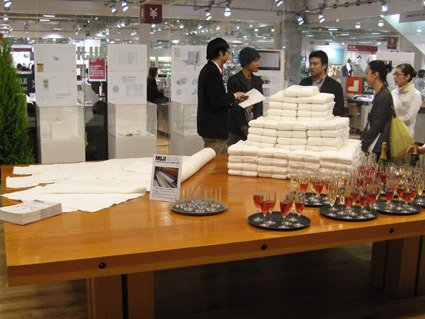
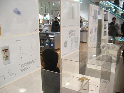
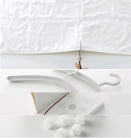
You might’ve known that the results for MUJI Award 02 was announced some time ago – the winners were selected from among 3422 entries from the world. ‘Towel with Further Options” won the Gold Prize:

This bath towel moves your mind toward further uses of the product. Towels take every day dirt and gradually become damaged. In accordance with such changes, you can downsize the towel with “further options” from a bath towel to a bath mat, and then to a floor cloth and dust cloth. The towel has a vertical and horizontal textured surface that does not produce pile-fabric waste when cut with scissors. The lines act as a marker for cutting and form square modules that let you imagine other uses, encouraging you to re-use it.

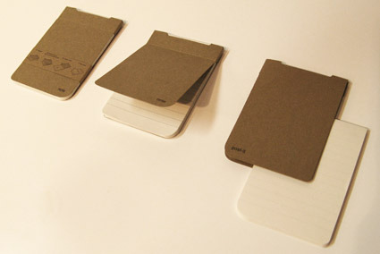
The rest of the entries are the Stackable Hanger, Chronotebook and Kakujio (cube salt). In this post, I’d like to explain more about the Chronotebook design: if for no other reasons – well, because I’m the designer behind this. As the title implies, this is a notebook with Time as a central element in design.

chronotebook-outside

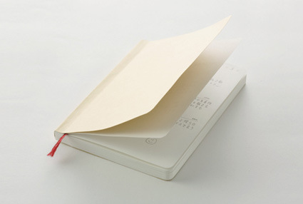
On the outside, the Chronotebook is a rather plain notebook meant for daily use – much like a daily planner. It is A6-sized, thus able to fit into your pants pockets if you really wanted it to. It comes with rounded corners both for aesthetic purposes, as well as to minimize ‘dog-earing’ of the book pages as you use it. A handy bookmark ribbon helps you remember which page you stopped at. Overall, simple plain MUJI-ness.

chronotebook-inside

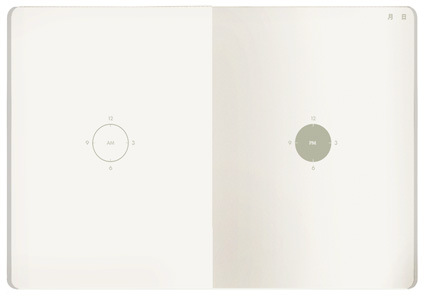
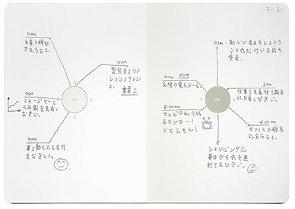
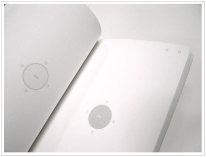
The inside is where the difference lies. Instead of lines and rows of scheduling grids, you are greeted by stark and minimal graphics. At the center of each page there is a graphic of a clock – AM on the left and PM on the right. That’s it. You plan your daily activities around the clock.

muji-chronotebook-usage

That much about the product design and usage itself. Why do it this way? Quite a few factors. A daily planner’s central purpose is to communicate clearly what the owner needs to do at each time. Here’s where I thought the design can be improved:

1) Grid Phobia

typical-daily-planner

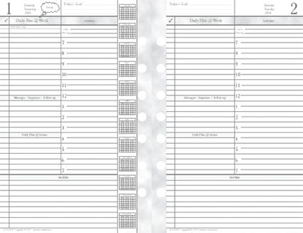
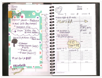
This is how a typical daily planner might look like. In the traditional layout, time is usually arranged in rows defined by horizontal lines. At a glance, they look oppressive and rigid, as we are forced to segment our lives and activities into an artificial lattice of compartments. We are however, not that robotic.

2) Analog vs Digital

analog-vs-digital

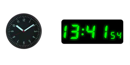
We lead our lives in analog, continuous circles of days and nights. While some have grown used and fond of digital watches, I believe that many of us still feel a more direct and intimate connection to an analog watch face. Time seems to be more human this way – maybe it’s the tradition dating all the way back to the first sundial. Or that it’s round and repetitious, just like time (day and night). These are subtle qualities that are lost in the translation to the digital notions of telling time (albeit more precise perhaps). 3) Writing within the lines All Over

typical-diary

Because of the numerous hours in a day (and various other constraints), the lines in a diary are typically very narrow. They are also usually equally distributed (somewhat). But our information is a hierarchy. Some are more important to us. Some we feel happier about. We want to highlight stuff that’s important to us. We want to write things that are more important in BIGGER sizes. Our lives cannot be so easily and clearly divided into equal parcels.

chronotebook-detail

In response to those issues, the Chronotebook’s design gives freedom: You can write all over the page – there are plenty of blank spaces. It’s not entirely haphazard either – the central graphical ‘clock’ element still holds all the appointments and schedules together in a logical and intuitive way. It is also easier and quicker to glance at the happenings for the day.

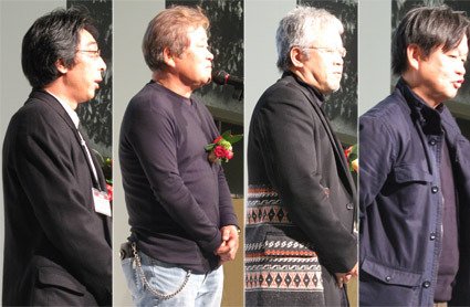
So, those were some of the thoughts behind this design. Hope it helped you understand the design intent behind. If you have any comments/criticisms, do voice them out – I’d certainly appreciate them. Meanwhile, I’d be away for the next few days in Tokyo for the award ceremony – so there probably won’t be any updates until next week.

[Greenhouse Effect] Concepts (Part 4)

This is the fourth (and last) part of the the GreenHouse Effect concept series, showing and explaining some of the thoughts behind the design concepts. The GreenHouse Effect is an exhibition by Orcadesign as part of the Singapore Design Festival, exploring what it means to tackle sustainability through design.

lullaby-plug-copylullaby-plug-explanation

We have many mobile and electronic accessories, and when we charge them we tend to leave it on and forget about them (or go to sleep). Even while they are fully charged, the devices still consume phantom electricity. There’s also always the nagging suspicion that such overcharging may reduce battery life.

Borrowing a familiar metaphor found in baby pull-string toys, the Lullaby Plug is a power socket with an intuitive timer interface. Pulling the string down activates the power supply; the length you pulled is proportionate to the time you require (markings are on the string for every hour).  As the device gets charged, the ring slowly retreats upwards until it finally cuts off power after the desired time span.

paperhaus1paperhaus-usage

Newspaper recycling is one of the more accessible and common eco practice (at least here) – they are often however either stacked at a corner messily, or are relegated to the storeroom. Their fate somewhat mirrors the mindset of households – they are conceived more as an inconvenient waste rather than a valuable resource input (albeit recycled).

The PaperHaus elegantly houses the newspapers, fitting into the living room environment (where newspapers are often read/kept). Flaps on the four sides keep strings neatly tucked. The graphics on the rear wall does more than lifting the product visually – it also indicates how many kilograms of newspapers are accumulated. When you’re done, you can just unzip the edges, tie and bring the newspaper for sale/recycling.

[This post is a part of the series on the ‘GreenHouse Effect’ exhibition under the Singapore Design Festival]. This will be the final post on it – if you have any comments or critiques of any of the ideas (or the thought behind), let ‘em loose!]


[Greenhouse Effect] Concepts (Part 3)

This is the third part of the the GreenHouse Effect concept series, showing and explaining some of the thoughts behind the design concepts. The GreenHouse Effect is an exhibition by Orcadesign as part of the Singapore Design Festival, exploring what it means to tackle sustainability through design.

bottleneck-saver

This is the Bottleneck Saver – it’s the little black ‘C’ shape thing on the neck of the nozzle. It’s a little simple device designed to attach onto the necks of common dispensers – be it shampoo, lotions or handwash – and it works by restricting the ‘travel’ of the nozzle (and thus the final amount dispensed each time). It may not be a product for everyone – some do need that much of whatever solution is in the bottle – but what Bottleneck Saver gives is a choice. Just think of the average crew-cut guy – typically he doesn’t need all that shampoo for one full press; by natural instinct, however, he would have dispensed a full amount. In addition, manufacturers always have an incentive to make users use more of their products – in some ways, this design attempts to counter that inherent bias in product design. It’s not only less of the soap/shampoo that you save – eventually you’d save more water too.

sticker-identitty

The product in this picture is actually in the top right corner – it is a set of stickers known as Sticker Identity. Often, we sub-consciously or conveniently reuse old products for new usages – we might make do with the back-of-a-notepad as a mousepad; we might use a CD jewel case as a coaster, etc. This is in fact a good practice – we don’t really need to always get a new item. The sticker set affirms these actions – iconic graphics on the sticker affirms the new-found identity of old products – in someways, you can think of it as a ‘re-birth certificate’.

[This post is a part of the series on the ‘GreenHouse Effect’ exhibition under the Singapore Design Festival].

[Greenhouse Effect] Concepts (Part 2)

This is the second part of the the GreenHouse Effect concept series, showing and explaining some of the thoughts behind the design concepts. The GreenHouse Effect is an exhibition by Orcadesign as part of the Singapore Design Festival, exploring what it means to tackle sustainability through design.

black-out-lamp

This is the Black Out Lamp. In normal days, it sits pretty as per any normal table lamp, casting light through the efficient LED light bulbs. But it’s more than just a table lamp – if and when you need a torch, you can actually detach the ‘lamp’ portion and use it as a torch, as the internal circuit can be switched to run on battery mode instead. For the same function (of illumination), we don’t really need two separate products (lamp + torch). They could very well be the same thing – plus you can definitely find it much easier compared to ransacking your third drawer in the store room.

facade-vase

The question – what exactly is a vase? Do we need a real, whole (and pretty) object to place flowers in, or is a simple facade up to the mark? Made of industrial felt, the construction of the Facade Vase is absolutely simple – two flat pieces of felt sewn together. It then becomes a parasite onto a ‘partner’ as structure – the omnipresent PET bottle that we almost certainly can find around our house – and becomes a fully functional vase. It is a versatile design too – different silhouette gives rise to rather different visual outcome.

notepadpostit-pad

Post-It pads are almost exclusively used on one side only. We also often scribble only on one side of our notepads. So, we have two ‘one-sided’ products. In this concept Post-It Notepad, the second life usability is built into the design. You start off with the notepad (using one side, presumably). When you’re done, you can remove the cover, turn it over and you get a Post-It pad. A product’s reincarnation is straightforward and integrated within the design – turning two ‘one-sided’ products into a single ‘double-sided’ one.

[This post is a part of the series on the ‘GreenHouse Effect’ exhibition under the Singapore Design Festival].

[Greenhouse Effect] Concepts (Part 1)

cup-lasso

Cup Lasso might require some understanding of the Singaporean context. When you buy a take-away hot drink in a coffee shop, chances are you’d end up with a disposable plastic cup carrier (the green thing on the left photo). Cup Lasso (pictured on the right) is a permanent alternative to this item. Apart from reducing the usage of plastic carriers (which may occur on a daily basis – e.g. for your post-lunch coffee), it can also be an identity, a statement in support of being more sustainable – somewhat like the Live Strong bracelets.

bin-there-table

‘Bin There’ is a table with an in-built rubbish trapdoor. While eliminating an unnecessary extra rubbish bin, it also makes it more convenient for the users, who can simply sweep their tabletop wastes into a plastic bag below. Eco-design does not necessitate sacrifices – in some cases, they can even enhance the functions. The plastic bag can be hanged onto sliding hooks below the table, accommodating a wide variety of plastic bag sizes.

wax-pod

WaxPod brings a familiar eco-concept to a new area of application. Refillable shampoos, lotions, etc. have been around for a long time – they consume less resources as the refills are packed in less energy and resource intensive packagings. Why not hair wax then – as it is a product that one uses constantly? In WaxPod, the white external casing is permanent, while refills come in ‘pods’ (black parts). The slits you see at the bottom of the product are vents for an optional air-freshener module, which are frequently deployed within the same setting. This reduces the total packaging and housing materials required substantially.

[SDF GreenHouse Effect] – Exhibition in SDF

greenhouse-effect-main-picture

Concurrent with the (somewhat) regular blog posts and tidbits scoured from web, I’d be doing a series of blog posts on some of the exhibitions and going through designs featured in the Singapore Design Festival(SDF) over the next few days. The first (only?) one that I will cover is the GreenHouse Effect, which is conceptualized by Orcadesign especially for the design festival.

[Disclosure: I am part of the team that conceptualized and designed for this exhibition. Which, helpfully, also affords me some ‘behind-the-scenes’ thoughts to the exhibits.]

It was clear from the start (about 3-4 months ago) that we wanted to do an exploration into green/sustainable design. This is a major (almost too overwhelming) topic in design recently, and very likely will continue to be so. The exploration for a more focused theme soon kicked off – and we reached an agreement of what we are not going for rather quickly. There are some prevalent ‘standards’ or approaches in ecodesign:

  1. Guilt: “If you do X, you’re destroying the Earth!”. Guilt is often a primary psychological emotion to exhort the consumers into alternative actions; this is often coupled with pictures of dilapidated landscape and/or cuddly animals, with the hope that the consumer would link ‘ungreen’ practices to the more invisible destruction caused. In many ways, these scare tactics would lose their effectiveness, especially as consumers become more jaded with overexposure.
  2. Statistics: “Every year, we spill X tonnes of Y into Earth; we cut down Z acres of forests just to …”. Statistics is yet another tool to back up – to argue (against the user) logically. Statistics may be quite illuminating when analyzing macrotrends – but they seldom connect intimately with the user.
  3. Sacrifices: “If we just reduce P per person, as a nation we would have saved Q…” – the argument in this is that if everyone does some green thing, the world can be saved. The person is thus persuaded to make some personal, noble sacrifices for the greater good of humanity. But sacrifices are what they are: sacrifices.
  4. Materials/Technology: “The new plastic in this product uses 30% less energy to produce, and does not emit toxic fumes to the air…these appliances uses 50% less electricity”. Important as it is, technological and material eco-innovations are seldom visible or directly appealing to the user. Often also, products stressed their ‘all-natural’ origins (e.g. no synthetic materials), leading consumers to assume that ‘natural=harmless’. This may or may not be the case – it really depends on how that natural resource is being managed and replenished.
  5. Recycle-bility: “It’s made to be recycled: you can take it apart so easily, and you can recycle all the parts!”. Many-a-times, recycle-bility is equated directly to being green. It’s simply not the case – recycling is just a small component of the whole picture of sustainability. It’s often exacerbated by the fact that ‘green-as-recyclebility’ often turns up in many frivolous products, as much to assuage guilt while encouraging consumption.

It’s not that the principles behind those trends are wrong – in fact, those are still important considerations and tools to sustainable living. However, they are admittedly tired – we’ve seen it over and over, while we are still nowhere in sight to being meaningfully greener. This was the question we set to ourselves: “what could green design be – beyond statistics, technology and sacrifices?”. Where and how could designers contribute? How can we more meaningfully connect with people through better (green) designs?

How do we create products that are appealing to the users not simply because they are green, but because they are inherently superior (and green too!)? If a greener product is better – whether in function, aesthetics or meaning – than the ‘non-green’ counterparts, there is simply no reason for the consumer to choose otherwise.

That was our idea in the GreenHouse Effect, which lead to the exhibition (photo below). In the next few days, I’d be posting the actual product concepts and approach, and how we’ve answered our probe (or not). If you want to see these concepts physically, they are still on show at the Utterubbish Exhibition (in Singapore) till Dec 16th.

greenhouse-effect-exhibition