Japan Love Hotels

japanese-love-hotels

For decades Japan’s love hotels have provided a place for couples to enjoy anonymous, uninterrupted sex. Politician and secretary, teacher and student, husband and hooker — all are welcome, as long as they pay in cash and leave when the time limit is up. But 2006 spawned a new type of love hotel. Decorated with theme park interiors and equipped with game consoles, karaoke boxes and sex machines — these establishments provide kinky fun for all types, from fetishists and sadomasochists to the ordinary couple seeking sexual adventure.

Wow, I must say I’m very amazed at these themed rooms – larger than life, vivid, extremely lived-out – I guess this is why the Japanese are so good in anime? The desire to imagine in fantasy, and more importantly, the audacity to create and live in and among it. They are a people of contradictions – generally perceived to be polite and reserved, they do have a wild side that has probably witnessed and spurred the growth of their arts and creative scenes.

[link]

COR – Green Building in Miami

cor-miami

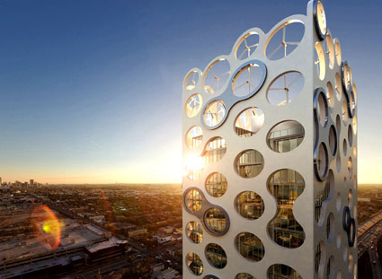
A new 400-foot cheese grater is proposed for the Miami Design District!

Designed by Miami-OPPENheim architecture + design, it will add an interesting icon in Miami’s skyline. The key merit of $40-million, 25-storey building is the emphasis on the “green” factors:

COR extracts power from its environment by utilizing the latest developments in wind turbines, photovoltaic panels, and solar hot water generation. A hyper-efficient exoskeleton shell simultaneously provides building structure, thermal mass for insulation, shading for natural cooking, enclosure for terraces, armatures for turbines, and loggias for congregating on the ground. The incorporation of all of these elements into one building represents a major breakthrough in design and engineering.

This building actually reminded me of Centre Pompidou, in the way that they showed off their design intent and utilitarian vision through explicit, external structures. Although on first sight I thought the external grater appearance was just the whim of a cheese-obsessed architect, I was pleasantly surprised when I learnt that it is a lot more, being the platform for the multitude of green architectural details to achieve their green objectives (did you notice the brilliantly integrated wind turbine on the roof?)

[link]

Art Hotel Berlin

ArtHotelBerlin

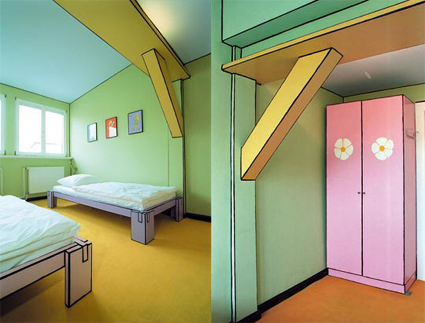
What is this? You might guess that it’s perhaps an illustration from a children’s book. Well as fake as it looks, it’s a real picture of a real hotel room – the only reason it’s so comical looking is: an artist had hand-drawn thin black lines around the edges of walls, cupboards, corners etc, so it looks really fake.

This is just one room out of the many interestingly decorated rooms in Art Hotel Berlin. They invited a different artist for each of their rooms, resulting in about 50 unique interior. This one shown above is one of the better ones in my opinion: there are many others which still couldn’t shake off the look of a typical hotel room – they were just adorned by some installation or display art pieces.

Passionate Users

When it comes to how you’d measure how satisfied a user is with your product/service, an article summed it up quite succinctly and simply: the words that you need to look for coming out of the user’s mouth is: “COOL!”.

That’s where passion begins. Those are the words I want every user of my product to utter. Ideally followed up by something like:

“Dude, you have to check this out.”

I don’t want their reaction to be a measured, rational, dispassionate analysis of why the product is better than the alternatives, how the cost is more reasonable, feature set more complete, UI more AJAXified. I don’t want them to pause to analyze the boring feature comparison chart on the back of the box.

That is an incredibly high mark. Satisfying the user so completely that he is left with nothing but amazement, and it’s not stopping there: he is so satisfied from the product that there is nothing but a compelling, almost religious desire to spread it around – to his friends, families, and even strangers – just for them to experience the experience as well. This is the pinnacle of user satisfaction – have them like it so much that they just have to evangelize it.

These are the kinds of products that creates a fan base of its own – people would make video tributes to it; spoof it; make stuff about it that goes viral. And those are really the highest forms of honor and endorsement – possibly one of the most effective ones too, now that our attention span to individual advertisements across any platform are greatly reduced.

Some examples that I could think of are Apple products and Mozilla Firefox. While there may be other companies having items that can match the sale volume of Apple’s gadgets, how many can also boast websites created by fans in anticipation of future products? iPhone Concept Blog features fan art sent from around the world in anticipation of Apple’s iPhone. People dedicating many hours of their time, painstakingly dreaming up and illustrating what your company might produce in the future.

How about Firefox? It inspires users enough to have a site showcasing fans who spent time developing 30seconds flicks to advertise Firefox – free ads made and widely distributed by fans evangelizing the browser. Or how about this picture below – crop circles cut in the mark of Firefox – perhaps to advertise it to aliens from outer space?

cropcircle3

So, when you’re designing, set that ideal in mind – “satisfied” is a good start – but look beyond! Have them enthralled! Thrilled! Mesmerized! They’d tell the world about it, perhaps make guides and hacks around it; they’d be your most persuasive marketers. Have them evangelize your products!

Pantone Color Cue 2

art_colorcue2_more

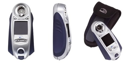
Looking like a cross between a Darth Vader (I’m serious, the first thing I saw was the face shape – maybe a frowning, angry Egyptian mummy) and a generic poorly-designed MP3 player, this device helps you identify swatches in real life by scanning it and matching it to a Pantone color.

It reminds me of a previous post where people tagged Pantone color charts to real-life objects. I used to think that these gadgets are the marks of a designer – I’d imagine someone who’d get “inspired” by the surroundings – perhaps the autumn leaves triggered a new fashion scheme or something.

But now I’m totally not sure about it. For one, “inspiration” would be pretty weak if all you can derive from it is a bunch of RGB or CMYK numbers. And also, why’d you need to match a color of a real life object – unless of course you’re simply just trying to copy it wholesale?

For those of you who do happen to use on of these, it’d be great to shed light on the how’s and why’s!

Flickr: Pantone colours in real life

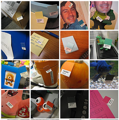
Many designers swear by Pantone color charts, saying that they give the most accurate specification on what exactly he/she wants. I still have a half-suspicious view towards Pantone charts though – secretly thinking “are we just trying to make ourselves feel more professional?”.

Anyway, that aside, this Flickr photo-set made me smile, looking at the innocuous Pantone color placed against real life items. Is that trying to say that Pantone does cover every imaginable color? Or that most, if not all, of manufactured products were specified as one of those Pantone numbers?

pantonematchingcolor

Concrete Pipe Hotel

concrete-pipe-hotel

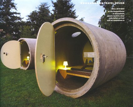
I have fond memories of my primary school, where abandoned concrete pipes like these would lie around in the field. We would climb onto them, in them, skip around them, hide in them. The thick, solid pipe seemed like an impregnable fortress – while we shared jokes and secrets within the echo-y walls. Perhaps the designer went to a similar school too!

This is a ho(s?)tel in Austria, designed by art college graduate Andreas Strauss. Organized into clusters of threes, they nestle in green fields beside the Danube River. Facilities like shower, bar and cafeteria are in a central location. The hotel currently works on an honor system – you leave behind however much you think is fair for the duration of your stay.

Now I”m just wondering – is there a little big plug that’d cap the sky-hole should there be rain?

Link

Visionaire

visionaire-issue-light

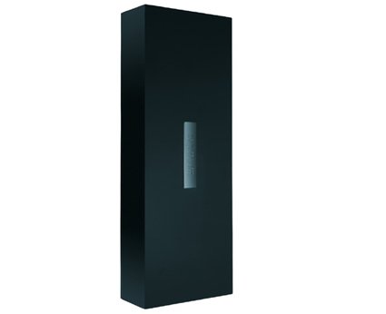
Visionaire is almost like a style magazine, and yet not quite. Published 3 times a year, each issue follows a central theme like “Smell”, “Toys”, Uncensored”, “Taste” etc., and each issue is unique. Unique because the physical look/feel of each issue is different according to the theme. For example, the issue shown above is “Light”. In order to capture the feel of the theme, it is made of 24 large format transparencies contained in the sleek black light-box, lit by paper thin filament. See the issues in their website – even though it’s just selected pages off each issue, I think you’d like it!

Of course, such indulgent luxury and pursue of detail comes at a price – annual subscription comes to the tune of $675 (yes, for 3 issues), though you’d get the assurance that you’d get your individually numbered edition (as they only publish a few thousand for each). Someone actually paid $32,000 to collect issues 1-49.

I think Visionaire is not so much “published” as it is curated. Established artists, designers, photographers and art directors have all propped in, and from the website, it really does impress as a collection of extremely high quality images and experiences.

I’d really like to get my hands on them – so bluff/wring your design managers  into this worthy subscription, and let me know! Meanwhile, I guess I’d just have to stick to Colors.


Audi – Designed to Thrill

audi_thrill1

audi_thrill2

audi_thrill3

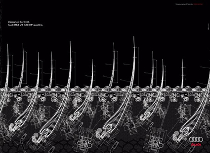
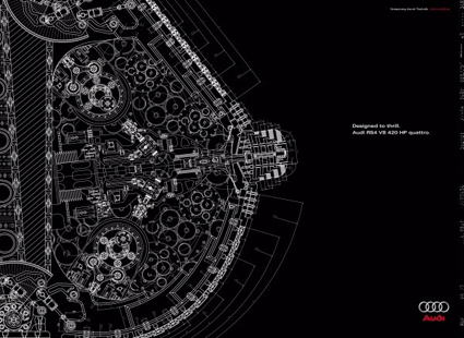
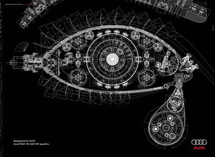
I’ve always been partial towards Audi cars – for me, they symbolize a fusion of well-thought engineering and refined design. Here’s a print ad campaign for the Audi RS4 – I think the execution for this series of ads simply crystallized that Audi spirit, expressing it in a clear and yet artful manner.

A toast to those who can see the art and beauty of engineering! And here’s the video for the campaign: