
This made me chuckle a little – from no less than the Russia-based design consultancy Art Lebedev. Also made me think whether it’s possible to make them actual storage that corresponds with its labeled size… like hard disks or something, only cuter.

This made me chuckle a little – from no less than the Russia-based design consultancy Art Lebedev. Also made me think whether it’s possible to make them actual storage that corresponds with its labeled size… like hard disks or something, only cuter.

This Moon Lamp is a whimsical giant lamp of – well – a crescent moon. While it’s certainly very literal and outright in its interpretation of the moon, it still somehow retains a magical attraction. Perhaps the moon itself has a strong sense of legacy, evocative mystery and beauty (can’t say the same for say, “Mars Lamp”). Although perhaps in real life, this lamp might just be the centerpiece of an extremely cheesy romantic proposal going along the line of “I’d even bring you the moon~~”.
[via English Russia]
I loved the new MINI that was unveiled some years back. While paying homage to the original MINI with its classic and yet playful lines, the design was modern and alluring. That car proved to be very popular indeed, reviving the MINI brand, which I suppose was the raison d’être for this new expanded MINI Clubman, which unfortunately did not gain my affection.
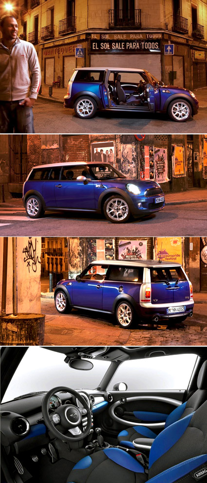
Perhaps extending a tiny classic would necessitate some compromise in its design or spirit – after all, you can’t just chop the car in halves and extend the middle section (like what Top Gear people would do to make a limousine). The proportions aren’t quite so endearing, but the thing that really killed it for me was the rear.The silver plastic frame looked really squarish and squashed-up – it seemed like it was transplanted from some other cars, like a small Daihatsu van or something.
The car actually has five doors – but it’s not your typical configuration though. The barn door design at the back counts as two, and there are two front doors, so what’s left? One short door on the side, of course! It’s on the right side of the car (see the first picture), more like a half-door that allows more access to the back seat. For instance, where the driver seat’s on the left (non-British systems), this would allow the back passenger to get off onto the pavements on the safe side of the road. One of the griefs though, is that the back seats seems to be the non-folding kind, which means you’re very much screwed if you want to chug some bulky stuff around.
Overall, for me it’s really like seeing MINI grow up and entering the awkward adolescent age. It’s got bigger, and are pretty much still uncertain what to do with some of its parts. The cuteness that carried it in the tender years cant really pull it through, and yet it hasn’t muster enough sophistication for adulthood. Haha, am I thinking too much?
[Jalopnik gallery with more pictures]
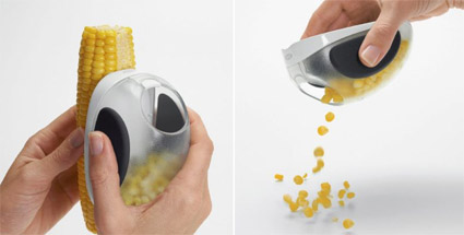
Just came across the OXO Corn Stripper designed by TODA – looks like yet another trademark OXO product – neat, safe, good grips and all. It also actually got me wondering – so before this thing came along, how did people get corn-in-a-cup?
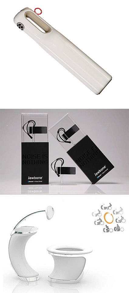
The winners of the IDSA 2007 are out – here’s the link to a gallery of goodness in product design – see if you get inspired by some (hopefully many) of them!
[Some winners shown above in the picture: The HomeHero Fire Extinguisher – the stylish and yet functionally expressive design encourages home owners to display rather than hide them, ensuring its reachability when seconds matter; The Aliph Bluetooth Headset packaging, which highlights the product instead of hiding it in layers of packaging; The Universal Toilet, a student design concept that aims to remove the excessive maneuvering a wheelchair user has to go through even in current toilet designs].

The superlative description on its homepage (seems it is already defunct) – “Newest functional innovation in the handkerchief since the Dark Ages! Dont call it a handkerchief, call it a NosePouch!” amused me. At the same time it also makes me want to dismiss it as yet another entry in “one-of-those-inventions”. But, (perhaps influenced by my current runny nose), I reconsidered and questioned myself – why was my first reaction to dismiss it? What was the gap between this and those which I’d exclaim “why didn’t I think of that”?
Does it not solve a problem? Well I think it does – the pouch-design would help to contain the goo from a case of bad flu. Even while many have converted to tissue papers, there are still the steadfast handkerchief group – so marketing may not be an issue either. Could it be simply down to the unpolished presentation and web design? Probably.
It really matters how you package it.
Most of us have mobile phones – they have become so pervasive in modern life that mobile phone usage rate in some major cities like Singapore and Hong Kong have passed 100%, and in Luxembourg, the figure actually stands at a whopping 164% (1.64 mobile phones for every person).
And yet, many of us still keep a house phone – some may keep them because of latency or legacy (some old friends may only have that as contact), but most of the time the reason is more economical – phone charges on the mobile phone is much more expensive than a residential land line, and so it still makes sense if there is moderate to heavy usage of telephones while at home.
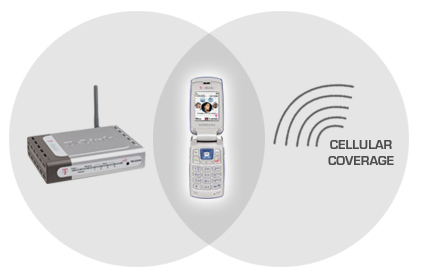
T-Mobile recognized this, and came up with the mobile phone that can “roam” across both cellular and home WiFi networks.
When it’s in a Wi-Fi wireless Internet hot spot, this phone offers a huge bargain: all your calls are free. You use it and dial it the same as always — you still get call hold, caller ID, three-way calling and all the other features — but now your voice is carried by the Internet rather than the cellular airwaves.
These phones hand off your calls from Wi-Fi network to cell network seamlessly and automatically, without a single crackle or pop to punctuate the switch. As you walk out of a hot spot, fewer and fewer Wi-Fi signal bars appear on the screen, until — blink! — the T-Mobile network bars replace them. (The handoff as you move in the opposite direction, from the cell network into a hot spot, is also seamless, but takes slightly longer, about a minute.)
It’s about time! Works with any router (great!) – but with T-Mobile’s, you get some advantages like the router prioritizing your call so downloads won’t degrade the call quality.
I’ve been waiting for this for a long time, and I do hope it comes to where I stay. That will sure save some money!
[via New York Times]
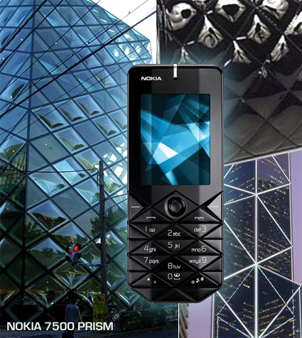
Nokia has launched the 7500 Prism model in China, positioned as a fashion phone with a very unique keypad composed of diamond-shapes (alright, if you are that particular, diamond shape from triangles). It’s certainly a fresh approach to the standard keypad – some blog sites have been calling it fugly, but I actually quite like it. Not sure about the actual product/finishing, but from the glam shot, it gives a rather sculptural quality to an otherwise ordinary handphone.
I’m not sure where the designers got their ideas from – I’ve just put together some images that could’ve been the inspirations – clockwise from left: the Prada store in Tokyo designed by Herzog & de Meuron, a classic ladies Chanel handbag, and the Bank of China in Hong Kong. Or maybe… since this positioned as a fashion phone presumably targeted primarily at girls, it just stems from the old adage “diamonds are a girl’s best friend”?

If you reject Transformers for a tad too much of violence, how about some good ol’ fashion wooden pieces that transforms – in the process teaching two languages bundled with a pictogram to boot! These Kokuyo Toypography pieces can be assembled in 3 configurations: English, Pictogram or Japanese Kanji.
Quite a clever manipulation of simple wooden blocks, and are definitely strong on the educational front too, don’t you think?
Many more examples here.
iriver was for a long while the “also-ran of the also-ran”: the followers with me-too products on the portable mp3 player scene. Their former company name, iRiver, didn’t help much in suggesting originality – it looked like they’ve pirated it straight off the iPod. (Actually the company was founded in 1999, before iPod’s launch in 2001. That’s probably why they’ve changed the company name from iRiver to iriver, dropping the capital R to shrug off the shadow of Apple’s “iProduct” naming convention).
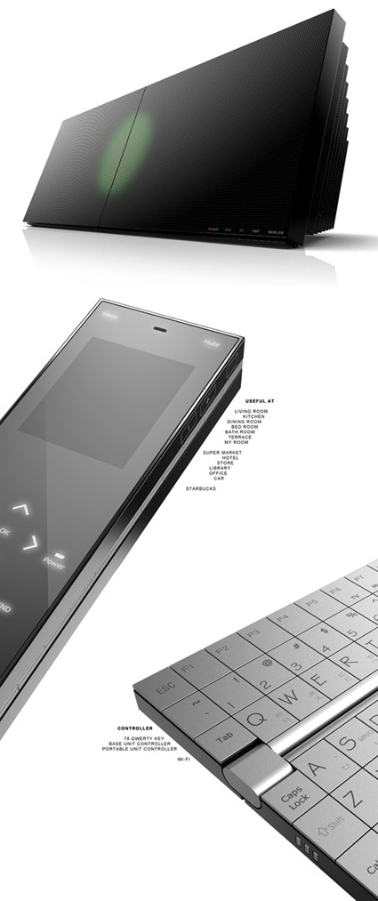
I must say I was rather pleasantly surprised about iriver’s to-be-launched Life Unit – from the looks of it, this is positioned as a high-end entertainment hub that handles all the media you could imagine: music, movie, flash, photo, e-book, Wifi-streaming; it charges and syncs with their portable players; – you name it, they’ve covered it. They’ve also got Niro Nakamichi onto the team for sound design.
The aesthetic also looks exquisite and refined, though the friendly, rounded iriver logo does seem slightly awkward nested among the precise and pristine lines in the Life Unit. I’m particularly drawn to the flippable remote control – the touch screen controller opens up to reveal a finely-crafted Qwerty keyboard. All of this does suggest that iriver put a lot of attention into this product, and that could be just a suggestion of their ambitions to come.
This actually triggered me to rethink and reposition the new roles of digital media and the devices – that will come in a later post soon!