Philips Light Painting


Philips seems to be quite keen on bringing mood/ornamental lighting (as opposed to illuminating) into everyday life – from their Ambilight Television sets to the Lumalive textiles, it does seem as though their chief has been to one too many musical fountains or something.

Shown above is a rather amazing application of light quite literally as paint. A glowing wand first dips into a pot of colored-light, and the child can then begin to draw on the wall. Painting with light – isn’t that some sort of childhood fantasy coming through?

Here is a press-release site of some of the other items that were shown in the Philips Simplicity Event last October, featuring many other similarly intuitive and yet imaginative applications of lights and colors.

Sony Design

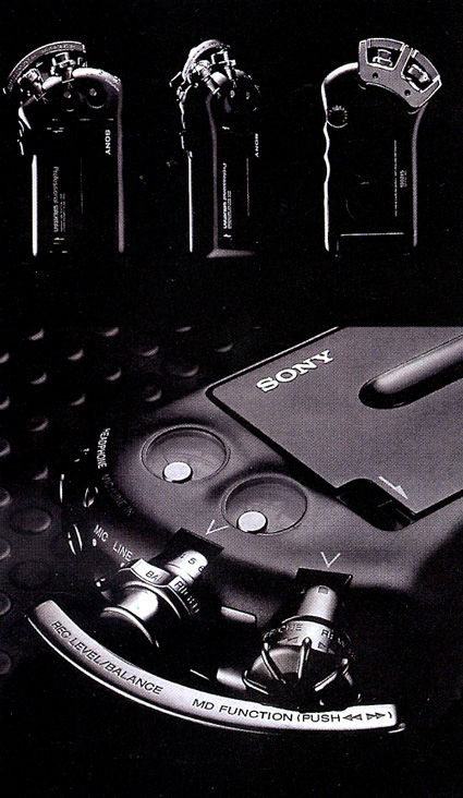
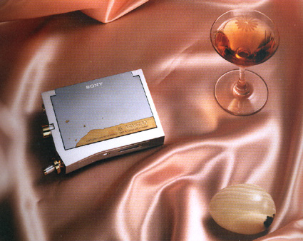
Sure, Sony seems like a pale shadow of its former self – it is no longer the de-facto category leader in most of its audio/visual business, the brand value is falling, Blu-ray notwithstanding. Yesterday though I was flipping through a book called Digital Dreams – The Work of Sony Design Center, and I must say that I am still rather impressed by some of its concepts/designs.

sony-casette-walkman-joe-waka-1989

sony-walkman-joe-wada-elegance

sony-earphone-concept-1996

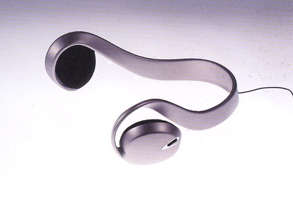
The amazing thing about the concept products in these pictures is that they’re all designed eons ago (relative to the digital age anyway). The first two are Walkman concepts by Joe Wada, done in 1989. The last one is a Street-style earphone, designed by Hiroshi Yasutomi in 1996 (which has since evolved into the mass-production version of the category-defining MDR-G61 StreetStyle. While the technology has moved on, the design to me is still very classic and dare I say, avantgarde even in 2007. The design principles and rationale behind them are still very relevant and inspiring.

And did you know that the Sony VAIO logo (VAIO – acronym for Video Audio Integrated Operations – the sub-brand in Sony that handles items using consumer audio/video) is supposed to represent the transition from analog to digital? The letters V and A forms a analog sine wave, while IO looks like the binary inputs of the digital age – and in fact, the people over at Sony is geeky in some ways – the startup melody made by VAIO products is actually the equivalent to the sound of punching V-A-I-O into a dial tone telephone.

Cool stuff – do check out the book if you have the chance – it’s a great read on the philosophy and legacy of the (once-great, and hopefully will revive to its former glory someday) Sony.

Volkswagen Ball

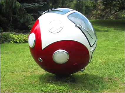
volkswagen-ball

My brain went “PS!” the moment I saw this picture (for the less aware, PS means photoshopped – where the photo was manipulated using Adobe’s software). “Bah, a very well-done spherize-filter or something.” It looks like I’d be eating the humble pie – because this seems to be the real deal – someone actually made a Volkswagen like a ball! Full respect for the audacious idea, and more for the execution.

Now if only this could really drive (it has no wheels) instead of just rolling around perhaps…

[link]

Table, Lamp.

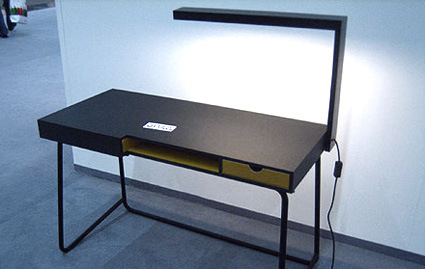
table-with-lamp

Reduce your clutter! Integrate the lamp into the table! I like this design because it does a few things in one stroke: give light to the table surface; eliminate the need for a lamp-base; create a somewhat-sculptural aesthetic look out of the whole thing; and it is easy to keep/flat-pack.

Though the lamp is probably not adjustable (meh!); though the wire seems to be clumsily jutting out of the piece (meh!); though it’d probably be cooler if the light is turned on/off simply by rotating the light into position instead of using the switch (meh!).

Designed by John Slater.

Green Lullay Cradle

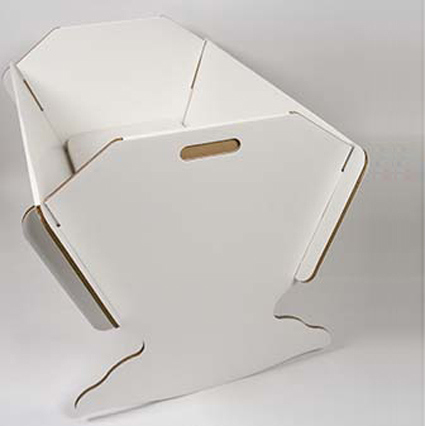
GLcradle

This cardboard cradle meets all the usual standards. It’s flame retardant and meets the EU’s safety and performance for cribs and cradles. However, unlike traditional cribs, you won’t need any tools to assemble it and you can either store flat when done or recycle the cardboard. Keep this crib in mind for traveling as well. For infants up to three months old.

It’s interesting that the introduction blurb for this cradle starts off with a defensive statement by reassuring potential buyers that this thing is safe – they probably anticipate that the first reaction from most people would be the fear of their precious newborn would roll-over, crumble, tear apart or be injured in every scenario imaginable.

That said, this design  started me thinking about whether it made sense. Portability – well, okay it can be taken apart and all that, but I do not really see it as really useful (does it have to do with me never being a parent to a baby?). Being made out of cardboard, the recyclable aspect of it seemed an important point in this design, which  is also somewhat strongly correlated with treating the “baby” phase of a newborn as a relatively temporal one.

But babies would usually sleep in a crib for maybe 3 years or so – by then the next child in line could have arrived, and who’d take over the crib for another few years. So this crib is likely to be in the house for maybe five years or more. In that case, wouldn’t a more permanent crib be more relevant? Of course, this crib has passed all the structural tests etc., but ultimately, the semantics of this design seemed to make the point that it is temporary and functional, which is probably  just about the furthest emotion away from a parent’s attitude towards his/her child.

Green Lullaby Cradle

Wireframe

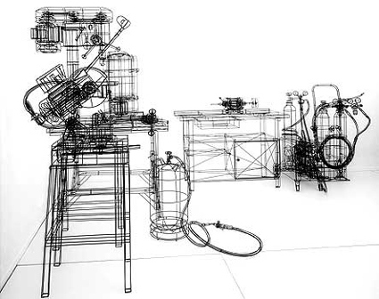
wireframe-room

This is yet another example of subverting virtual and reality – at first glance, this looks just like a typical wire-frame as used in 3D modeling – until you realize that this is indeed in 3DThomas Raschke builds everyday objects out of wires – and from a certain perspective, they really would make you wonder if you have walked into the 3DMax scene or something.

Linguine Cooker

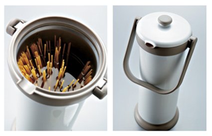
pastajapan

When I saw this over at Gizmodo, my mind went – “Finally someone has decided to make this!”. Not that I’d buy it even if it is reasonably priced – though every time I try to cook linguine (linguine is the type of pasta that is long and thin – like the ones in the picture), I’d always think to myself – “Someday, I should design a pasta cooker where you didn’t have to put one end of the pasta into hot water and you wait impatiently for it to soften to twist the rest of the pasta within my small-ish pot. “

Imagine my disappointment when I realized that it was not exactly a pasta cooker.  It’s more like a hot water flask, and has no powered heating element within the unit. That really brings pasta cooking into the kingdom of ultra-budget instant-noodle cooking or something.

Maybe I should still design the pasta cooker after all. With an easy-serving measuring feature included. And yes, with its own heater.

Head Bag

head-bag

This is the reason I love molded felt. Carry your slain, beheaded enemy around! Let the people at Station Control go panicking over what to do with you! The designer, Yael Mer, says that the design was inspired by “biblical story about Judith and Holofernes and its visual representation from the Renaissance”. Well, whatever! Guaranteed to draw a more than a few stares.

(Mer is from Royal College of Art – more quirky products on her page – like a skirt that inflates into a canoe!)