Camp in the City

car-tent

If you’re in a crowded city with a minimal budget (say, in the finals of a World Cup or something) and you don’t mind just camping it out, here’s an interesting solution of a tent masquerading as a covered vehicle. Blend into the urban landscape while surreptitiously having a good (and cheap!) night’s sleep right in the middle of the city!

Feminine Hard Drive?

costume-concept-2

costume-concept

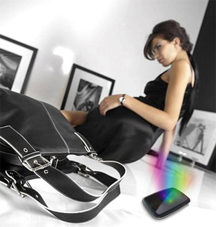
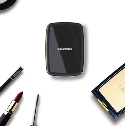
Here’s ‘Costume‘ – a concept design for a 2.5″ hard disk drive by designer Joongoo Lee, which obviously takes inspiration from ladies accessories, specifically the compact powder case. While the Samsung mark is on the product, this is almost certainly not really from Samsung design.

Diane from Popgadget (a blog dedicated to technology from a feminine perspective) here mistook it for an official Samsung idea – but it’s interesting to see her reaction to this product:

…Samsung has designed a concept compact hard drive that looks similar to a piece of make-up – and this picture shows it surrounded by make-up, to prove the point. You know, ‘cos we women are so crazy about cosmetics, we’ll buy anything if it looks like we can paint our faces with it.

So far though, this is just a concept – and maybe it should stay that way. I think the design is sleek and all, but I don’t agree with making tech designs gender specific. (Don’t small, sleek designs appeal to men, too?)

As a (male) designer, this is often a question that I ponder too. While I think simply ‘pinkifying’ a gadget is superficial, I can’t help but wonder if it (sometimes?) works. When designing a functionally neutral object (e.g. a hard disk drive) is there really no gap between male and female’s preferences? If there are (I think there are) – what are they (or what are they likely to be)?

It’s a Small World

zooplankton

embryo

zebrafish

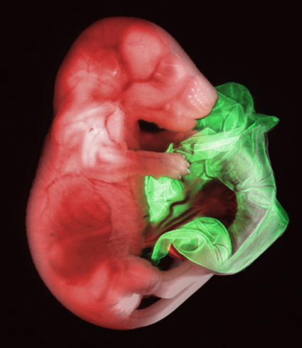
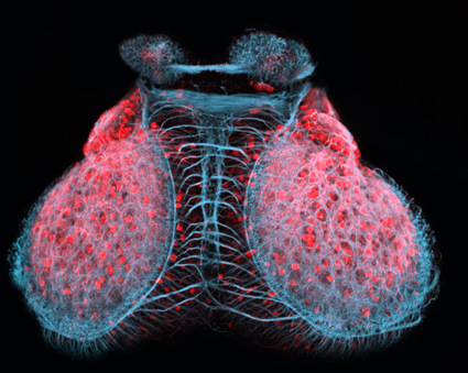
Check out some of these microphotography – (from top: zooplankton as seen in a drop of sea water with a needle head; mouse embryo; zebrafish embryo). They are just a few out of the many great shots as submitted to the Nikon Small World photography competition:

The Nikon International Small World Competition first began in 1974 as a means to recognize and applaud the efforts of those involved with photography through the light microscope. Since then, Small World has become a leading showcase for photomicrographers from the widest array of scientific disciplines.

A photomicrograph is a technical document that can be of great significance to science or industry. But a good photomicrograph is also an image whose structure, color, composition, and content is an object of beauty, open to several levels of comprehension and appreciation.

Head over to Nikon Small World~


VooDoo Envy Laptop & Packaging

voodoo-envy-box

voodoo-laptop-in-case

voodoo-laptop-unboxing

voodoo-laptop-details

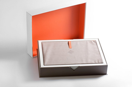
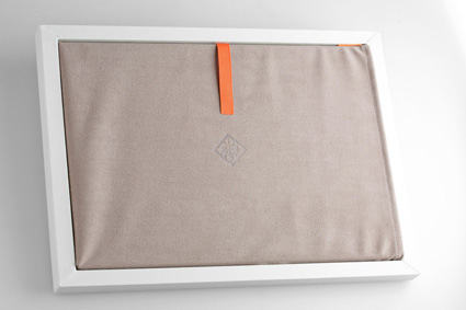
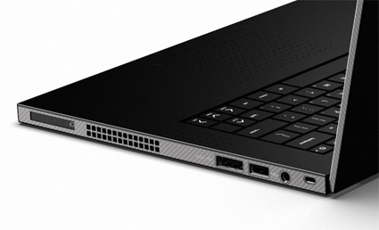
I think Voodoo has certainly showed that they are pulling out every last trick to conjure the absolutely lust-worthy, live-up-to-its-namesake ‘Envy’ laptop. Nothing’s spared – from the packaging we see the high-quality squarish box with a signature cut in front; the microfiber sleeve that comes with it…

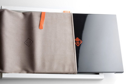
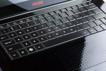
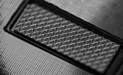
On to the laptop itself – taking on a bold, boxy profile with the high-gloss, genuine hand-formed carbon fiber shell (reminds me of Japanese lacquerware or urushi); thickness is only at 0.7 inches (1.79cm); the microweave texture on the surface; and the unique array of dimples replacing the staid trackpad.

There are a few things that I liked about these designs, which are rather rare among other similar products. Firstly, they’ve included the microfiber sleeve that is gorgeous enough to be used as a day-to-day laptop skin – the packaging isn’t necessarily just a temporary refuge for the product waiting to perish after unboxing. Instead I suspect most owners will keep the sleeve and it will remain as an iconic companion together with the laptop.

Also, as everyone’s led and harping about Apple’s ‘simplicity’ I like how Envy’s going on all burners in the details with textures. Personally I think appropriately placed surface textures add interest and detail to a product, helping to prolong an interactive experience with the owner in the longer run. Check these out:

envy-texture-1

envy-texture-2

I think Voodoo have set for themselves a mark to beat.

[More Envy goodness]

Sliding Radio

08-radio

The 08 Radio is a concept that interestingly fuses technology and plain old-schoolness. The tuning bar common to most analog radio receivers is magnified to a structural scale, while the radio itself (along with the speaker) travels along the rail to seek your favorite station.

I like how the screen seem to have unfolded and stretched straight horizontally, bursting through the sides of the plastic housing of the sliding unit to display its full content in one shot. The old-schoolness of the font and calibration, as well as the colors & materials on the speaker were also a delightful nod to the bygone style of the past.

The design is by Michael Silvanto, a part of the aivan! group based in Finland, whose website seem to have an even greater affinity for simplicity than their designs.

Re-Braun

Back in the 1960s especially, Braun was among the very cutting edge in industrial design – they were the pioneer and the leaders that played a major role in defining and shaping conversations on aesthetics and design. Even today, modern design icons from Apple are still arguably very much inspired by the Braun aesthetics of the bygone era.

The Braun Prize is still very much a coveted prize for any design students in the world, though you’d have to admit, Braun itself as a corporation has faded somewhat significantly in its influence on the design world.

Industrial designer Joe Doucet noticed this issue, and took the initiative to start the speculative design efforts designed to reignite what made Braun great:

Doucet hopes the self-funded prototypes (presented to the manufacturer earlier this year) will help initiate a change in the Braun aesthetic, which, since Dieter Rams’ days as head of design, has “lacked distinction”. “It’s been 40 years since Braun was in the design museum,” says Doucet. “The products are still engineered very well, but there is no ethos. If you remove the Braun branding they could be by any other manufacturer.”

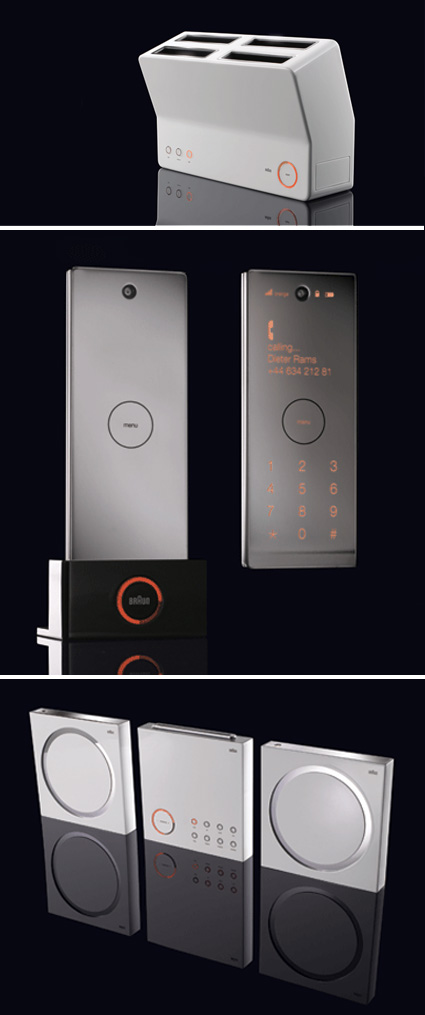
Here are his three speculative designs for a toaster, mobile phone and music player:

rebraun

For me, I’d agree with the assessment that Braun has faded from design leadership in many (most?) of its consumer product segments. Perhaps they’ve decided that one-style-can’t-fit-all-demographics; perhaps no one could take on Dieter Ram’s hats. In any case, as I glance across the home appliances aisle now, it is difficult to pick out a Braun apart from its (imho) still very iconic BRAUN logo.

What do you think of Doucet’s proposals? Do they work for you?

Steel Truss ‘Lego’s

rockefeller-erector-set

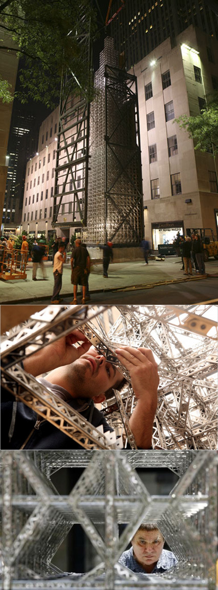
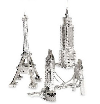
Perhaps I should count myself deprived, or maybe just too young or something – when the NYTimes reported on artist Chris Burden constructing a 65-foot tower using stainless steel modular pieces, I was in awe. I’ve never seen or heard about these metal trusses before – and thought ‘Wow, these are like LEGO for grown-up engineers or something”.

It’s inspiring to see these basic building blocks stretched right to its limits:

“The fact that it is both a model and the height of a real building is bizarre,” she said. “It is simultaneously right and wrong from a traditional building perspective. And so it starts to play tricks on you.”

The pieces he used were stainless steel replicas of a toy commonly known as ‘Erector Set’s, which to my surprise was launched almost a hundred years ago back in 1913, and created history by being the very first toy to be advertised nationally.

erector-set

Wish we’d see more (resurgence) of toys like these. Open-ended, as-challenging-as-your-imagination, and probably encourages kids (and adults!) to take interest, understand and marvel at engineering and construction ideas.

I need to play more.

CSM Product Design Graduation 08

As the world becomes more connected through the tubes of the Internet, we’re certainly also seeing more and more graduation shows moved outline (or at least, duplicated somewhat) so that the results of the students toil can be shared across the world.

Here are some of the works from Central St. Martins, hosted on Flickr here; meanwhile I’ve picked up some that I thought were interesting:

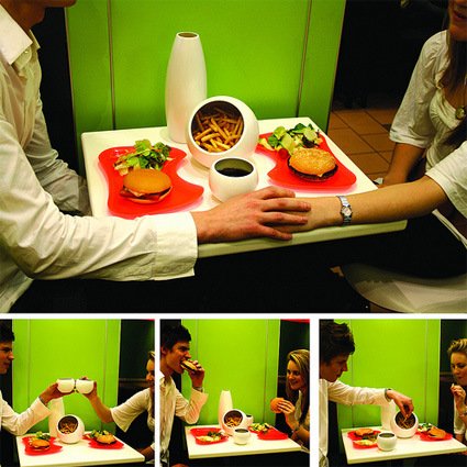
Slow Down Fast Food – by Pearl Chung
slow-food-fast-food

Slow Down Fast Food explores how different food containers can pare down the original ‘fast’ intent of the fast food into a more gradual, spread-out ritual of food consumption:

In Slow Food culture, apart from the quality of food, it is important that whether people really enjoy what they are eating and whether they can find the pleasure from it. Therefore, if people really enjoy the process of food consumption, no matter what kind of food it is, all kinds of food can actually be Slow Food. I initiated a task to design a set of products to encourage people enjoy their Fast Food consumption and to have more sitting down occassion with the others while eating Fast Food.

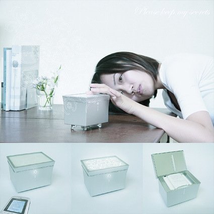
Please Keep my Secrets – by Mayuko Sakisaka
please-keep-my-secrets-printer

Meanwhile, Please Keep my Secrets explores the evolution of communication between significant halves, and steps up to restore a bit of nostalgia and tangibility in the SMS-era:

Letters offer a more poetic and romantic medium than emails or texts. I feel that this is the vanishing quality of the communication in the digital age. I initiated a task to design an electric devise to transfer the potential of this older communication tool to the text message. Fundamental concept is to see how a mobile message from a boyfriend can be kept in physical object in more emotional way.

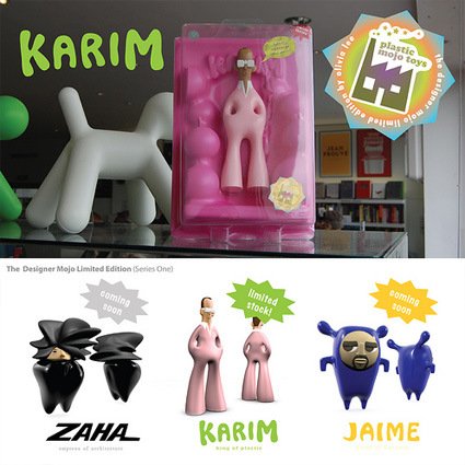
The Cult of Design – by Lee Yunn Si
designer-toys-lee-yunn-si

This is a much more whimsical and playful approach to the whole thing about design superstars – they’re so super, the very image of them are now design collectibles:

Where consumption is the new religion, this project explores the growing worship of Design and seeks to stimulate discussion of this contemporary phenomenon. So, if you find yourself coveting these limited edition designer toys, ask yourself why.

See the Worlds Highest Resolution Camera in Action


The worlds highest resolution camera is currently in development to be used as a video surveillance system. This technology, ARGUS array, developed by DARPA, features an unbelievable 1.8 Gigapixels. This is accomplished by combining hundreds of imaging sensors in an array and capturing the streaming video in real time. The video is stored and transmitted at the same time so it can be searched and analyzed later. We are not given all the details since much of this is classified, however, the video shows off some of the capabilities such as seeing objects as small as 6 inches from 17,000 feet (5180 Meter).