This cracked me up – meet Gene, who will tell you how much his life has suffered due to “First-Person Shooter Disease”.
This cracked me up – meet Gene, who will tell you how much his life has suffered due to “First-Person Shooter Disease”.
Sony Bravia may be one of the early pioneers of ads in this style – but this ad from Schweppes is no less in artistic merit either. Using high-speed cameras at 10,000 frames per second, the ad lines up a series of moments just as water balloons burst, releasing the splashes of water inside in a cool, sensual and captivating manner (when seen in slow-motion and paired with apt music).
Hopefully more ads in the future move towards this!
At first it looks just like any normal in-flight safety briefing video, perhaps just a little cheerier and more upbeat than usual. If you look closer, however, you’d realize that all the crews doing the briefing are… naked!
Fear not of indecent bits though – while they’re naked, they’re body painted with their usual uniform to still look very much un-naked; and of course, all their camera takes are cleverly angled and timed to avoid any sensitive exposure.
And why go through all these? The airline behind it – Air New Zealand – is promoting their tagline of having “Nothing to hide” (no hidden charges for checked baggage, refreshments, etc.). I suppose this somewhat gimmicky video just about captures this spirit and eyeballs!
(PS: the guy loading the baggage in the video is actually the CEO Rob Fyfe – I don’t suppose many CEOs have this sense of fun and involvement with their company!)
If you’re the type that needs a whole lot of cajoling before waking up, this may just be for you!
Segway was meant to change the face of transportation forever. Unfortunately, that promise didn’t seem to pan out. One unexpected application, however, is found in this video – the mode of movement for an eerily creepy “marching” band. The smooth glide of Segway gives off a ghost-like aura, as if these were wandering spirits making music.
It’s a segment from the street performance “Glissendo” at a French art festival: “Lightning” by Philip Glass. Concept and technical design by Ulik (the mechanical clown).

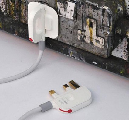
This concept design for the UK plug’s been making the rounds round the web like wildfire – probably as a testament to how much people loathe the big, fat bulky UK 3-pin plug. Here’s how it works:
It’s a concept design by designer Min Kyu Choi. There are certainly still many technical issues to resolve – putting numerous moving parts and hinges into that small an area will probably require a hell lot of (costly or difficult?) engineering to realize in a large-scale, cheap manner; the live wire looks really perilously close to the neutral wire in the assembly, etc. The final comparison for the 3-way plug was also somewhat unfair as the bulkiness of the plug-heads were also due to the transformer-circuits (e.g. in Apple’s plug).
That said, I loved how the design has approached this prickly problem and tackled it with an elegant and innovative solution (loved the fuse idea – makes it easier to change too!), while still maintaining the compatibility with the current sockets. Kudos to the designer!
Blast from the past – commercial in 1978 advertising Milky the Marvelous Milking Cow – you (more likely your kids) put water in it, and pretend-milk comes out of the udder. I wonder if we still have this type of … weirdly attractive toys around the aisle nowadays…
As an industrial designer, I am quite intrigued in the approach that this chair has taken to resolve ergonomic issues. The task chair design is always a complex and often rigorous one – it has to fit many people, be comfortable to be used for long periods, by many people of different sizes and statures, etc., and it is always welcoming to find new designs and innovations on it.
The Salli chair in the video above does tackle some of those issues – with a rather peculiar focus in the marketing: a big chunk of the ergonomic benefits it is extolling are specifically to address the comfort of the nether regions. I just wonder though the amount of emphasis placed on it throughout the entire video seems to be making it more awkward for people intending to buy this chair…
Karim Rashid is definitely no stranger to many of us – here’s an interview from Nylon TV in his home as he talks about design – you can just catch glimpses of how he has filled up his house with design objects mirroring his personal style – though he also mentioned that he’s getting more and more dematerialized.
Hmmm. Actually I’d love to see Karim Rashid doing design that doesn’t have a tangible, physical expression…that should be quite interesting.