MINI Augmented Reality Ad


There is quite a bit of user involvement before he/she can ‘get’ the ad – but the concept is an interesting one. The steps are as follows:

  1. User sees the ad on magazine, follows instruction to the MINI website.
  2. User holds the magazine in front of his own webcam.
  3. MINI website detects the orientation of the magazine, super-imposes a 3D model of the MINI car on the magazine on the monitor.
  4. User plays around, taken by the interactivity of this augmented reality.
  5. ???
  6. Profit!

[via designboom]

Seadragon for iPhone

I was somewhat surprised that Microsoft has decided to launch for free (for the first time) Seadragon Mobile, a very interesting zooming-user-interface, on Apple’s iPhone. Check it out:

I was first captivated by Seadragon some years ago when it was shown in a demo – the way it can (infinitely) zoom down smoothly and still be sharp (without first opening a gigazillion-byte file), the way it has almost zero UI element on screen for it to work (so nothing is blocking you from the things you actually do want to see)  – is something inherently suitable for mobile application, IMHO.

Wonder if this’d take off to one day become a dominant way of accessing information. While currently it’s very much just browsing through static images, some day it may be interactive elements: links, bookmarks, videos, opened and running applications, etc.

Ecofont

Could this be the David that takes down Goliaths like HP, Canon and Epson?

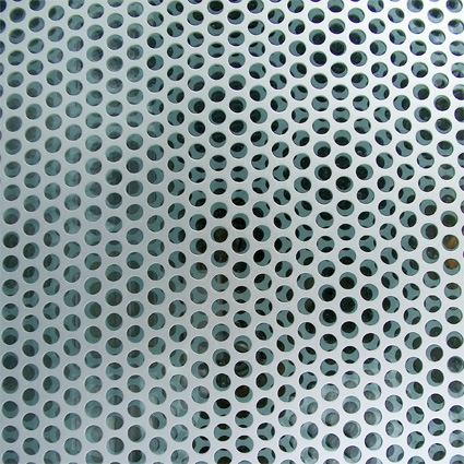
Architects have been using perforated metal panels like this for a long time. The holes are spaced and cut in a way that does not compromise the overall strength of the material, while removing a substantial portion of the weight, making it easy to use these panels for applications from facade to railing panels (with the bonus of allowing some light through and sometimes making interesting patterns from).

perforated-panel

What happens when the same spirit is taken to typefaces? That’s what happened to Ecofont (a free font), designed with minute perforations in its face without sacrificing legibility:

eco-fonts

The Ecofont is developed by SPRANQ, based on a hunch of Colin Willems. We tried lots of possible ink-saving-options. From extra thin letters to letters with outlines only. We have omitted various shapes: dashes, squares, triangles and even asterisks. In the end the circle was chosen as the best candidate for the job.

With the Ecofont SPRANQ hopes to increase environmental awareness too. Increasing customer awareness about printing behavior: is printing really necessary or (partly) a waste of ink and paper? We also hope to inspire software giants and printer manufacturers to innovate in an environmentally conscious manner.

Would this be a small catalyst that dramatically reduces printing ink needs? Probably not – but still, I liked the interesting thought and cross-field application of the same concept!

Another Evolutionary Painting

Blog posts are like buses…when they come they come in clusters of the same kind or number.

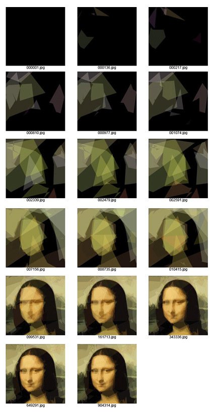
Hot on the heels of computer-generated algorithm to design – here’s yet another manifestation – this time the challenge was to paint as close to Mona Lisa (or for that matter, any other image) as possible simply by using no more than 50 semi-transparent polygons.

monalisa-evolution

As described:

We start from random 50 polygons that are invisible. In each optimization step we randomly modify one parameter (like color components or polygon vertices) and check whether such new variant looks more like the original image. If it is, we keep it, and continue to mutate this one instead.

You can see that by iteration 904314, it’s very close to the original (or probably about as close as it can get for just 50 overlapping polygons).

Go on, play with it yourself here and see how it is done (you can use your own pictures too!), and the explanation (source code coming soon too) is here.

Car Design by Evolution

Back in school I used to have a professor who taught us about design+genetics (and called it Geno-metrics). The central thesis was for designers to move away from the role of designing the object to designing the parameters/rules in which the object can exist. In a one-semester exposure this was nothing much more than programming parametric CAD software to churn out hundreds of designs based on a series of randomly varying dimensions (within reasonable bounds).

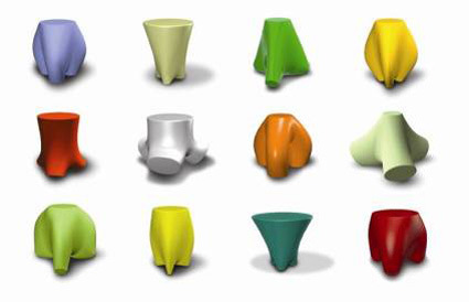
So we were supposed to find an object, program a range for a core set of dimensions, and let it be randomized within these bounds. Due to the ‘law’ within the programming, the outcome is bound to be varied and yet have identifiable ‘genes’. For instance, here are some stool designs (not necessarily valid) that were executed by the computer:
genometri-stools

I remember the majority of the class balked at the idea. Some of the reasons include:

“So what does that make me? I’m here to learn design – if the computer does everything, then what’s the point?” – the same was said for a lot of other things that are taken-for-granted design tools for designers nowadays too.
“How can the computer make good designs – it has no brains/intelligence?” – Well maybe not in 100 iterations – but what about in 1000? 1 million? 1 billion?

I was somewhat sceptical too, but the idea of ‘genes’ captured my imagination. The idea that you can boil a cacophonic, complex external object (or even systems), and distill it into its essence with just a few variables. However, the shortcomings of the above exercise lied in the fact that at the end of the day, the judgement for ‘good design’ is subjective and human. This readily makes the computer seem incompetent.

A contrasting case-in-point:
designing-a-car-by-evolution

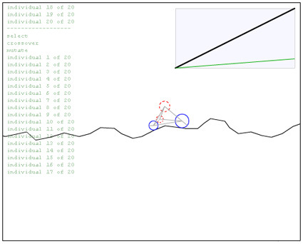
This was a Flash program by Matthew where a primitive car design is iterated by computer.  The (objective) aim of the car (that defines whether it’s a good design or not) is the length of treacherous terrain it can go pass before crashing. The variables are the size and initial positions of the 4 circles, the length, spring constant and damping of the 8 springs.

If you let it run, you’d see that as it crashes, it reboots and tries to refine the design again, and through time, the design gets improved without further manual input.

Here is the difference – with a quantifiable, objective feedback to the success of a design, computers can automate and rapidly refine designs (very likely) better than a human can. If the evaluation is subjective, however, the process becomes ineffective or slows down by orders of magnitude.

In a landscape where we are increasingly talking about user-generated content, democratic design and increased semantics intelligence for computers, this may become more relevant. There are already web-advertisements that modify its own designs (font size, colors, images, etc.) on-the-fly based on real time feedback on click-through-rates.

How/where else can this be applied?