Nicely produced short videos explaining what is “information” and what is “architecture”:
Created by Maya Design.

Nicely produced short videos explaining what is “information” and what is “architecture”:
Created by Maya Design.
Even if you’re not really into Formula 1 racing, the video is yet another nice, slick and well-explained production, going through some of the changes to the race format in order to reduce costs for teams involved and to make the race more interesting.
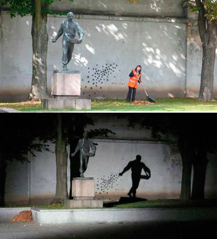
I thought this statue “Seeder” in Kaunas, Lithuania quite nice – how as nightfall the shadow gives the statue a new life and new angle – much more interesting than the daytime version I’d say!
Here are some other ideas (that didn’t make it) – many are as interesting too:
The concept itself isn’t anything new – in fact many of us has probably tried our hands on this, drawing faces or names with sparklers. But I thought Michael Bosanko’s execution was quite above the average:


The pictures are not Photoshopped – just long-exposure photography (anything from 10 seconds to an hour) with light torches and carefully chosen backdrops – typically empty urban spaces at night. I particularly like the sense of depth that conforms into the space; in amateur shots the light source are often formed into 2D, flat words or maybe smiley faces, but in this case the light path transverse and flows along with the scene – e.g. the spider on top.
Good stuff!
[via Daily Mail]
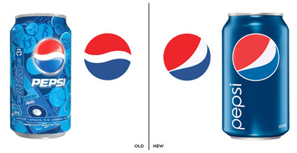
It has been some times since Pepsi launched its new logo and identity. In the old design, the blue-red sphere sits above the can with various (blue-toned) graphic designs behind it that were launched every 3-4 weeks, in an attempt to reflect the fickle-mindedness and lack-of-attention of today’s generation. Apparently that didn’t work out well enough – they’ve now come up with a much more toned down can design, removing all the distractions (ala Coke) to leave a flatter, much more graphical and in-focus Pepsi globe, adorned with a new twist in the white partition.
Most of the reaction I see on the web expressed disapproval over the makeover, feeling that much heritage was destroyed in an uninspired stroke. I stumbled across a brand identity file that was supposed to support this new brand direction and was surprised by the amount of “inspiration” for this new identity – of how this new Pepsi Globe is basically going to be the center of the universe after the re-branding:
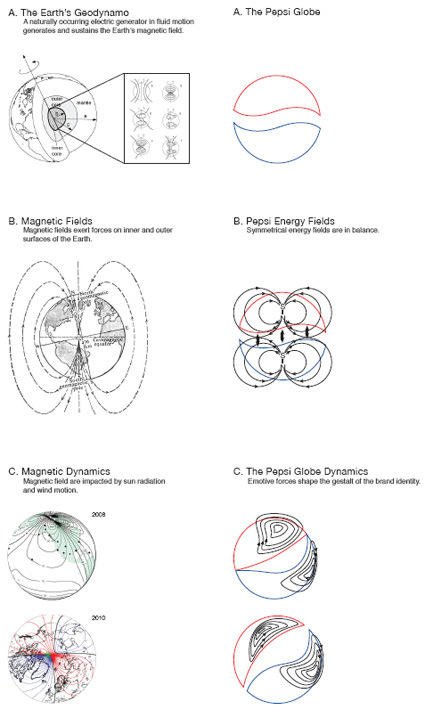
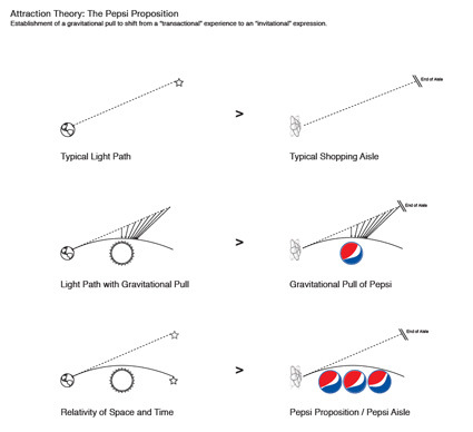
Personally I thought – hey, it’s great that you have an inspiration. But to me it seemed in this case the inspiration went really hyperbolic – contrived scaffolding (weakly) attempting to persuade and hold up the new identity. It is trying to make linkages between the visual identity and the ‘cool concept’, but often where there is none.
And at least for Lawrence Yang, it seemed the notions of the Pepsi Globe supposedly bending the space-time continuum doesn’t quite carry through:
![]()
Nikki Farquharson, a graphic designer-illustrator took some of the age-old familiar proverbs and adapted them into something that may be more reflective of modern times – it’s quite interesting to see how the usual statements get twisted and yet strangely still describe truth (somewhat? perhaps with less enduring wisdom)…
More here at the portfolio site (under ’65 modern proverbs’).
I thought this was quite funny and creative –
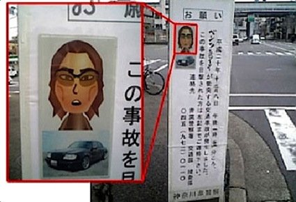
In Japan’s Kanagawa prefecture, it looks like you can add ‘police sketch artist’ the list of occupations being killed by technology. The authorities there evidently skipped the pad and pencil and went straight to the Nintendo Wii when they had to come up with an image of the perpetrator, using the Mii digital avatar tool.
‘Mii’s are avatars created for playing games through the Nintendo Wii – I suppose this simply shows that people will use their creativity and the most proximate/easiest tool to get what they need done?
[via autoblog]
If you have a microphone you may want to try this site out – instead of using the typical interface tools like mouse or keyboard, this Flash application requires you to use the microphone. A low volume tone will make the line curve counterclockwise, a medium will let it run straight and a high volume will turn the line to the right.
For example:
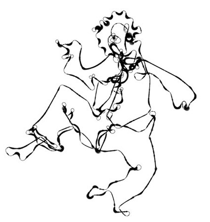
(no, that’s not my drawing – it’s an example on the site)
[via Today and Tomorrow]
Perhaps this is how music playlists should’ve been all along – visual and much more spontaneous and interactive in how you’d listen to and choose songs, created by MIT lab’s Anita Lillie (as part of her master thesis):
My Master’s thesis is focused on the problem of finding music you like, both inside your own collection (to match a particular mood, for example), or outside of your own collection. I don’t like the hugely text-dependent ways of searching for music in traditional media players like iTunes and Windows Media Player. My thesis work will depart from that interface, and will present your music collection in a space, organized by similarity. I will be calculating similarity both from audio features (straight from the audio signal) and textual descriptions (gathered from tags on the web).
It’s also great that she’s decided to share it out openly and early – hopefully this’d turn into a mature (free and open?) software soon too – I’d certainly dig this over iTunes and Windows Media Player.