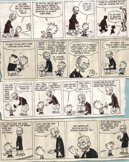
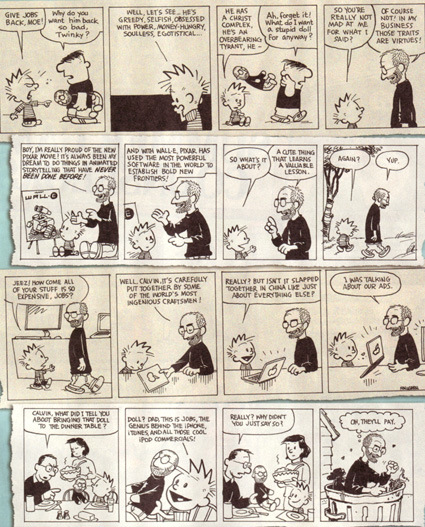
Steve Jobs replaces Hobbes in this series of “Calvin and Jobs” – if you can’t read it well, the larger versions are here and here.

The portrait photos are great, the navigation style is interesting – but I feel shallow if I just commented on the design of Philip Toledano’s site about his interaction with his dad (age ninety-eight) who has no short term memory. It is an ongoing chronicle – do head on and be touched.
(Move your mouse to the bottom right corner for the next picture; towards the left of the screen for the ‘overview’).
Philip Toledano – Days with My Father

Must you cute-sify your logo if you want to show you’re green? For instance, major corporations like BP and Monsanto have ditched their stodgy and serious logos in favor of cuter and more ‘down-to-earth’ ones. Nicole Peterson (who has a very interesting research going on – the usage of cute in contemporary design) ponders in this article. Excerpt:
Environmental awareness has been around for decades, but increasing alarm about global warming has put it on the forefront of the public mind. It is no longer only in the realm of hippies and tree huggers; the average American consumer can also be an environmentalist! But since the issue of environmentalism is so vast and complicated, many newcomers to the green movement may feel unsure about where they can start. Cuteness is an effective way to make novel, complicated ideas and technology easier to understand by taking away uncertainty and allowing empathy. For example, when introducing the iMac G3 in 1998, Apple focused on the computer’s cuteness and ease of use rather than its technological capabilities. Television commercials playing the Rolling Stones’ “She’s a Rainbow” emphasized that the G3′s rounded, approachable design came in a variety of bright colors. Similarly, the green movement is now focusing on easy, feel-good ways consumers can help the planet.
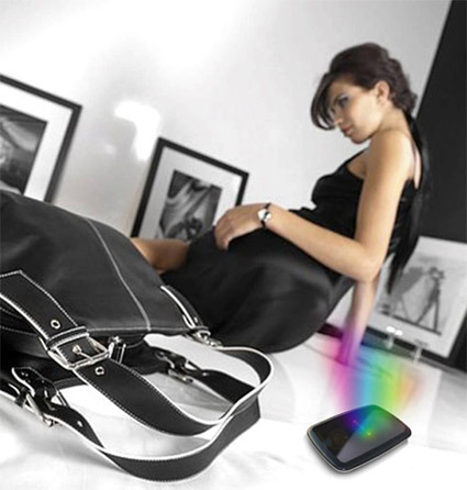
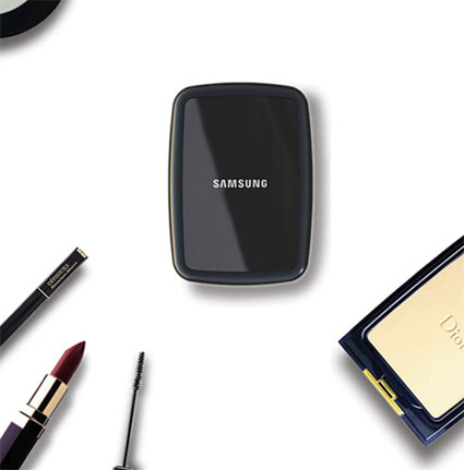
Here’s ‘Costume‘ – a concept design for a 2.5″ hard disk drive by designer Joongoo Lee, which obviously takes inspiration from ladies accessories, specifically the compact powder case. While the Samsung mark is on the product, this is almost certainly not really from Samsung design.
Diane from Popgadget (a blog dedicated to technology from a feminine perspective) here mistook it for an official Samsung idea – but it’s interesting to see her reaction to this product:
…Samsung has designed a concept compact hard drive that looks similar to a piece of make-up – and this picture shows it surrounded by make-up, to prove the point. You know, ‘cos we women are so crazy about cosmetics, we’ll buy anything if it looks like we can paint our faces with it.
So far though, this is just a concept – and maybe it should stay that way. I think the design is sleek and all, but I don’t agree with making tech designs gender specific. (Don’t small, sleek designs appeal to men, too?)
As a (male) designer, this is often a question that I ponder too. While I think simply ‘pinkifying’ a gadget is superficial, I can’t help but wonder if it (sometimes?) works. When designing a functionally neutral object (e.g. a hard disk drive) is there really no gap between male and female’s preferences? If there are (I think there are) – what are they (or what are they likely to be)?
The Natural Theatre in the UK has a ‘Street Theatre’ section that I thought was pretty cool:
We don’t perform ‘a show’ but rather people an area with immaculately turned-out, visually striking characters acting out a scenario. Often we are unannounced and at first might blend with the surroundings and passers-by. Gradually our eccentric behaviour becomes noticed and onlookers start pointing and laughing. Eventually the whole street comes to a standstill and the onlookers become willing participants.
It’s a bit like Improv Everywhere, though Improv tends to involve high numbers of volunteer amateurs while this Street Theatre are a few professional actors dressed up playing interesting (and often very weird or out-of-this-world) characters in an attempt at spontaneous guerilla drama. Check out some of their very creative scenes:

Freezies
Striding in strict formation, these serious looking gentlemen stop in mid-step and freeze for up to five minutes. A crowd gathers to investigate. Suddenly, the freeze is broken with a blood-curdling primal scream. They then continue their progress, repeating the exercise. People love to follow them to watch the reaction of the next unsuspecting audience.
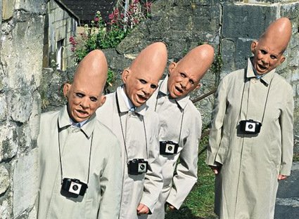
Pointy-Headed Aliens
Pointy-headed aliens equipped with the wrong information about Earth, and naively puzzled by the reaction of Earthlings. A traffic-stopping scenario.
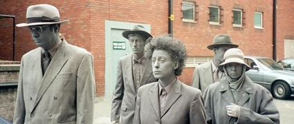
Grey People
Strange, sad, monochrome people creating wistful tableaux as they move slowly and silently down the street. A haunting moment in a busy day.
This research is pretty interesting. Here’s the premise: photos are easier to capture (and in a better quality) and it’s also easier to edit/manipulate. Put the ease-of-maneuver of photos into video shots, and composing them together as if they were originally one to begin with.
Here’s the description from the researchers:
The work presents a system for automatically producing a wide variety of video enhancements and visual effects. Unlike traditional visual effects software (e.g., After Effects, Shake, Boujou, etc), the system is completely automatic and no manual labor is required from the user. The major limitation of the work is that it can currently handle only videos of static scenes (i.e., videos shot with a moving camera but containing no moving objects in the scene). Efforts are being made to lift this restriction in future work.
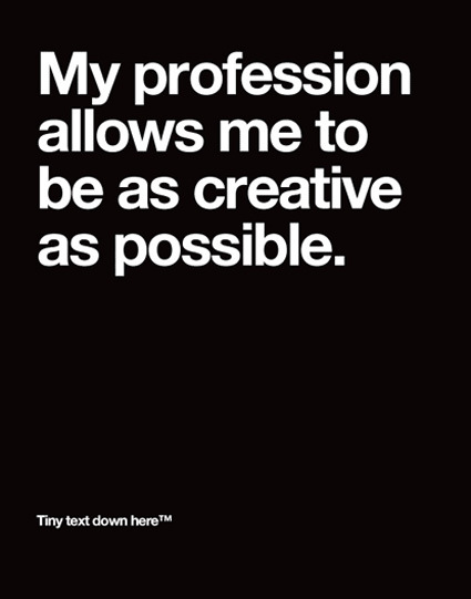
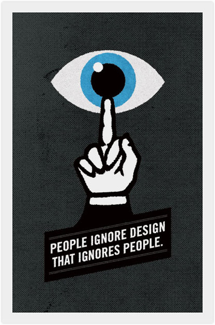
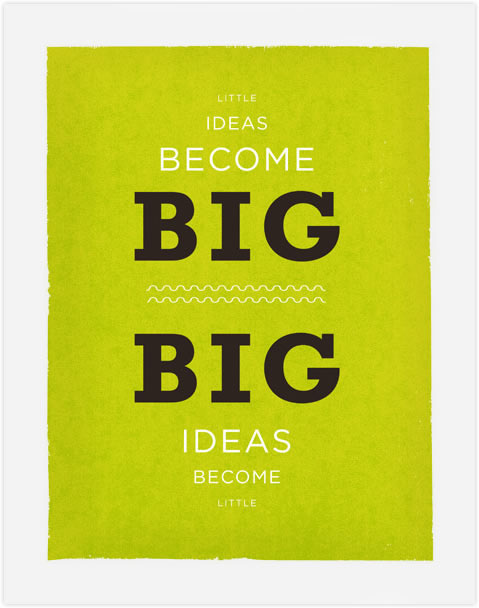
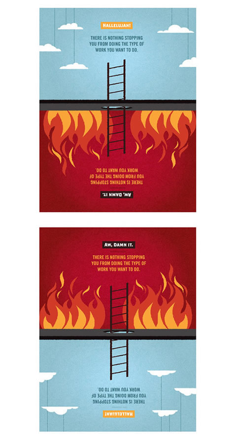
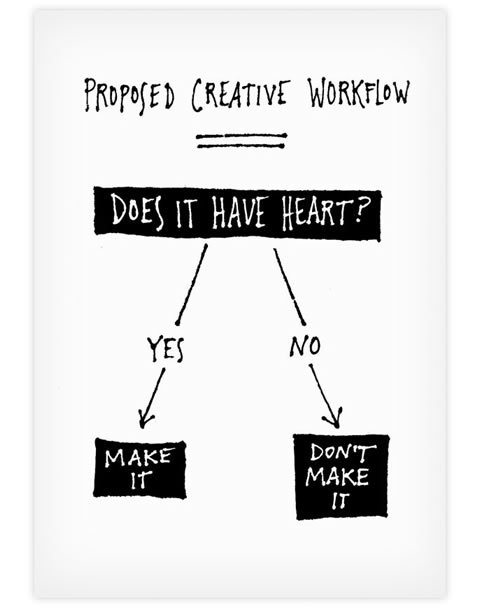
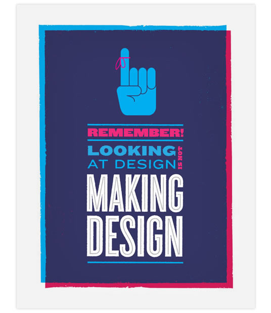
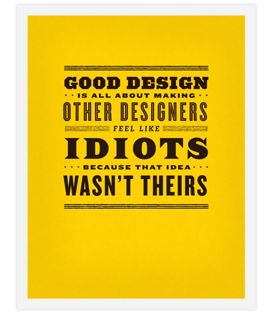
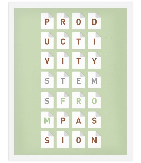
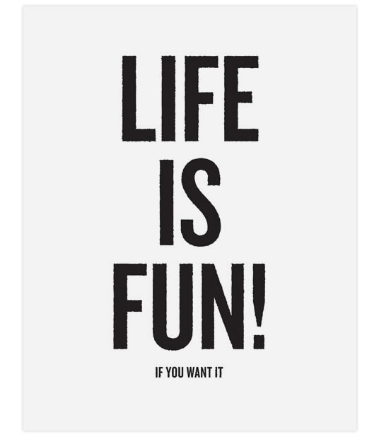
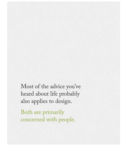
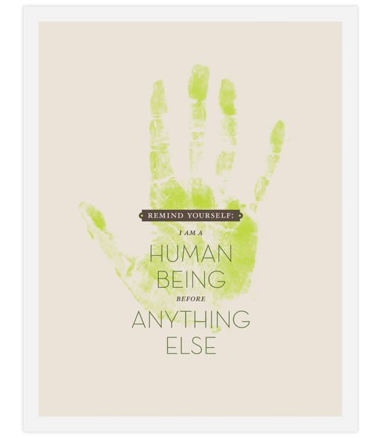
Frank Chimero is a talented graphic designer from Missouri, with a particular knack (as far as I see) blending wholesome goodness and bits of humor into nostalgic designs. This post features one of his series ‘Inspirational Design Posters’:
I decided to embark on creating some “inspirational” posters aimed specifically at designers. The topics range from various truisms I’ve discovered about the field in the past few years to snarky tongue-in-cheek comments. I think we designers spend an awful lot of time talking to ourselves, and I consider this my contribution to the monologue.
I quite like how most of his posters are simple and well-proportioned juxtaposition of just a few elements – and there’s no harm having these to inspire you.
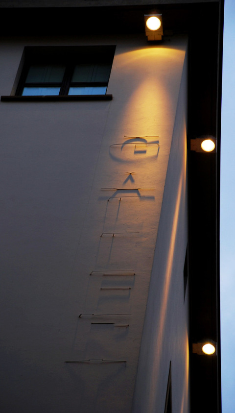
The sign is discreet – not too common for a marque bearing the name of a tourist-attracting business like a hotel. But that’s how this hotel in Florence, Italy roll. A faint spotlight at the top of the wall casts light upon what we usually see as an awkward ensemble of wires and voila – the name of the hotel is spelled out in the shadows on the stucco facade.
Subtle art!
rust the Japanese for the weirdest and yet engaging content on their variety show. In this one, they’ve managed to (in my view) put nostalgia and creepiness into one – a variety-show rendition of the famous ‘We are the World’ MTV.
This brought me back to the times of school physics – I remember we were introduced to a bunch of abstract symbols (the icon for each gate type), what each meant (bunch of truth tables), etc. This video shows each of the logic gate in a more physical form though – through domino constructions. Much more interactive isn’t it?
Put together a bunch of these dominoes, and we’re on our way to a Core-I7 (or something)…