
Here is the list of the IDEA Awards 2008. Check out which products were deemed the best industrial design. Now 5 years later, other than the iPhone 3G, were any of them a hit? Check out the original list here Business Week.

Here is the list of the IDEA Awards 2008. Check out which products were deemed the best industrial design. Now 5 years later, other than the iPhone 3G, were any of them a hit? Check out the original list here Business Week.
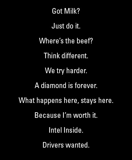
Each line above was concocted as part of a commercial campaign, and each of them has resonated with us, associated strongly with the brand behind it, and became classic in their own rights. Tagline Guru has a list of the top 100 most influential taglines in history – check it out to see if you agree!
Wow, that’s way cool – demolishing a building from the lowest level first:
How do they do it? First they replace the support pillars at ground level with computer-controlled metal columns. Then, a crew carefully demolishes the entire floor by hand, leaving the structure resting on the mechanical pillars, which then go down slowly until the next floor is at ground level. They replace the support pillars again with the mechanical ones, destroy that floor, and repeat the operation until they get rid of all the floors. This makes it look as if the building is shrinking in front of you, or being swallowed by the street.
According to the company, this method greatly reduces the environmental impact of the demolition, as well as the time. Kajima says that it speeds up the task by 20%, while making it easier to separate materials for recycling, as well as reducing the amount of products released into the air.
I suppose a method like this would also work very well in a congested urbanscape like Tokyo. The marvels of engineering!
[via Gizmodo]


Check out some of these microphotography – (from top: zooplankton as seen in a drop of sea water with a needle head; mouse embryo; zebrafish embryo). They are just a few out of the many great shots as submitted to the Nikon Small World photography competition:
The Nikon International Small World Competition first began in 1974 as a means to recognize and applaud the efforts of those involved with photography through the light microscope. Since then, Small World has become a leading showcase for photomicrographers from the widest array of scientific disciplines.
A photomicrograph is a technical document that can be of great significance to science or industry. But a good photomicrograph is also an image whose structure, color, composition, and content is an object of beauty, open to several levels of comprehension and appreciation.
Head over to Nikon Small World~
Matt Willey recently put together a video snapshot of the design and editing (and editing, and editing, and editing…) process for a Royal Academy magazine cover story. Before the final layout is frozen – there is a pretty long and iterative process that designs in general often undergo before it reaches the final glossy look (which is what most laymen may have access to).
This may help in-part for those of you who have clients or others saying “What? You spent a whole day just on this”? type of questions.
A wonderfully weird stop-motion video of the pasta-cooking process.

How do you want to die?
“Would you prefer to be old when it happens?” she then asked.
This time the response was swift and sure, given the alternative.
Then Dr. Lynn, who describes herself as an “old person in training,” offered three options to the room. Who would choose cancer as the way to go? Just a few. Chronic heart failure, or emphysema? A few more.
“So all the rest of you are up for frailty and dementia?” Dr. Lynn asked.
And then she showed the audience – health policymakers, legislative staff, advocates for the aged and for family caregivers, etc. mostly at middle ages – these graphs:

Dealing with one’s own mortality is definitely not a pleasant thing – it’s not all fun-and-games, and many of us would probably just turn a blind eye to it, avoid it and pretend it doesn’t exist, so much so that death is in many ways still a conversational taboo. You may ask someone about his family, his career, his life in general, but never about his death. When conversation hits a recently-deceased family member, the standard is just to say “Oh I’m sorry” and to just fudge on from there.
Handling (on-behalf) a sick loved-one’s can prove to be an even more difficult dilemma. Family members with sick elderly often find themselves staring down extremely tough decisions, tangled amongst the vines of exorbitant medical costs, guilt, dignities, care-responsibilities, quality-of-life, etc.
As medical treatment advances we are seeing ways of intervention that can put more time into our lives – but it doesn’t necessarily put more life into our time. At some point we would need to ask ourselves how do we want to age – and die?
[via NYTimes – The New Old Age]
If you’re in a Gandhi mood today, you may want to pay Joseph Delappe a visit, because he loves Gandhi. Or really admires him. Or something like that. Because for one, he built this incredible 17-feet Gandhi statue (looking somewhat like a video-game character back in the days of Playstation 1 or something – what with the low-polygon count). Not only did he build Gandhi, he’s made an Instructable out of it – so you can make your own Gandhi in your own backyard too!

The reason that he makes it is perhaps somewhat more interesting than the sculpture itself. Joseph has an avatar in the online virtual world Second Life called (guessed it?) MGandhi Chakrabarti:
In March of 2008 me and my Gandhi avatar walked throughout Second Life for 26 days to reenact his famous 1930′s Salt March – the forward steps of my avatar in SL were controlled by me walking in real life on a customized treadmill.
… After walking with Gandhi in Second Life for 240 miles I decided it would be interesting to extract my avatar from this online world and recreate him in monumental scale…the process of creating the 17′ tall cardboard Gandhi using a variety of readily accessible (mostly free!) software tools, cardboard and a hot glue gun. The production of this sculpture took a total of 4 weeks, 6 days a week, 9-11 hour days with the assistance of an intern for two-three days of each week.
Here’s MGhandhi walking in Second Life:
[Artist’s Page]

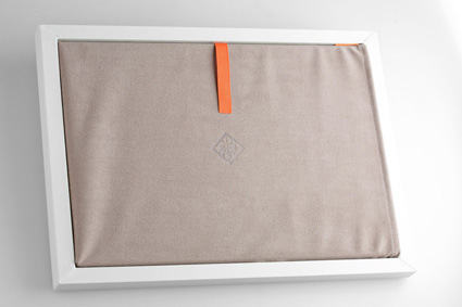


I think Voodoo has certainly showed that they are pulling out every last trick to conjure the absolutely lust-worthy, live-up-to-its-namesake ‘Envy’ laptop. Nothing’s spared – from the packaging we see the high-quality squarish box with a signature cut in front; the microfiber sleeve that comes with it…
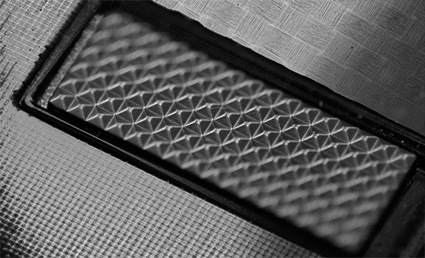
On to the laptop itself – taking on a bold, boxy profile with the high-gloss, genuine hand-formed carbon fiber shell (reminds me of Japanese lacquerware or urushi); thickness is only at 0.7 inches (1.79cm); the microweave texture on the surface; and the unique array of dimples replacing the staid trackpad.
There are a few things that I liked about these designs, which are rather rare among other similar products. Firstly, they’ve included the microfiber sleeve that is gorgeous enough to be used as a day-to-day laptop skin – the packaging isn’t necessarily just a temporary refuge for the product waiting to perish after unboxing. Instead I suspect most owners will keep the sleeve and it will remain as an iconic companion together with the laptop.
Also, as everyone’s led and harping about Apple’s ‘simplicity’ I like how Envy’s going on all burners in the details with textures. Personally I think appropriately placed surface textures add interest and detail to a product, helping to prolong an interactive experience with the owner in the longer run. Check these out:

I think Voodoo have set for themselves a mark to beat.
[More Envy goodness]
If you’re into content page design – Smashing Magazine has collected a smorgasbord of content pages from a wide variety of publications in a wide variety of styles.
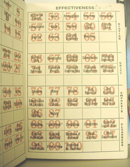
Guide to Grammatical Errors

Annual Report for SB Bank
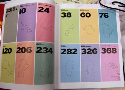
The Canadian Hockey Atlas
Head over for more!