Interesting Economics

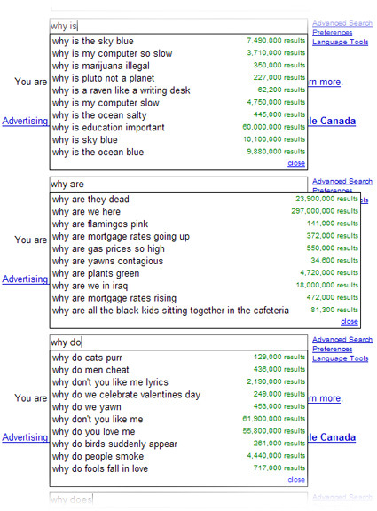
If you’ve enrolled in an average Economics 101 classes,  you’d probably be spending time on (deceptively) simple-looking graphs and chanting mantras like ‘quantity demanded falls as price increases’ and such. But questions like those below are what (I think) makes the subject much more interesting:

  • Why do women endure the discomfort of high heels?
  • Why is milk sold in rectangular containers, while soft drinks are sold in round ones?
  • Why are DVDs sold in much larger packages than CDs, even though the two types of disc are exactly the same size?
  • Why do shops put up signs in their windows saying that guide dogs are permitted inside?

Robert H Frank, an Economics professor at Cornell University hands off this assignment to his students :

Use a principle, or principles, discussed in the course to pose and answer an interesting question about some pattern of events or behaviour that you personally have observed.”

In addition, they were not to use academic buzzwords (which I personally think Economics have too much of). “Imagine yourself talking to a relative who has never had a course in economics. The best papers are ones that would be clearly intelligible to such a person, and typically these papers do not use any algebra or graphs”.

There are some rather interesting results from the assignment, as students attempt to explain the apparent paradoxes of life using economic lenses. Not sure how much of them are really true – but interesting perspectives nonetheless, I think. Here’s the link to about 15 examples.

Alphabet Book


This simply amazing book by book and graphic designer Marion Bataille floored me – it’s really delightful to watch how those 3D alphabets pop up, morph into the next, etc. – it’s like watching a live magic show:

From the lenticular cover that changes with the angle of your hands, all the way to the Z, ABC3D is as much a work of art as it is a pop-up book. Each of the 26 dimensional letters move and change before your eyes. C turns into D with a snap. M stands at attention. X becomes Y with a flick of the wrist. And then there’s U… Boldly conceived and brilliantly executed with a striking black, red, and white palette, this is a book that readers and art lovers of all ages will treasure for years to come.

You can order it on Amazon here – it’s only $19.95! On my wish list it goes!

Method Tub Scrub

method-tub-scrub

I’ve always loved Method – I think they set the standards in household cleaning products – their tub scrub bottle is no different, with a well-resolved slot for the inevitable cleaning pad that goes with scrubbing. It just show the thought and sensitivity that the designer had (my scrubbing pad is always tugged in between the wall and some pipes in the bathroom – who knows what grows on it?).

No More URLs!

japan-advertising-keywords

There’s a rather interesting observation by Cabel in Japanese advertisement panels – many of them have decided to abandon showing the URL, but instead recommending the keywords to search for. Keywords are probably shorter and more directly relevant to the promoted products, and it could also be more wieldy especially for a nation where some are perhaps still less familiar with the Roman alphabets. I suppose the advertisers would have to be really good in making sure their sites are the top returns in search engines.

Cabel also has an interesting question:

But, I ask you: could this be done in the USA? Wouldn’t search spammers and/or “optimizers” ruin this within seconds? I did a few tests with major name brands and they’re almost always the top hit on Google (surprisingly, even Panic). But if Nabisco ran a nationwide ad campaign for a hot new product and told users to Google for “Burlap Thins” to learn more, wouldn’t someone sneaky get there before they do?

Creating Value of out Thin Air (or Rubber Bands)

Stanford has an ‘Entrepreneurship Week’ with a rather interesting ‘Innovation Tournament’.  A mundane object (this year’s being the rubber band) is the theme for groups to innovate and create value upon:

The 2008 Innovation Tournament is open to teams of Stanford students, as well as students around the world. Teams can be of any size. Your challenge is to create as much value as possible using rubber bands. You can use as many as you want, of any size, shape, or color. Value can be measured on any scale you choose. Remember, value comes from actually implementing your ideas and delivering results. To be successful, challenge assumptions, seize opportunities, be creative, and Make it Happen!

This, I guess is probably really the equivalent of the common ‘drop-an-egg-from-a-certain-height’ assignment that many design/engineering students get. With the minimal of materials (and usually time), teams have to be really creative, innovate and in this case, get the most amount of value (money?). Here’s the video of the winning team, who effectively leveraged the visuals of an bigger-and-bigger rubberband ball as a focal point in their donation appeal, and subsequently trying to harness the internet viral effect.

Would you’ve been able to pull off something like this (or even better!)? For good measures too, they did it in 24 hours.

PS:

I quite like the prizes in this competition too. In most university efforts, what you’d probably get is maybe a certain budget, with the top prizes invariably some variant of iPod or some other ‘young hip thing‘. An object of desire of some sort – easily dealt with. But for this tournament, all of these are experiences that you can’t buy (in part with the sponsorship from Deloitte) – “A day of sailing on the San Francisco Bay on a 36′ yacht provided and skippered by Club Nautique; Meet Deloitte’s Global leaders, hear Al Gore speak in person, and enjoy cocktails and dinner at Deloitte’s World Meeting at Stanford University; Box seats to Sharks game – Donated by Deloitte, etc”.

I’m sure Deloitte et al could’ve have it much ‘easier’ by signing a cheque for a certain amount to buy prizes – but putting effort into creating experiences and meeting the winners shows some measure of sincerity. Plus it’s a win-win situation for both parties – for the experienced directors to meet with the young upcomings – I’m sure the exchange would be both much more fruitful and remembered.

Muscle Cars had a Childhood

baby-car-logos

Cant help but to have a wide grin seeing these adorable icons getting ‘kiddie-fied’ (Minichamps is a scale-model car seller). It’d be really interesting if the cars themselves can get kiddie-fied and yet still retain the iconic DNAs of the respective marques. Any designers keen on taking this challenge?

Happy 50, Peace Symbol

peace-symbol

Did you know this was how the peace symbol (as a graphic element) was born?

 Gerald Holtom, a designer and former World War II conscientious objector from West London, persuaded DAC [Direct Action Committee Against Nuclear War] that their aims would have greater impact if they were conveyed in a visual image. The “Ban the Bomb” symbol was born.

He considered using a Christian cross motif but, instead, settled on using letters from the semaphore – or flag-signalling – alphabet, super-imposing N (uclear) on D (isarmament) and placing them within a circle symbolising Earth.

KDDI au concept phones

The KDDI au design project is probably a favorite among many industrial designers and phone designers. Japan’s phone technology is certainly world-leading – this is fortunately paired by KDDI’s commitment to explore the forefront in the design side as well. Many design luminaries were engaged to envision what could mobile phone really be, resulting in many breath-taking concept phones, with quite a good percentage going into mass-production (such as the Infobar by Naoto Fukasawa, the Mediaskin by Tokujin Yoshioka, Talby by Marc Newson etc).

I’m not sure if I’m late to the party, but I just came across these three new(ish?) phone prototypes – the latest in the series.

kddi-sorato-prototype

Even though there are English descriptions, the really poetic nature of the descriptions for the Sorato can only leave me guessing at its intention (I have absolutely no qualms about its product design though). The Sorato – “use this phone to reach up and touch the sky, and feel the present moment in your hand” – if I guess correctly, the phone’s outer skin morphs according to the environment around it, much like how a chameleon blends into the surrounding. The crystal clear and yet soft object becomes like a drop of rain on the car windshield, capturing the poetry of the environment into itself.
kddi-hitoka-prototype

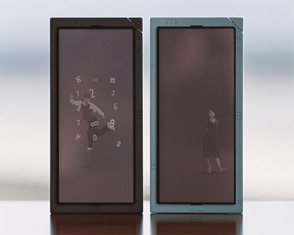
In the Hitoka concept, the typically tech-centric phone interface is swapped for a much more emotive scene: think of it as having your own butler that lives in the world within your phone’s frame – “they are your friends, your assistants, your confidants, and even your alter egos. A little human touch adds even greater pleasure to communication”.
kddi-actface-prototype

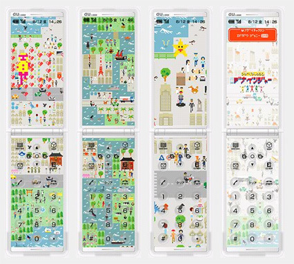
Actface translates activity on your phone into a SimCity-like arena: “your town grow as you use the phone. Your town’s residents are the people in your address book. In your town, something is always happening”. It’s pretty interesting to see how the harvested information is translated into different developments of the town too – and in this way, everybody has their own truly customized, a unique digital fingerprint on their phones.

I’m not sure whether KDDI set a specific theme for this year’s exploration, or did the designers explore their own paths and coincided on a broad perspective – it does seem like there’s a focus towards the the software rather than hardware – on how the phone behaves; how the phone reacts emotionally and organically.

It’s no longer so much about the product design: the curves, surfaces and line of a technological product. Instead, you get a feeling that this is an emotional object, with a life and world of its own, that just happened to be a phone as well.  The designers are really designing the phones’ behaviors as much as the phones themselves.

What are the implications of designing behaviors be – what are the new challenges and opportunities as compared to designing products/artifacts?