Here’s a humorous take by the Nokia N-series on the origins of Hip-Hop – could it have originated from the most unlikely of places? More points if you understand the Mandarin.
Here’s a humorous take by the Nokia N-series on the origins of Hip-Hop – could it have originated from the most unlikely of places? More points if you understand the Mandarin.

Product Red (styled (PRODUCT)RED) is a for-profit brand which is licensed to some of the more iconic brands: Apple, Motorola, AMEX, GAP, etc., who are then entitled to use this brand on their products. In return, they donate a percentage of profits towards the AIDS cause in Africa.
I don’t harbor warm feelings to this campaign – a marketing gimmick that leverages on human compassion to dig more gold from the consumers. Look at the copy of what (Product) RED is about – if this isn’t marketing and branding fluff, I don’t know what else is:
“Each company that becomes (RED) places its logo in this embrace and is then elevated to the power of red. Thus the name — (PRODUCT)RED. You, the consumer, can take your purchase to the power of (RED) simply by upgrading your choice. Thus the proposition: (YOU)RED. Be embraced, take your own fine self to the power of (RED). What better way to become a good-looking samaritan?! [bold mine, ?! theirs]
Stemming from a reaction against the (RED) campaign, the (LESS) campaign invites donation to the same charities for AIDS as (RED), but without the conspicuous consumption of the branded goods. When I first saw the ads/pictures, I thought it was rather refreshing. I must say I’m a little less inspired when I went to their website though.
While they sharply challenged the (RED)’s ideology of copious consumption in the poster ads, they have inherited and duplicated (RED)’s style – be it in their web design, approach or their overtly-marketing tone, complete with slogans and a faux sense of grandeur. While reacting against the superficiality of (RED), they seem to be sorely lacking in sincerity of their own.
It does make me ponder if (LESS) is even operated by the same people in (RED) – like you’d learn in Marketing 101 – it never hurts to capture more segments of the target demographic.
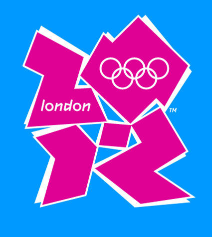
I can’t say I liked this logo designed for the London Olympics 2012 – in fact I think it’s outright ugly. The colors hurt my eyes as much as they are loud, while the shapes look haphazard except for the requisite “2012″ embedded within. For a lack of a more elegant way of putting it, I shall block quote from retry:
This is the logo unveiled for the 2012 Olympic Games in London. Lord Coe, the guy who spoke at this auspicious event said “London 2012 is inspired by you and it’s for all of you.” The people of London are wondering what they did to deserve that comment. The thinking was sound: Olympic viewing will take place on a lot of media devices in 5 years time so they wanted a recognizable shape that can work across lots of platforms. I love the bold intention to create an original Olympic ID and break from Otl Aicher’s Berlin ID (enough with ancient history! most of us weren’t born when that work was done.) I’m disappointed that the execution will open it up to massive criticism and give smug design/client conservatives one more arrow.
Lisa Simpson giving a blowjob indeed! Haha, I couldn’t remove that mental image after this comment was made, much like the hidden arrow in Fedex’s logo (I apologize if I have irreparably rid your mind’s ability to look at this logo simply as a London Olympics logo). An excerpt of some of the (predominantly negative) reactions on the BBC Sports Blog as well:
Is this supposed to be one of those picture puzzles that eventually makes sense after slowly refocusing your mind’s eye?
It looks like a logo designed for young people by old people who don’t understand young people.
Like the 2012 Committee had a student intern who said he could use Photoshop and they said ‘Great, you can design the logo’.
Disjointed and dysfunctional, a graphic mess and also underwhelming and uninspiring.
It’s awful isn’t it. I just can’t decide which bit of it I hate the most.
Oh,dear! This is so sad. Aren’t Logos meant to sum up the spirit of something and capture a vision. This one only seems to evoke derision.
This is foul beyond words and a total embarrassment to a world leader in design. which London is (or was).
For better or for worse, the logo seemed to have rallied a great majority of Londoners (if only in opposition of a common enemy) – it’s like a grand party of universal condemnation, seeing who has the wittiest retort for the design. Oh well, Creative Review has more to say (a more neutral and considered article). If you liked this logo, don’t be afraid – you’re not alone either!
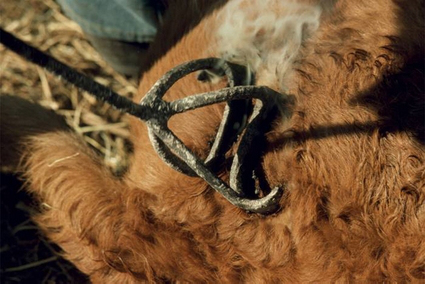
The idea of branding – and indeed the term ‘branding’ itself – began thousands of years ago, when people started literally branding their livestock with hot iron as a mark of ownership or quality. Gradually through the years, the notion of branding as a clear visual symbol has evolved and spread to practically all industries. Some of the principles of branding include clarity (legible, easy-to-read even within a short time), identity (the mark should communicate the idea/spirit of the brand) and consistency (consistent style of application to reinforce the mark’s strength and recognize-ability).
These principles have generally evolved into extremely comprehensive brand identity guidelines – the exact vector of the marks notwithstanding, there are also generally stringent rules about the colors, minimum perimeter space around the logos, where and how the logo may be used, etc. Like a jewel on a crown, they were the untouchables – the identities must be so – they stand proudly on or atop products, displays, posters, etc., almost like a king watching in solitude over the rest of the artwork doing the legwork in conveying the message. The brand-mark was very much simply a stamp of approval.
Lately though, I’m beginning to see some forward-thinking brand-marks developed less as a stamp, but more as a flexible lasso to hold everything together. Wolff Olins is among the pioneers in this school of thought. As their CEO, Karl Heiselman remarks:
In the past, corporate identity was about control and consistency. With too much control, people tend to forget about content. In the era of blogging, social networking and user-generated content … a bit of flexibility is essential.
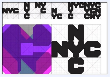
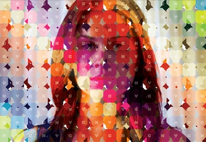
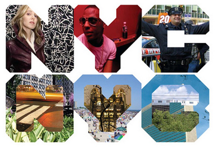
They are often just as strong and iconic (if not more), but they have an added dimensionality and freeplay that allows for creative interpretations of the symbol, rather than just a static stoic symbol. Sometimes they are used as a design tool – an example is the ‘NYC’ logo for New York City, which can be manifested beautifully such as in the second picture below:
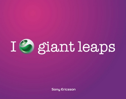
Some other memorable and successful designs from Wolff Olins include the Sony Ericsson symbol, which is being used in place of a verb in many billboards and poster advertisements, leaving the user to imagine and associate whatever the word is (and associate that to Sony Ericsson too):
Another one is the Product(RED) campaign – the bracket and the superscript RED forms an extremely strong visual identity, and yet allows a large amount of free play to how it is used, which is especially important given the varied styles and usage for its partners.

They are also the ones behind the London 2012 Olympic logo, which I didn’t find too impressive (and blogged here). The logo was along the same thought – promising versatility and flexibility in usage – but I thought aesthetically they weren’t as well-done as some of these above.
It’s great though to see brands getting more alive and versatile. With the new mediums of expression (cellphones? Google Earth views?) and the Web2.0 culture of hacking and mashing, a versatile logo allows the audience not only to receive but also to actively reciprocate and reinterpret what these brands mean to them (such as the (LESS) campaign in response to the RED). Some marketers may freak out and take this as perversions of the company’s brand identity – but let’s face it – a brand is what the consumers think about you, and not what you want them to think about you. And with modern technologies like the net, there is no way you can stop them either. So might as well just leap in!
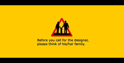
Found a rather cool icon+caption over here (a Chinese design blog), which I have translated into English as above. It was originally intended as an avatar picture for chat software like MSN Messenger. I guess most designers can somewhat relate to this?
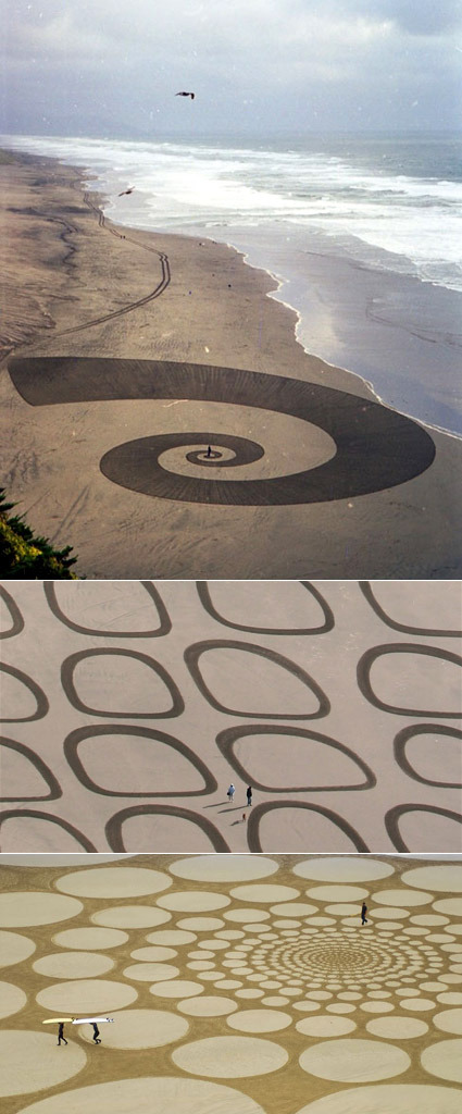
Sure, we have seen a fair share of crop-circle art before – here’s something equally amazing, but done on sand instead of crops:
Jim Denevan makes freehand drawings in sand. At low tide on wide beaches Jim searches the shore for a wave tossed stick. After finding a good stick and composing himself in the near and far environment Jim draws– laboring up to 7 hours and walking as many as 30 miles. The resulting sand drawing is made entirely freehand w/ no measuring aids whatsoever. From the ground these environments are seen as places. Places to explore and be, and to see relation and distance. For a time these tangible specific places exist in the indeterminate environment of ocean shore. From high above the marks are seen as isolated phenomena, much like clouds, rivers or buildings. Soon after Jim’s motions and marks are completed water moves over and through, leaving nothing.
Pretty cool (it’s a pity these art pieces are all temporary though), eh? Tonnes more, and some processes on the artist’s website.
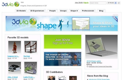
Dassault, which is the conglomerate behind popular professional 3D softwares such as CATIA and Solidworks, are putting another big step forward with their (coming) debut of 3DVia, which is a web-based 3D modeling interface for people to create CAD models:
3DVIA is the newest of the 6 Dassault Systèmes brands. Its mission is democratizing the usage of 3D so that everybody can use it in its everyday life, either at work or at home, through the web. Our objective is to give you the power of 3D.
This is certainly a radical branch from its stable of sophisticated (certainly with price tags to match) softwares traditionally only operated by professionals, be they designers or engineers. This is all about increasing the accessibility of 3D software: free (accessible to more people), online (accessible anywhere) and easy to use (accessible in terms of learning curve). In a world where many are increasingly immersed in virtual worlds – be they games like WOW or universes like The Sims (I still don’t get Second Life though) – giving people a foothold in creating 3D artifacts online seems really logical.
It is certainly worth thinking of the implications of a move like this – what does it hold in the future, if it succeeds? What if 3D literacy is as common as computer literacy? What would that imply? Think of how the PC overthrow the mainframe computer; or how blogging opens up mainstream journalism. It could be a case of massive rapid prototyping, where each person creates their own products around them as easily as creating a Facebook profile today. Or products can be developed like a Wiki or open-source software, with each participant crafting a specific part (this is already sort-of happening with BugLabs).
How would designers evolve? Would technical operators of traditional 3D softwares becoming extinct, just as we don’t see many computer operators around anymore? The designers who succeed would then be people who can readily harvest the massive growth of a 3D-literate online populace – how would you position yourself to be the next Bill Gates for 3D?

Designed a truck before? How about a bag? How about both (nearly, anyway)? FREITAG, known for making bags out of used truck tarpaulins, is organizing a design contest for the truck tarpaulin. The design would first be used on trucks for 5 years, until they get cut and harvested into limited edition bags.
Kind-of like a subversion of host-and-parasite, cause-and-effect, don’t you think? Bags that started off picking whatever waste was available is now in a strong enough economic position to try to alter it upstream. Fortunately in this case the tarpaulin do get used just as any others – so the core spirit isn’t that much off yet. Here’s FREITAG’s reason for this competition:
They still exist, the <undesigned> truck tarps. Colors, signals, stripes, circles and bars form words and messages. These <undesigned> truck-tarps form the basis for the production of FREITAG bags.
However, the truck-tarp <diversity of species> is endangered. Increasingly they are being used as moving advertising space, wallpapered with uniform advertising campaigns. With the <Design-A-Truck> contest FREITAG is making the first moves to preserve transit graphics.
Head over if you will!
Once in a while, you get an ad that transcends the very definition of an ad. One that is so remarkably and creatively different from the pack, it shines. I think this is one of them.
The product is as typical as any – a facial cream. You can already picture how an ordinary ad for this would be – a pretty (fair) model rubs the cream into her palm, uses it, and the slow-motion sideview take of the water splashing her face, which leads to an end cut-scene extolling the virtues of Brand X cream, and your life becomes perfect.
But this one manage to narrate it through a series of four short movies (or long ads) – the story can either be cheesy or touching depending on your point of view – but the ad scores brownie points for me when they were able to laugh at themselves: ridiculing the very medium of an advertisement while being on an advertisement. It also doesn’t make it seem like magic will ooze out once you use it like most ads would have portrayed – so there’s an element of honesty there as well (wow!). It’s Thai-produced, so you’d recognize their almost trademark exaggeration and comical humor as well.
They have managed to produce one that in my opinion, even draws people to want to watch it, to “can’t-wait for it to be screened”. That is some feat indeed!
If you’re a typographer and just find it hard to communicate the value of your work (“Oh, so you choose fonts for a living?”) – here’s an excellently-produced video that may help give a quick explanation of the artistic level in true typography. Well actually, it’s rather likely the response would still be more like “Ah, so you choose pretty fonts for a living!”, but at least the video would probably make you feel the worth of your work more.
“Typography is what language looks like”.