Blood Donation Ad

blood-bank

I thought this ad was very well done – an extremely elegant way to convey the message for the Blood Bank. The outline of a man and the Red Cross are respectively printed on either side of the hourglass, depicting the symbiotic relationship between the (potential) donor and the Blood Center – anytime one is short of blood, the other can help.

Agency: TBWA, Shanghai

Hand Shadow


Forming shadow patterns with a light source and hands are an old trick that everybody would likely have used to entertain themselves in those days of black-outs and power outage. But our tricks were probably nowhere as imaginative and well-executed as this one from artist Raymond Crowe.

Arc Light – Troja

troja-light

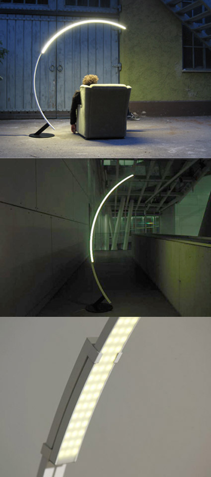
If you’re looking for a arch-shaped floor lamp for your home, and you’re thinking “It’s so cliche to get the Arco!” – well here’s your salvation! The Troja light, by hansandfrans, offers a more modern take on the typology of an arched floor lamp. With its simple and yet distinct outline, it may eventually grow to be another icon in itself. A small peeve for me though is the look of the lights (3rd picture) – it makes it feel just a little too much like a lamp for an operating theatre.

The Art of Shattering Sculptures

shattered-sculptures

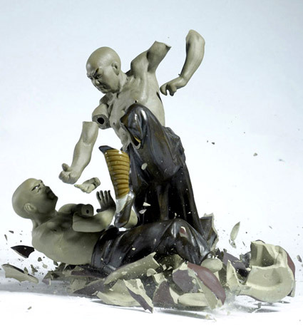
I wonder how many figurines it takes to capture just one of these photos of figurines being smashed while seemingly being posed and arranged in a thoughtful composition. As the artist Martin Klimas explains,

Yes, the shooting environment must be controlled and kept consistent. The lighting is clear and direct, head on. My background is neutral, but bright enough so that the shattering object completely stands out. I drop the figurine from the same height in complete darkness while the lens of the camera is open. When the figurine hits the ground, the sound triggers the lights to go off for a fraction of a second. I do this procedure many times or until I find the one frame that is just right. I keep just one such picture for every figurine. Every attempt yields a unique outcome, so I need to look for the one that best expresses a transformation of the figurine into a new form.

More shattered works over here.

Smile Detection mode on Sony’s T200

sony-t200

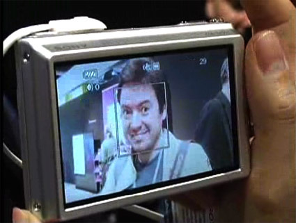
So I just realized that the Sony T200 has a feature/mode known as the smile detector. When this mode is activated, the camera goes into a standby mode, capturing your subject once they flash their pearly whites. I don’t know about you – on my camera, there’s a long list of modes – night shots, sports, portrait, landscape, etc. – but I have never ventured past the first few options. This feature seems like one of those – enough to be marketed as a unique selling point, but not quite compelling enough to be useful in real life.

Or maybe that’s just me?

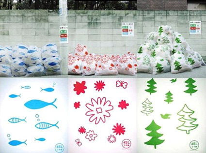
Pretty Recycle-bags

garbage-bag-designs

Garbage Bag Art Work trash bags aim to transform Japan’s unsightly neighborhood garbage collection points into instant works of disposable art. Produced by design agency MAQ, the bags come in three patterns — trees, fish and flowers — and they are colored to match Japan’s official color codes for various types of waste, each of which are collected on different days. Green is for recyclable trash, blue is for non-burnable and red is for burnable, so while livening up the appearance of trash heaps, the bags also remind neighbors about what trash day it is. Packs of ten 45-liter bags sell for 380 yen (about $3) at a select few Tokyu Hands and Loft outlets in Tokyo, or they can be purchased online here (Japanese).

To ponder: does making garbage bags prettier encourage people to recycle? Shown above are graphic-coded trash bags – one each for burnable, non-burnable and recyclable trash. Pretty artwork would certainly beautify the pile (we wish you didn’t have that much to dump though) – and this is perhaps much more emotionally engaging than the standard, stark (no doubt clear) coding systems like stark blue, yellow and green color-coded bags. More arty and less town-council-y.

Work done by design agency MAQ. [via Pink Tentacle]

Origami Paper

origami-paper

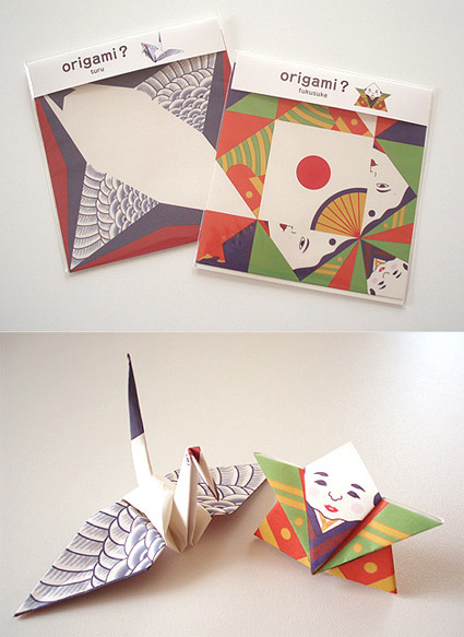
I came across these origami papers over at Pingmag (along with many other souvenir ideas from Tokyo), and thought they were pretty clever: having the final form pre-printed on the origami paper so that the end product has an additional dimension of appeal. Of course, this would mean that the paper is restricted to only that particular fold/object, but it’d still make a good gift especially for beginners!

Graphic design on the paper done by cochae.

Packaging Design Blog

packaging-design

Here’s to yet another niche design blog – this time focusing on the art of packaging. According to the blog owner Torben,

A quick count shows that an average person is in contact with a packaging approximately 52 times per day! If you didn´t notice this fact before it is maybe because you´re surrounded by good and well worked out packaging designs.

But for those who are disabled to some extend, bad packaging design can turn out to be an everyday nightmare. That is what I deal with and want to improve!

It’s a budding blog but it certainly shows promise. Head over to Design Better Packaging to shower some love!