adidas takes on Nike

adidas

It does seem like adidas is taking Nike heads on in this ad campaign (not sure of its origin though – could it be fan art?) – the copy reads: “Nike has great ads”, signed off by “adidas – love competition”. If it’s real, I do hope Nike would respond with a creative return – that’d certainly make life a lot more interesting, like the (hoax, but funny nonetheless) battle between BMW, Audi, Subaru and Bentley.

Barcode Ads

barcode-ads

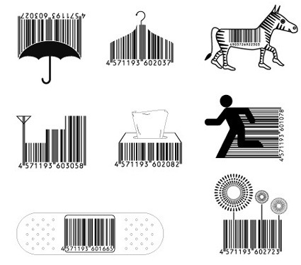
Creativity finds itself in the smallest and most mundane details!

Wonderfully creative works by a small Japanese company called Design Barcode – whose name probably implies that they’re definitely very specialized in giving barcodes a facelift, as demonstrated by their works above. And it was no wonder that they grabbed the Cannes Titanium Lion Award (the only ad campaign to do so), which is given to firms  to recognize work that broke through traditional awards category boundaries and represented creative innovation.

I guess Design Barcode is having a rolling good time now, especially since they’ve trademarked this proprietary method of advertising (and have since licensed the rights worldwide). From the juries in the competition:

“Our industry has banged on about ideas being important and about intellectual property issues for some time,” said juror Craig Davis, worldwide creative director of JWT. “This idea is trademarked, it’s proprietary, it speaks to many of the issues we’ve been talking about.”

Scott Goodson, creative director at Strawberry Frog, said the winner represented “an agency owning something that brands around the world will pay for.”

[Design Barcode]

Apple iLaunch

This parody of Apple’s new product launches really tickles my funny bones:

 Jobs introduces Jobs introducing the iLaunch, Apple’s new product-unveiling product.

The iLaunch, as the new product is called, was then raised up from below the stage, prompting the audience of technology journalists, developers, and self-professed “Apple fanatics” to burst into a five-minute standing ovation.

“Get ready for the future of product introduction,” said Jobs, looking resplendent in a black turtleneck and faded jeans. “The iLaunch will be able to make announcements from this, or any other stage, making human participation in generating consumer awareness almost entirely unnecessary.”

Whether you’re an Apple fan or Apple hater (are there really any neutrals?), I’m sure you’d agree that the article vividly captures the spirit of most of Apple’s product launches –  a carefully orchestrated event that borders on being cultish (or actually, probably already), calculated and inspired to achieve the greatest bang possible, and casting every star product on each show as the must-have, revolutionary one.

Architecture against Threats

The Berlin Wall was a potent symbol crystallizing the divided world of “us” versus “them”. It is stark, monumental, and it gives “protection” to the people from the foes on the other side of the wall (whether you’re the West or the Soviets). The wall came down in 1989, and some predicted a world with less boundaries.

That was not quite the case, and the 911 incident would forever entrench this. Instead of fearing the opposite world power, the fear has shifted to agents of asymmetrical warfare – terrorists. And in place to replace the Berlin Wall are many more little Berlin Walls – various architecture against the newer forms of perceived threats. And, instead of being pure functional and direct in its form and purpose, these new securities are dressed up in disguises.
new_wtc

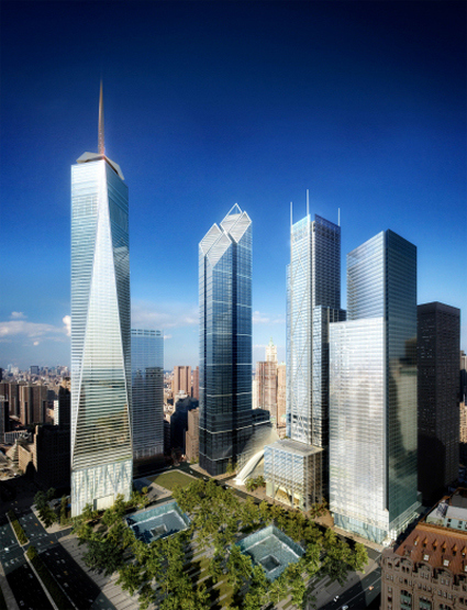
The Freedom Tower (above) may attempt to symbolize the American resilience after the 911, but the insecurity (or to some, being prepared) is betrayed by the 20-story windowless, fortified concrete base. Innocently decorated with prismatic glass panels, it masks paranoia as design/architecture. After hundreds of years, we’ve still not moved much beyond moats and castle walls it seems. While bollards, planters and various other implementation are still used – often these security features are masked as public benches, sculptures and the like.
caltrans-district-7

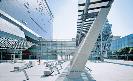
Seems like the owners of the Caltrans District 7 building cares a lot about its occupants – littering the plaza with sculptures and benches – but their real purpose is to deter any large vehicles that may be carrying explosives into the building. Apart from terrorists, building and urban space planners are also increasingly targeting other “threats” like skateboarders and the homeless.

It’s a pity that while we connect and link more on the Internet, the physical space seems to revert to the “protect-my-turf” mentality. While we build walls – numerous visible and invisible ones – against others to keep “them” out, from their perspective we’re simply locking ourselves in.

[read more: NYTimes “Design Strikes a Defensive Posture“, Excellent blog on Architectures of Control]

Papipo – the Kid’s Cell Phone

papipo

Papipo is a cellphone designed for the kids market – developed jointly by Willcom (phone company) and Bandai. The product design itself is pretty run-of-the-mill – a simple, easily customizable phone for all your Hello-Kitty and Manga upgrading needs.

It’s one of the games inside that got my attention. This phone features a “coloring-the-picture” type of game – those typical ones where each segment is denoted by a particular number – the difference though, lies in the way the colors are chosen. Instead of coming off a standard software palette, the kid would have to take a photo of something that has that color (pretty similar to another very interesting concept, the IO Brush).

Now isn’t that a whole lot more exciting – searching high and low in school and the house hunting the right shade for your Power Ranger Megazord!

FLIP – the flipping ship

flip-vessel

FLIP (or, Floating Instrument Platform) is an amazing ship – technically it isn’t a ship, but more like a buoy since it doesn’t have its own propulsion and has to be towed around – but I bet you though no other sea vessels in the world can do what it can – intentionally “capsizing” so that it can turn 90 degrees, and turn from “ship-mode” to a “platform mode” by flooding its tail:

During the flip, everyone stands on the outside decks. As FLIP flips, these decks slowly become bulkheads. (This is the name sailors use for walls.) The crew step onto decks that were, only moments before, bulkheads. Inside, decks have become bulkheads; bulkheads have become decks or overheads (ceilings).
Some of FLIP’s furnishings are built so they can rotate to a new position as FLIP flips. Other equipment must be unbolted and moved. Some things, like tables in the galley (kitchen) and sinks in the washroom, are built twice so one is always in the correct position.

The reason for the flip is the stability required to perform the scientific experiments that this vessel was designed for – measuring effects on the environment caused by long range sound propagation, research in geophysics, meteorology, physical oceanography, non-acoustic anti-submarine warfare, and in laser propagation experiments – having this design would enable FLIP to be towed to the desired location for the research while still having superior stability (which affects the precision and accuracy of readings) over conventional ships.

The video of the transformation:

I wonder how it turns back to the ship mode though – does it have to expel water from its ballast against the deep sea’s water pressure? Would that be too much? Then again, virtually all submarines do that with no problem…perhaps I’ve just answered my own question.

And their homepage: FLIP

Crop Circle Font

cropcircle-font

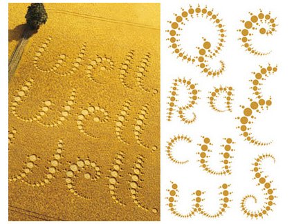
When crop circles were first created, many speculated supernatural origins of these complex patterns that seem to magically find themselves in vast fields. With the open admission of some of the original crop circle creators, however, it has taken on a different light. Some take it as a pure art form, challenging themselves to create more and more elaborate patterns, often based on sacred geometries, fractals and mathematical proportions. It didn’t take long till crop circles  were first imbued with commercial values (Google Earth sure help to motivate that!) – for instance, the Firefox crop circle that I blogged about some months back.

The above picture actually shows the development of a font inspired by the artform of crop-circles – what with the chain of circles of increasing radii, etc. – and it’s commissioned by the grand daddy of the artworks’ canvas: Quaker Oats. Pretty interesting I’d say – reminds me of a Flash-based game that became popular recently too – Flow.

The creators of the font here.

12 Best Games, in year 2010

totalkungfu

omega-1

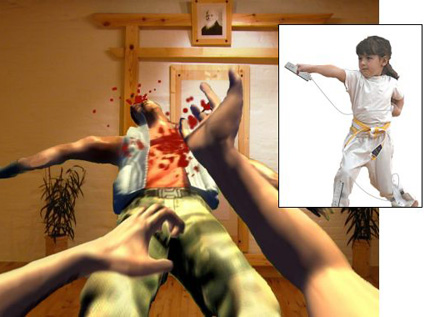
Someone has compiled a top-twelve list of the best games – the catch though, is that these games are not published, nor even being scheduled for publishing (as far as I know anyway). They simply represent the dreams/desires of gamers – and I must say that they are really imaginative gamers – because the suggestions that they came up with definitely appealed to me (I’d really want to jump in and play some of these suggestions) even though it was just a simple paragraph explaining how an example game scenario would work in each of those games.

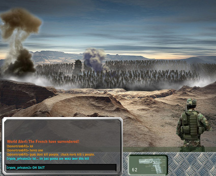
The first picture is for the imaginary game Total Kungfu – where you’d fight animated opponents using the Wiimote, leaving you frantically waving and flailing ala Dance Dance Revolution gone havoc. The next picture, showing a war scene, is simply a Massively Multiplayer Single Scene War – hear ye:

    This is the Combined Arms Simulator PC gamers have been dreaming about from the first time a shot was fired in anger over a modem. A sprawling world war, a Battlefield 2 but with one gargantuan, persistent map that everybody plays on.

There will be AI units to do grunt jobs like holding positions and supply lines. There will be RPG elements like statistics, character growth, and chain of command “guilds.” And Normandy-sized invasions with five thousand players.

Wow, that’s pretty cool aye! Some of the others have pretty cool concepts too! Like “Hard Cell”, whereby the protagonist you control need not want to follow your orders – he does not particularly want to follow your orders, especially if you have betrayed his trust and sent him down hell holes. Your task is then to shepherd and guide him past various obstacles and challenges in the game – fail to look after him, and things gets ugly… COOL isn’t it?

(Am I just fanatical here or something?)

Anyway, here’s the complete list – go look at them yourself and see if these games move you! Game publishers, take note too! And with some luck, some of these would DO indeed come to life.

Philips Light Painting


Philips seems to be quite keen on bringing mood/ornamental lighting (as opposed to illuminating) into everyday life – from their Ambilight Television sets to the Lumalive textiles, it does seem as though their chief has been to one too many musical fountains or something.

Shown above is a rather amazing application of light quite literally as paint. A glowing wand first dips into a pot of colored-light, and the child can then begin to draw on the wall. Painting with light – isn’t that some sort of childhood fantasy coming through?

Here is a press-release site of some of the other items that were shown in the Philips Simplicity Event last October, featuring many other similarly intuitive and yet imaginative applications of lights and colors.