Jumping over 14 people


With all due respect to the incredibly athletic people in the video,  this short clip made me chuckle as it reminded me of performing animals like those you’d find in Underwater World or something – where the stunt would eventually be greeted by polite applause and a little treat from the trainer.

But 14 people is really quite a long distance.

Gems Sty on 9rules

9-rules

On 21 Dec 2006, an email from 9Rules came in, informing me that Gems Sty is now part of the 9Rules web community. For those of you who might not have heard of it before:

9rules is a community of the best weblogs in the world on a variety of topics. We started 9rules to give passionate writers more exposure and to help readers find great blogs on their favorite subjects. It’s difficult to find sites worth returning to, so 9rules brings together the very best of the independent web all under one roof.

Well and wow then! I’m not quite sure if this is “the very best” stuff online just yet – but it’s pretty cool to have it recognized by a community where its editors do actually go through some sort of curation – selecting and sifting among blog submissions – traditionally about 8-15% of the submissions are accepted.

And it is this very thing about human selection that draws me too – many blog aggregation sites are either incarnations of the “Blogring” concept – whereby a central place links to any website that was submitted, or the “Digg” mode, where popular posts are voted and moved to a prominent front page.

“Blogring” style aggregators can quickly get boring as quality and appeal varies – how many of you really do click on the “Next Blog” button on top of Blogger pages? The “Digg” style requires popular topics with wide audiences, sometimes those that appeals to the common denominators of a broad audience.  Human-intervened selection process, on the other hand, has the gift of judgement, and it can pick up stuff that may have been left behind because of its quirkiness, niche content, etc. And that’s where 9Rules come in – picking the best content on the web, regardless of a blog’s popularity or links.

So there! Another little milestone for Gems Sty!

Talking Tapes and Inkless Pen

talking_tapes

In the early days, LP records work by having a needle tracing the microscopic grooves on the underside of a record. As the needle traces the contour, the vibration is amplified, broadcasting the music content. Later, CDs were developed in the same principle, but instead of a needle, an optical laser is used to read even finer grooves on the disc.

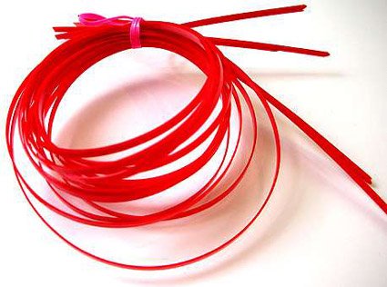
The red talking tape above works in a similar manner. According to the website selling it, it is:

A long thin plastic strip, about 60cm long. It doesn’t look like much, but it talks! Along the length of the strip is a pattern of fine ridges or lines. Run your thumb nail along the ridges, and the tape speaks. However the sound needs to be magnified, so that you can hear it. One method is to hold one end of the strip between your teeth. Then, when you run your nail along the strip you hear it talk, but no-one else does. Or you can stick one end of the strip to an inflated balloon or a paper cup using sticky tape. The balloon or cup acts as an amplifier, and you can then demonstrate it to anyone nearby. Never heard a balloon talk? You have now!

What do the tapes say? One says ‘Happy Birthday’ others say ‘Congratulations’ or ‘Have a Nice Day’. We have 5 different messages, and we supply 4 tapes of each message, making a pack of 20 Talking Tapes.

That sounds pretty amazing, as something that invokes an old familiar technique to create a new effect – however, I’d still have to hear it to believe it – I still can’t quite picture how this works or sounds.

pen-with-no-ink

There are other rather interesting articles of merchandise too – like the one above, an “inkless pen” – however seemingly contradictory that might seem.

The pens we sell are a modern version (and do not use silver). The solid metal ‘nib’ consists of a metal alloy, that leaves a mark on most types of paper. If you use the sort of paper typically used in printers and photocopiers, the pen leaves a mark that looks as if it was made by a pencil. However the line will not smudge, and cannot be rubbed out.

Since there is no ink, there is nothing to dry out, so the pen will work just as well in 25 years time as it does today. And of course it never needs sharpening!

For the quirky geek in you!

World Time Clock

rugby-clock

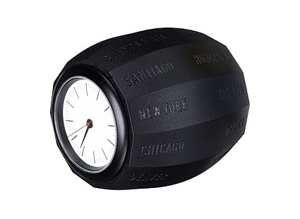
I stumbled upon this unique clock while surfing. The clock’s shaped like a grenade or a rugby ball – the cool thing about it is the various cities carved on the sides – to choose a time zone, simply choose the city you want and put it at the 12 o’clock position.

Definitely a much simpler solution than the cumbersome dials, or multiple faces, or other more conventional solutions.

Japan Love Hotels

japanese-love-hotels

For decades Japan’s love hotels have provided a place for couples to enjoy anonymous, uninterrupted sex. Politician and secretary, teacher and student, husband and hooker — all are welcome, as long as they pay in cash and leave when the time limit is up. But 2006 spawned a new type of love hotel. Decorated with theme park interiors and equipped with game consoles, karaoke boxes and sex machines — these establishments provide kinky fun for all types, from fetishists and sadomasochists to the ordinary couple seeking sexual adventure.

Wow, I must say I’m very amazed at these themed rooms – larger than life, vivid, extremely lived-out – I guess this is why the Japanese are so good in anime? The desire to imagine in fantasy, and more importantly, the audacity to create and live in and among it. They are a people of contradictions – generally perceived to be polite and reserved, they do have a wild side that has probably witnessed and spurred the growth of their arts and creative scenes.

[link]

COR – Green Building in Miami

cor-miami

A new 400-foot cheese grater is proposed for the Miami Design District!

Designed by Miami-OPPENheim architecture + design, it will add an interesting icon in Miami’s skyline. The key merit of $40-million, 25-storey building is the emphasis on the “green” factors:

COR extracts power from its environment by utilizing the latest developments in wind turbines, photovoltaic panels, and solar hot water generation. A hyper-efficient exoskeleton shell simultaneously provides building structure, thermal mass for insulation, shading for natural cooking, enclosure for terraces, armatures for turbines, and loggias for congregating on the ground. The incorporation of all of these elements into one building represents a major breakthrough in design and engineering.

This building actually reminded me of Centre Pompidou, in the way that they showed off their design intent and utilitarian vision through explicit, external structures. Although on first sight I thought the external grater appearance was just the whim of a cheese-obsessed architect, I was pleasantly surprised when I learnt that it is a lot more, being the platform for the multitude of green architectural details to achieve their green objectives (did you notice the brilliantly integrated wind turbine on the roof?)

[link]

Blow Table Lamp by Studio Italia Design

blow-lamp

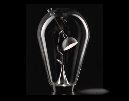
I came across this Blow Table Lamp from Studio Italia Design, and was immediately mesmerized by its powerful imagery – like a forlorn lamp trapped within a glass house.

The more interesting part is the control for the direction of the lamp – a magnet is outside the clear globe. Move it around the globe, and the lamp inside would turn and follow accordingly, giving rise to an engaging and innovative experience while maneuvering the lamp. I can even almost imagine the lamp becoming “happier” if you moved the magnet further down the globe, causing it to “look up” – heh, it’s funny that a lamp can elicit so much (irrelevant?) imagination from me.

Technical details: Low voltage lamp with metal ware finish in chrome and diffuser in brushed aluminum; outer clear crystal globe; H41cm, maximum diameter 24cm. The painful price: $1363

Find it here!

What should I get?

whatshouldiget

I came across a rather interesting site called “What Should I Get?“ (note site is now no longer available). What it basically does is – give you a single recommendation in a particular product category. For example, you’re in the market looking for a pair of earphones. But just which one? This site simply states that the one to get is the Sony MDR-EX51LP (with a picture accompanying that recommendation).

In their own words,

We are not a shopping search engine. They return too many results to sift through and deal with. We are not a product comparison page. They take too long to navigate through and interpreting the results is too difficult.

We are not a review site. There are tons of them out there. They take a really long time to sift through and read. Reviews are often outdated and go into much more detail than you care about. Sometimes the product comparison charts are so big they don’t fit on the screen!

We do one thing and we do it well. We just tell you what to get.

Products are really a dime a dozen nowadays. Too many of them, in fact. If you want to buy a cellphone, there’s at least 50 choices from a single manufacturer alone. As a industrial designer who dabbles with consumer products day in and out, I’m already finding it difficult to keep up with the developments of new technologies, models, etc. Like they say, review site sometimes give too much, and makes it even harder to make a decision.

In a way, this site reminds me of Google. When every review site out there aims to feature more comprehensive reviews, indexing more products, this site realizes that when people surf review sites, they are likely to want to make a purchase. The site attempts to maintain a simple path, cut through the cheese and bring them straight to the purchase (they link to the Amazon purchase site directly from their recommendation – and earn clickthrough commission – although they are not endorsed by any manufacturers/brands).

I think a site like this has great potential. While Yahoo! overwhelemed users with features and information, Google undercut Yahoo! by removing all the clutter and leading the user straight to the one thing it does best – search.

I am, however, rather peeved with the way it tries to manipulate users into clicking the Google Adsense ads, which masquerades as content proper. Sure, a site needs bandwidth, and those cost money. Deceiving the users into clicking ads may give some easy income, but it definitely does not project the honest, sincere and neutral image that this site should have.

BC Hydro Bicycle-powered Billboard

This is a rather unusual concept that aims to pedal home the point – LED lights use a lot less energy than conventional light sources. For 120 hours, the ad agency had volunteers pedaling around the clock on the bicycle to keep the 1500  LED lights glowing.

A Christmas campaign by BC Hydro – which interestingly, is an power/utility company. Maybe I’d write more on the apparent hypocrisy of companies who advocate the opposite of their products next time (e.g. Big Tobacco funding Quit-Smoking centers) etc.